

Harry Potter and the Prisoner of Azkaban – 2004

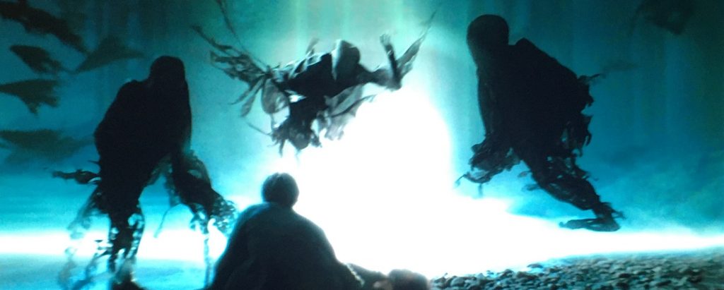
Here we are with the third installment of the Harry Potter franchise. Like the others, it is geared toward a younger audience, filled with whimsey and humor, but at the same time, I’m betting it frightened a great many children with its very dark tone. This aspect, of course, affected the really creepy visual effects, mostly in the form of the main bad guys, the Dementors of Azkaban.
These guys were truly scary. The visual effects artists really paid attention to the way they looked, the way they moved, the way they floated. I loved how their flowing black robes moved as if they were always under water. It was a really awesome effect. For the most part, they were CGI creatures, and that might have been fine except for a certain scene where it really looked like it. This bad shot was the one where Harry first learns to conjure a Patronus. When the Dementor shaped Boggart tries to penetrate Harry’s shield, it moves like a bad 1990s CGI image.
I also thought the completely made-up – meaning they weren’t in J.K. Rowling’s source material – characters of the talking shrunken heads, were ridiculous. They looked like nothing more than childish puppets, and moved like pieces of stiff rubber. They were poorly done and completely unnecessary as part of the movie, and yet, though it was only a little, the film spent too much time focusing on them.
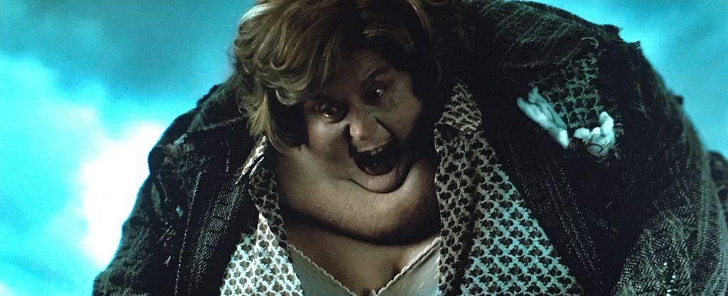
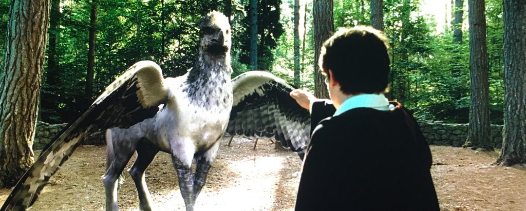
But what they got right was amazing. The film starts off with Harry’s aunt blowing up like a balloon and floating away. I always like the visuals in that scene. Then there was the hippogriff, which was a perfect combination of CGI and practical effects. They had sections of the creature built for the actors to interact with, and digital sections that were incredibly detailed, and it was all blended together seamlessly. I thought it looked incredibly photo-realistic. There were also Peter Pettigrew changing from rat to human, which was fantastic, and from human to rat, which wasn’t as good. And there was Professor Lupin transforming into a werewolf. Unfortunately, it looked too cartoonish, and didn’t have that photo-realism that the hippogriff and the Dementors had. The transformation was a combination of CGI and practical effects. It wasn’t bad, but it wasn’t perfect. And then when the change was complete, some of its movements were a little too computer-controlled.
And lastly, I’ll mention the Whomping Willow fight scene. Pay attention to physics, effects people! When Hermione swings by Harry at break-neck speed and grabs his shirt, if she was even able to grab him at all, she would only have knocked him down or torn his shirt, and probably hurt him in the process. Lifting him off the ground and tossing him with perfect aim into the tunnel at the base of the tree would have been impossible. A thirteen-year-old girl can’t lift a boy off the ground by his shirt with one hand! And they made it look as silly as a Wile E. Coyote cartoon. That one bothers me every time I watch it!