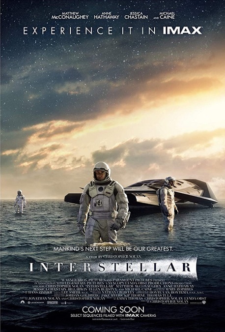


Interstellar – 2014 (WINNER)

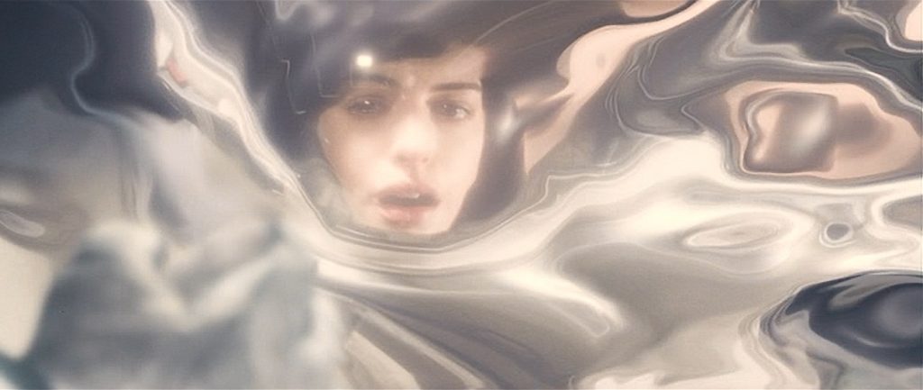
Wow! I can only imagine what this film would look like on an IMAX screen! The visuals in this movie approach the realm of art, not mere special effects. But when I did my reading about the VFX for Interstellar, I learned a few very surprising facts. There is no doubt in my mind that this movie’s award for Best Visual Effects was completely deserved.
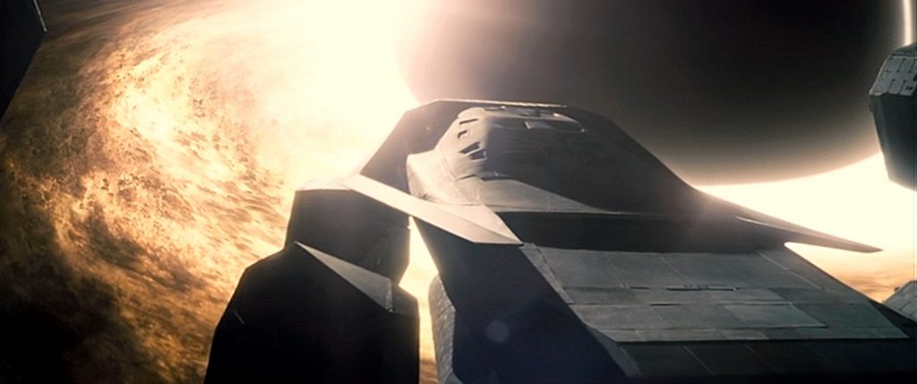
First, there was the realistic and scientifically accurate visual representations of cosmic phenomena, some of which we do not currently have the technology to be able to see properly, like black holes and theoretical worm holes. However, director, Christopher Nolan brought on Kip Thorne, a prominent astrophysicist at Caltech, as an advisor to Paul Franklin, the film’s visual effects supervisor. Together, along with a team of other scientists and advisors, they created images that were beautiful and captivating.
To quote an article by Rod Pyle on space.com, “‘Kip got us the three-dimensional mathematics behind these things, and we were able to turn this into software that could accurately calculate all the light-ray paths around these objects, to show how they distort space and create these vast gravitational lenses,’ Franklin said.”
The next thing I learned was that there were very few CGI space ship shots in the movie. They mostly used miniature models, something that is very rarely done these days. The model for the mother ship, the Endurance, was actually about 25 feet across, which is about three times wider than the model of the Enterprise, used in several Star Trek films. The Ranger shuttles were also built as models. Nolan felt these miniatures gave a more realistic representation on the screen, especially when it came to reflected light and shadows.
And then there was the film’s climax in which the main character enters what they called the 5th dimension, in which time itself has been turned into a physical three-dimensional space. It is seen as a giant chamber behind the walls of his daughter’s bedroom. But the M.C. Escher-like representation was done without green-screen effects, and was not an artificial digital environment. It was created using the same camera effect that Stanly Kubrick used in 2001: A Space Odyssey. To paraphrase Rod Pyle’s article, “Franklin used slit-scan photography, which allowed images to move past a slit-shaped shutter held open for longer-than-normal exposures. What you get is a photograph that captures one point in space across many moments in time, as opposed to a regular photograph, which is one point in time across many points in space. This immediately spoke to the idea of an object standing still, leaving its trace through time.” It was pretty spectacular!
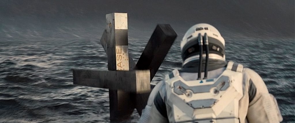
All that, and I haven’t even mentioned the amazingly designed robots that accompanied the astronauts. They were like walking blocks made of connected sticks. They were very mobile and versatile. Yet even they weren’t CGI, but on-set puppets, controlled by puppeteers. Amazing! This was a well-deserved Oscar win!