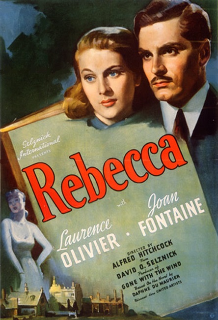


 Rebecca – 1940
As I’ve mentioned in other reviews, sometimes, the best visual effects are the ones you don’t see. This is certainly the case with Rebecca. Yes, there was the great fire at the end that burns the Mandalay mansion, but I think the movie earned its Best Special Effects nomination through the use of beautiful scale models. The models were filmed and then composited with the live action shots.
And the big scale model of Mandalay was perfectly done. Every little detail looked authentic, and if I hadn’t done my research and discovered that the house was a model, I would have never known. The illusion really worked with me.
The only thing that might have given the illusion away was when the model was set aflame. When the image was blown up to give it its size, the tongues of fire themselves looked too big. And to make it appear that the house was burning properly, the film had to be sped up to make the mansion sized flames appear to move realistically.
And while we are on the subject of the fire, I have to say that the last shot of the film was incredible! We are inside the room with Mrs. Danvers when the burning ceiling caves in and kills her. Then the camera begins to move through the flames to the bed, where it ends up focusing on a burning pillow with a fancy “R” embroidered into it. The fact that the camera was panning across the room, where, had it actually been in the room, the camera and its operator would have been destroyed by the fire. It was a pretty cool shot!
There was also something which I’m not sure belongs in the Special Effects category. I’m talking about the lighting effects, which were amazingly done. There were shadows in nearly every shot of the film, emphasizing the feeling of hidden secrets, so prominent in the film’s narrative. They appeared on the walls, the actors, and everything, really adding an extra dimension of texture to the film, both visually and subliminally. It was Hitchcock giving us that masterful blend of imagery and story that made him such a fantastic filmmaker. However, this might be categorized under Art Direction or Cinematography, so it may not apply. Either way, it was a subtle effect that was pure genius.
So why did I give the Special Effects a four star rating instead of a five? It was the rear projection shots. They were too obvious, especially when anyone was driving. First, the actors and the backgrounds didn’t seem to belong in the same shot. They looked separate. But more than that, the moving backgrounds made it appear as though they were driving way too fast. If I was simply watching the movie, it wouldn’t have bothered me, but since I am specifically looking for those things, they are catching my attention.