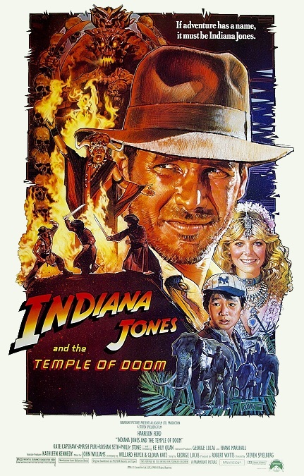


Indiana Jones and the Temple of Doom – 1984 (WINNER)

I must admit, I’m baffled. How could this movie have won the Oscar for Best Visual Effects? Yes, there were a few good ones, but the majority of them were pretty awful! It was up against Ghostbusters and 2010 The Year We Make Contact. I’ve seen both of those films, and I don’t remember their effects being this poorly done, especially Ghostbusters. Several of the effects in this second installment of the Indiana Jones franchise looked incredibly amateur.
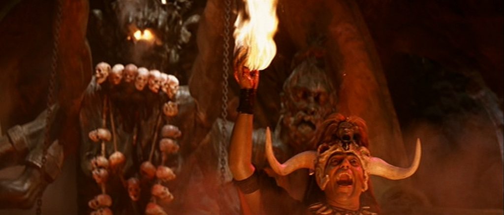
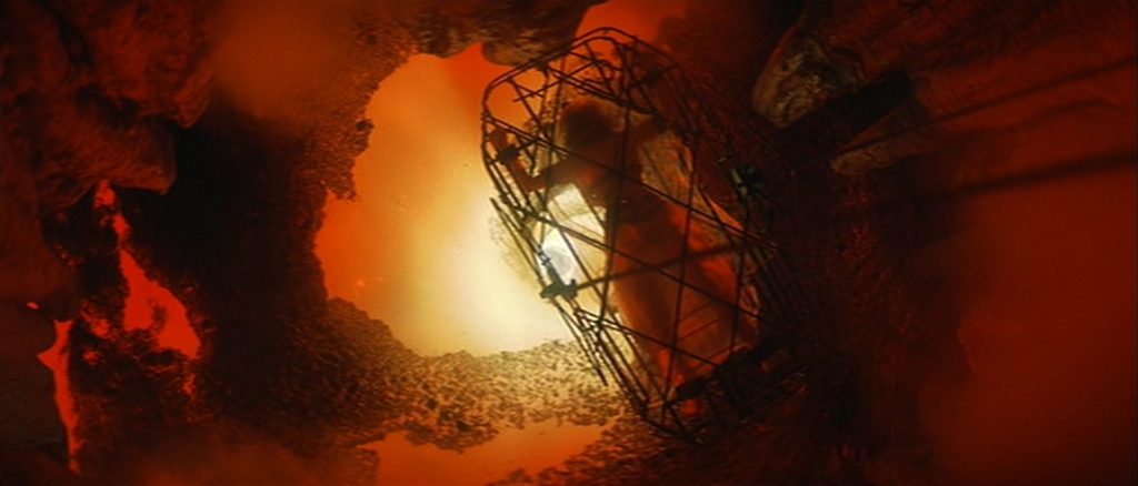
So I’ll go over the good ones first. One scene that comes to mind was the scene in which a Thuggee priest removes a man’s beating heart and holds it in his hand. As the man is lowered into a pit, at the bottom of which is a swirling pool of molten lava, he is burned to death. At the same time, the heart in the priest’s hand begins burning. That was cool. And the magma whirlpool was also pretty cool, though I imagine, not difficult to do.
But the bad effects far outweighed the good ones. Right near the beginning of the film, our hero and his companions jump out of an airplane on an inflatable raft and do not die when the hit the ground. The feat makes the magic refrigerator seem from the franchise’s fourth film, Kingdom of the Crystal Skull, suddenly plausible. But I digress. Behind them we can see the airplane crash into the mountain. The aircraft abruptly vanishes as the explosion erupts. The flames quickly die and we suddenly see the stationary wreckage of the plane. It all looked very fake.
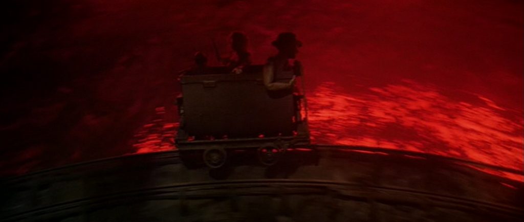
Then there was the ridiculously impossible rollercoaster ride in a mine-cart. When the live actors changed to stop-motion animated miniatures, it was painfully obvious. After that, a flood of water threatens to throttle them, and they rush out of the tunnel. They find themselves stranded on a few narrow rocks on a high cliffside to either side of the mouth of the tunnel. When the water pours out of the hole, their images appear to flicker because of bad compositing.
Then came the climax of the film. Indie is on the center of a rope bridge and he uses a sword to cut the support line. Half the people on the bridge fall into the crocodile infested water below. The falling figures were clearly not part of the same image. I don’t know, it all just looked shoddily done. We see the men plummeting and they looked like something akin to paper cut-outs against the out-of-focus backdrop of the cliff and the river beneath them. Just look at the rocks below them and the thick black outline that separated them from the water. And then when the men are eaten by the crocs, there was no blood, no struggling victims. Just reptiles chomping on wet clothes. Couldn’t they at least have put red dye in the water?
The poor effects went hand in hand with the ridiculous nature of the narrative itself. There were so many plot points and stunts that were physically impossible, that the effects took on a fakeness which they might not have otherwise had. Yet this seemingly low-quality work won the Oscar, and I really can’t figure out why.