

Transformers: Dark of the Moon – 2011

This was one of the dumbest and poorly written movies I have seen in a long time, but thank goodness the visual effects were passable. I’m not saying they were perfect, but they did what they were supposed to do. There were some really good things that made it to the big screen, but there were some little disappointments as well. Unfortunately, I think I may have missed out on one of the main reasons this movie was nominated for Best Visual Effects. It was supposed to be a 3D movie. But if I am right, and that was the movie’s main reason for being nominated, then I’m glad it didn’t win the Oscar.
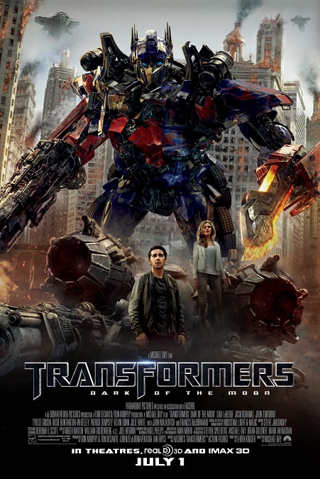
This is the third film in the Transformers franchise, and as was the case with the first film, which was also nominated for the Best Visual Effects award, it was directed by Michael Bay. As such, it had all the same signature techniques and aesthetics as the first one. Lots of fast, jarring action, quick cuts, lots of explosions, and a massive amount of mayhem and destruction. The problem is that we’ve seen it all before. True, I have not seen the franchise’s second installment, but I can only imagine that it is more of the same. The transformations looked cool, for the most part, but no better than in the first film.
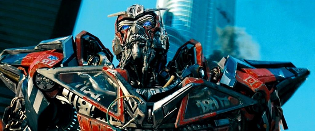
Not only did we see all the same effects in the first movie, but they seem to have amplified the aspects of the effects that I didn’t like. When the robots changed from vehicles to robots, it all happened faster and more unbelievably. When skyscrapers were destroyed, they defied the laws of physics for the sake of looking “cool”. When the robots spoke, their metal mouths were flexible enough as to behave like human lips. In fact, one of the new robots, Sentinel Prime, had metal facial hair. He had a long beard and moustache that seemed to wave and flow like human hair. Someone needs to tell Bay that metal doesn’t bend that easily.
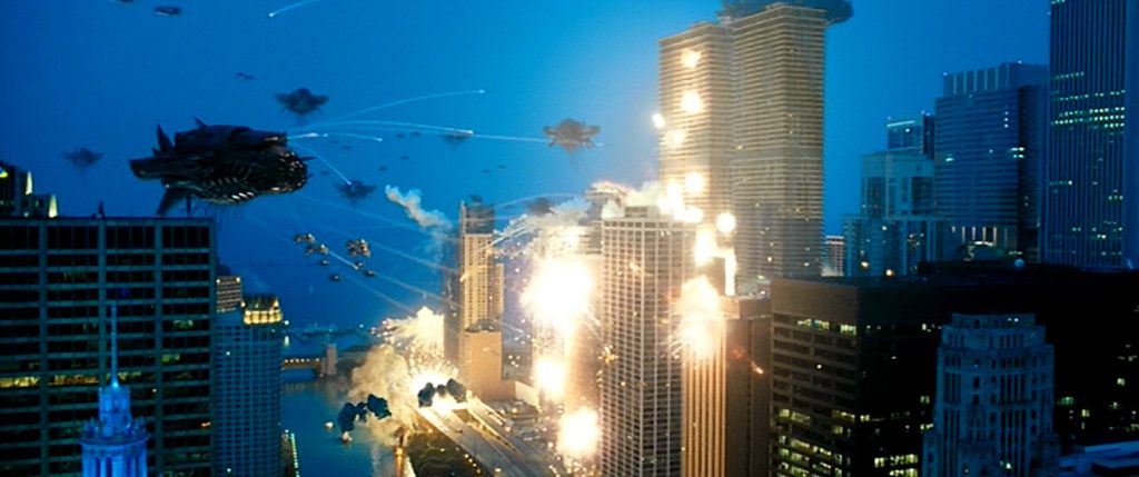
Another effect that really bothered me was the skyscraper that broke in half. The top half tipped over to about a 45 degree angle, causing our heroes to slide along the angled floor, and crash out the windows on the far side. Both halves of the broken building just stood there, shaped like a bendy straw. It was so ridiculously unrealistic, that I was taken out of the story. I sat there rolling my eyes. But that was only one example of how realistic physics was completely ignored. I get that the real problem was with the script, but that poorly written script demanded that effects artists had to create that terribly unrealistic effect and make it look good.
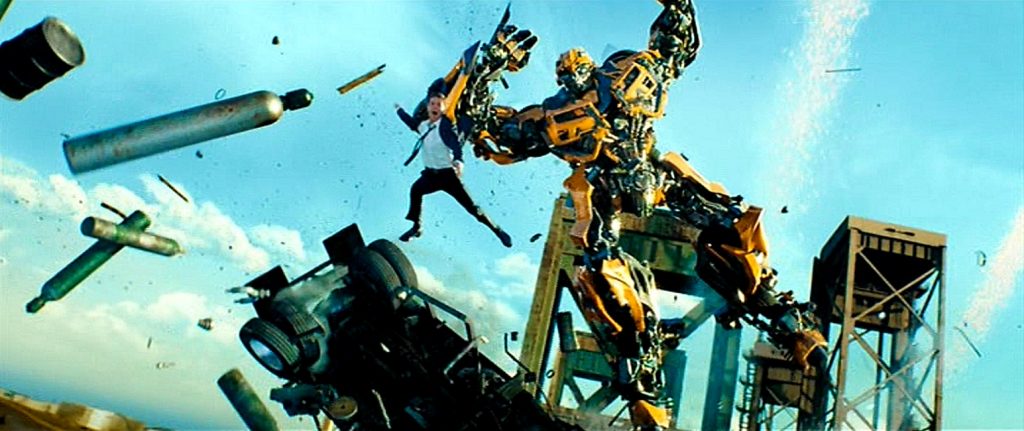
I also got really tired of the fast action that would periodically break into slow motion, in a bad attempt to look “awesome”. No, actually, I think they did it because if they left the speed of all the effects alone, there would be times when the audience would never be able to comprehend what was happening. If you need to slow the action down for us to be able to see what you are doing, then maybe you should find something different to do, or at least find a different way to do it. Oh well. At least Michael Bay knows how to blow things up in an exciting way.