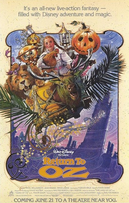


Return to Oz – 1985

OK, I’ll start off by saying that the movie was geared toward young children, and the visual effects reflected that. To be sure, there were plenty of special effects, but unfortunately, many of them looked fake and very unrealistic. That being said, the film was still interesting to watch. To a slight degree, I can see why it was nominated for the category, though I’m not sure it should have been. But it’s also easy to see why it didn’t win.
Return to Oz was Disney’s unofficial sequel to the ever-popular musical from 1939, The Wizard of Oz. However, they changed several things to differentiate it from that film. First, they based it on elements from two different books in Frank L. Baum’s series of Oz books. Also, they remained much closer to the books than the previous movie did. But one of the reasons the movie was made, was that Disney owned the rights to the Oz books and their copywrite was only a few years away from expiring.
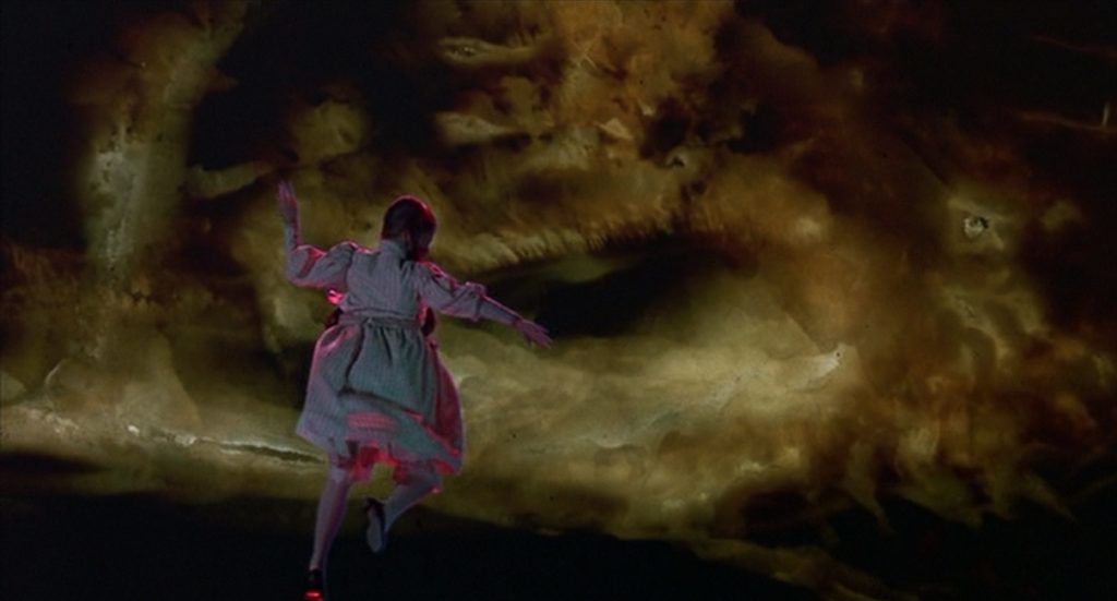
In order to create the fantastical landscapes and environments, the production design team created some incredible sets. To make them appear more expansive, some matte-paintings were created. Unfortunately, many of them looked nearly cartoonish in their execution. Again, this lent itself to entertaining a younger audience. There was also a fair amount of blue-screening, but even this common technique displayed some sub-standard work. The actors often had little outlines around that separated them from their backgrounds. They didn’t look like part of the same image.
Another visual effect was the use of animatronics. But once again, it looked very fake. They looked mechanical, like the robotic characters found in the Country Bear Jamboree or the Hall of Presidents. They had limited movement that was all too jerky and artificial, little to no facial expressions, and cartoonish appearances.
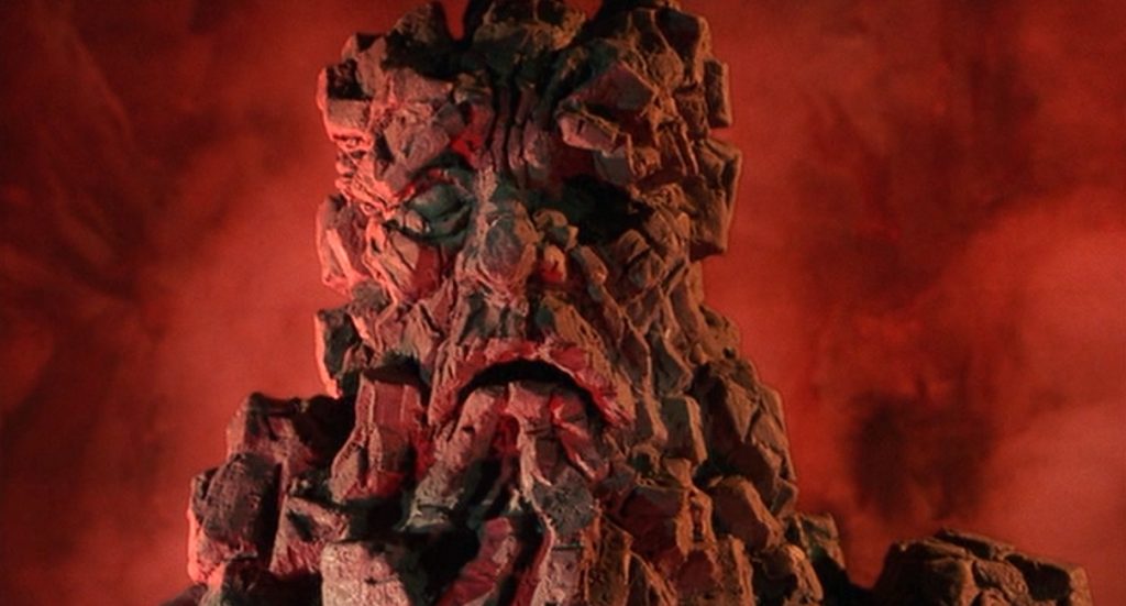
And then there was the Claymation. Now, this was probably one of the more interesting visual effects of the film. Claymation is a form of stop-motion animation that uses clay figures. It is actually really amazing what can be done with Claymation. You’d never believe it was simple clay. The detail, the range of motion and color, and the sheer fantastical nature of the clay imagery can be amazing, and to be sure, they really used it well. It wasn’t as impressive as the 1985 Claymation film The Adventures of Mark Twain, but still expertly done. The problem is that it never doesn’t look like clay, like a cartoon, like a child’s toy. It never looks as real as the actors who have to interact with it.
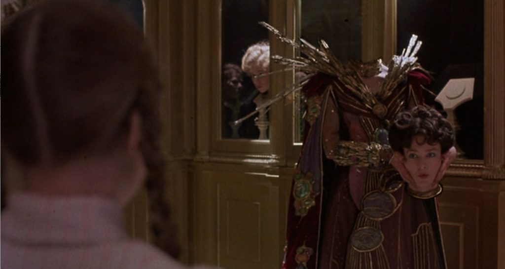
Otherwise, I think the most impressive effect was when the character of Mombi removed her head and exchanged it for another one. The slight flickering at the base of the neck when it was set in its display case was barely noticeable, and I’ll admit, I’m being very picky on that point. It was a pretty good effect. But was that and good Claymation enough to earn it its Oscar nomination? I don’t know.