2000 – The Perfect Storm

The Perfect Storm – 2000

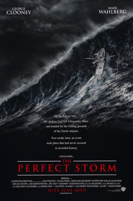
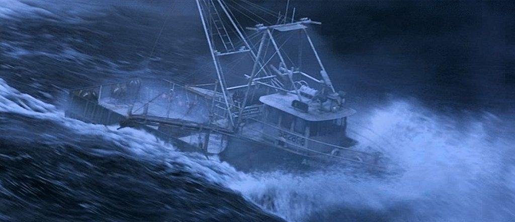
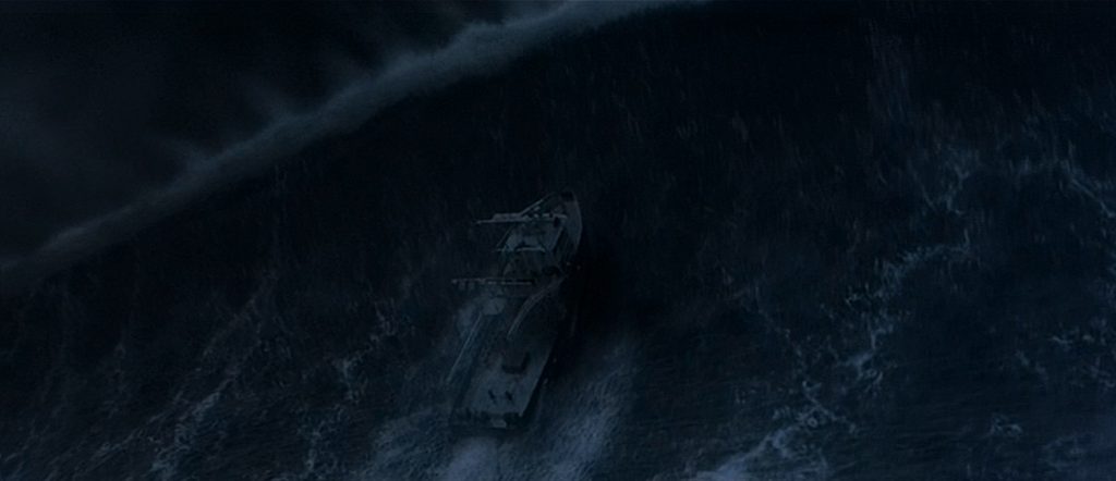
I’m going to admit that I didn’t have the highest expectations for this movie as a whole, and consequently, its special effects.  But I was surprised by both the film and its effects.  As you might expect, most of the effects focused on the storm.  Giant, one hundred foot waves that did their best to crush the stalwart fishing vessel, the Andrea Gail, loomed large on the screen like the sentient, killer tornadoes in the movie Twister, and there’s no doubt about it.  They were pretty darn impressive.  And why not?  It was the same special effects team that worked on both movies.

A handful of scenes were filmed in a real boat on calm waters, but once the two storm fronts collided with the hurricane, the filming was taken into a specially made tank with a life-sized recreation of the boat attached to a gimbal so that it could be turned and held at a variety of angles.  The documentary featurette included with the DVD said that the tank that they had built was the largest tank ever built for a film on Warner Brothers Studios.

The storm scenes were dark and ominous, whether the scene took place in the daytime or the night.  The black waves were only visible because of the white foam and the frequent flashes of lightning.  The way the big boat was tossed about like a child’s toy was impressive.  I learned that the visual effects artists created most of the raging ocean waves digitally, using software that created an ocean surface with fluid dynamics.  According to a 2006 ABC News article by David Morgan, “Several artists or teams of artists would be responsible for separate elements in a given shot: the waves, the boat, the lighting on the boat, foam, spray, rain, lightning and reflections on the surface.”

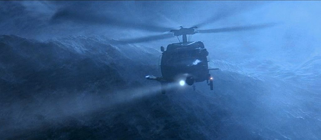
Then the images of the boat in the tank were combined with the CGI waves so seamlessly that it appeared to be one single image in furious motion.  Pretty spectacular, guys.  And it wasn’t just the Andrea Gail.  There was a smaller boat that had three people on board, all of whom were rescued by a pararescue team. There was a whole subplot where the rescue helicopter ran out of fuel, and could not refuel in mid-flight.  The helicopter went down, and crashed into the killer waves.  The crew was then stranded in the turbulent ocean and had to be found and pulled out of the water by a Coast Guard vessel.

And just in case anyone might be wondering, yes, the swordfish that were caught and fished out of the water were all animatronic animals.  So was the shark.  No real fish were harmed during the making of this movie.  So here we have yet another case of an otherwise average movie that was elevated to pretty good because of the impressive special effects.  It’s just one more reason I really enjoy the Special Effects category.
2000 – Hollow Man

2000 – Hollow Man

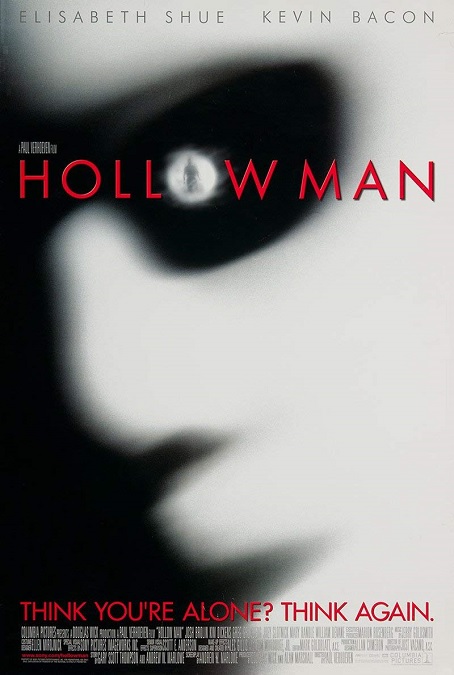
This movie was one of those films that would have been average on its own, but it was elevated to greatness because of its special effects.  But I’m starting to see a pattern in its director, Paul Verhoeven.  The same assessment could be given to some of his other movies.  He also directed two other Best Visual Effects nominees, Starship Troopers and Total Recall.  Not that I’m complaining, mind you.  It’s just something I’ve noticed.

Hollow Man was a modern take on the 1933 film, The Invisible Man.  But where the original movie had to create all their effects practically, this one was able to make use of both practical effects and CGI, along with other modern techniques like motion tracking.  The resulting effects were both realistic and scientifically accurate.

Of course, the big thing was the invisible Kevin Bacon, which was done so incredibly well and interestingly!  For the most part, it was done pretty simply, by having the actor in a green body suit, which a computer was able to digitally remove from the image.  But Verhoeven made great use of camera angles to really display what could be done.  For example, as part of the plot, they made him a kind of rubber mask, but when you looked into the eyes of the mask, you could see the inside of the back of the mask, which was lit by the light coming in through the eye holes. There was even a great shot where he turns his head to the side, and you could see the wall behind him through both eye holes at the same time.  Very cool.

But there was also the different incarnations of the invisible man.  We see him through smoke, fire, rain, and underwater.  The actor played out his part wearing different colored body suits that were coordinated for optimal for visibility and clarity in the different mediums.  For example, in the underwater sequence, neither blue nor green really worked, so they had him in black.

But another one of the movie’s great effects achievements was the transition processes, both of making someone turn invisible, and of making them visible again.  It was done in layers of the body.  The plot made the process happen by chemical injection.  From the point of the needle, we see the veins appear.  After the serum makes its way to the heart, it enters the arteries and the brain.  Then the bones, organs, muscles, tendons, and ligaments begin to appear in sequence.  It was really fascinating because they paid attention to the actual details of anatomy, first of a gorilla, then of a Kevin Bacon.

The climax of the movie was a little more commonplace with fire and explosions, and people getting stabbed and that kind of thing.  These effects were done well enough, but hardly innovative.  And that’s ok.  The rest of the film’s effects were very inventive and realistically enacted.  All in all, very good effects!

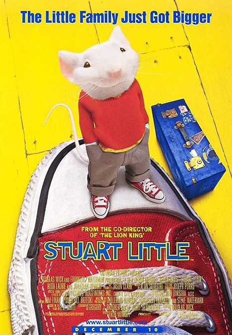
1999 – Stuart Little

Stuart Little – 1999

This was a kid’s movie, so generally not my favorite genre.  But the special effects were actually really amazing.  They were done so well!  I think they were far superior to one of its fellow nominees, Star Wars: The Phantom Menace.  They were simpler and yet so much more effective.  This is a clear case of less-is-more.  The effects turned this average film into an impressive feat of visual effects.

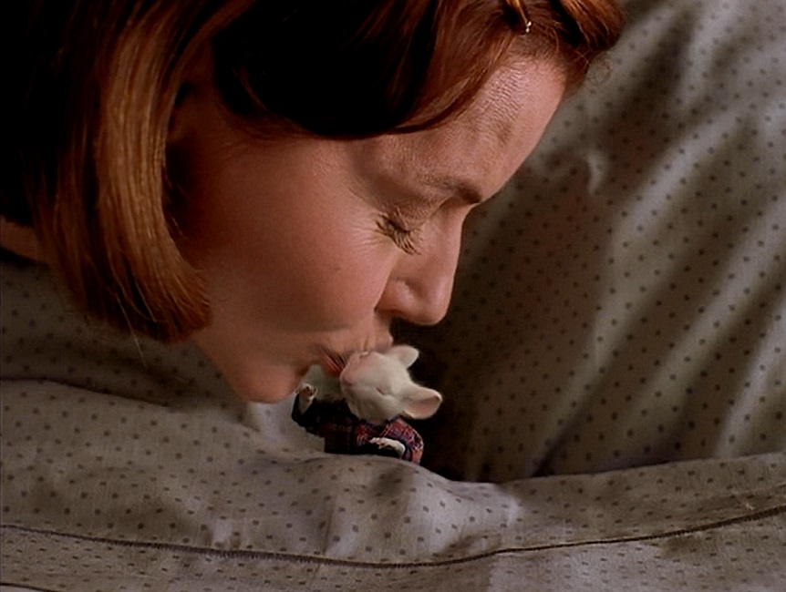
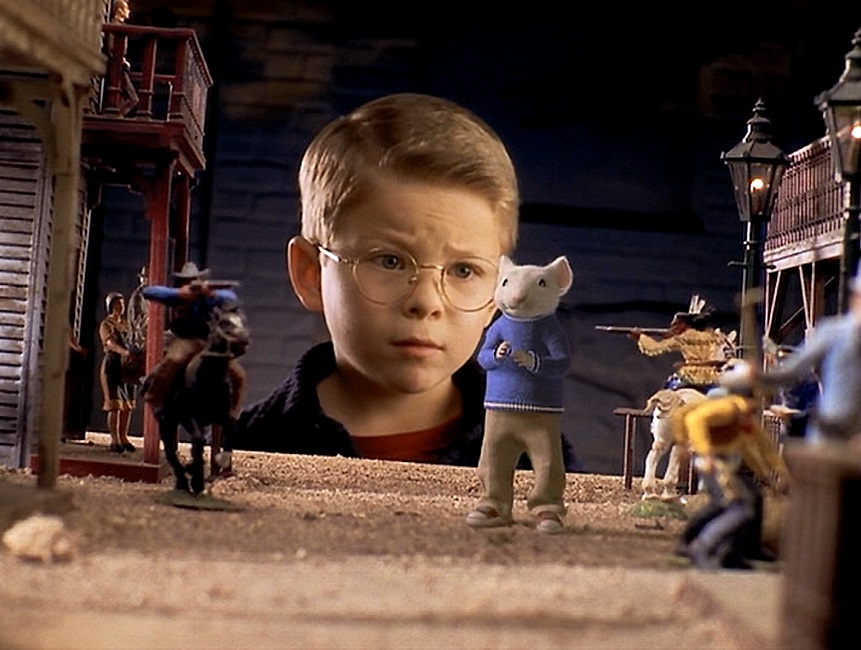
Of course, the main focus of the film’s visual effects was the talking mouse.  It was incredibly photo-realistic.  It had movement and expression, and yet the fact that the character was a three inch mouse was never forgotten.  The fur and the whiskers looked real. The eyes conveyed emotion, but never stopped looking like the eyes of a mouse.  The resulting effects were charming and I think Stuart Little really deserved its nomination, though there was really no way it could have won the Oscar.  It was up against The Matrix, so really, it never stood a chance.

The realism that made the mouse expressive was created by the visual effects artists building the mouse from the inside-out.  First, they combined aspects of both humans and rodents.  Then they gave him an appropriate skeletal structure and musculature so that his movements would be believable as a mouse, but recognizable as a human.  They were able to manipulate this computer model in minute ways, giving him the ability to emote as well as any actor.  Michael J. Fox’s wonderful voice talents completed the illusion.

And I have to say that all the little details were given attention.  A blanket would depress when Stuart was waking over it, and he would cast an appropriate shadow. There was even a scene in which he was driving a remote controlled roadster, even though it apparently no longer required a remote and simple drove like a regular car… but I digress.  When he got out and stood in front of the vehicle, you could see the hint of his reflection in the front bumper.  Very nicely done!

But there was much, much more!  Stuart wasn’t the only talking animal.  A herd of cats also spoke, but these were a little different than the mouse.  These were mostly real cats that had digitally moving mouths, like all the animals in the 1995 Best Visual Effects winner, Babe.  But here the effect of the talking felines was more refined, and so much more realistic.  They seemed to have perfected Babe’s admittedly innovative effect.

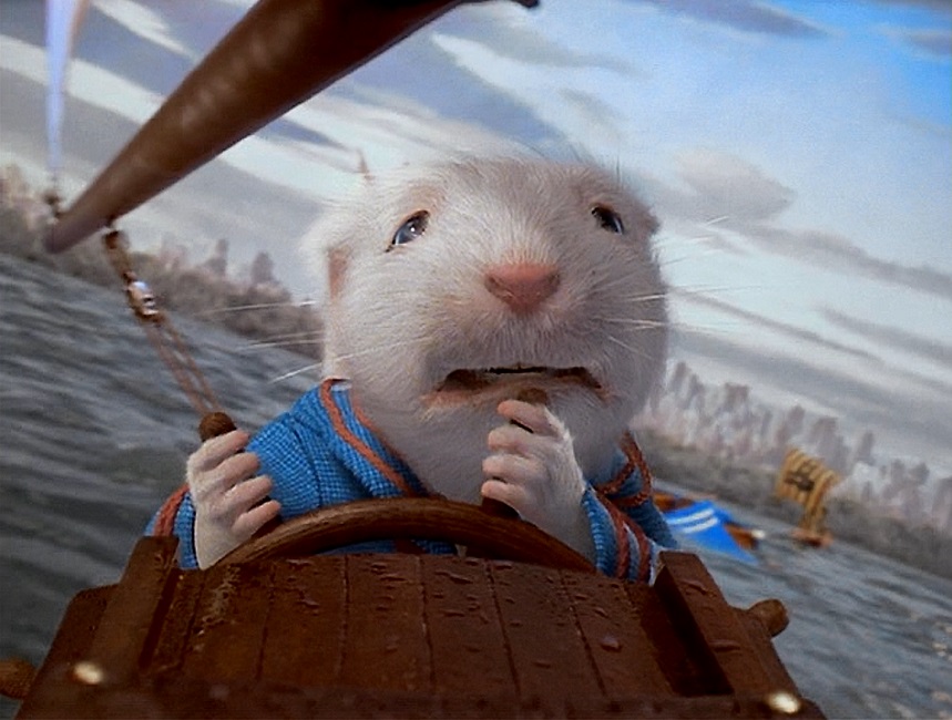
And I have to make special mention of the boat race, which was a wonderful combination of both practical and CGI effects.  One of the things that I really liked was how the boats never stopped looking like toy boats, just like they were supposed to.  But the fact that they were size appropriate for Stuart made the whole thing seem like a real race, and was a very fun sequence to watch.  All in all, the effects in this movie were very well done and I applaud them!

1999 – Star Wars: The Phantom Menace

Star Wars – The Phantom Menace – 1999

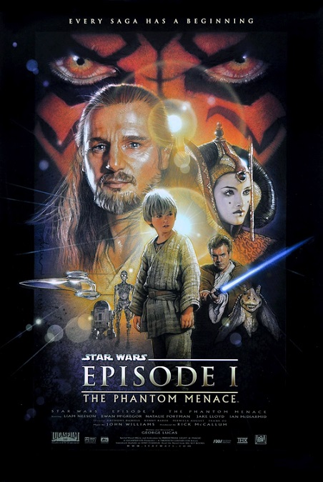
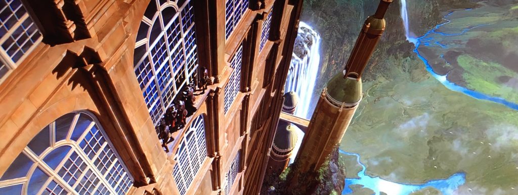
Ok, so this is widely regarded as the worst of all the Star Wars films, but it wasn’t because of the special effects.  Much of the movie’s visuals were created in a computer, the environments, the non-humanoid characters, and the space ships.  Were they as good as modern effects?  A few of them are.  But most of them are very dated.  They were good for 1999, but we can do better today.

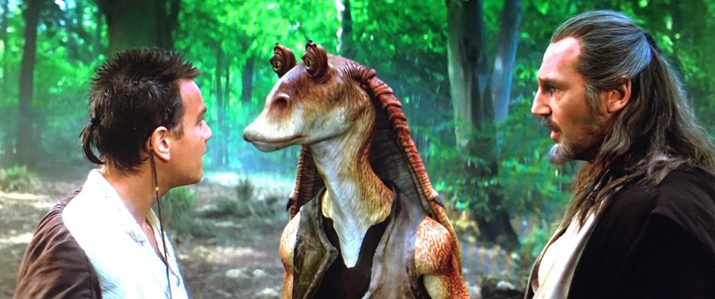
Probably the most universally hated character of the Star Wars universe is Jar-Jar Binks.  The character may have been juvenile and offensive, but the special effects that created him were not, though again, they were a product of their times. At times, Jar-Jar had great photo-realism, and at other times, he almost seemed like a two-dimensional cartoon.  And it wasn’t just our beloved Mr. Binks.  It was the battle droids, most of the alien creatures, especially the ones in the pod race, and the Gungans.  You’d think that since these digital characters were CGI, just like the CGI backgrounds, then the two would look like they were part of the same image, but they didn’t.  Just like the entirely CGI battle between the Gungans and the battle-droids.  They often looked like sophisticated cartoons that were barely and inconsistently photo-realistic.

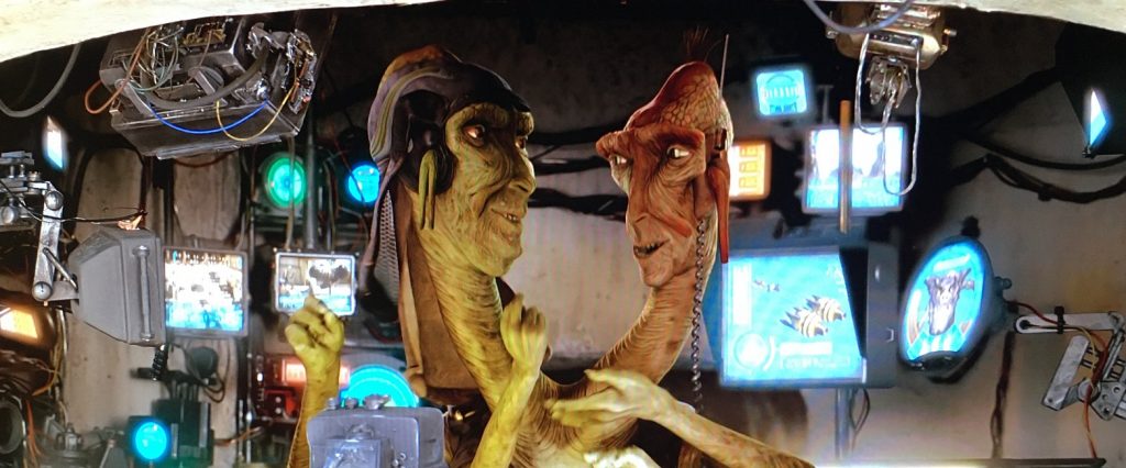
Characters like Wato or the two-headed pod-race announcer look like actual cartoons.  Yeah, they were pretty bad.  Granted, fully CGI characters had come a really long way since their beginnings with the stained-glass knight in 1985’s Young Sherlock Holmes, but there was still a lot of room for improvement.  And that’s not to say all the alien characters were badly done.  The Viceroy and his Neimoidian compatriots were actually pretty good, but in my research, I found that they were not CGI.  They were actors in suits.  But I also learned that one of the best innovations in the CGI images in this movie was the development of software that simulated the flowing fabric of clothing.  But that’s an effect that I don’t think they’ve really perfected, even today.

Still, as I think about it, those things were really the worst offenders of the film’s visual effects.  There were other CGI effects that looked fantastic.  For example, the entire CGI pod-race looked great, and was exciting to watch, just as long as I didn’t look too closely at the cartoonish alien pilots.  The racing vehicles moved smoothly and wonderfully, and they looked fantastic.  I also really liked the under-water sequences with the giant sea-creatures, even though they were completely gratuitous and didn’t need to be in the film.

The space battle sequence in the movie’s climax was short, but was definitely up to the standard of what we have come to expect from a Star Wars movie.  And the climactic lightsaber battle was awesome!  I know that a lot of people like to really complain about this movie and they aim most of their anger at George Lucas for the poor quality of the script.  But they tend to forget how great the visual effects were for their time.  So I’m not so critical of the movie.

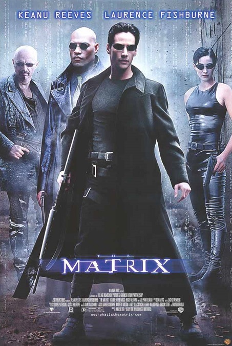
1999 – The Matrix (WINNER)

The Matrix – 1999 (WINNER)

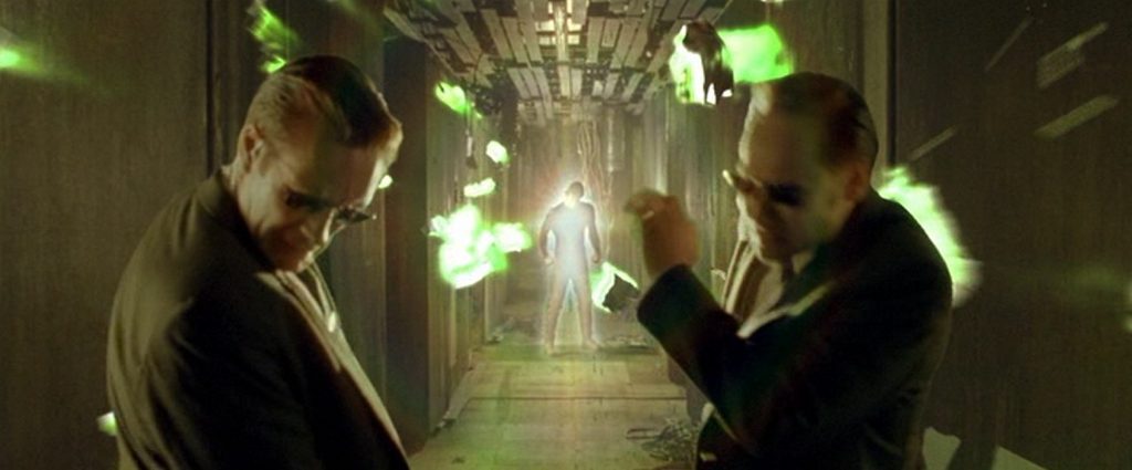
The Matrix was an incredible movie!  It was amazingly original, and spectacularly innovative in just about every way possible.  The special effects they invented were phenomenal, giving audiences images that they had never seen before, effects that have been copied over and over in numerous movies that came after.  This was really one of the major landmarks in the category, forever changing the nature of what was possible for cinematic visuals effects.

This was both a science fiction film and an action film, and both aspects were handled with incredible realism and exciting flare.  I think the effect that this movie is really remembered for, the one that really left its mark on the visual effects industry was what is now known as the Bullet Time Effect.  In this effect, time slows down or freezes for the actors, and the camera can rotate around them a full three hundred sixty degrees, showing them from every angle in one continuous shot.

This effect is used several times in the Matrix.  For example, there is the scene where an agent tries to shoot Neo on a rooftop, and Neo bends over backwards to dodge the bullets.  Here is how that scene was constructed.  First, Keanu Reeves, who was strung up on wires, threw himself back and appeared to float at an impossible angle.  Around thirty still cameras had been positioned around the actor, all set up into a green-screen background.  Each camera fired, not at the same time, but in sequence.  After that, a software similar to morphing software interpolated between the images, giving the action a slow-motion feel.  Finally, a CGI background was inserted in place of the green-screen.  The result was a fantastic display of movie-making genius that ultimately impressed audiences, critics, and movie-makers alike.

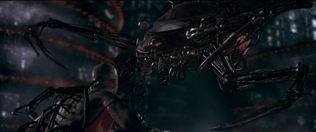
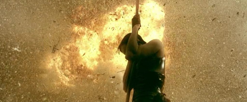
Now, being a sci-fi/action film, there were lots of explosions, flying hover-craft ships, killer robots, guns, lasers, incredible stunts and set pieces, and lots of fast-paced, thrilling action.  This movie also had a lot of martial-arts fighting and exciting chase scenes.  The sequence in which Trinity crashes a helicopter into a sky-scraper while jumping out of the exploding vehicle, only to be caught on a cable by Neo, was really awesome!  I also liked the scene where the robot Sentinels attacked the Nebuchadnezzar, ripping it open like a tin can and trying to kill the people inside.  There was also a great effect where a bomb went off in the lobby of an office building, and the slow-motion fire that flooded the room like a flowing liquid conflagration was amazing.

If I had any complaint about the effects, it would be a minor one.  Every now and then there would be a shot in which a green-screened actor didn’t quite look like he belonged with the background.  The environment might have looked real and amazing, but sometimes the lighting on the character or object in the foreground didn’t seem to work properly.  But these occurrences were very few and far between.  For the most part, the effects were seamless, realistic, and stunning!

1998 – What Dreams May Come (WINNER)

What Dreams May Come – 1998 (WINNER)

First off, I have to say that I love this movie, so I’ll be the first to admit that I might be biased towards its wonderful effects, though I’ll try not to gush.  A lot of the visual effects were accomplished through some pretty spectacular production and set designs.  In this movie, the afterlife, both the beautiful and the terrible, are depicted as a fantasy world that is as vast and varied as the souls that reside there.

The first real special effect took place after the main character, Chris, is killed in a car accident.  He is visited by a spirit who helps to guide him into the afterlife.  The spirit dances through the world of the living in a blur of color and motion.  He slowly becomes clearer and clearer, as Chris learns to accept his own death.

When he finally leaves Earth, Chris awakens in a vast fantasy, a painting that his wife created.  And this is where the movie really earned its Oscar for Best Visual Effects.  The world is full of beautiful color and motion, and is made entirely of paint.  The vibrancy of the colors, the way everything looked like paint, so much so that the brush-strokes are clearly visible.  It was absolutely gorgeous.  At one point, he imagines a fantastic bird into existence.  It flies through the gold painted sky, streaking the paint as it passes.  Chris decides to give the magical bird fanciful turquoise and mauve feathers, and the color just bursts from it in mid-flight.  It all made for a beautiful contrast when the painted world was ready to become real.

The only thing that took me out of the story at this point was when Chris first arrives in the painted world.  He grabs a painted flower and crushes it in his hands.  The vibrant blue of the flower glows with a sparkling, glistening light of its own.  The paint squishes through his fingers and drips to the painted ground.  But then in the next cut, as Chris is looking at the mess of real paint in his hands, it is a dark almost black-blue that had lost its magical quality.  I think his hands should have been covered in the same vibrant color of which the flower had been made.

In many scenes, people and spirits floated with grace and ease.  They made it look as natural as walking.  The same could be said for when Chris could breathe under water.  There were scenes with floating people in beautiful fantasy outfits, a storm in a violent sea where damned souls swamp the sailboat, a field carpeted with the tortured upturned faces of trapped souls, and a plethora of fantastic imagery that combined all the skills of the movie-makers to give us one dream after another.  Even the fiery entrance to Hell was filled with dark and disturbing images that held their own kind of terrible beauty. 

The entire movie, aside from being a wonderful love story, was a just feast for the senses.  There was a kind of a gothic aesthetic about the imagery that carried an air of fanciness and nobility.  It was a style that really appealed to me.  I think this movie really deserved the Oscar it won.  The visuals were bold and innovative, giving the audience a grand epic full of effects that had never been done before.

1998 – Mighty Joe Young

Mighty Joe Young – 1998

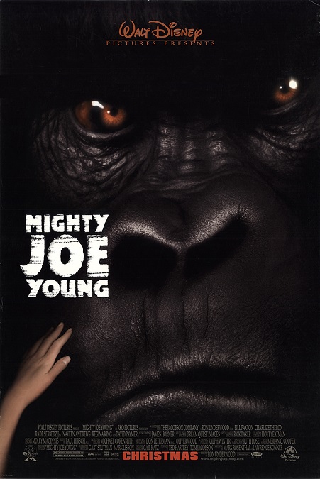
I have to say that I was a little underwhelmed by the effects in this movie. First it is important to note that this is a Disney remake of the 1949 RKO Special Effects nominee of the same name, and they did a fine job of modernizing the story.  It goes without saying that the effects are far superior than the stop-motion animation that was used in that film, though for all that, the 1949 film’s effects were pretty awesome for that time.

But now we have CGI to help create a gorilla with gigantism, as opposed to a giant gorilla like King Kong, and blue-screen to replace the rear-projection of the 1940s.  The problem is that this movie came out in 1998 and I expect better compositing from a big-budget blockbuster from Disney Studios.  That’s not to say all the blue-screened shots were bad, but enough of them caught my attention as to merit mentioning.  Sometimes Joe just didn’t seem to belong in the environments in which he was placed.

And there was the scene in which Joe picks up Bill Paxton by the leg and shakes him around a little.  I can’t put my finger on exactly what looked wrong with the image in motion, but there was a jerkiness about it that made Paxton look just as fake as the gorilla holding him.  They would cut to a close-up shot of Bill’s face as he hung up-side-down, and he looked fine.  But then they’d cut back to the wide shot, and he looked a little fake again.

In my research, I learned that most of the shots of Mighty Joe in the film were accomplished using a man in an elaborate monkey suit with a very realistic radio-controlled animatronic gorilla mask.  The man inside the suit, John Alexander, acted in front of the blue-screen with lots of miniaturized sets and props.  For the most part, he did just fine as he mimicked the movements and mannerisms of a real gorilla.  But there were too many times in the film when the animal moved a little too much like a human.  Sure, he was supposed to have near human-level intelligence, but his body was still supposed to be that of an ape.  But I’ll be the first to admit, this didn’t happen often and it is a minor complaint.

So the fifteen-foot, two thousand-pound gorilla was really the movie’s big thing.  But there were other effects that were notable.  The scenes where Joe is running through the streets of Los Angeles were pretty cool, as was the helicopter chase.  The unnecessary sequence where Joe demolishes a car was interesting, though not particularly special.  The climax found Joe at a carnival where a fire breaks out, as opposed to an orphanage, as in the 1949 film.  The climb to the top of the burning Ferris Wheel to save a trapped child was cool, as were the shots where it came crashing down. All in all, not bad but also, nothing to get too excited over.

1998 – Armageddon

Armageddon – 1998

This was a really stupid movie with some pretty decent visual effects.  Director Michael Bay has gotten himself a reputation for making movies in which there are exciting action sequences with high-speed chases, and a lot of things getting blown up.  There were all the Transformer movies, The Island, Pearl Harbor, and the Bad Boys films.  But Armageddon was one of his early efforts and I can see why his reputation was earned.

Another common trait of his directing style is the use of quick cuts that are often more confusing than effective as a story-telling technique.  A fast-paced action sequence ends, and you are left wondering what exactly just happened.  I learned that Michael Bay got his start as a director in filming commercials and music videos.  In those mediums, the goal is to get as much information about a product onto the screen in the shortest and most direct way possible.  So in light of that, his hyper-fast pacing that breezes through story and character development in order to make way for the action sequences makes a certain amount of sense.

In this movie where a planet-killer meteor the size of the state of Texas is on a collision-course with Earth, there were two main things that took up the bulk of the special effects.  First, there were the meteor showers that assaulted New York, Shanghai, and Paris with amazing accuracy.  Even though most of the earth’s surface is covered with water, only these three major cities got hit. 

But for all that, the destruction of these cities was impressively done.  From what I’ve read, the effects were mostly accomplished through the clever blend of scale models and CGI.  One of the coolest icons to be taken out was the Chrysler Building, which was cut in two by a meteor so that the top half of the structure crashed to the ground in a fiery explosion.  In Paris, I wanted to see the Eiffel tower get a similar treatment, but this one only had a gigantic impact with an expanding radius of destruction.

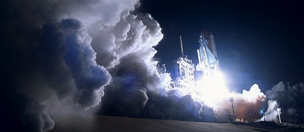
The rest of the effects took place in outer-space.  Two space shuttles were sent up to land a team of oil drillers on the monster meteor, drill into the structure, and then drop a nuclear warhead into the shaft.  The result was that the meteor broke in two and each piece sheared off to either side of the Earth, missing us by a narrow margin.  Could a single nuclear blast break the entire state of Texas in half?  I don’t know, but it stretches believability a bit for me.

And then there were the sequences in which the shuttles were flying through space with the maneuverability of fighter jets in the Earth’s atmosphere.  Nope, I’m not buying that one either.  You can have the best visual effects ever, but if your story takes place in the real world, and you blatantly ignore common physics to this degree, then the illusion has failed.  Did they look great?  Sure.  Were they believable?  Not in the slightest.  But I guess Michael Bay never claimed that this action movie was scientifically accurate, did he?

1997 – Titanic (WINNER)

Titanic – 1997 (WINNER)

This was, as I’ve said before, a movie befitting its name on a number of levels, and its visual effects were a huge part of its success.  And while I have the Special Collector’s Edition on DVD that has bonus features and the like, remarkably few of those bonus features focused on those incredible effects.  There was a very short featurette from which I learned a few things, but I was surprised at the lack of attention given to this movie’s spectacular special effects.

Now, I realize that most of the movie’s effects budget went into the sinking of the ship, but before I get into that, I want to mention a few of the effects that were shown before the big event.  Like I keep saying, the best special effects are the ones you don’t see.  I was surprised to learn that very few full scale sets were built, though it looked like there were many. 

For an obvious example, the engine room, with its five-story tall pistons, was a CGI set that was seamlessly composited with live actors, all filmed separately in bits and pieces.  But then there was a less noticeable scene in which some ladies are sitting at a table and having a conversation in a grand dining room.  It was apparently less expensive to create the room in a computer, and film each table in the background separately, as well as the couple walking behind the main characters, not to mention the main characters, themselves.  There were no black composite outlines, and not a single thing to give away the fact that the scene was made up of five or six different elements.  It really only looked like a single image.

That’s not to say that all of the CGI effects were perfect.  Every time I watch the movie, the shot where Jack and Fabrizio are at Titanic’s prow and the camera pans back all along the entire length of the ship.  The tiny CGI people on the decks move like bad Poser figures, stiff and mechanical, and like their feet seem to be sliding, ever so slightly, across the wooden planks they are supposed to be walking on.

But the climax, the actual sinking of the ship was beyond incredible.  This movie really earned its Oscar.  Every detail of Titanic as it sank into the Atlantic was meticulously adhered to.  Every nuance was given thought.  The actors, the lighting, the angle of the deck as it slowly but inevitably tilted from horizontal to vertical, the people falling into the icy water, all combined to create an illusion so realistic, you almost feel like you were there on the real Titanic.  Watching the boat sink can sometimes be an emotional experience.

There are two awesome little sequences that always catch my attention, every time I watch the movie.  One was that emotional little scene where the Captain dies.  The windows of the submerged bridge crash in and the unfortunate man is drowned.  The other is when the sinking Titanic breaks in two, just before its last moments in the open air.  The effects that made up the sinking of the ship, the super-detailed scale models, the perfect compositing, and the mostly undetectable CGI were flawless, and this juggernaut of a movie really deserved all its awards.

1997 – Starship Troopers

Starship Troopers – 1997

This movie is truly one of my guilty pleasure movies, and the special effects are a big part of that.  The movie, as cheesy as some of its script is, as bad as some of the acting is, is an awesome spectacle that is science fiction at its best.  The big effect in the film is the giant insectoid alien creatures that are waging war on the human race.  They are a perfect blend of practical effects, scale models and CGI, and they are very photo-realistically portrayed.  These insectoid aliens were big, monstrous, and appeared completely real on the big screen.

At first, we see them en-masse in a night-time setting, so it is difficult to see just how many there are and what they actually look like in a large group.  The good guys get their butts kicked in short order.  But the following scenes shows them in the daytime, and we can see just how massive their army is.  There are lots of action, guns, blood and guts, human slaughter, and lots and lots of giant bugs!

In fact, the over-the-top gore, the ridiculous carnage, the flying blood, and the sheer number of severed limbs is so crazy and chaotic that you just want more.  More!  MORE!!  It is like the special effects team went out of their way to make all the in-your-face violence and mayhem so spectacular, as to be almost cartoonish.  But honestly, that is what I loved about it.  It was so over-done that it was acceptable.  If you saw that kind of bloody a massacre in real life, it would be absolutely horrifying.

I also have to make special mention of the great use of sound effects that really enhanced the visuals.  When the army of alien bugs were moving, it sounded like the thunder of horse hooves.  The way they screamed was like the sound of an old movie monster.  It made for a pretty cool alien creature.  And again, I can’t say enough about the photo-realism of the creatures.  They looked good both in wide shots, and in close-ups.  Very cool!

And there were more than just the dangerous foot soldiers.  There were several different species of insect-like organisms.  There were the flyers that looked like giant dragonflies, great beetle-like behemoths that spit acid, and massive creatures with glowing sacks on their butts that shot blowing blue bolts of destruction into space to take out the Terran space ships. There were the little bugs that were the attendants of the big globular brain bug.  The design team did a fantastic job of making the different kinds of bugs look individual and distinct, while also making them all look as if they had evolved on the same planet.  Just fantastic.

And then there were those Earth ships that really took a beating in the space above Klendathu, the planet of the alien bugs.  Again, the design team did a really fantastic job and they looked cool as they were destroyed in great flaming explosions.  I happen to love this movie.  But if you want to really enjoy it, don’t pay too much attention to the acting or some of the cheesy dialogue.  Just turn your brain off and enjoy the great sci-fi visuals.