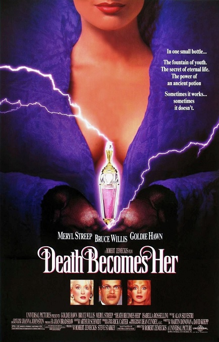
1992 – Death Becomes Her (WINNER)

Death Becomes Her – 1992 (WINNER)

This was a fun movie with some fun visual effects.  They made use of new techniques that gave audiences things they had never seen before.  Once again, ILM made some impressive leaps forward in CGI effects that lent a greater realism to impossible images on the big screen.  This movie and its special effects were a pleasure to watch.

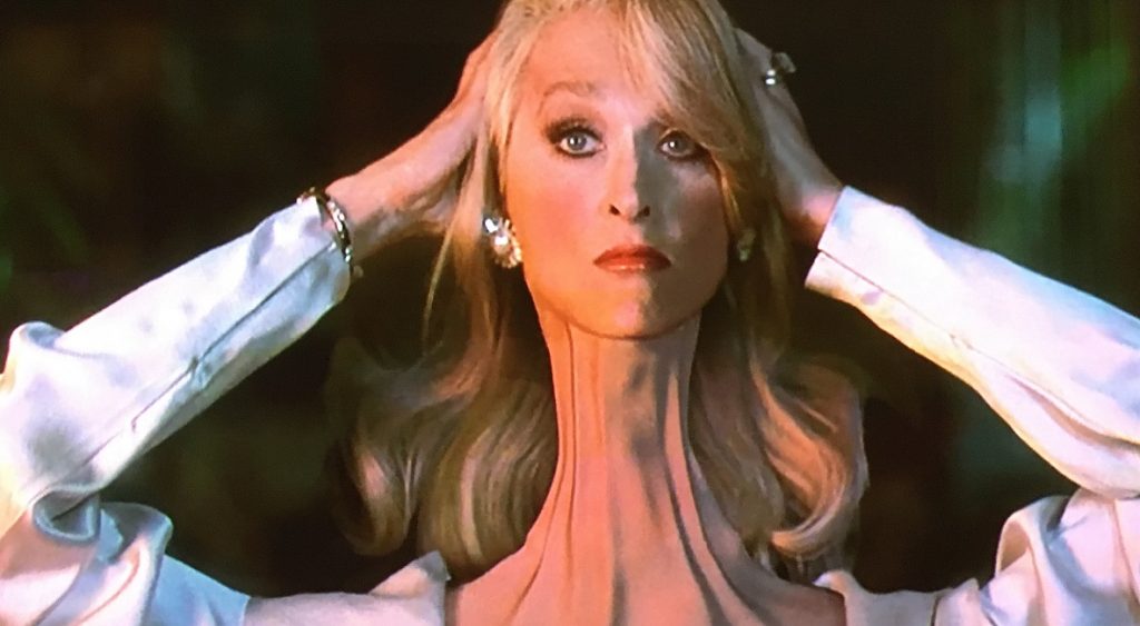
According to the ILM website, “ILM’s work in Death Becomes Her predates many of the digital advancements and breakthroughs of Jurassic Park, which came out only a year later.  Experimenting in the development of commercial and proprietary software, the film marked the first time human skin texture had been computer generated.”  It was really very cool and looked very realistic.

Most of the movie was pretty simple without many significant special effects.  In fact, the only real noticeable effect right at the beginning of the film was a single shot that panned down from the sky, passing a background of big city skyscrapers, until it came to rest on a Broadway-like theatre.  The city-scape looked remarkably fake, and I don’t know if that was intentional.

Then it was pure drama until the second half of the film.  When Madeline goes to visit Lisa and drinks the magic potion, the effects began to ramp up.  The potion itself was actually kind of cool.  It was a glowing pink liquid that looked like it had a string of electricity floating in it.  After Madeline drinks it, the CGI morphing transformation of her face and body from old to young was perfectly executed. 

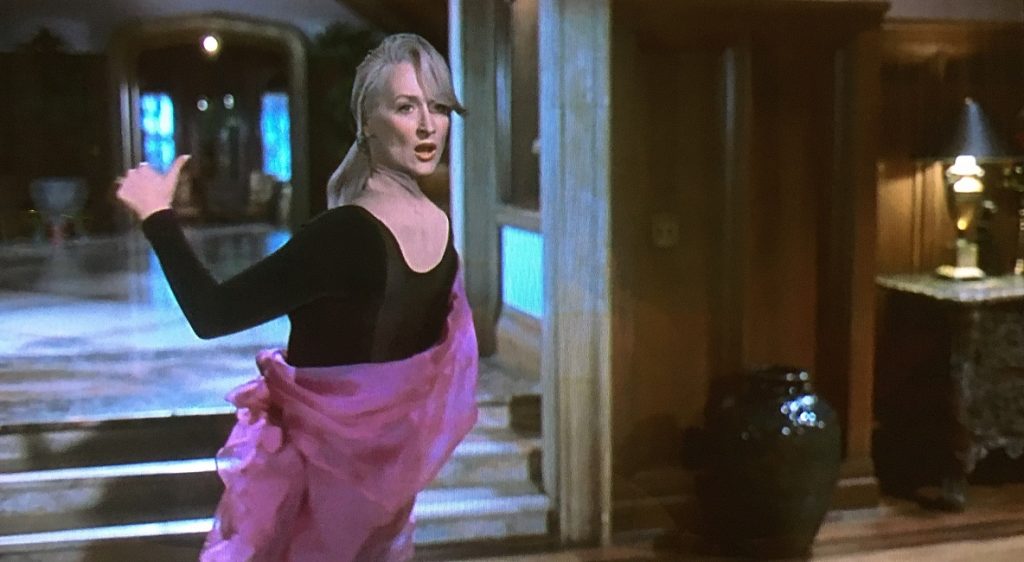
But then she is pushed down a grand staircase, breaking her neck and leaving her in a twisted pile of distorted limbs.  Then she hilariously stands and tries to walk with her head facing the wrong way on her shoulders.  It was done using a combination of three different shots composited together.  One was Meryl Streep with a blue-screen mask on her head as she walked backwards through the scene, the second was a clean shot of the room itself, and the third was Meryl in a blue-screen body suit so that only her head was showing.  I also saw some behind-the-scenes footage in which an animatronic Meryl was used.

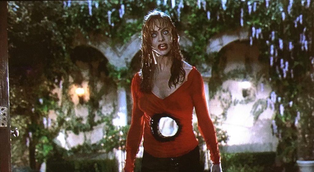
Later, she shoots her nemesis, Helen, through the stomach with a shotgun, a death from which she also recovers, though there is a gaping hole going right through her torso.  The two fight, mangling each other in unbelievable ways.  The effects, though macabre and gruesome, were fantastic.  Madeline’s head gets smashed and stretched at incredible angles while Helen has a shovel handle thrown through the hole in her stomach.  It was funny, and yet disturbing at the same time.

I read somewhere that the filmmakers were somewhat surprised at their Oscar win, saying that the movie wasn’t an effects driven movie.  It was a comedy that happened to have effects in it.  But I beg to differ.  When I think of the movie, it is the visual effects that really stand out in my mind because they were so good!
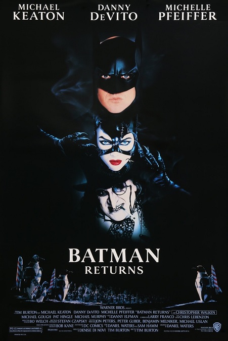
1992 – Batman Returns

Batman Returns – 1992

This movie was a very dark movie, not simply in its story content, but in its overall visual aesthetic.  I’m hard pressed to remember more than one scene that took place in the daytime.  Everything was in dim shades of white, black, gray, and blue, but mostly black.  There was a single scene in golds and yellows, but that was brief.  There were very few other colors used.  As such, the visual effects took place in images that were so physically dark, they were sometimes difficult to see.

A lot of this movie’s special effects overlapped with the production design.  Back then, Tim Burton had a very specific look to his films, like Edward Scissorhands and The Nightmare Before Christmas.  Nowhere was this more evident than in the sweeping shots where the camera panned through an abandoned World’s Fair park at night while a gentle snow is falling.  The crumbling and decaying structures resembled the skeletons of animals.  As far as I could tell, the park, and a lot of Gotham, for that matter, was a miniature model.  The climactic scene where the park was blown up by hundreds of rockets was cool.

Many of the special effects in the film were of the stunt variety.  As you might expect in a super-hero movie, there were fights, explosions, cool cars, penguins, and more explosions.  Penguins, you might ask?  Why yes, there were three main kinds of penguins used, four if you count Danny DeVito.  There were live birds, animatronic ones, and then there were small people dressed in mostly convincing emperor penguin costumes.  They all looked good when they were standing still, but when they moved, it was pretty obvious which of the three varieties they were.

Then there were the bats, all of which were animation, but not bad for all that.  There was a sequence in which Batman extends a magically appearing hang-glider apparatus from within his cape, and dives off the top of one of those high Gotham skyscrapers, the implication being that his cape could transform into the hang-glider.  It was big and bulky, and would have severely hampered his movement during hand to hand combat, but never-mind that.  A flock of bats are harassing the onlookers as Batman flies among them.  However, as I was pausing the scene, looking for screen captures, I happened to pause the movie right as the Caped Crusader was flying past the camera.  For that split-second shot, the animators cut his feet off at the ankles, though you’d never know it without using a pause button.

But the one effect that caught my attention was the part where the Batmobile went into armored mode.  This was the first example I have seen in a Best Visual Effects nominated film that used the magical, physically impossible CGI telescopic armor that has since become a standard visual effect, especially in super-hero movies like Iron Man.  They explain the unbelievable effect away as nano-technology, like in a few Star Trek episodes, where the armor plating seems to spring into existence from nothing.  It is an effect which has always bugged me, but I guess it looks cool enough, and ultimately, it is a fantasy movie, so why not?

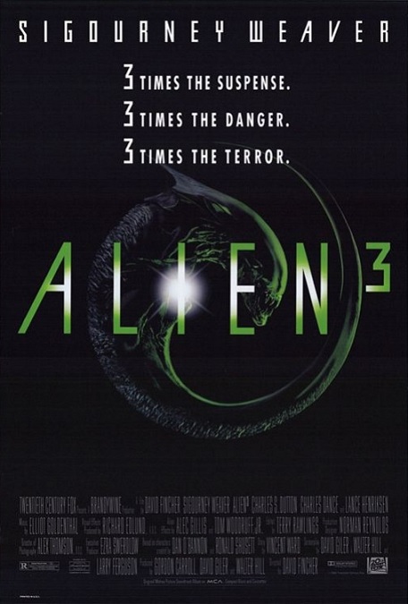
1992 – Alien 3

Alien 3 – 1992

Woah!  I expected more from a Best Visual Effects nominee.  Some of the effects were terrible!  Just terrible!  And I had fairly high expectations for a couple of reasons.  First, the movie was part of the spectacular Aliens franchise.  Alien 1 was created and directed by Ridley Scott.  Alien 2 was directed by James Cameron.  But Alien 3 had a director I had never heard of before named David Fincher.

Now, just because I had never heard of him, it doesn’t mean he isn’t a good director with an impressive body of work.  He has since directed movies like Seven, Fight Club, and The Curious Case of Benjamin Button, all of which were very good movies with great visual effects.  But Alien 3 was his directorial debut, and honestly, I found it lacking in several ways.  I won’t even go into the story content or character development issues I had.  The poor visual effects alone were enough to throw the movie off.

Nowhere is this more evident than right from the very beginning, in the opening sequence.  As the craft containing Lt. Ripley in a stasis pod crashes into the water of a desolate planet, we see the ship falling like a burning comet.  The camera cuts to a closer shot, and the pod looked as fake as a piece of cardboard crashing into the ocean.  The lighting on the pod was terrible, not matching the environment into which it was descending.  And that was just within the first two minutes.

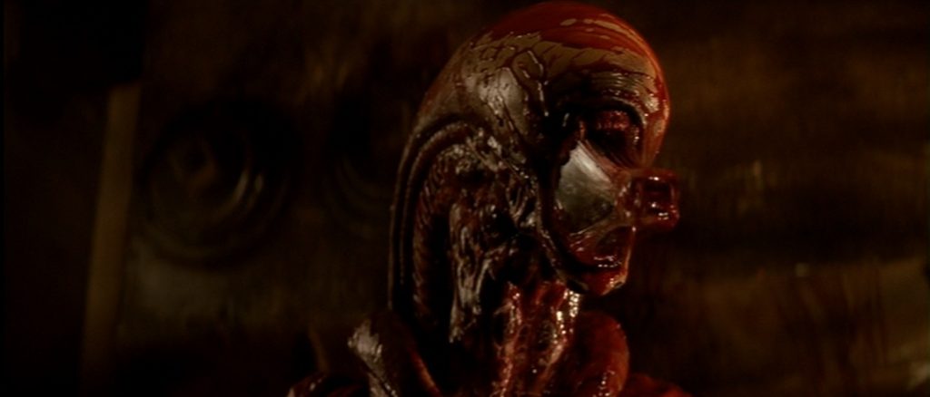
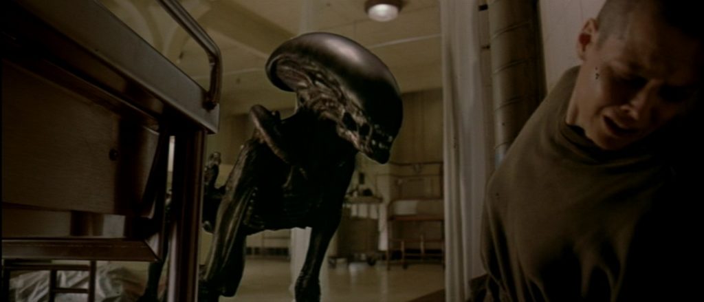
But it was the alien we all came to see, right?  Now, I’ll concede that it was cool how the creature which used a dog as its host had come out with more canine-like qualities, so I understand the different look of the monster.  And I understand that CGI was a technique that was still fairly new, only a few years old in its common and widespread use.  But come on!  The scene in which it attacks the infirmary was so poorly executed!  Let me explain.
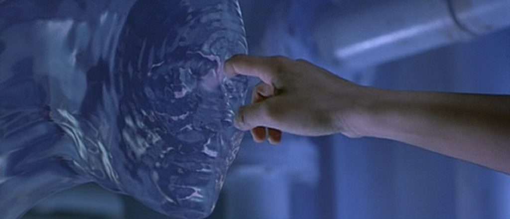
As the creature approached, we could see its shape through a plastic curtain.  It grabbed the doctor and killed him, but they were tangled in the plastic curtain, so we still couldn’t see it clearly.  Ripley backs up against the wall and it creeps around the bed.  It was clearly a CGI alien that looked like a two-dimensional, hand-drawn cartoon. It didn’t look like it belonged in the image.  Then they switched to a sophisticated puppet when it came close to Ripley, and that looked good.

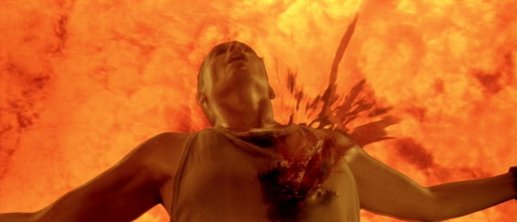
And then there were the two scenes in which bodies were dropped into an incinerator.  We got to see the bodies from above as they fell in slow-motion.  But they didn’t burn, or suddenly vanish as they were obliterated by the fire, or anything realistic like that.  They strangely faded like ghosts.  It looked a bit ridiculous.  But yes, there were a few good fire effects in the film, and a couple of stunts, but they were all overshadowed by the bad CGI and questionable blue-screening.  For the third film in the franchise, I just expected the high quality of the effects in the first two movies to be upheld.  Unfortunately, I was disappointed, and I don’t think I’m the only one.

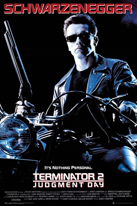
1991 – Terminator 2: Judgement Day (WINNER)

Terminator 2: Judgement Day – 1991 (WINNER)

There was no question that this movie was the right winner.  The CGI effects were really spectacular, giving audiences visuals that they had never seen before.  The morphing liquid metal effects of the T-1000 took the technique used so effectively in The Abyss and took it to a whole new level.  Not only that, but it was a Schwarzenegger action movie, so as you might expect, there were lots of guns, lots of explosions, a car chase or two, and a number of cheesy catch phrases.

The pyrotechnic effects were all really good, as you might expect.  The guns and people getting shot were standard issue, but still done well.  The part where our heroes blow up the Cyberdyne building was pretty cool.  I also liked the car chases, especially the one where the T-1000 takes a semi-truck and crashes it through a guard rail into a massive storm drain.  But though that was a memorable effect, it was the liquid metal T-1000 that we all came to see, and it didn’t disappoint!  We get to see it change and transform in a wide and clever variety of ways.  We see the actor Robert Patrick morph into different people, turn his fingers and arms into sharp blades, and pour through small holes, only to re-form on the opposite side.
There was one time where he disguised himself as the floor.  Once a person walked over him, allowing him to “sample” that person, he rose up, and killed him by extending a metal needle from his finger and through the poor man’s eye.  Also, the sequence where he walked out of the burning wreckage of a truck in semi-liquid form and then morphed into Robert Patrick was awesome!  And when he walked through the bars of a jail cell door was really cool.

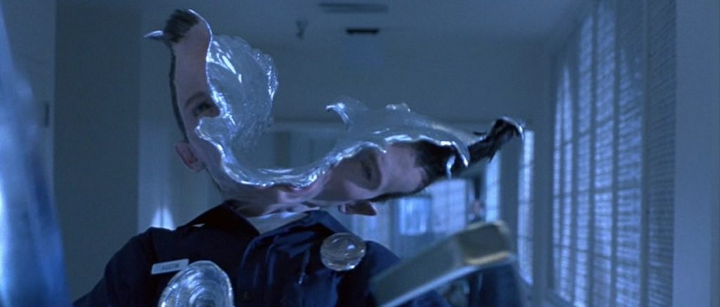
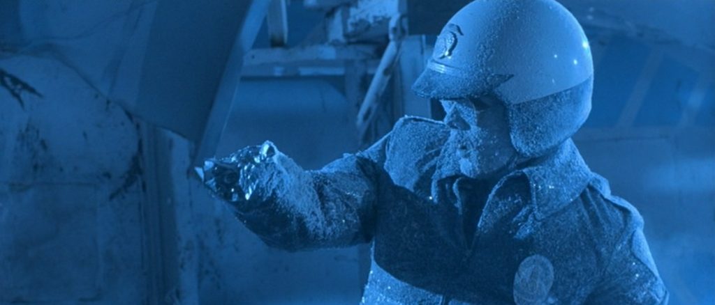
The effect of when he was shot, blown up, bludgeoned, or generally disfigured was awesome.  We could see the parts of him that still resembled a person, as well as the metal that looked like solidified mercury.  It was amazing and perfectly executed!  But there were three awesome effects in the climax that are worth mentioning.  First was when the T-1000 was doused in liquid nitrogen, which super-froze him.  He tried to walk, but froze to the floor.  When he tried to take a step, his leg broke off.  When he stopped moving, Arnold shot him and he shattered into a thousand pieces.  Second was when Linda Hamilton shot him in the head and the camera panned around him so that we saw the actress through the hole she had created.  And the last is when he was shot with an exploding bullet.  His incredibly mangled body fell into a vat of molten steel, and as he was dissolved into oblivion, he rapidly cycled through the screaming forms of all the victims whose forms he had taken.  Very cool villain death!

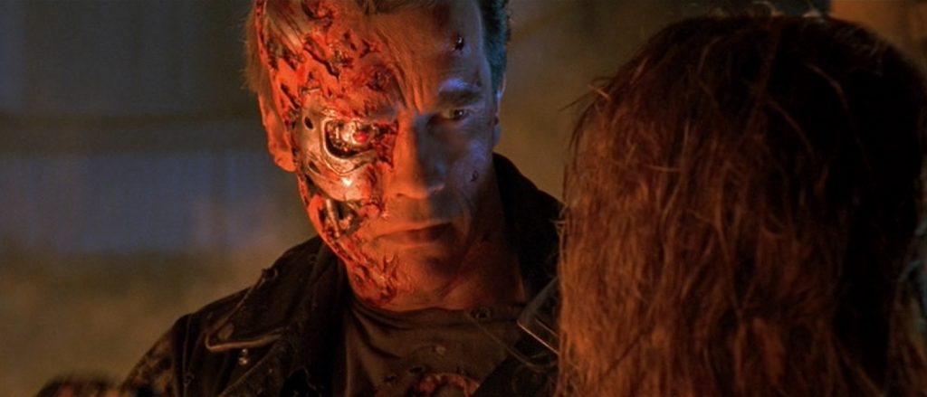
But the effects on Arnold, himself were also very cool, as he is beaten and nearly destroyed by the superior T-1000.  There was only one shot that looked a little fake, and that was when he jumped off the crashing liquid nitrogen truck, but that was only a minor flaw in an otherwise incredible display of CGI visual effects.  I think it really deserved its Oscar win!

1991 – Hook

Hook – 1991

As a movie, it was ok, but as a special effects movie, it was… sadly lacking.  I say this because it had the potential to be really spectacular, but some of the effects seemed to be poorly done.  Still, on the other hand, the effects that were done well, were done very well.  So I guess what I’m saying is that my opinion about the visuals of Hook is divided.

On the one hand as befits a movie about a boy, or in this case, a man who can fly, there was a combination of wire work and blue screening.  That took care of most of the visual effects for Peter Pan, and then there was Tinkerbell.  There was some questionable size compositing, and some fluttering fairy wings.  For that, I thought the effects were done passably well, though certainly not perfect.  On the other hand, there were a lot of fun stunts, great lighting effects, and some wonderful matte-paintings.  In fact, according to the ILM website, “The film is notable for featuring the first-ever dimensional matte painting, where a traditional matte painting was mapped onto 3D geometry, allowing for camera parallax and resulting in a truly spectacular shot of Pan flying towards Neverland.”

So Peter’s flight came in two different varieties.  The closeups were actually pretty good.  They had a competent stunt man on wires, doing flips and rolls.  And they were able to digitally remove the wires from the image perfectly, although it was certainly clear he was on wires.  And they switched between the stunt man and Robin Williams pretty seamlessly.

But the wide-angle shots were where the bad blue screening was really evident.  There were times when the actors looked like they didn’t belong in the same image as the background.  Some of the shots of Peter flying through the Lost Boys’ camp had some really bad lighting that highlighted him, creating a halo around him that didn’t match the light sources in the image.  And a few times a telltale dark outline separated him from the environment.

Tinkerbell’s blue screening was better, for the most part, but even she had some poorly crafted moments.  Also, her size seemed to be a little inconsistent.  In some scenes, she seemed smaller than in others, in comparison to Peter.  But I liked the way they made her wings look, both in wider shots when she was in flight, and when she was in close-up shots, where you could see more detail.  But for the most part she was fine.  The worst shot was during Peter’s flashback when she first comes to him and takes him off to Neverland.  The lighting was all weird and made her image look really fake, like a cardboard cut-out.

A few of the other special effects were geared toward small children, were very silly, and were thus a bit ridiculous.  Like when the character of Thud Butt (Yes, that was actually his name) pulled his laughably fake legs up to his head, somehow turned into a perfect sphere, and rolled around, knocking over pirates like bowling pins.  Well, they can’t all be winners.

1991 – Backdraft

Backdraft – 1991

The effects for this film were very well done.  In fact, they were nearly perfect.  As you might imagine from seeing the movie poster, the screen captures, and the name of the film, the effects in this film were mostly fire based.  The plot revolved around firemen, and the fire effects were unlike any other movie I have ever seen.  They were just incredible.

The actual fires, the miniature models, the compositing, the matte-paintings, and even the really cool use of CGI flames, were all perfectly executed.  But it was the ultimate reality, or in this case un-reality, of the behavior of the flames, that threw things askance.  I understand that this was the fault of the script and not the visual effects, though they cannot be held blameless.  In my research, I found that in real fires of the magnitude shown in this movie, there is always so much smoke and ash in the air that visibility is pretty much non-existent.  But they couldn’t do that if we, the audience, need to hear and see what is being said and done in the midst of the infernos.

Fire isn’t alive, and doesn’t behave like a living entity.  But that being said, the effects themselves were pretty spectacular.  We got to see fire behave in a number of different ways.  We saw it shoot like rockets, flow like water, spin like a tornado, and explode like a bomb.  It crept around corners, hid behind walls, and retreated under doors.  Most of the flames caught on film were real, though not all of them.

There was one sequence in particular in which our good friends as ILM created photorealistic flames that destroyed the roof on which our hero is running.  As the roof crashes in upon itself, great exploding balls of flame begin bursting into the dark sky.  They seem to chase the character of Brian to the edge of the roof.

According to a 1991 article in Entertainment Weekly by Christopher Henrikson, when creating the film’s real flames, the visual effects artists experimented with burning different kinds of flammable substances like alcohol, kerosene, diesel fuel, and propane.  “They wanted a fire that was dirtier and more realistic than the bright gas-jet flames usually seen in films. To harness their volatile fuels, the crew built steel tanks that sprayed the liquids through a nozzle before igniting them four or five feet from the machine, much the way a flamethrower works. The largest of these tanks was called ‘Big Bertha’ for its 100-gallon capacity and its awesome ability to discharge a 60-foot-by-20-foot wall of fire.”

The article goes on to say that about ninety-five percent of the flames in the movie were real, filmed on location.  So the actors had to endure some pretty difficult and dangerous conditions.  But I also learned that there were very few injuries over the course of the four-and-a-half-month shoot, besides a couple of minor burns and singed eyebrows.  Still, it all added up to some pretty impressive visuals that really deserved their Oscar nomination.  Now, if they just could have done something about William Baldwin’s bad acting…

1990 – Total Recall (WINNER)

Total Recall – 1990 (WINNER)

It has been a very long time since I have seen this movie.  Watching it again now, I was unsure of how its effects would hold up.  But I was pleasantly surprised… for the most part.  The effects were good.  Not perfect, but good.  It was a perfect example of a Schwarzenegger action film, and in that regard, it didn’t disappoint.  It was incredibly violent, and by the time the movie was over, the body count was incredibly high, but it had an intellectual edge to it that can’t be ignored.

The story took place in the future, 2084 to be exact, and offered a fairly realistic and believable picture of the futuristic setting.  Technology was portrayed as advanced, but not ridiculously so.  There were self-driving cars, portable personal hologram devices, colonies on Mars, and vacations to Saturn.  The driving concept of the plot is the concept of purchasing memories, so that you could remember a perfect vacation without having to actually take it.

That being said, the visual effects were mostly good.  Unfortunately, there were certain effects that were horrible, bordering on comical, and I don’t think they were supposed to be.  For me, the worst special effects were the ones that took place on Mars.  Whenever someone was exposed to the super-thin Martian atmosphere, their faces would distort, their tongue would bloat, their eyes would expand and bulge out of their skulls, and they would turn in to gross versions of cartoon characters that didn’t look remotely realistic.  In the film’s climax, when Arnold and his woman suffer this fate, they are saved at the last minute.  Their faces return to normal before they die, but after such extreme trauma to the eyes, mouth, nose, and ears, there isn’t a hint of blood or damaged flesh. 

As is becoming increasingly true, the special effects are very specifically interwoven with the production design and the makeup effects.  But my little bit of research has revealed to me that this movie was one of the last major big budget films to use extensive scale models.  There were only a few brief shots in the film that showed the bleak Martian landscape.  But it was all a real model that was filmed, and then composited with live actors.

But the mysterious mutant, Kuato, was a baby-like person living from another man’s stomach, like some kind of parasite.  He was created using complex puppetry, cables, electronic animatronics, and the like, and was actually very well done, if not pleasant to look at.  I liked how they showed how the host body continued to breathe while the mutant creature was moving ad speaking.

Add to all that a simple trick of a sideways camera to make it look like people were floating horizontally without the use of wires, as they got sucked out of a giant passage to the Martian surface, and you had a pretty cool, action packed climax to a fun film.  Also, I liked the fat lady’s head that split apart in sections, revealing that she was Arnold wearing a mask the whole time.  That was pretty cool!

1989 – Back to the Future II

Back to the Future II – 1989

I’m not exactly sure what to say about this movie.  Focusing on the special effects, I have to say, I was surprised by the low quality of some of them, while others were very good.  They did something I have only seen in two other films, though I’m sure it has been done in many films I haven’t seen, which was to use time travel so that a person could interact with events we have already seen, thus showing us the same scene, but from a completely different perspective.

But let’s cover the disappointing effects first.  The most obvious one was in a scene in which Old Biff steals the Delorean and crashes it into a garbage dumpster.  Most of the flying car shots throughout the film looked great, but a few of them, like this one, just didn’t.  The motion of the car was jerky and stiff, as if it was a two-dimensional cardboard cut-out that bumped into the trash.  Granted, I haven’t seen many flying cars lately, but it didn’t seem to move realistically during the impact. 

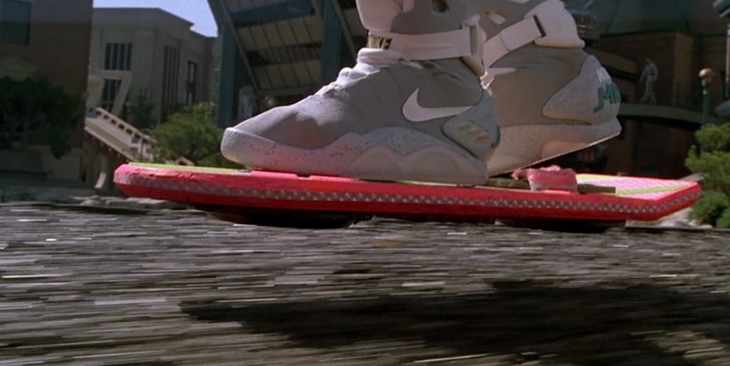
Next was the hoverboards.  For the most part, the effects were passable, but there were several shots, like the one in which three punks in 2015 throw their boards down towards the camera.  In that one shot, the boards themselves look like they don’t belong in the shot.  The shadows they cast look like they are shaking in a strange animated way.  Again, they looked like two-dimensional cut-outs.

But then there were some really good effects, having to do with split-screens and actors having to play opposite themselves.  There was one scene in which Michael J. Fox plays himself, his son, and his daughter, all on the screen at the same time, all interacting with each other.  That was pretty impressive.  But what was even more impressive than that was when they had to recreate scenes from the first Back to the Future film, costumes, sets, props, actors and all.  In the 1950s setting, the current Marty weaves his way in and out of the high-school dance sequence.  They used actual shots from the previous film and new shots filmed for this one, but shown from different angles and perspectives, to create a new story line that took place behind the one we’d seen before.  That whole sequence was done incredibly well.

During the hoverboard scenes, ILM used computer animation techniques to seamlessly remove all the wires that were holding up the floating stunt men.  And there were plenty of other great effects like animated lightning, some pretty cool stunts, and a pretty cheesy hologram effect from the 2015 sequence, in which a hologram shark from a Jaws 19 advertisement harmlessly chomps down on Marty.

So I’d say the visual effects from this film were about fifty-fifty.  Some were great, and some were questionable.  But unfortunately, the one illusion in the film that really didn’t work for me was not even technically a visual effect, except that it kind of was.  It was the makeup.  Some of the makeup effects, making characters look old, looked way too much like makeup.  But ok, the actors seemed to be playing caricatures of themselves, so it almost worked.  Well, better luck next time.

1989 – The Adventures of Baron Munchausen

The Adventures of Baron Munchausen – 1989

Stop!  Stop that!  It’s SILLY!  It’s very silly indeed!  Yes, this Terry Gilliam film was incredibly silly, but what do you expect from the Monty Python alum?  But despite its ridiculous nature, the visual effects, as is also typical of Gilliam’s work, were creative, incredibly detailed, and ultimately stunning.

This movie was packed full of special effects, from the terribly destructive siege of a city in the Napoleonic age to representations of Roman gods and goddesses, from a giant sea monster to the horrifying specter of death, itself.  The plot, and thus its special effects came in two phases.  There was the town that was being sacked by the Turks, in which we see constant explosions, smoke, fire, crumbling buildings, and dying people.  And then there was the fantasy element, as Baron Munchausen recants the seemingly tall tales of his adventures.

When it came to the scenes of war and destruction, there was a realism about the effects that was rather impressive.  There was a grittiness, a griminess, and yet an unfabricated quality about those scenes that created a wonderful illusion.  I understand that this might be one of those cases where production design overlaps with the special effects, but the filmmakers made those sequences very effectively.

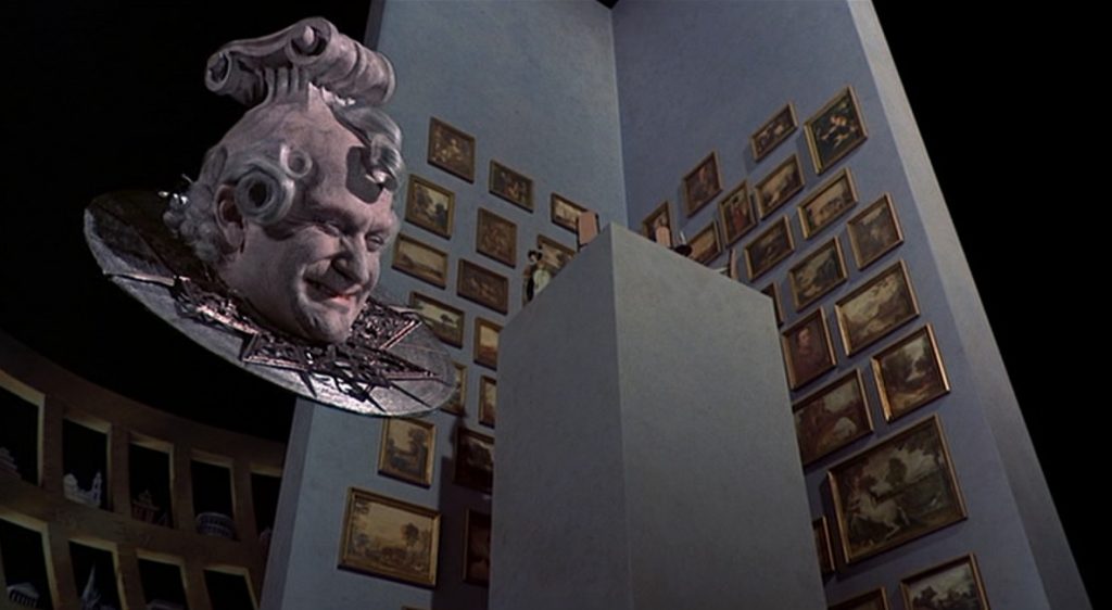
But it was the fantasy sequences that were flashier, more memorable.  First the Baron and Sally fly a hot air balloon to the moon where a King and Queen are able to detach their heads and telepathically alter reality.  Upon their escape, they visit Vulcan, the Roman god of the forge, and his wife Venus, goddess of love and beauty.  This was my favorite sequence of the film because of the amazing visuals.  Great costumes, great makeup, and great sets, and both Oliver Reed and Uma Thurman gave fantastic performances.

But it was the flying dance between Venus and the Baron that offered the most magical imagery.  Apparently, during the close-up shots, the floating dancers were the actual actors.  But in the wide angled shots, they were animated mannequins held up by wires, and because they were constantly floating around the room and there are several magnificent water fountains and waterfalls to distract the eye, you only notice the differences if you make an effort to see them.  The beautiful imagery of the dancers floating among the clouds with winged cherubs fluttering about them, holding a long pink ribbon between them was exquisite.  It was as if a romantic Renaissance painting had come to life.

Next there were the Baron’s servants and friends, each of whom had supernatural powers.  One had super speed, another super sight, another super strength, and another super hearing and super strong breathing.  The varied depictions of these powers were very well created and fun to watch.  Top it all off with the moving specter of death constantly trying to take the Baron, and you have a cavalcade of fantasy effects that were beautifully made, despite the silliness of the over-plot, all of which masked the extremely introspective and serious nature of the under-plot.

1989 – The Abyss (WINNER)

The Abyss – 1989 (WINNER)

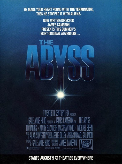
My opinion of this movie is a bit biased because it is one of my top five favorite science fiction films of all time.  I’ll do my best to look at its special effects with an objective eye and not simply gush about how incredible the effects were, not to mention the movie itself.

Most of the movie takes place far below the surface of the ocean.  There were many scenes that had to be filmed underwater.  There were divers in and out of wet-suits, deep-sea vehicles, and submersible drones.  But were these really special effects, or were they just amazing set pieces and expensive props?  But aside from those things, director James Cameron also used some truly groundbreaking CGI effects that showed audiences things they had never seen before.

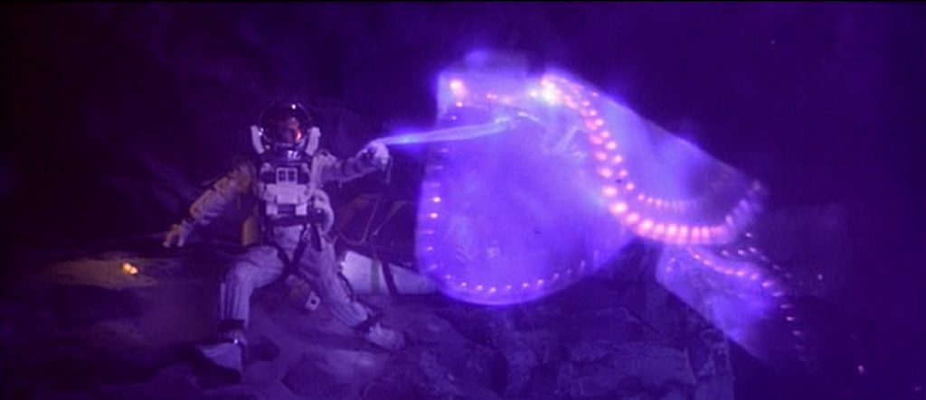
To be sure, the underwater stunts and dive filming were impressive, but I think it was the stunning CGI effects that won the film its Best Visual Effects Award, the most memorable of which was the scene in which the underwater aliens create a massive water tentacle in order to explore the underwater drilling rig.  They also used it to establish communication with the people trying to survive inside of it.  The tentacle was a flowing column of water that moved like a snake through the corridors of the rig.  Then when it encountered the people, it shaped itself into the likenesses of the actors’ faces.  Movie CGI effects were still pretty new, but I think the solid liquid effects still hold water (sorry) even by today’s standards.

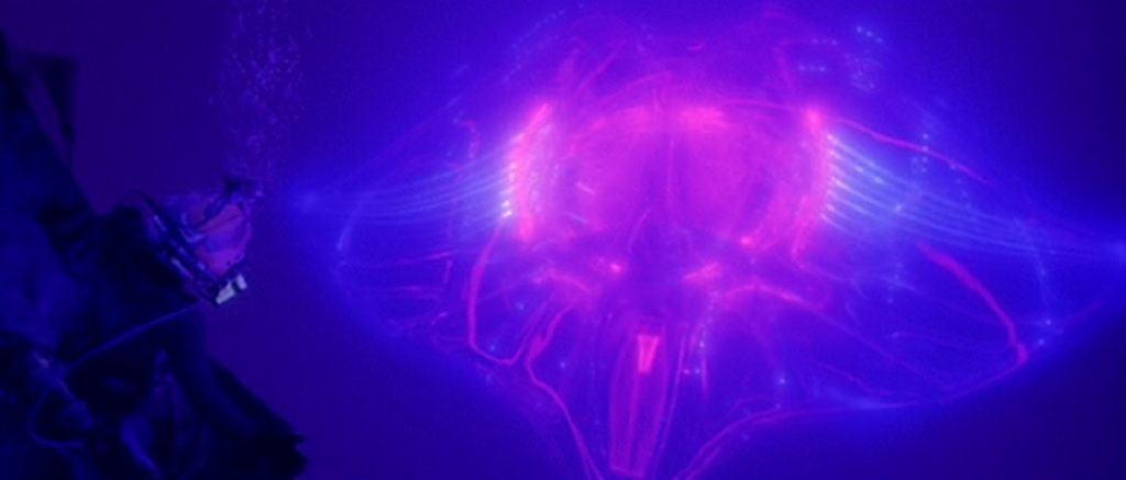
And then there were the aliens themselves.  Their magically luminescent appearances were the perfect combination of beautiful and mysterious, evoking the feel and strangeness of real creatures of the deep that we know actually exist.  But they also made them alien enough to allow us to believe that they were not of this world.  They had technology that glowed in shades of pink, purple, and blue, much like the world created for Cameron’s 2009 blockbuster, Avatar.

This beautiful effect is spectacularly displayed in one of my favorite scenes in the film.  The first time the aliens approach Lindsey, played by Mary Elizabeth Mastrantonio, their ethereal and yet clearly technological designs are amazingly displayed.  When she reaches up and touches one of them, it glitters and sparkles like something magical.  It was just beautifully filmed.

But I would be remiss if I didn’t mention the underwater vehicle battle.  In one of the great action sequences in the film, a man who was suffering extreme paranoia from high-pressure nervous syndrome.  He has stolen the large flatbed craft, but Lindsey has taken control of a smaller submersible.  The two crash into each other and smash each other into rock walls, until they are both too damaged to continue fighting.  When the flatbed falls into the abysmal trench, it only takes a few seconds for the immense pressure to crack the glass of the craft’s front window.  The vessel then violently implodes, instantly killing the insane occupant.  All these things make it easy to see why this movie won the Oscar for this category.