1988 – Willow

Willow – 1988

It has been a long time since I have seen this movie, and I had forgotten just how good it actually was.  Part of that was its truly groundbreaking special effects.  The man behind them was named Dennis Muren, and he has been quoted as saying that Willow was “’a transition’ film: one which led the way into new special effects territory.”  And after watching the film, focusing on the visual effects, I completely understand that he knew what he was talking about.  And well he should.  He is a visual effects legend.  He has won eight Academy Awards and has worked on such visually stunning films as the Star Wars trilogy, Jurassic Park, Mission Impossible, Terminator, Close Encounters of the Third Kind, and Indiana Jones.

The reason it was a transition film was that it used practical effects, hand drawn animation, stop-motion animation, and incredible groundbreaking CGI effects.  Muren took on the task of pioneering digital morphing effects, changing a goat into an ostrich, into a turtle, into a tiger, into a human woman.  And honestly, I think the effect still holds water, even by today’s standards.  It was probably one of the most memorable effects sequences in the film, and that’s saying a lot.

Another memorable scene is the one in which the fairy sorceress, Cherlindrea charges Willow with protecting the baby, Elora Danan.  The ethereal fairies were beautifully depicted, as if they had come right off the pages of an English story book.  They were tiny floating balls of light which, when they appeared in closeup shots, were glowing women with tiny gossamer wings and long flowing hair.

According to my research, the Brownies, who were also the film’s comic relief, were very difficult to film.  Clearly, they had to do a lot of blue-screen filming.  But again, they seem to have mastered the technique, because I specifically watched for the tell-tale dark outlines around them, and there were none.

The stop-motion animation came in the form of a two-headed monster that breathed fire.  At one point, the hero, Madmartigan, jumped on one of the heads and was thrashed about before plunging his sword through the top of its head.  The next time it tried to spit fire, the head exploded.  It apparently used go-motion techniques that had been perfected on the movie Dragonslayer, which was also nominated for Best Visual Effects.

And finally, there was the climactic scene and Queen Bavmorda’s death.  She spills ritualistic bowls of blood and the blood turns into a red swirling mist that surrounds her.  Lightning is flashing all around her, and you can see her skull shining through the skin of her face.  She, herself, is turned into mist and is sucked up through the hole in the ceiling.  It was a pretty magnificent way for the evil sorceress to die!

The whole film was a special effects extravaganza, and they were all done very well.  It lost the Oscar to Who Framed Roger Rabbit, but I don’t know.  I think maybe this movie should have won.

1988 – Who Framed Roger Rabbit (WINNER)

Who Framed Roger Rabbit – 1988 (WINNER)

This was a really fun and really enjoyable movie.  Its main draw was its combination of cartoon and live action, which was certainly not a new concept.  But it was an integral part of the plot, and as such, it was done to such an extent as had never been done before.  And it was all in the details.  When Jessica Rabbit pushes back the collar of Eddie’s coat, it moves in a realistic manner.  When she takes off his hat and shoves it in his face, it is as if a live person is doing it.

According to Wikipedia, “Many of the live-action props held by cartoon characters were shot on set with either robotic arms holding the props or the props were manipulated by strings.  The animators and layout artists were given black-and-white printouts of the live-action scenes known as “photo stats”, and they placed their animation paper on top of them.  The artists then drew the animated characters in relationship to the live-action footage.  After rough animation was complete, it was run through the normal process of traditional animation until the cels were shot on the rostrum camera with no background.  The animated footage was then sent to ILM for compositing, where technicians animated three lighting layers (shadows, highlights, and tone mattes) separately, to make the cartoon characters look three-dimensional and give the illusion of the characters being affected by the lighting on set.  Finally, the lighting effects were optically composited on to the cartoon characters, who were, in turn, composited into the live-action footage.”

So it is a long and complicated process.  There were very few scenes in the film in which there were not animated characters.  The post production for the film lasted for fourteen months.  One of the most spectacular parts of the movie was the nightclub scene in which Jessica Rabbit sings a sultry, sexy song.  It wasn’t just the character, but the stunning animation used on her dress.  It sparkled with her every movement.  It stood up to wide shots and closeups alike.  The shots in which the camera is focused on her legs as she walked were amazing.  The bright stage lights behind her showed through the animated fabric in such a way as to make it look incredibly real, and yet animated at the same time.  It was some really impressive animation!

There were also plenty of stunts, sight gags, pratfalls, and the like.  After all, the movie was a comedy, and a little physical humor is never a bad thing.  Nowhere was this more evident than in the scene in which Eddie has to make the weasels die laughing, and he has a warehouse full of cartoon ACME products at his disposal.  He juggles animated bowling balls, ultimately dropping all three of them on his head.  There are trips, slips, and falls, putting Hoskins and his stuntmen to work.

All in all, the interaction between the Toons and the live actors had been ratcheted up to a level that had never before been done, and the result was fun, funny, and captivating.  I think this one really deserved its Oscar win.

1988 – Die Hard

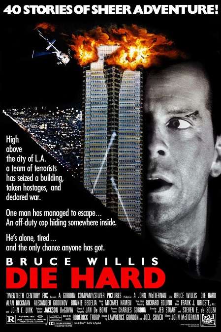
Die Hard – 1988

Wow.  The phrase of the day is blowing stuff up!  That seemed to be this movie’s main draw.  It was pumped full of testosterone and machismo.  There were lots of guns, lots of explosions, lots of people getting shot, lots of stunts, and lots of bad guys getting killed off.  But what was it about all the fire and carnage that made Die Hard stand out as having superior special effects?

Well, there was more than just explosions.  There was some pretty convincing compositing.  I’ve noticed that in films from recent years, filmmakers have finally been able to get rid of the dark outlines around blue-screened items and actors.  And many of the shots that showed the exterior of the high-rise were composite shots with a miniature model that could safely be blown up, though director John McTiernan has said that a vast majority of the exterior shots of the building showing explosions were real, full scale explosions set off in and around the actual building.

One of the most memorable visual effects shots of the film was when the leader of the bad guys, played by Alan Rickman, fell to his death.  First, it was shown in slow motion, giving the audience plenty of time to scrutinize the shot.  Second, it was shown from two different angles, each of which was impressive in its own right.  The first from the hero’s perspective, looking at Rickman in the face as he falls away from the camera.  After that was the wide shot in which we see someone who was clearly not a dummy falling the full length of the high-rise.  A brave stuntman, using a hidden decelerator wire rig, fell into one of those giant air-bags. 

Then there was the helicopter crash.  When the bombs on the roof of the building detonated, the helicopter caught fire, exploded, crashed into the building, exploded some more, and then broke apart.  It was pretty impressive!  That was right after John McClane tied a fire hose around his waist and jumped off the roof.  Then he used his gun to shoot out a window and swing inside to safety. 

I think the most memorable explosion was the one in which McClane tapes a huge amount of C4 to an office chair, and pushes it down an open elevator shaft.  The resulting explosion was enough to shake the foundations of the building and send a rush of fire back up the shaft.  McClane narrowly avoids being burned as flames shoot out of the open elevator door.  Incidentally, I also learned that the thirty-story elevator shaft was actually only about twelve feet deep, but they used forced perspective, shaping the shaft like an inverted cone to make it appear full sized.

But that was mostly it, stunts, explosions, and some skillful compositing shots.  If you enjoy action movies that have lots of things getting blown up and destroyed, impossible stunts, and a hero that doesn’t know the meaning of the word pain, then this is the movie for you.  That’s generally not my kind of film, but I was fully entertained anyway. 

1987 – Predator

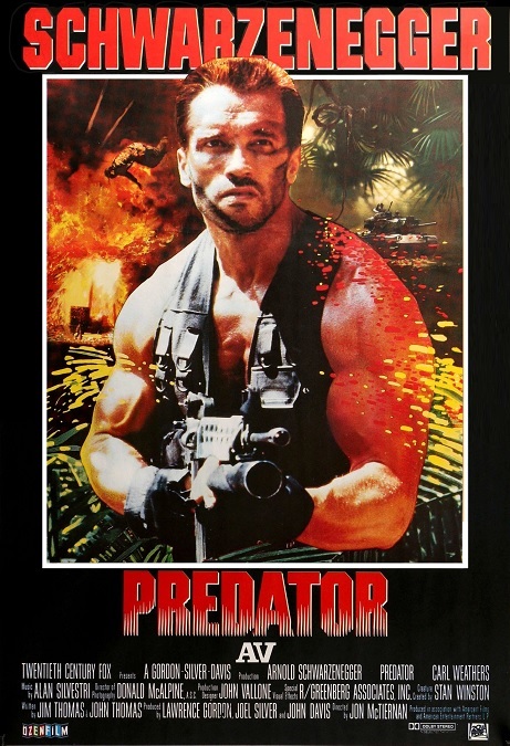
Predator – 1987

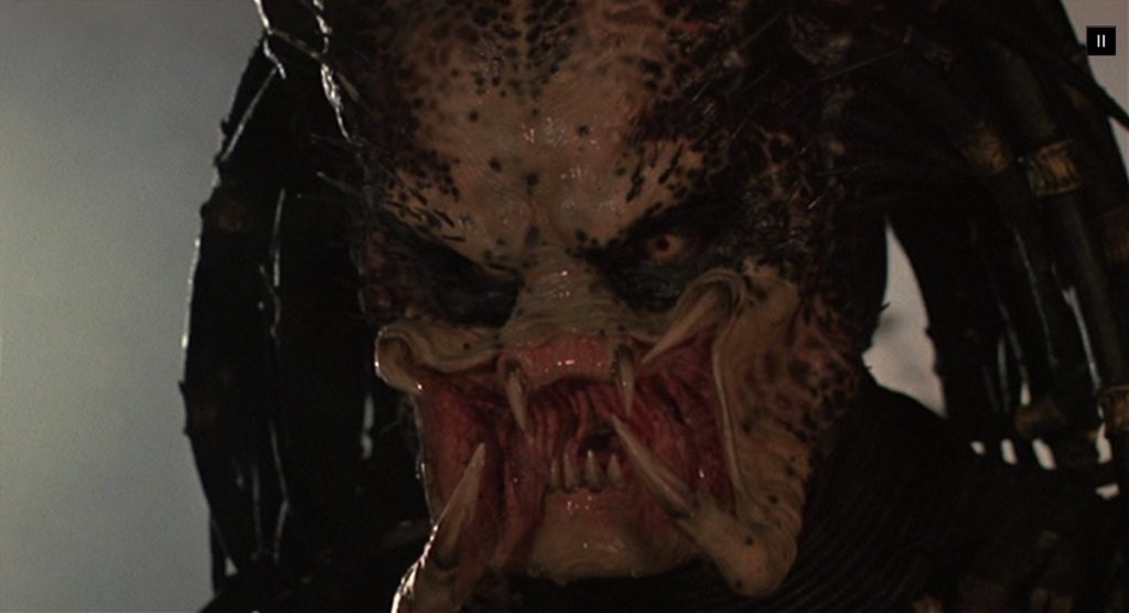
The special effects for this sci-fi super-action film were actually pretty good.  They certainly gave us things that we had never seen before.  And the alien creature effects were definitely creative and perfectly executed.  There were a group of commandoes who carried massive amounts of guns and other firearms which they used to obliterate both men and jungle vegetation, though none of the weapons were able to fatally wound… the Predator!  And no, Arnold’s biceps cannot be counted as a special effect.

Still, the alien’s stealth and tracking technology were very unique, and its destructive weaponry, its gun and its claw-like arm blades, were pretty cool.  Then there were its actual claws and its fantastically designed expandable face mandibles for Schwarzenegger to contend with.  All that and its strange cat-like movements combined to make an awesome alien.  It was one frightening piece of work!

So for the first act of the movie, it was a plain shoot-em-up, in which our heroes are supposed to go into the jungle and rescue a cabinet minister and his aide from a bunch of South American guerillas.  That was your standard text book operation with nameless men getting blown away by giant guns and grenade launchers.  There were plenty of things that got blown up, both men and machines.

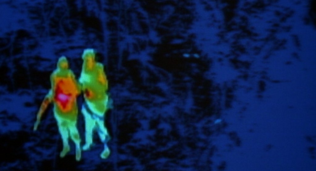
But as they find that they had been lied to about the rescue, they try to make their escape from the jungle.  In the second act of the movie, they find that they are all being hunted by a powerful enemy that begins picking them off one by one.  It was very cool when we got to see and hear things through the Predator’s alien senses.  He sees the world through heat-sensitive eyes, and hears sounds as high-pitched.

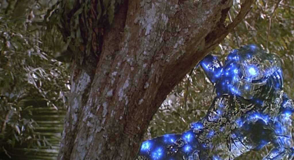
But I think it was his light-bending stealth technology that was the most memorable effect.  You could see the outline of the creature, but if it stood still, it was very difficult to spot.  How do you make something invisible, and yet visible at the same time?  Well, the effects artists at R/Greenberg Associates figured it out.  Wikipedia explained the effect perfectly, saying “The invisibility effect was achieved by having someone wearing a bright red suit (because it was the farthest opposite of the green of the jungle and the blue of the sky) the size of the Predator. The red was removed with chroma key techniques, leaving an empty area. The take was then repeated without the actors using a 30% wider lens on the camera. When the two takes were combined optically, the jungle from the second take filled in the empty area. Because the second take was filmed with a wider lens, a vague outline of the alien could be seen with the background scenery bending around its shape.”

I also have to make mention of a really cool quick shot in which Carl Weathers gets his arm shot off by the predator’s gun.  Very cool, and very violent and bloody!  The way his severed arm kept squeezing the trigger even after it hit the ground was awesome!  Yeah, who doesn’t like a little blood and gore every now and then in their action flicks?

1987 – Innerspace (WINNER)

Innerspace – 1987 (WINNER)

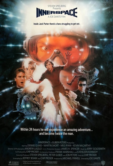
This was a movie to which I’d been looking forward, having never seen it before.  As the opening credits began to roll, I was surprised to find Stephen Spielberg’s name attached to the film as an executive producer.  The effects were plentiful, and all of them were done quite well.  Of course, I think that most people remember the film for Martin Short’s wonderfully comic performance, not the excellent visual effects.

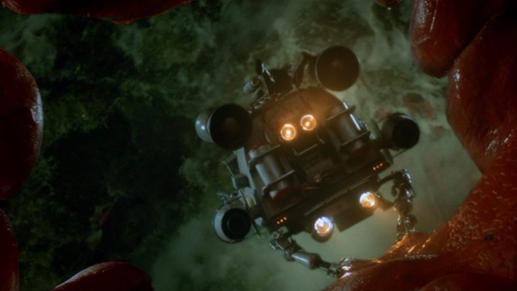
This movie was a modern take on the 1966 film, Fantastic Voyage.  However, as that movie was a serious Sci-fi film, this one was written as a zany comedy.  Still, that being said, many of their visuals were much more realistic in their execution than their predecessor.  For example, in Fantastic Voyage, the interior of the human body was generally well-lit, and everything was illuminated to be brightly colored, as if the interior of the body is rainbow hued.  In this film, the interior of the body was appropriately dark, and the internal organs were more flesh-toned.  We also got to see more of the incredible environments than in Fantastic Voyage.

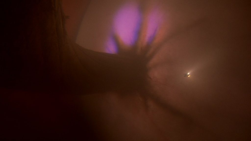
In Innerspace, we are treated to a little journey through the human body that included things like the ocular nerve behind the eye, the inner ear, the esophagus, the exterior of the heart, a collection of fat cells, the stomach, which sported a terrible ulcer, and a pregnant woman’s womb, which displayed a realistic looking fetus.  I thought the scene behind the eye was particularly interesting, as you could see the glow of light coming in through the orb of the eyeball.  It was very cleverly displayed, and even intellectually fascinating.

But there was so much more than just the inside of the human body.  There were stunts, and funny hijinks as people are shrunk to half-size.  The most memorable stunt was when Martin Short is hanging onto an open door that is swinging from the back of a speeding freezer truck.  He ends up standing on the windshield frame of a convertible, and then falling into the passenger’s seat.  That was pretty cool.  And the half-sized villains were very funny, too.  In both cases, the effects were hilariously executed, though when the miniaturized man attacks Short as he is driving, it was pretty obvious when the small man was replaced with a puppet.

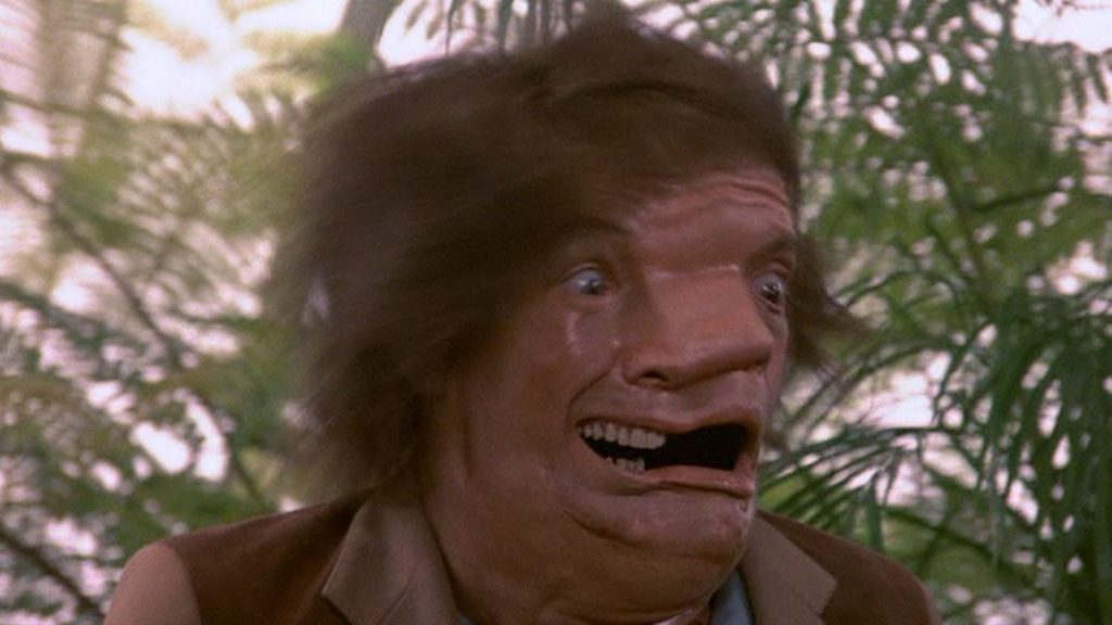
Probably one of the zaniest gags in the film is when Short’s face is transformed into Robert Picardo’s face.  It is important to note that this was before the modern era of CGI, and the crazy morph was shown as a fast blur while the character’s head thrashed back and forth.  It was very funny, but suspension of disbelief must be employed.  Just to watch the comedian’s antics and facial acrobatics was worth the price of admission!

But even as I look back on the film’s visual effects, I am hard pressed to find any real flaws, which tells me that the film deserved its Oscar win.  And as for the story, well, it was supposed to be silly, so in that, it succeeded.  To their credit, the special effects went a long way to furthering that comical agenda.

1986 – Poltergeist II

1986 – Poltergeist II

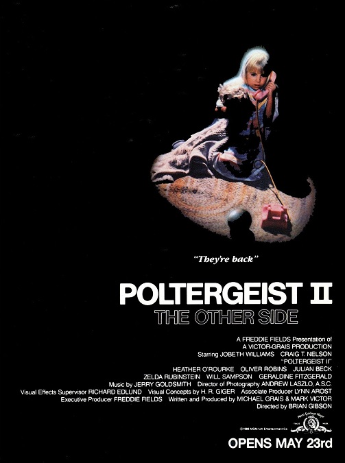
This movie was not as bad as I remember it being.  The plot, while not terrible for a sequel, is far inferior to the first Poltergeist film.  That being said, the special effects were also better than my faulty memory made them out to be.  And while the ending of the plot was still hokey, the visual effects were pretty good.

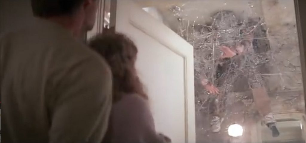
The creepy character of Reverend Kane, was able to stand still while other people walked through him.  It was a simple, but effective effect.  But the effects really kicked into overdrive in the latter half of the movie.  It all started with Robbie’s braces coming to life, causing metal wires to shoot out of his mouth like menacing tentacles.  By the time his parents could help him, there was enough wire to wrap the poor boy in a cocoon of metal and pin him to the ceiling.

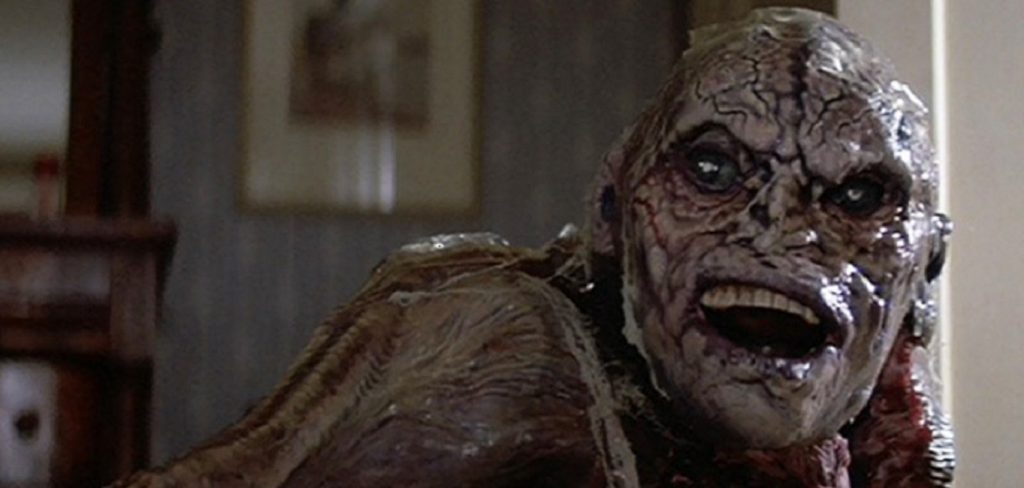
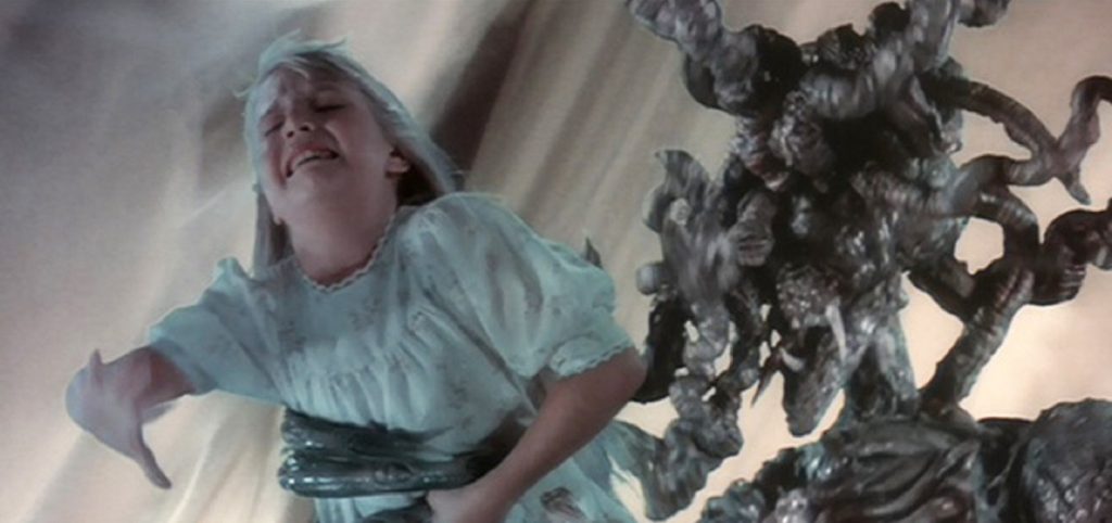
But for me, one of the most memorable effects in the film was when Kane was able to get into the house by possessing the worm in a bottle of tequila.  When Stephen swallowed the worm, the evil spirit possessed him.  When Stephen’s body rejects the worm, it slithers out of his mouth as a huge, slimy, H.R. Geiger inspired creature that quickly grows into a legless ghoul resembling the preacher.  That part was pretty horrifying!  It continued to grow until it resembled a massive column of evil, complete with monster claws that lifted Stephen into the air.

One of the effects that looked a little cheesy was when the family tries to escape in the station wagon.  A chainsaw turns on and floats through the air, attacking the car.  I can’t put my finger on what looked wrong with the effect, but something didn’t seem right.  Doing my research, I found that the director had considered making the movie in 3D, and this was one of the few effects that was filmed while that idea was still being considered.  Maybe that had something to do with it.
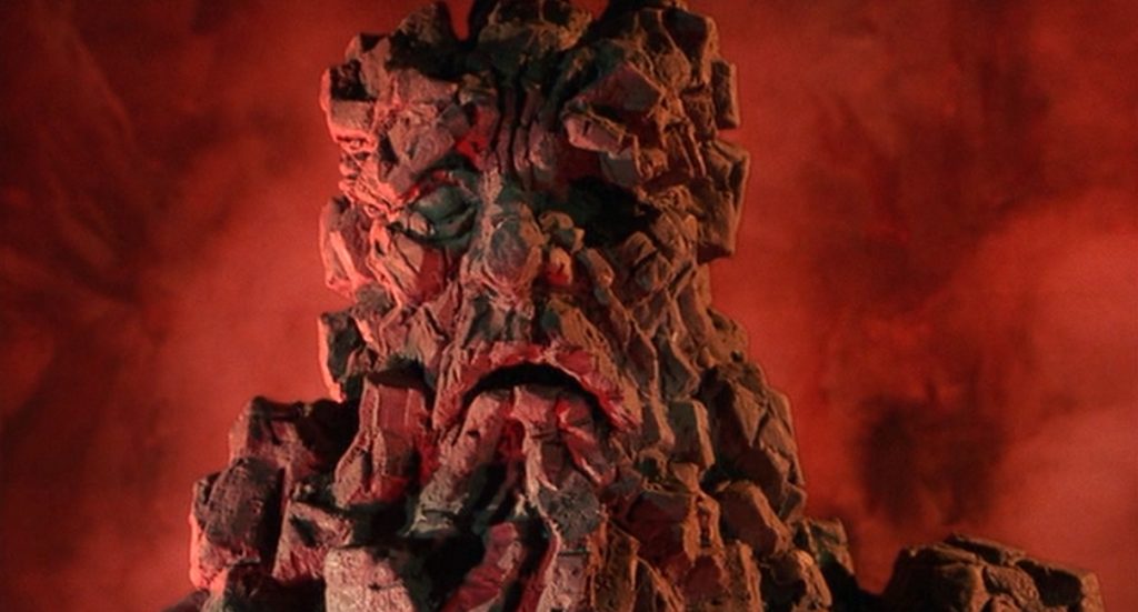
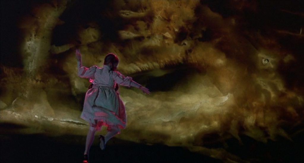
Then there was the climax of the film, in which the four members of the Freeling family voluntarily venture into the spirit world to confront the evil Rev. Kane.  We see the family floating in a bright nebulous ether while a giant monstrous blob of monster attacks them. It gets Carol-Anne away from her family and her face shrivels to that of a corpse.  Stephen uses a magical Indian spear to kill the beast and he falls away.  Unfortunately, Carol-Anne is thrown into the spectral light of the next life.  But the spirit of her kindly grandmother rescues her from an early journey to the afterlife.  Even though the ending of the story was pretty disappointing, the effect of which it was comprised were pretty good.

Aside from those memorable effects, there were some other simple things like a dream sequence in which Diane is pulled into the ground by rotting skeletons, or another quick shot of dozens of ghostly spirits appearing all over the lawn.  Then there was the part where Stephen is thrown across a room after contact with the spirit of the evil preacher coming out of a toy phone.  Sigh… Could the story have been better?  Yes.  But for all that, the effects weren’t bad at all.

1986 – Little Shop of Horrors

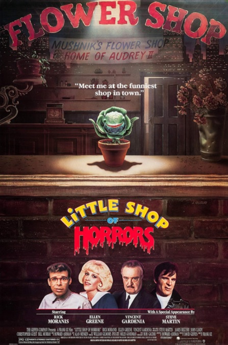
Little Shop of Horrors – 1986

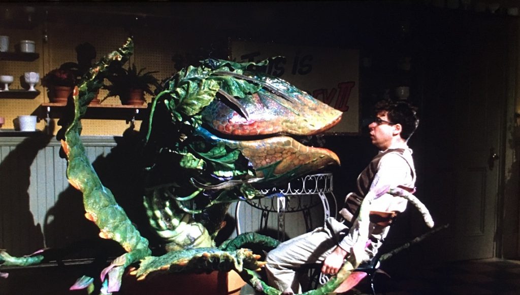
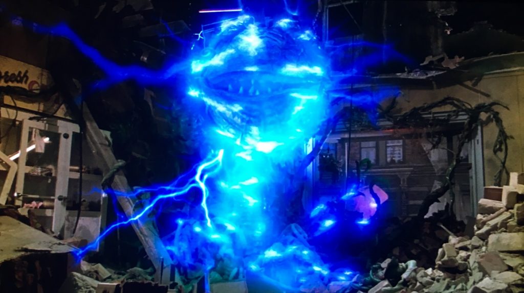
This was a strange movie to be getting an Oscar nomination, but I think it really deserved it.  Still, aside from a few lightning-like electricity effects, the film’s only real special effect was the plant, and as far as that went, it was incredible.  Today, it would be easy to accomplish with CGI effects, but in 1986, it was all done with practical effects.  Don’t get me wrong.  Modern CGI effects would have looked phenomenal.  But because the monster plant was a practical effect, it had a solidity about it that CGI sometimes lacks.  Filmmakers are getting better at tricking our eyes into believing that the CGI effects are as solid as real objects, but they aren’t always successful.  Not yet, anyway.

Audrey II, the evil space alien plant, bent on conquering the Earth, was a marvelous combination of animatronics and complex puppetry, but it looked as real and true as reality.  It moved as smoothly and as naturally as a live actor.  I was amazed at how this incredibly naturalistic motion was accomplished.  It wasn’t stop-motion or go-motion.  It was slow-motion.  They created several puppet plants to use in its varying stages of growth, from hand-sized to room-sized, each with the ability to move and form complex word shapes with its mouth.  They filmed everything, including the live actors, in slow motion. Thus, they were able to control the puppetry of the plant with remarkable precision.  Then, they sped the film up making Audrey II appear to move as naturally as the live actors.  It must have been an arduous task to film in such a way, but the result was cinematic magic.

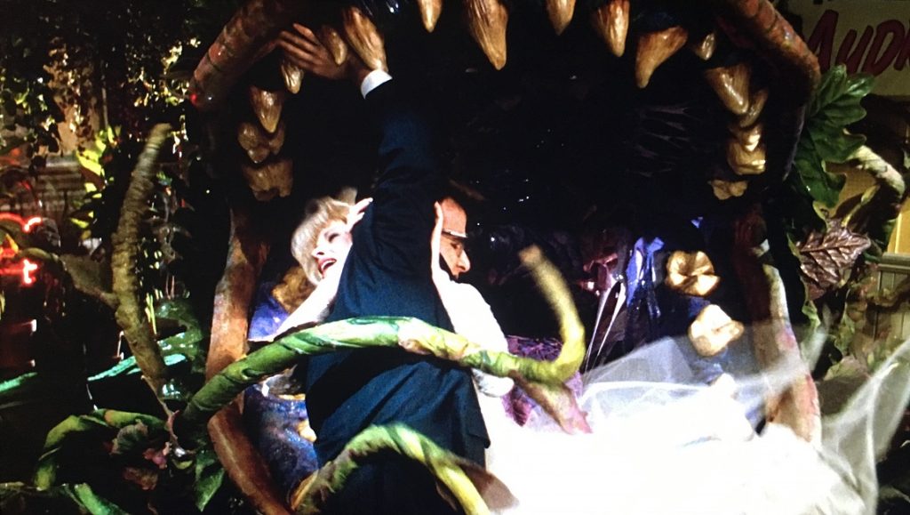
The range of movement in the puppet was amazing, allowing it to display a wide range of emotion.  The varied expressions that were displayed were perfectly crafted and easily readable.  I also loved the way the plant devoured one character and nearly swallowed another.  Just as an interesting note, in the stage play on which the film is based, Audrey II successfully eats both Audrey and Seymour.

One of the things that must have made it even more difficult to create the illusion was the fact that the whole movie was a musical.  So filming everything in slow-motion had to be precisely timed to match the rhythm of the music in regular speed.  The music was very energetic and fast-paced.  But Director, Frank Oz and his team of puppeteers did their jobs perfectly.  Everything matched exactly as it was supposed to.  Well done everybody!

In keeping with the idea of the plant winning, an alternate ending was filmed for the movie, in which the plant and its offspring win, and the earth is conquered.  In this ending, there were a number of miniature models of cities crafted, which are destroyed by gigantic versions of the plants.  This ending is included on the DVD, but I’m glad that the theatrical release kept the happy ending.  The miniature city models looked a bit too fake.  It was interesting to note that this unused ending had more special effects than the rest of the film.  As the giant plants topple buildings, the military is called in to fight them, ultimately losing to the aliens.

1986 – Aliens (WINNER)

  Aliens – 1986 (WINNER)

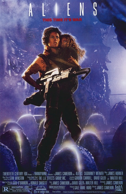
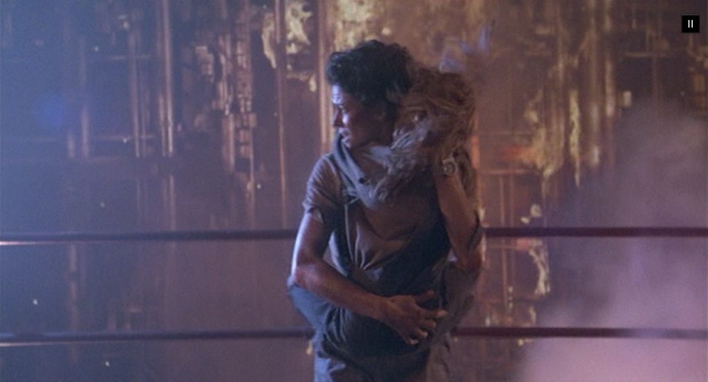
Aliens was such a great sequel to James Cameron’s science fiction/horror film Alien!  It took the mythology and aesthetic of the successful first, and went in a completely different direction.  The added the word action into the mix, and it was awesome!  And nowhere was this more evident than in the incredible special effects!  Everything was more!  There was more creepy tension, more deaths, more face-huggers, and, of course, more aliens!

And speaking of those pesky face-huggers, they were even more threatening than in the first film.  They were featured more prominently and were much more mobile than we had seen them before.  This time, the movement of their spider-like legs made them even more frightening!  The scene where two of them attack Ripley and Newt was really scary and really intense!

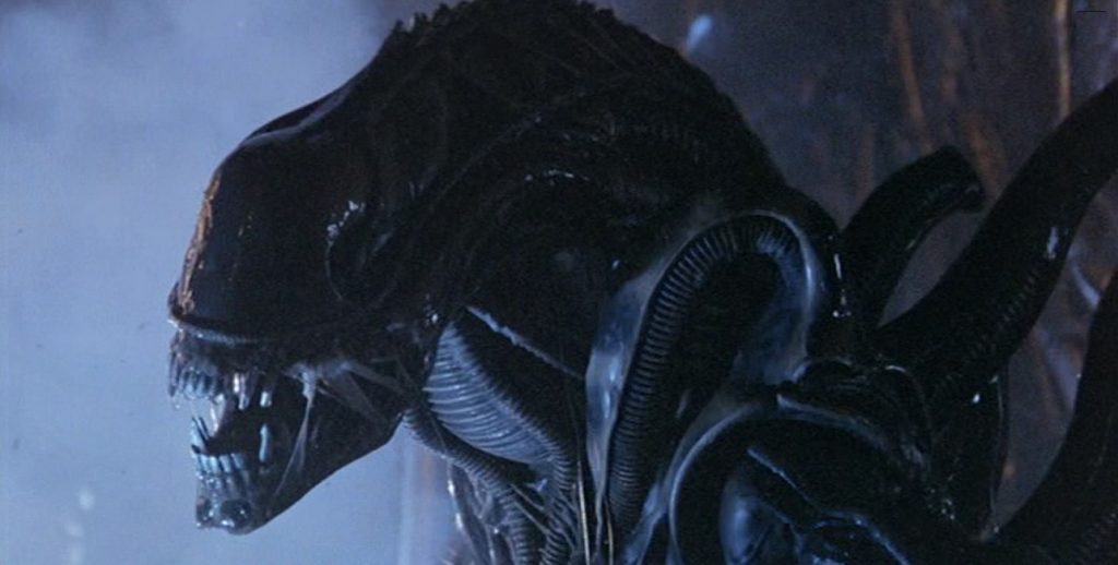
In an interview, Cameron talked about how the design of the alien suits worn by the actors was improved.  One of the smartest things he did was to sacrifice some of the details of the costumes in favor of motion, giving the actors the ability to move in much more realistic ways.  And despite there being hundreds of the creatures in the film, there were only six of the suits made.  You never see more than six of them on the screen at once.

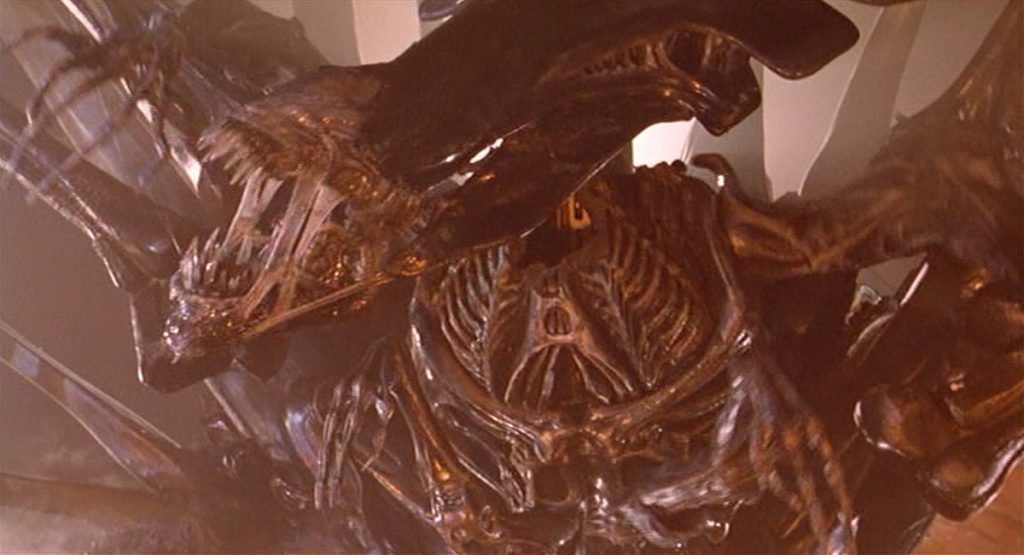
And one of the most memorable parts of the movie was the addition of the Alien Queen, which Ripley must battle.  She was gigantic, with a marvelous head crest, and two sets of arms.  We got to see her attached to a massive egg sac, which she was able to leave behind.  The Queen was mostly controlled using mechanical animatronics and complex puppetry techniques.  The result was that we got to see it do so much more than the drone aliens, which were just gymnasts and acrobats in suits.

In this action-packed movie, there were great gun battles, flame-throwers, massive explosions, a few flying ships, a miniature model of the colony, a tank, and a spectacularly crashing shuttle.  But the best part of it all was that none of it was gratuitous.  It all made sense to the story and turned a simple horror/action film into a fascinating story from beginning to end.

If I had any complaints about the film’s special effects, they would be minor.  Some of the compositing of the flying shuttle as it descended through the clouds was a little shaky.  Also, the scene where Bishop picks Ripley and Newt up from the platform, they didn’t seem like they belonged in front of the exploding background.  They looked a little too separate.  But I know I’m being picky, and those things were minor.  Everything else was incredible!

1985 – Young Sherlock Holmes

Young Sherlock Holmes – 1985

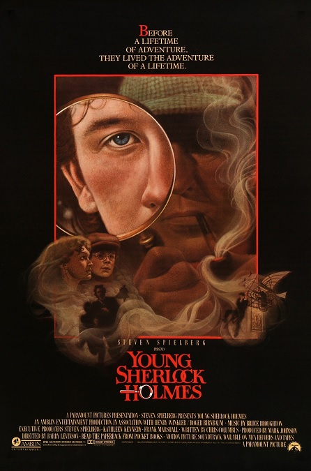
The movie itself was ultimately campy, but some of the special effects were pretty amazing.  Well, actually, they were mostly pretty average, but one effect was incredibly good.  It pushed the boundaries of the technologies of the day and gave audiences something they had never seen before.

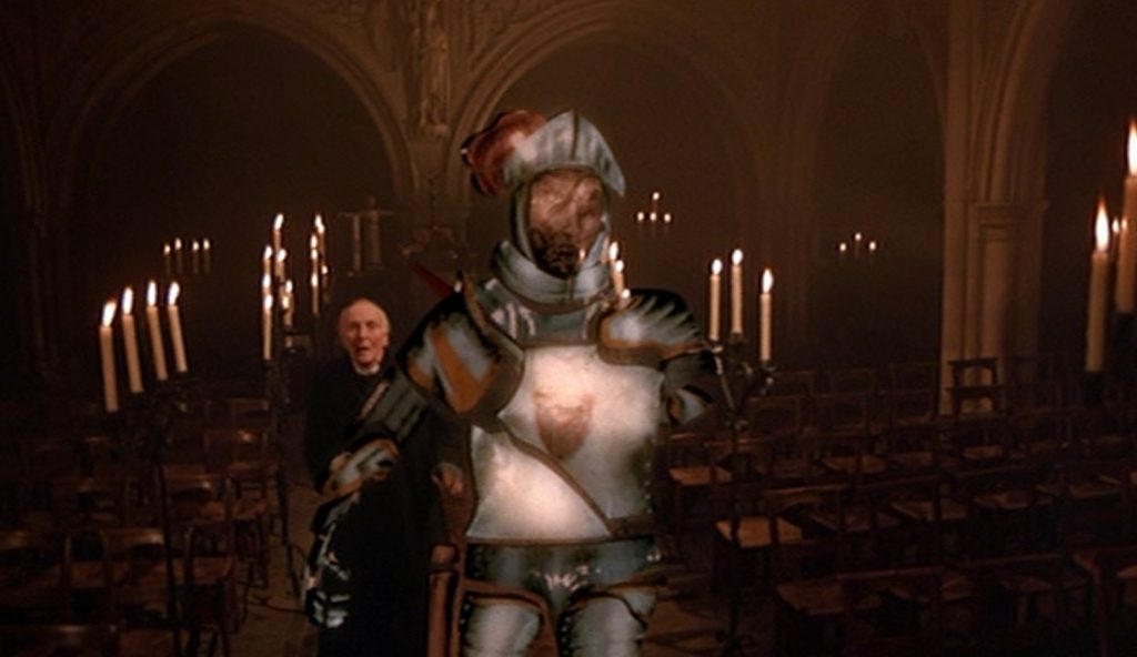
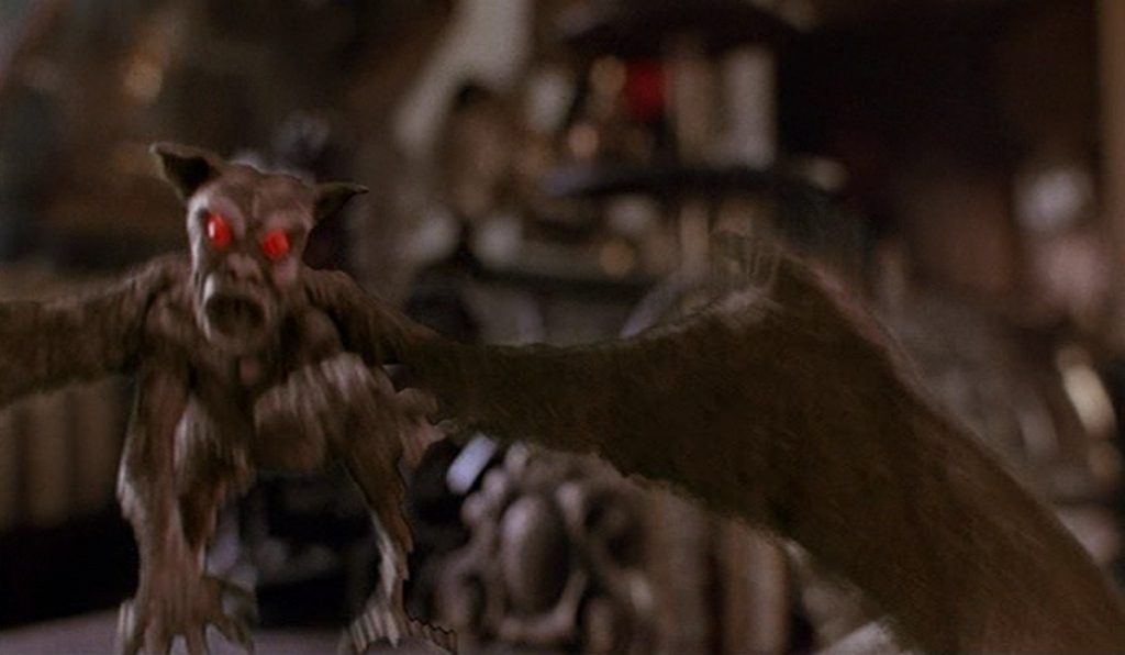
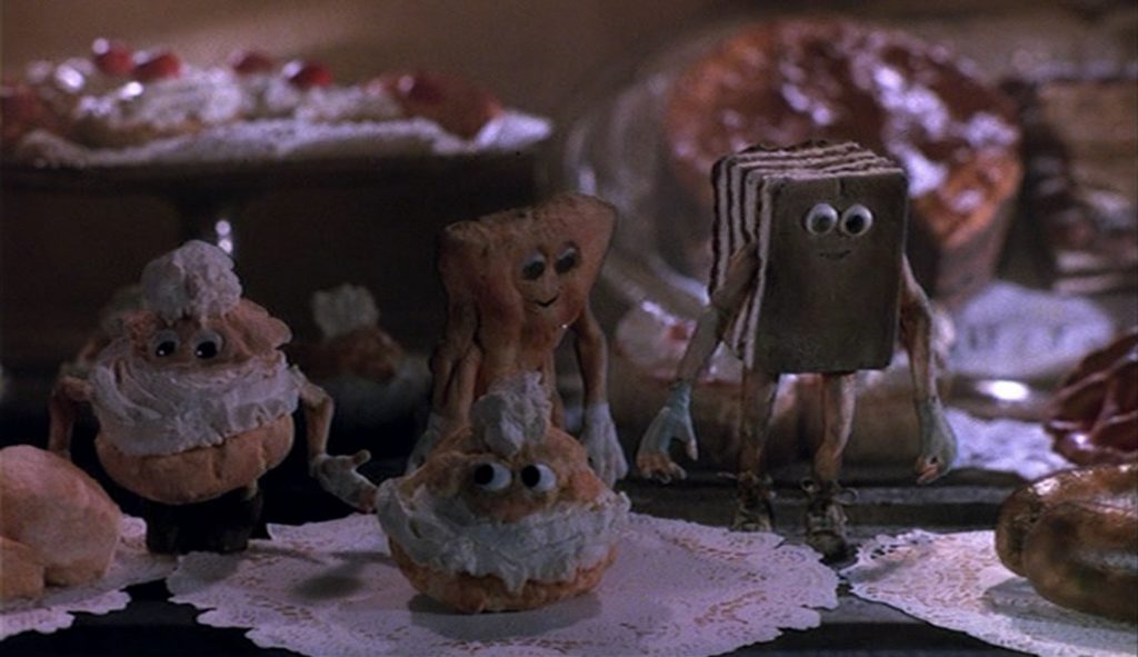
Good old ILM, or Industrial Light and Magic, did the visual effects for the film, and here is a paraphrase of what their website had to say.  “The drug-induced hallucinations allowed ILM to test three technologies for three effects sequences.  First was the stop-motion animation-controlled flying harpies, the second was the dancing pastries controlled by rod puppets, and the third was a knight that leapt out of a stained-glass window.  To create the stained-glass man, the computer division at Lucasfilm used new motion-blur technology and the first 32-bit RGBA paint system.”

In other words, it was the first completely CGI character ever used in a motion picture.  They did something that had never been attempted before, and it worked beautifully.  The knight was a walking piece of stained glass, so it didn’t need to look remotely human or even photo-realistic.  As such, it was incredibly well done, and I think that it holds up pretty well, even by today’s standards.  It looked like a walking, segmented pane of glass.  They even paid attention to the detail that, like actual stained-glass images, if you look through the opposite of the glass, the image is reversed.

The ILM website goes on to say, “For the sequence, visual effects supervisor Dennis Muren and Lucasfilm’s Computer Division devoted months of research and development to the seven-foot-tall knight.  Final composites, comprised of the CG knight, animated shadows, and a stained-glass window matte painting, were recorded directly to film by a revolutionary laser scanner.”

The stop-motion harpies were pretty good, as were the more practical effects for things like a metal coat rack shaped like a bird’s head that came to life and began shooting little fireballs from its beak, or a roast chicken that came to life and attacked a man.  And the DaVinci-like flying machine, while it was a pretty stupid plot point, was executed with a certain amount of skill.  Unfortunately, the stop-motion animated pastries looked very cartoonish and silly, making the effect stand out as looking childish ridiculous, especially compared to the relative realism of the rest of the film.

There were a few other effects like some assorted stunts and choreographed fights, a burning wooden Egyptian-style pyramid that crumbled and burned, and a handful of competent matte-paintings.  There was really nothing wrong with any of the visual effects, but we have to give the movie proper credit for wowing us with that CGI stained-glass knight!  It’s just that there were too many scenes in the film that were campy, tongue-in cheek, or just plain silly to be taken too seriously.

1985 – Return to Oz

Return to Oz – 1985

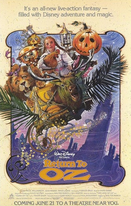
OK, I’ll start off by saying that the movie was geared toward young children, and the visual effects reflected that.  To be sure, there were plenty of special effects, but unfortunately, many of them looked fake and very unrealistic.  That being said, the film was still interesting to watch.  To a slight degree, I can see why it was nominated for the category, though I’m not sure it should have been. But it’s also easy to see why it didn’t win.

Return to Oz was Disney’s unofficial sequel to the ever-popular musical from 1939, The Wizard of Oz.  However, they changed several things to differentiate it from that film.  First, they based it on elements from two different books in Frank L. Baum’s series of Oz books.  Also, they remained much closer to the books than the previous movie did.  But one of the reasons the movie was made, was that Disney owned the rights to the Oz books and their copywrite was only a few years away from expiring. 

In order to create the fantastical landscapes and environments, the production design team created some incredible sets.  To make them appear more expansive, some matte-paintings were created.  Unfortunately, many of them looked nearly cartoonish in their execution.  Again, this lent itself to entertaining a younger audience.  There was also a fair amount of blue-screening, but even this common technique displayed some sub-standard work.  The actors often had little outlines around that separated them from their backgrounds.  They didn’t look like part of the same image.

Another visual effect was the use of animatronics.  But once again, it looked very fake.  They looked mechanical, like the robotic characters found in the Country Bear Jamboree or the Hall of Presidents.  They had limited movement that was all too jerky and artificial, little to no facial expressions, and cartoonish appearances. 

And then there was the Claymation.  Now, this was probably one of the more interesting visual effects of the film.  Claymation is a form of stop-motion animation that uses clay figures.  It is actually really amazing what can be done with Claymation.  You’d never believe it was simple clay.  The detail, the range of motion and color, and the sheer fantastical nature of the clay imagery can be amazing, and to be sure, they really used it well.  It wasn’t as impressive as the 1985 Claymation film The Adventures of Mark Twain, but still expertly done.  The problem is that it never doesn’t look like clay, like a cartoon, like a child’s toy.  It never looks as real as the actors who have to interact with it.

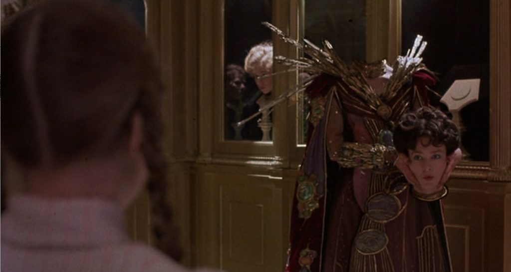
Otherwise, I think the most impressive effect was when the character of Mombi removed her head and exchanged it for another one.  The slight flickering at the base of the neck when it was set in its display case was barely noticeable, and I’ll admit, I’m being very picky on that point.  It was a pretty good effect.  But was that and good Claymation enough to earn it its Oscar nomination?  I don’t know.