1985 – Cocoon (WINNER)

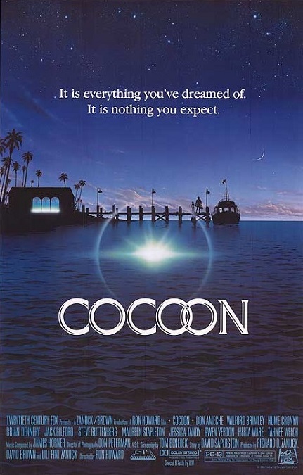
Cocoon – 1985 (WINNER)

The special effects for this film were surprisingly better than I remember them being.  It took home the Oscar for the category, but were the effects really better than those of its competitors? There was Young Sherlock Holmes which had the first fully CGI character ever, and there was Return to Oz which had some amazing Claymation effects and a headless witch.  Well, that’s an easy question to answer.  Yes, I believe it deserved its win.

While its effects weren’t necessarily flashy or over the top, until the climactic scene, they were incredibly well done.  Everything was seamless and carefully crafted.  The effects really consisted of four things.  There were the aliens without their human skins, the intimate moment between the female alien and Steve Guttenberg, the dying alien in the cocoon, and the arrival of the space ship at the end of the film.

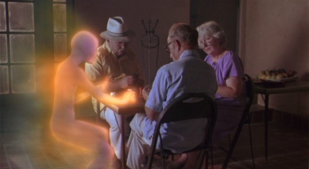
The first view we got of one of them was when Kitty removed her fake human skin, and Jack spied on her like a peeping tom.  She glowed like she was almost made of light.  The aliens were ethereal, luminous creatures that were almost fairy-like.  I thought it was cool that when we saw one in flight, the delicate mist that trailed after it looked like magical fairy wings. 

This led to the next effect, the alien sexual encounter, which did not involve any physical contact at all.  As Kitty released her emotions, her body began to change colors, and a spinning, glowing ball of red and gold energy rose from her naked form.  It flew around the room a bit, bouncing off the walls and ceiling, gaining intensity, until it crashed into Jack’s chest, making him glow like the aliens, except green instead of red.

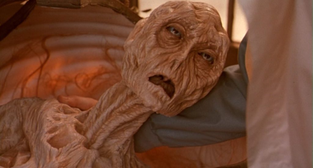
Next was the dying alien which appeared to be an animatronic construction, but it didn’t need to be anything more.  It was near death, so it was supposed to look dried out, hard, and sickly, and it did look appropriately pitiful.  It didn’t have to move too much or too quickly, so it looked like it should have been a relatively easy effect, and it was done well enough to create a very emotional scene.

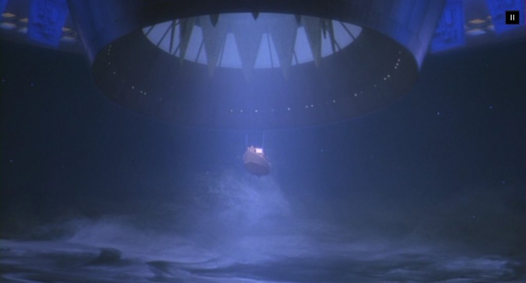
But it was the climax of the film that really impressed me.  Not only were we treated to a nice saucer-shaped space ship, but it created a massive swirling fog bank to hide itself from the coast guard.  And when it lifted the boat full of senior citizens and aliens out of the water and into itself, it was really perfectly executed.  There were no black outlines around the floating ship to indicate blue-screening.  Everything looked incredibly polished and well-done!

I wouldn’t call this a special effects-heavy movie, but what they did, they did extremely well.  I’d say that most of the film was the drama surrounding the seniors.  But the effects really enhanced the drama, and when compared to the other nominated films in the category, I think Cocoon really deserved its Oscar. 
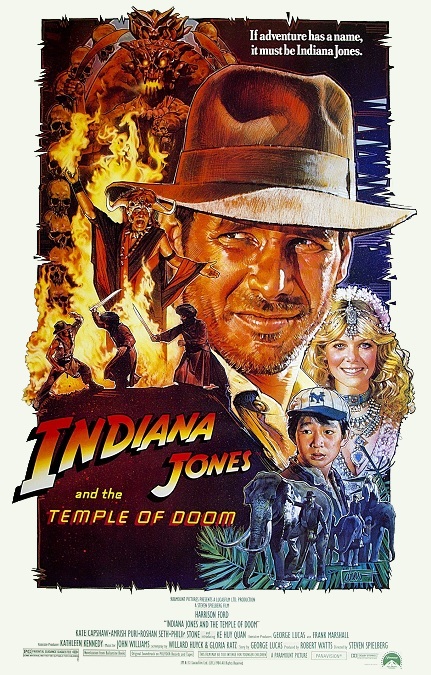
1984 – Indiana Jones and the Temple of Doom (WINNER)

Indiana Jones and the Temple of Doom – 1984 (WINNER)

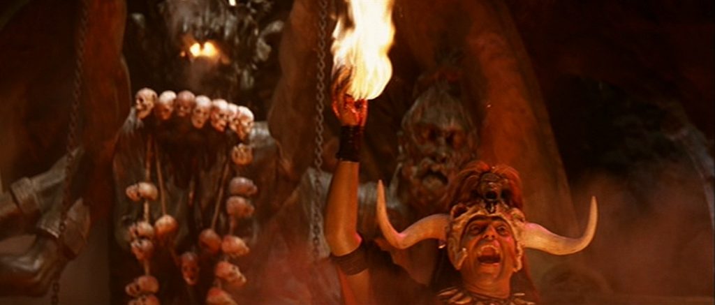
I must admit, I’m baffled.  How could this movie have won the Oscar for Best Visual Effects?  Yes, there were a few good ones, but the majority of them were pretty awful!  It was up against Ghostbusters and 2010 The Year We Make Contact.  I’ve seen both of those films, and I don’t remember their effects being this poorly done, especially Ghostbusters.  Several of the effects in this second installment of the Indiana Jones franchise looked incredibly amateur.

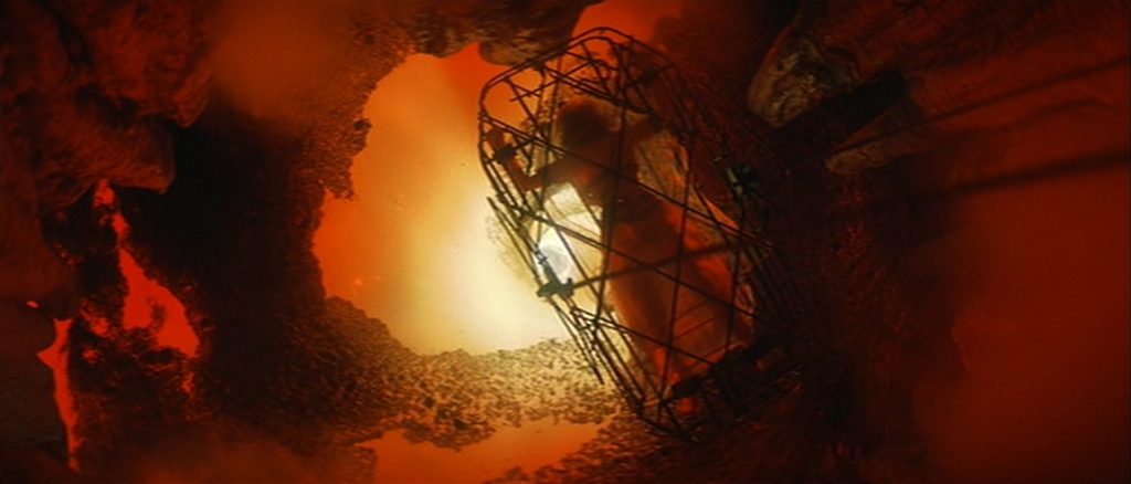
So I’ll go over the good ones first.  One scene that comes to mind was the scene in which a Thuggee priest removes a man’s beating heart and holds it in his hand.  As the man is lowered into a pit, at the bottom of which is a swirling pool of molten lava, he is burned to death.  At the same time, the heart in the priest’s hand begins burning.  That was cool.  And the magma whirlpool was also pretty cool, though I imagine, not difficult to do.

But the bad effects far outweighed the good ones.  Right near the beginning of the film, our hero and his companions jump out of an airplane on an inflatable raft and do not die when the hit the ground.  The feat makes the magic refrigerator seem from the franchise’s fourth film, Kingdom of the Crystal Skull, suddenly plausible.  But I digress.  Behind them we can see the airplane crash into the mountain.  The aircraft abruptly vanishes as the explosion erupts.  The flames quickly die and we suddenly see the stationary wreckage of the plane.  It all looked very fake.

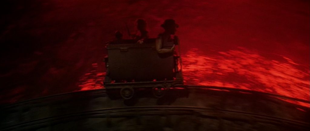
Then there was the ridiculously impossible rollercoaster ride in a mine-cart.  When the live actors changed to stop-motion animated miniatures, it was painfully obvious.  After that, a flood of water threatens to throttle them, and they rush out of the tunnel.  They find themselves stranded on a few narrow rocks on a high cliffside to either side of the mouth of the tunnel.  When the water pours out of the hole, their images appear to flicker because of bad compositing.

Then came the climax of the film.  Indie is on the center of a rope bridge and he uses a sword to cut the support line.  Half the people on the bridge fall into the crocodile infested water below.  The falling figures were clearly not part of the same image.  I don’t know, it all just looked shoddily done.  We see the men plummeting and they looked like something akin to paper cut-outs against the out-of-focus backdrop of the cliff and the river beneath them.  Just look at the rocks below them and the thick black outline that separated them from the water.  And then when the men are eaten by the crocs, there was no blood, no struggling victims.  Just reptiles chomping on wet clothes.  Couldn’t they at least have put red dye in the water?

The poor effects went hand in hand with the ridiculous nature of the narrative itself.  There were so many plot points and stunts that were physically impossible, that the effects took on a fakeness which they might not have otherwise had.  Yet this seemingly low-quality work won the Oscar, and I really can’t figure out why. 

1984 – Ghostbusters

Ghostbusters – 1984

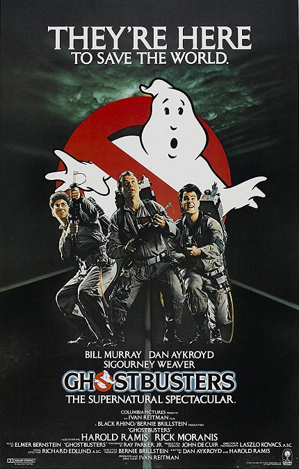
This was a fun movie from beginning to end.  The special effects straddled the fence between scary and humorous, leaning more to the comedic.  They could have easily cast the film into the horror genre, except that they were way too funny.  When New York is attacked by an interdimensional demon, it ultimately takes the form of the Stay Puff Marshmallow Man, a giant, white, puffy cartoon mascot in a sailor suit.  Its intent was the destruction of everything, but it was enough to make me laugh, even though I’ve seen it all before.

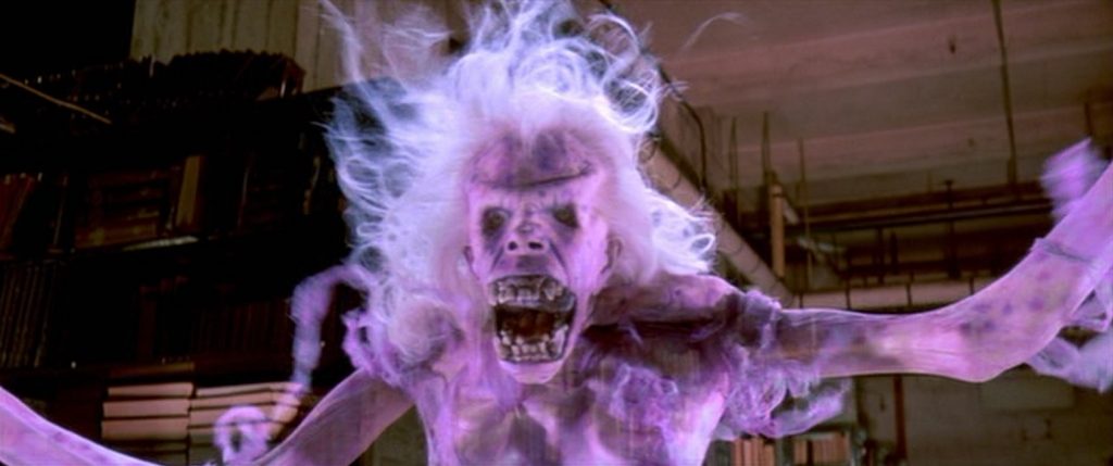
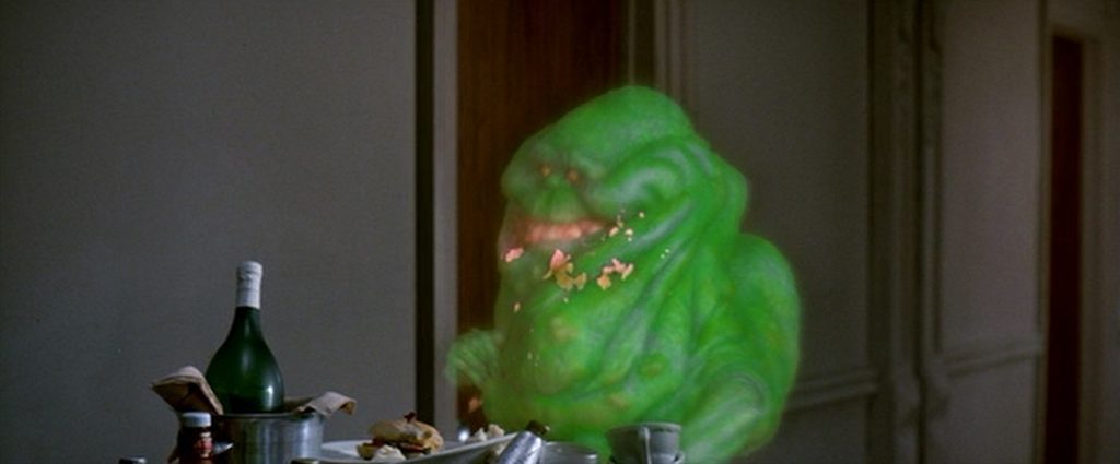
Even the ghosts that were supposed to be scary had an element of humor to them, though if I think about it, there were only three actual ghosts shown in the film.  There was the purple floating spirit in the library at the beginning of the movie, there was the green ghost known as Slimer who is the Ghostbusters’ first actual capture, and there is the blue-green phantasm that jumps out of the subway when all the ghosts escape from the containment grid.  Sure, we are also treated to a few cool shots of indistinct floating streams of color and floating glowing balls of light, but nothing else with a distinguishable face and body.

But for all that, they were pretty cool.  The purple ghost was fantastic as it quickly transformed from a quiet old lady reading a book to a crazy skeleton with wispy white hair.  The ghost that came out of the subway was only on the screen for a second or so. But Slimer had significantly more screen-time than the others.  He was a disgusting green blob that seemed to be the personification of gluttony.  He was eating and drinking everything in sight.  The effects team was clever in their execution of the ghost.  Looking at it objectively, I’m pretty sure it was a puppet.  It had just enough lack of movement.  But I loved the way everything it shoved into its mouth passed through it and fell to the floor.

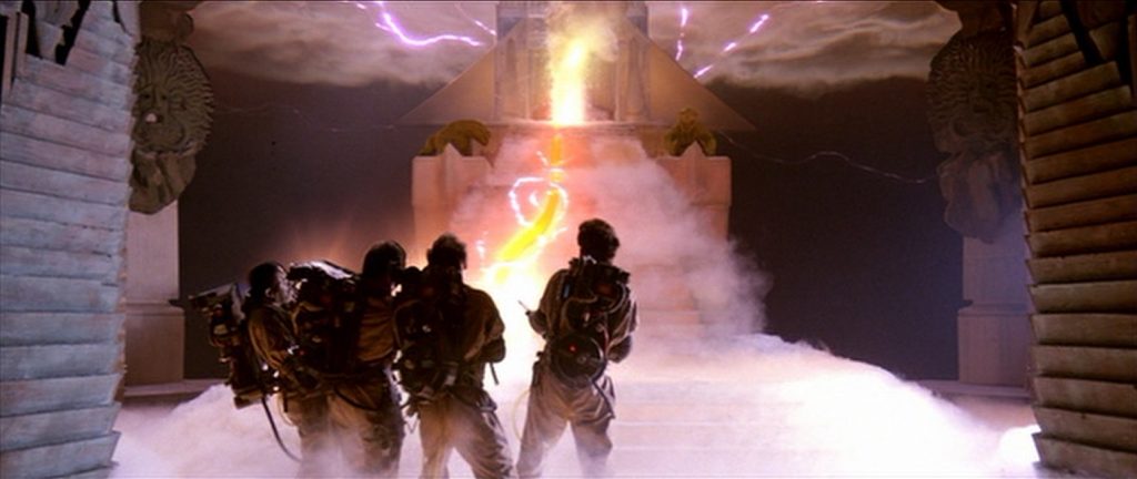
But then there were the stop-motion demons, Zuul and Vince Clortho, servants of Gozar the Destructor.  They were probably the scariest things in the movie, though even they were a source of jokes and humor.  The use of go-motion animation made their movements smoother than traditional stop-motion animation, but by today’s CGI standards, they still stood out as an effect.  Gozar was a really creepy, and yet sexy lady with red eyes and an evil-sounding voice.  And more than that, there were menacing black clouds that surrounded Gozar’s temple, and pink and green lightning that shot from her hands.

And lest I forget, there were the Ghostbuster, themselves.  Their weapons for combating the spirits, their backpack-sized particle accelerators that fired a stream of highly focused and radially polarized protons were very cool.  They looked like bright and colorful lightning-laser-guns.  It was a great effect!  In all, the effects were far better than that year’s Oscar winning film, Indiana Jones and the Temple of Doom. They were much more seamless and, dare I say, realistic.  I f you ask me, I think this movie got robbed!

1984 – 2010 The Year We Make Contact

2010 The Year We Make Contact – 1984

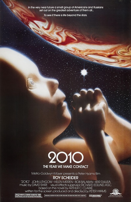
There was nothing wrong with the visual effects for this film, but I’ll say right off the bat, I think I know why it didn’t win the Oscar.  As simplistic as it sounds, they just weren’t very flashy.  They were done very well, but the filmmakers did their best to make everything factual and realistic.  And let’s face it.  Reality isn’t always very flashy.  But on the flip side, I also think I know why it received its nomination.  This is one of the first times that CGI was effectively used.
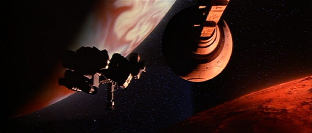
Now, granted, CGI was still in its infancy, and it was only used for a short sequence, but it was done well and looked pretty cool.  There is a scene in which a space ship must perform a risky aero-breaking maneuver by entering Jupiter’s gravity and sling-shotting themselves around the planet’s dark side, and settling into an orbit around Europa.  All the dense clouds on the dark side of Jupiter were CGI and they looked pretty cool!  That being said, I also really liked the shots of Jupiter’s light side.  The roiling bands of color looked sharp and very realistic.

But as far as I read, there was only one other shot in the film that used the new computer-generated visuals.  There was a shot of millions of monoliths streaming out of an interdimensional hole that had opened up in the gas giant.  However, aside from those two things, everything else still relied on practical effects.  There were a number of shots of large and slow-moving ships, and slow-moving astronauts and cosmonauts.  In fact, everything was pretty slow-moving.

However, there were several other effects in the film that caught my attention that are worth mentioning.  For example, they got the same actor who played David Bowman in 2001 A Space Odyssey, Keir Duella, to reprise his role.  He didn’t look like he had aged a day, despite the fact that the movies were filmed sixteen years apart.  Now granted, 2010 was nominated for Best Makeup, but they created the illusion that he hadn’t aged at all in sixteen years, and I call that a visual effect. Also, Stanley Kubrick destroyed all the miniature models and schematics from his original film.  They had to recreate Discovery One by studying the film footage.

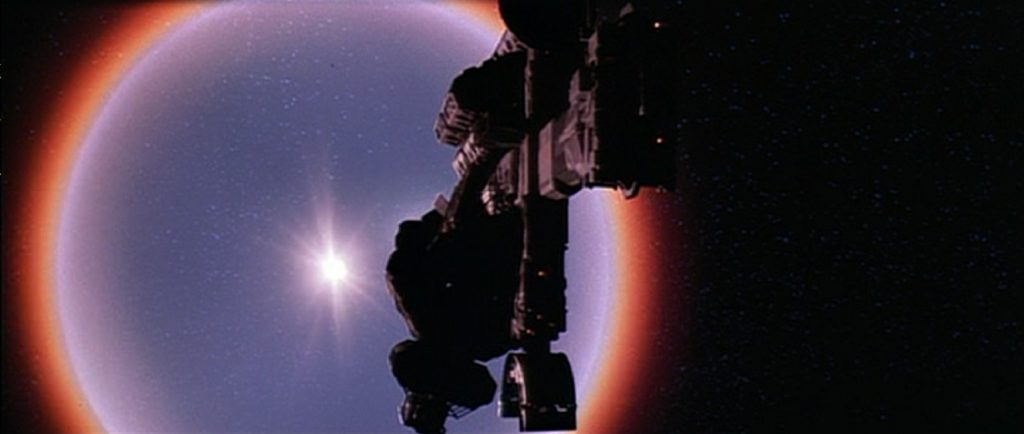
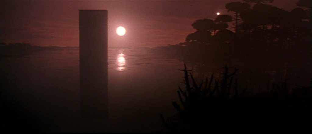
Also, there was that whole air-breaking sequence.  Aside from the competent CGI elements, the flames that surrounded the ship because of the friction with the Jovian atmosphere were pretty cool, making it look like an oblong fireball hurtling through space.  And then there was the film’s climax.  Jupiter basically imploded and turned into a new star in our solar system.  The shockwaves that emanated from the event were also pretty competently portrayed.  After that, we are treated to scenes from around the Earth which showed a sky that contained two suns.  Those were some interesting, though brief, shots.

But unfortunately, 2010’s slow visual effects just weren’t very flashy.  The space travel effects were just too subtle, leaning more towards reality than fantasy.  The mystery and intrigue of the film resided more in the plot than in the visuals.  That doesn’t mean the visuals were bad, but they were outshined by their competitors.

1983 – Return of the Jedi (WINNER)

Return of the Jedi – 1983 (WINNER)

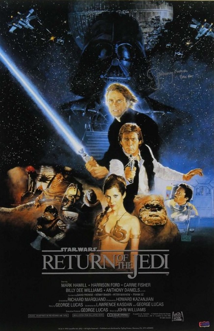
This film is part of the iconic Star Wars franchise, a series of films that are known for, among other things, their exciting action and amazing special effects.  In this third installment, we get the huge slug-like creature, Jabba the Hut, the giant monster, the Rancor, a high-speed chase through a dense forest on flying motorcycles, an epic space battle, an epic lightsaber battle, and… Ewoks.

I can’t really fault the film’s special effects for the cute, merchandisable teddy bears that could defeat the forces of the mighty Imperial Empire with literal sticks and stones.  Director George Lucas originally wanted them to be Wookies, which would have made so much more sense, but he determined that Chewbacca’s people were far too intelligent for what Lucas wanted in these unlikely allies.

But the other creatures we got were much more complex than the short people in bear suits.  Jabba was a massive puppet controlled by a team of six puppeteers, cables, air bladders, and other physical mechanics.  He looked really amazing, but his only failing was his mouth.  It was fine as long as he wasn’t talking.  He had a working tongue and his lips could make small, almost imperceptible movements.  But like all puppets, his lips could not move enough to believably shape his words.  I remember watching this movie as a child and wondering at the realism of his appearance, and yet the failed illusion of his speaking.

The speeder chase through the forest of Endor was amazingly portrayed.  I went to the ILM website and found the following blurb.  “Rather than build a miniature forest and film Leia’s Endor chase with motion control cameras, ILM had Garret Brown – who had invented the Steadicam – walk through a redwood forest near Eureka, California while shooting a frame every few seconds.  ILM then ran the film backwards at twenty-four frames per second, which increased the apparent speed more than five thousand percent.  Optical compositing sent Princess Leia (Carrie Fisher) – filmed on a blue screen stage – speeding through the forest.”

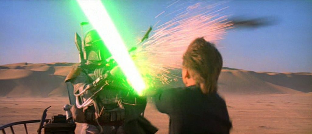
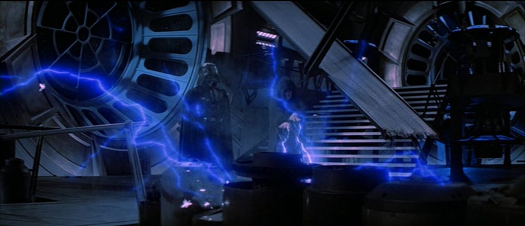
The lightsaber battle was faster paced and more exciting than we had seen in the first two Star Wars films.  But at the end of the battle, we got to see the Emperor shoot blue lightning from his hands in an attempt to kill Luke Skywalker.  And then when Darth Vader turned on him and threw him down one of those bottomless shafts that the Franchise is so fond of, the resulting ghostly explosion that accompanied his death looked really cool!

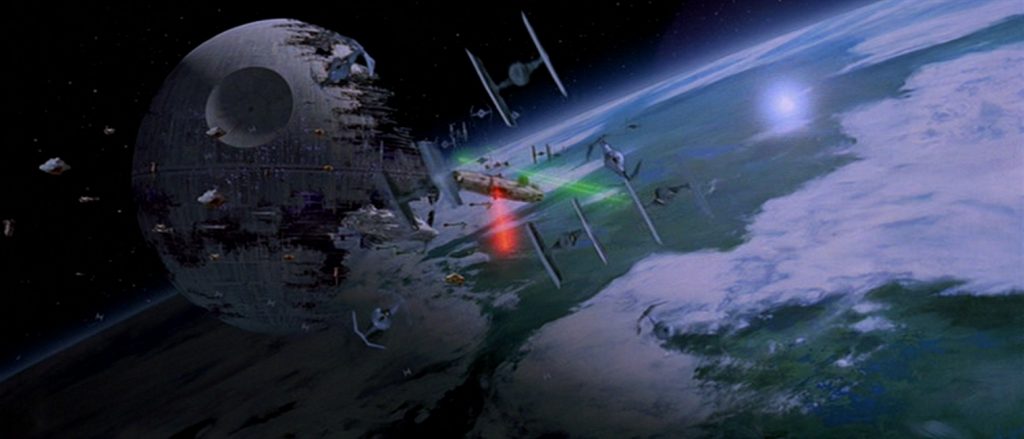
But the exciting space battle and the subsequent destruction of the half-completed Death Star was really the climax of the movie.  There were ships of all sizes that filled every inch of the screen with the quick and complex chaos of a real battle, which made for a very exciting sequence, the likes of which had never been seen before!  The whole scene must have been a nightmare to choreograph.  But unfortunately, despite the perfection of all these visual effects, Return of the Jedi’s Oscar win was nothing more than a give-away.  It was the only film nominated.

1982 – Poltergeist

Poltergeist – 1982

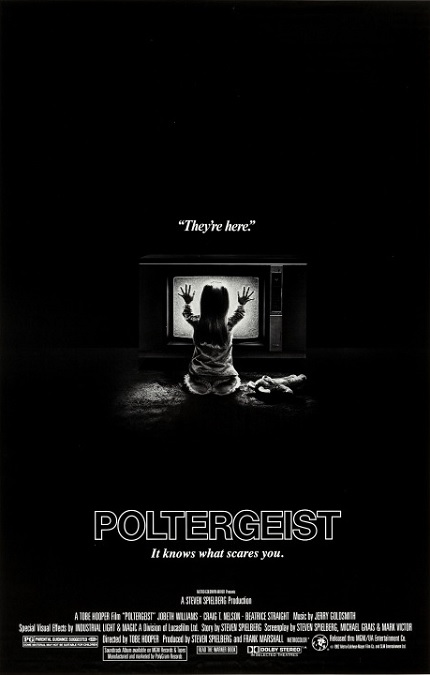
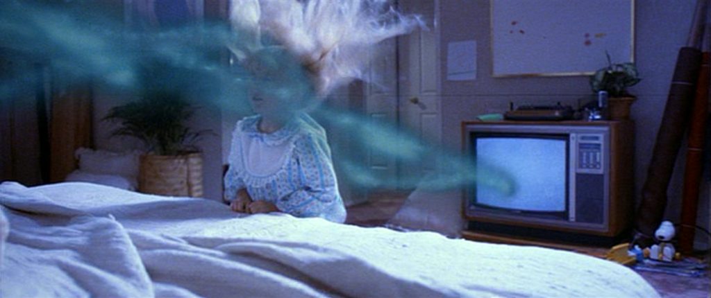
I have to start this off by saying that this is one of my favorite movies of all time.  I love the story, but I also love the visuals.  The incredible non-CGI special effects, while not perfect, were pretty phenomenal.  There were effects that were clearly physical or mechanical constructs, but then there were others that looked like creepily ethereal tricks of light and shadow.  Others looked like barely passable hand-drawn animation, and still others looked like perfect and seamless illusions that amaze the eyes of the viewers.

The movie was a special effects extravaganza.  There were too many to mention them all, I’ll comment on a few of my favorites and a few of my least favorites.  For example, the first effect that looked fake was a hand-drawn animation of a ghostly hand that reached out of a television.  Its movement was a little jerky.  Next there was the abduction scene.  When Carol Ann gets sucked into the closet, we see her hand gripping the plastic flower bed frame.  We see her hand slip off.  Then we see her flying toward the closet with a large piece of the bed frame still clutched in both hands.  Maybe this was an editing error and not a special effects error.

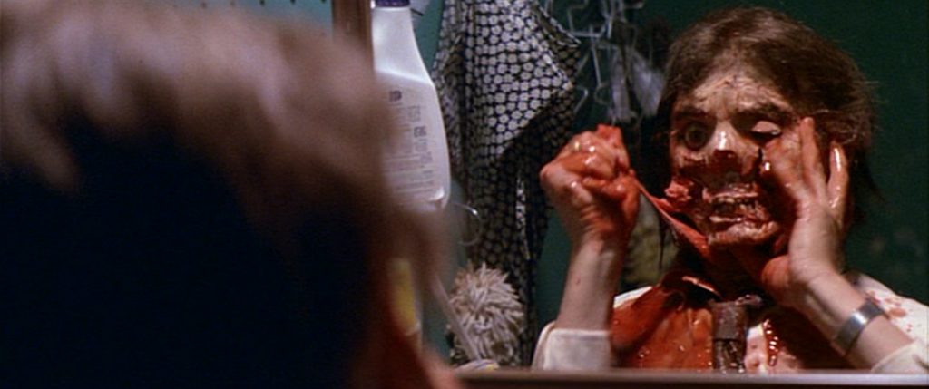
Next was the scene where a man tears his own face off.  Everything looked great until the large chunks of flesh started coming off his skull.  The dummy head looked too much like a dummy head, and the hands tearing at the face were badly positioned, making them appear to not belong to the same body, which of course, they weren’t.  But that was it.  Those minor things were the worst of the lot.

I loved the simple effect when the chairs suddenly stacked themselves on the kitchen table, accomplished by a combination of perfectly timed camera work and a crew of people rushing to move the chairs off camera.  I also loved the luminous spirit that descended the stairs, revealing itself to the terrified family and their guests.  The tiny ectoplasmic tendril that reached out and pushed the hanging light fixture was a really nice touch.  I also loved the rescue scene in which Diane enters the spirit realm to retrieve her daughter.  The giant skull with the flaming eyes that jumps out of the closet at Stephen was awesome.  And the image of Diane and Carol Ann falling through the portal in the living room ceiling was perfect!

The second abduction attempt was really great, too.  Diane getting pushed up the wall and across the ceiling was really cool, though if you watch closely, you can see the room shake a tiny bit as it is rotated. The scary clown that attacks Robbie is horrifying.  The ghostly dragon skeleton that threatens Diane was very scary!  When Diane flings open the bedroom door to save her children, and is almost sucked into the closet with them, was really exciting.  The coffins and rotting skeletons erupting through the floor were truly terrifying!  And the complex image of the entire house being sucked into the portal was amazing!  There was so much that director Stephen Spielberg… I mean Toby Hooper, got right, and although I’m not a huge fan of horror films, I love this one!

1982 – E.T. The Extra Terrestrial (WINNER)

E.T. The Extra-Terrestrial – 1982 (WINNER)

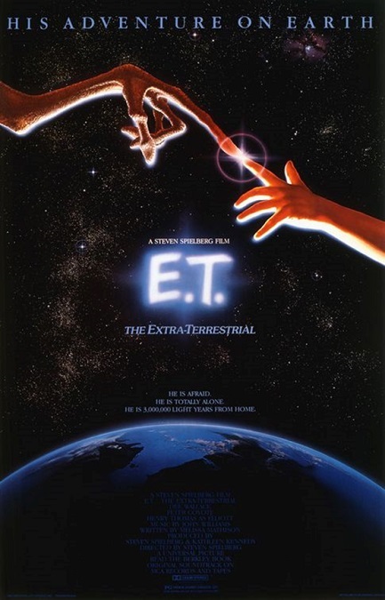
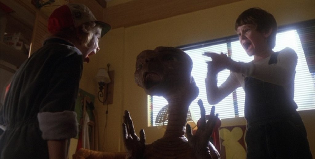
This was a movie with a lot of special effects, most of which were pretty good, though not all of them.  The real reason everyone came to see the movie was E.T. himself, and I think that for that, they did a fantastic job.  However, it is significant to mention that in 2002, director Stephen Spielberg meddled with his own film.  He redid a lot of the special effects with CGI, and that is the version of this movie that I am now used to watching.  However, for this review, I watched the original theatrical version, and I have to say that I don’t agree with all Spielberg’s CGI changes.  Here’s why.

One of the reasons for updating the special effects was to give E.T. more obvious or recognizable emotions.  They gave him facial expressions that they were not able to create in 1982.  But in most cases, I like the original version better.  The updates made him too human.  The stiffness of the original creature effects made him seem just a little more alien, and I was OK with that.  Then again, other changes they made were really necessary.  For example, in the beginning of the movie, when E.T. is running through a dark forest, the original version simply had an unmoving puppet on a track.  The CGI updates actually had a moving, running creature.

There were a number of techniques used to animate E.T.  There were, of course a number of puppets with a team of expert controllers manipulating the eyes, the mouth, and other parts of the face and head.  Sometimes when only his upper torso could be seen, an actor with gloves on became his hands.  But they also had a man with no legs in a suit.  What we saw as E.T.’s feet were actually his hands on which he was able to walk.  And we can’t forget all the detailed miniature models.

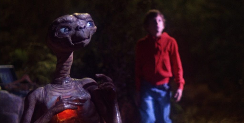
A little thing that I liked was in the part of the movie in which E.T. got sick.  As his health failed, he developed a white film all over his body.  An inconsequential detail, maybe, but I thought it added a huge amount of realism to the animated alien character and his unfamiliar alien physiology.  Add to that his glowing heart, and you have a character that is both alien and real at the same time.

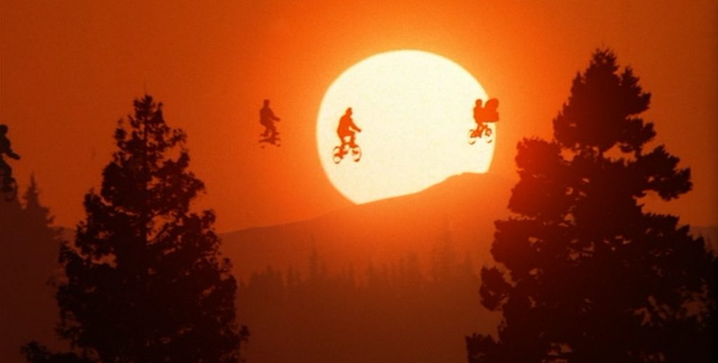
The most iconic shot from the movie is the one in which E.T. lifts Elliott into the air on his bicycle, and they fly past the face of a giant moon.  The shot was expertly done, though you could still see those pesky dark outlines around the flying characters which damaged the illusion.  It was very good, but not perfect.  And the shot was mirrored later in the film when five boys on bicycles fly into a giant setting sun.  It was really pretty fantastic!.  Incidentally, the dark outlines were something that the CGI enhancements were able to remove, and the result looked fantastic!

And finally there was E.T.’s spaceship.  It was a really cool globe-like design with lots of bright and colorful lights that looked great against the dark forest background.  And the rainbow that it painted across the sky as it departed at the emotional end of the film was a nice touch.  There were so many things that Spielberg got right, and I think the film really deserved its Oscar win.

1982 – Blade Runner

Blade Runner – 1982

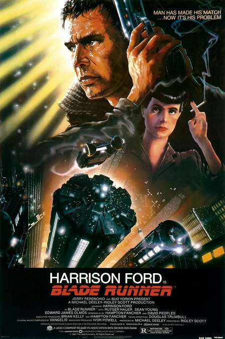
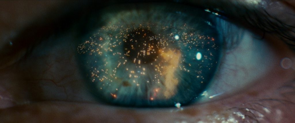
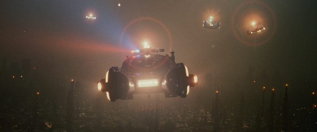
This movie had some seamless special effects that were visually fascinating.  Their matte paintings, their blue-screening, and detailed scale models were spot-on.  The film gave us images that were unique and eye-catching.  At times it was pure science-fiction, while at other times it was a film-noir detective story. Though it is significant to note that the film was set in 2019, and I still don’t have my flying car.
Wikipedia didn’t have much to say about the film’s special effects except that, considering they were before the era of purely digital effects, they were practically perfect.  Since it was so short, I’ll include it all here. “The film’s special effects are generally recognized to be among the best of all time, using the available non-digital technology to the fullest.  In addition to matte paintings and models, the techniques employed included multi-pass exposures. In some scenes, the set was lit, shot, the film rewound, and then rerecorded over with different lighting.  In some cases, this was done 16 times in all.  The cameras were frequently motion controlled using computers.  Many effects used techniques which had been developed during the production of Close Encounters of the Third Kind.”

That last observation made sense.  A few of the effects seemed to have a similar look to them.  For example, both films used bright colored lights glowing against black backgrounds, which made them stand out in a particular way.  Also, the way many of the miniature models were fitted with lights was fantastic, really selling the illusion of reality.  And as for the multi-pass exposures, It made everything look dark and misty, but I saw no dark outlines around characters or objects being composited into the paintings.  None.

One of the problems, I thought, was a big one.  The movie, in general, was way too dark, not in subject manner, but visually.  But I know, I get it.  It was a choice that was made for both the general aesthetics of the film and the narrative, itself, and it was very effective in creating a mood for the audience.  Unfortunately, some of it was actually difficult to see.  It was so dimly lit that it was sometimes hard to see what was happening on the screen.  And there were many scenes or shots that were back-lit, making the main characters in the foreground incredibly dim.

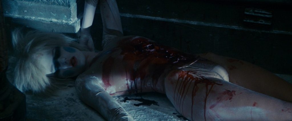
That being said, I really had no problem with the film’s effects.  If I had any problems with the film and its effects, it would be the pacing.  Everything was very slow, from the story to the effects.  There were only two action sequences in the film. When Decker chases and retires Zhora, she crashes through several plate glass windows… in slow motion.  When Decker fights and retires Pris, she violently thrashes about on the floor as he fills her with bullets.  But the climax of the movie had very little action.  Thus, the effects in the climax were kept to a minimum.  Add to that quick scene in which Roy pokes out his creator’s eyes and murders him, and that was about it besides the fantastic sci-fi environments, the cityscapes with the giant video billboards, and flying cars.

1981 – Raiders of the Lost Ark (WINNER)

Raiders of the Lost Ark – 1981 (WINNER)

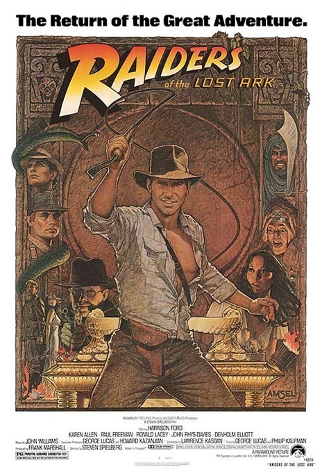
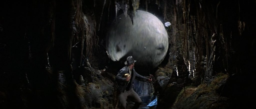
It’s hard to know where to start with this special effects extravaganza.  This was still a film that was firmly rooted in the era of practical effects, and as such, they were inventive and excellently executed.  There were a ton of stunts, animated effects, animal effects, very competent blue-screening, and some great matte paintings.  There were fire effects, ice effects, lightning effects, explosions, chases, skeletons, angels, and, of course, a giant rolling stone ball.

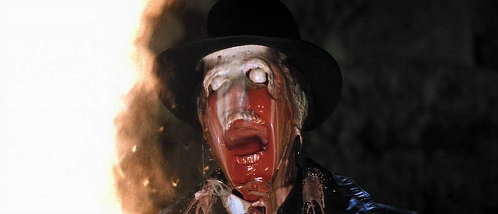
But for me, one of the most memorable effects in the film were the deaths of the three main villains in the film’s climax.  One’s head shriveled, one’s face melted off, and the last one’s head exploded.  The best one, the melting head, which had never been done before in quite such gory detail, was accomplished by doing a plaster mold of the actor’s face, sculpting a stone skull, and then painting on gelatin layers of different colors that would melt off the skull in stages.  A special gelatin was created that had a very low melting temperature.  Then, when the cameras started to roll, intense heat lamps were directed at the fake head.  The effect was frighteningly effective!

In the same scene, we see ghostly angels come out of the ancient artifact that change from beautiful to horrific just before lightning shoots out from the lost ark, killing all the Nazi soldiers.  Then a fantastic firestorm swirls around the bound heroes, freeing them and consuming all the dead bodies.  It was an exciting and utterly fantastic climax to the adventure story.

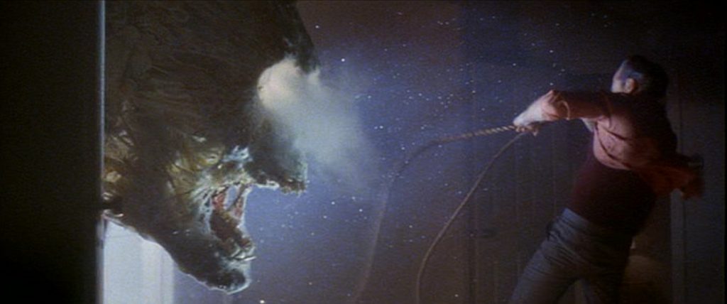
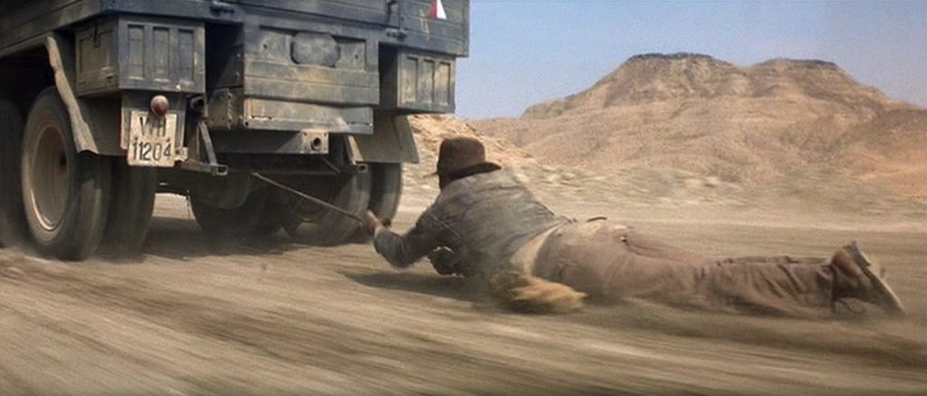
But I’d be remiss if I didn’t mention the incredible stunts!  Again, probably the most memorable one was when Indiana Jones hooked his bullwhip to the underside of a truck and was dragged along behind the speeding vehicle.  In reality, his clothes would be shredded, not to mention his skin, but never-mind that.  During that scene, there are men climbing all over, and falling off of, the outside of the truck.  But also quite memorable was the scene inside the Well of the Souls, from which Jones escapes by mounting a giant toppling statue and crashing it through a wall.

And, of course, there was the swarm of creepy animals, a repeating trend that every other movie in the franchise has continued.  Here, it was snakes.  They were there in their hundreds, covering the floor of the Ark’s resting chamber.  But the actors were never in any real danger, not even from the king cobra that threatened them.  It was behind a glass window, though if you look super carefully, you can see the snake’s reflection in the glass.
All in all, the film showed audiences fantastic things they had never seen before.  I remember seeing the film as a child and being terrified by its climactic horrors.  And because the effects were all practical ones, there was a solidity and a realism in them that CGI effects sometimes seem to lack if they are poorly done.  Today, most of these stunning visuals would have been created in a computer.

1980 – Dragonslayer

Dragonslayer – 1981

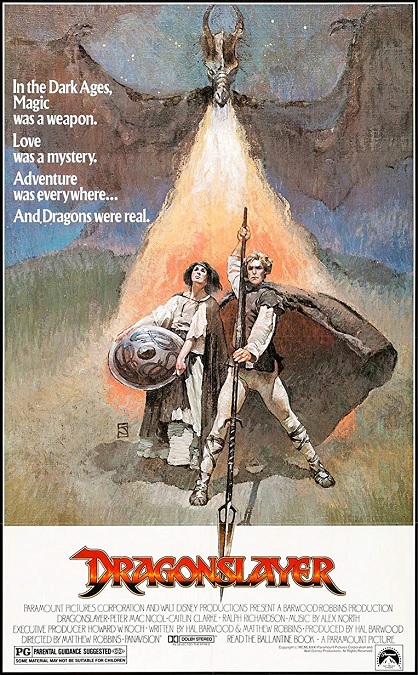
This was a fantasy movie that had a lot of great special effects.  The main draw for the film, the thing we have all come to see, was the dragon, and this is where the effects really shined.  And they were really awesome!  This was the first time we had ever seen the stereotypical version of the mythical monster that looked anything close to realistic.  But then there were a few blue screening shots that were way too obvious, undercutting the fantastic creature effects, just a little.

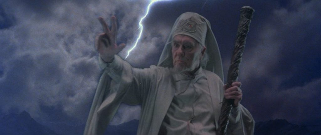
So let’s get those out of the way first, since the good far outweighed the bad.  The shots of the dragon flying looked pretty bad.  You could clearly see the tell-tale black outlines around the gliding beast.  But it was more than that.  Right before his final battle with the great Vermithrax, Ulrich the Sorcerer summons a storm, allowing him to strike the dragon with lightning.  His apprentice and his woman can be seen climbing a mountain, clearly a separate image from the swiftly moving clouds that can be seen behind them.  The lighting seemed completely wrong to make them look like they belonged in the image. 

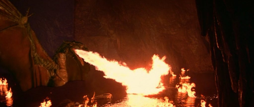
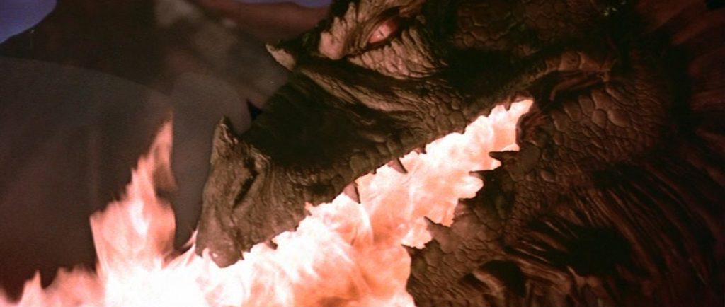
But that was about it.  The rest of the effects were pretty good.  Some of them were as simple as color enhancing magical flames to make them appear green, or making a glowing amulet appear to move across a table on its own.  Others were more elaborate like making a spear glow red hot with magical heat, or making a dead wizard come back to life in a cyclone-like column of fire.  And then there were some of the more physical effects like when our hero fights three baby dragons or, the close-up shots of Vermithrax’s head as she breathed deadly flames down upon her enemies.  And we musn’t forget all the wonderful matte paintings used to create wonderfully vast landscapes and environments.  These were all well done, though some of the animated effects might look a little dated by today’s standards.

But really, all that was secondary to the real reason we all came to see the movie.  The dragon, in all its terrible might, was exceptionally well done.  The wide shots in which you can see its large and sinuous body were all done using stop-motion animation that was incredibly smooth and easy to watch.  They used the go-motion technique which added motion-blur to the creature.  And the design of the dragon was cool, too.  It was properly menacing and powerful, and yet almost beautiful at the same time.

And they used a variety of different methods to create the illusion of a live dragon on the big screen.  They built a sixteen-foot head and neck assembly, a twenty-foot tail, thighs and legs, claws capable of grabbing a man, and a 30-foot-wide wing section.  They also sculpted a massive dragon head for the close-up shots that used  a combination of radio controls, cable controls, air bladders, levers, and hand controls which allowed for a wide range of emotions to be displayed on the monster’s face.  The effects were wonderful, giving the world a live dragon, the likes of which had never been seen.  And I call that pretty amazing!