2021 – Dune (WINNER)

2021 – Dune (Winner)

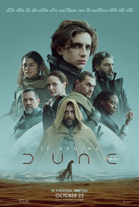
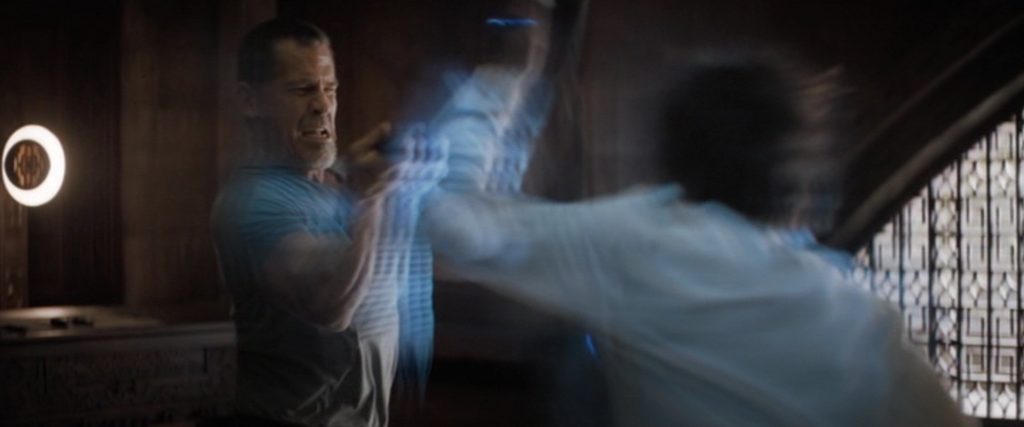
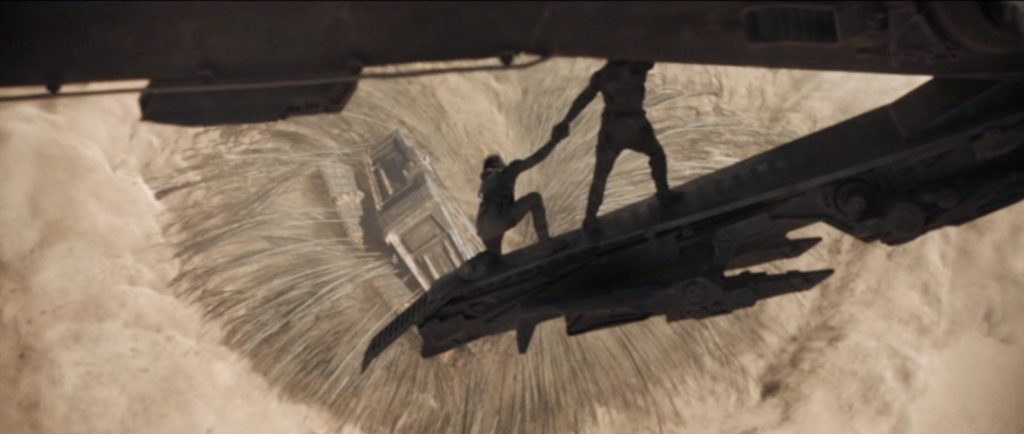
The visual effects for Dune were incredible.  They were unique, distinctive, flashy, captivating, and just plain impressive.  The movie, as a whole, was certainly good, and a big part of it was the visuals.  The filmmakers paid attention to the wonderful environments required by the narrative, and built the alien worlds in such a way as to make them other-worldly, and yet always grounded in a reality that audiences would be able to accept as real.

In doing a little reading about the film’s visual effects, I learned that the director, Dennis Villeneuve, used as many practical effects as he could.  You see, I’m noticing a bit of a trend in Hollywood, especially in big-budget films.  CGI effects and environments are wonderful.  When used properly, they can make the fantastical or the futuristic as believable as reality.  But CGI is not yet so perfect as to replace actual reality.  Filmmakers seem to be discovering that reality, enhanced by a sprinkling of CGI effects, often produces better results on the screen.  The CGI is still there, but it is used more sparingly.  Personally, I like the trend.

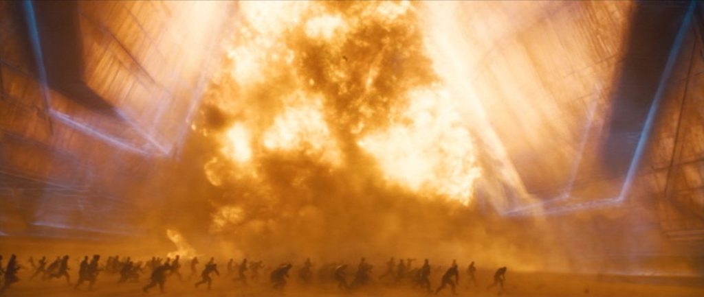
To this end, more complete sets were built, rather than building small pieces of sets that were then completed with large portions of CGI.  The dragonfly-like helicopters that were used, were full scale models that the actors could interact with, with functional cockpits.  They were made to fly with the use of cranes, and the insect-like wings were digitally added in post.  One of the coolest scenes in the film was the invasion of Arrakis.  The massive explosions, the ethereal blue shields, and the raining missiles were visually stunning, and were a carefully constructed combination of practical effects and CGI.

There was plenty of blue-screening used, but something they did that took it to a new level was to use different colored chroma key screens, based on the environments that would be added in post.  Instead of blue or green, they used sand-screens for some of the shots that took place in the deserts of Arrakis.  Gray screens were used for scenes that took place on Caladan.  The result of these different-colored screens was that post-production compositing was much easier, and the finished product appeared much more natural on the screen.

But the one effect that could not really be done practically, was the giant sand-worms.  Their scale, and their completely alien nature would have been hard to believably create practically.  But as for that, I found it pretty impressive that they were able to show the behemoths moving through desert sands like whales swimming through water.  It was clever of them to use water based CGI programs combined with sand based software.  Impressive!  And the massive maws of the beasts filled with baleen were really cool!  Great design, great execution!
2021 – Free Guy

2021 – Free Guy

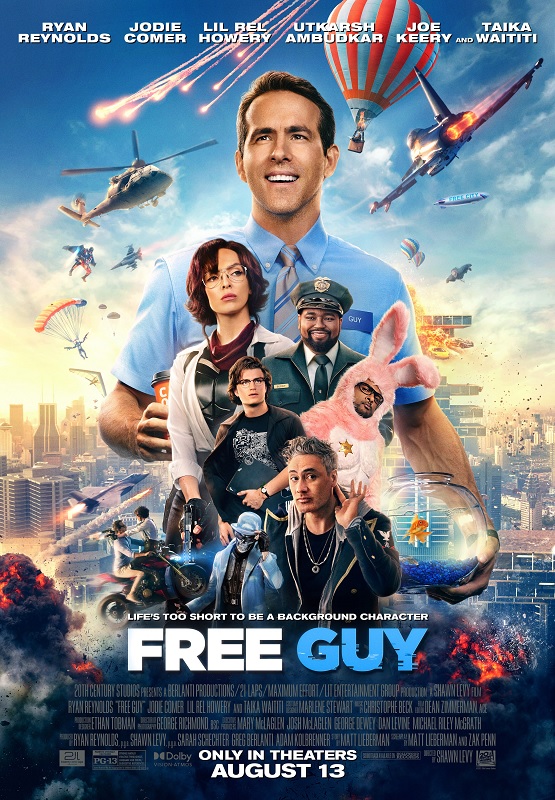
This was a fun movie, and the visual effects really reflected that.  The effects were creative and bright, and just pleasant to look at.  The color palate of the movie was flashy and familiar for anyone who has played video games.  And I liked that as part of the narrative of the film, it was both common and no reason for any concern to see explosions, gun-fire, car crashes, burning people, and helicopters crashing into buildings, just as a typical day.  Things like that were happening in the background of many scenes, and yet were not the focus of the scene.  It was a very interesting dynamic.

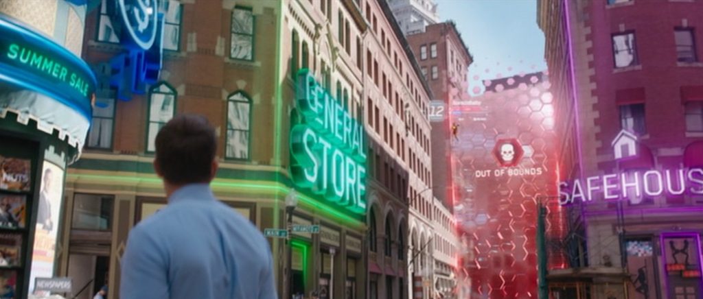
The visual style of the movie was perfectly crafted.  One of the great things they were able to do that helped to tell the story was to make it instantly obvious when a scene took place inside the game, and when one took place in the real world.  They used specific colors and lenses, as well as deliberate framing and camera movement techniques that made the differences easily recognizable.

But I think what made Free Guy so unique was the in-game experience that it created.  For example, when Guy puts on the sunglasses, and sees the world through the eyes of a player instead of an NPC, everything changed.  Everything was filmed as live-action, and yet it was an unmistakable video game experience.  All the glowing signs and the digital in-game markers looked exactly like they were supposed to, like live-action versions of video game interface devices.  It was really cool and very creatively designed.

As a side note, I have to say that it was also really awesome to see live action versions of specific video game devices like the gravity gun from Half-Life 2, or a Mega Buster from Megaman.  But my favorite was from the awesome game Portal.  The Portal Gun effect was really fantastic!  I wish they could have found a way to have GLADOS on the screen, if only for an instant!

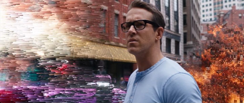
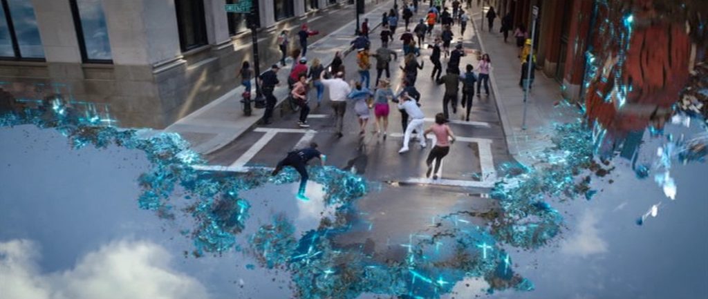
And the film’s climax was two-fold.  First there was the destruction of Free City.  As the bad Guy, Antwan, takes a fireman’s axe to the servers in the real world, the city starts to digitize and dissolve in the game.  As the buildings begin to crumble and dissipate, the NPC population flees in fear.  Some of the people are even lost along with the environment, and it was a cool effect.

But the other fun effect was the character of Dude!  They digitally put Ryan Reynold’s head on the body of professional bodybuilder, Aaron W. Reed.  It looked just real enough to be believable, but just fake enough to be, as the narrative required, incompletely created and thrust into the game before it was ready.  It was brilliant, and if truth be told, slightly creepy at the same time.  Well done, everybody!  This was a fun movie with fun visual effects.

2021 – No Time To Die

2021 – No Time to die

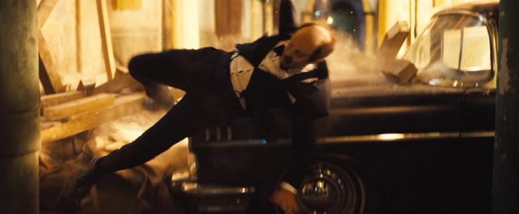
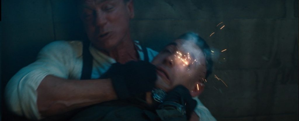
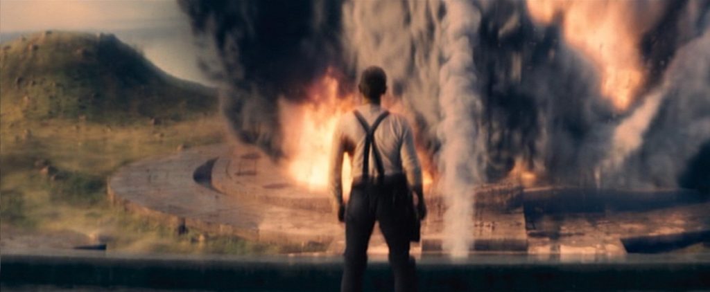
Well, I know your first question is going to be, “Why only three stars?”  It isn’t because the effects weren’t good.  In fact, they were very good.  But I’ll be honest, I’ve seen them all before.  It was a typical Bond film.  There were car and motorcycle chases, lots of gunfire, and a lot of things blowing up.  But there was nothing I haven’t seen before.  It was an action/spy thriller, and the action was certainly thrilling to watch.  But I’ve been trying to think of an effect that I haven’t seen in some other movie, and I can’t think of one.

In fact, I did a little looking on the internet for a reason why No Time to Die was nominated in the Visual Effects category.  What I found was an article written by Edward Douglas on Goldderby.com, and a video on Youtube that offered a short breakdown of the film’s effects.  Here is what Douglas had to say.  “Their visual effects work on “No Time to Die” is so seamless that few people will realize how much of the movie relied on those VFX. In order for director Cary Joji Fukanaga to pull off his movie’s stunts without putting his actors or stuntmen in danger, the VFX team could digitally place actors’ faces on stunt performers, which has become the norm in action movies, and save some elements of explosives and gunfire for post-production. The VFX were also used to create and enhance the movie’s real world locations, either adding or removing elements as needed.”

So basically, my assessment was right.  There was some masterful digital compositing and some seamless face replacements.  There were explosions and gunfire, and there were stunts and car chases.  But if that was all, then it wasn’t enough for me.  The two and a half minute video showed some of those things, but not much else.  Although, there was one thing the video revealed that I found interesting.  The scene where the American CIA agent, Paloma, wearing high heel shoes, is karate kicking a bad guy, apparently her legs were CGI.  Who knew?

There were also a few other interesting digital effects, but nothing spectacular or flashy.  There was the shot of a bomb-like device plummeting down an ele4vator shaft, spraying electromagnets onto the walls in a spiral pattern, an effect which lasted about a second and a half.  That looked interesting.  And there was the shot of a super-spy glider deploying its retractable wings, and that was cool.  But again, the effect was brief.  There was just, in general, nothing new or innovative here. 

But I have to ask, since there is no category at the Academy Awards for Best Stunts, are stunts essentially folded into the Visual Effects category?  I imagine they are, and that brings up an argument that I have heard before, more than once.  Should Best Stunts have their own category?  There are arguments for and against, and everyone seems to have a valid point.  But I don’t know the answer.

2020/21 – The Midnight Sky

 The Midnight Sky – 2020/21

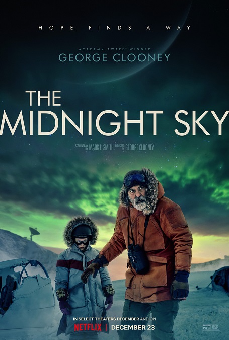
I had to do a little research and reading to figure out why this movie was nominated for an Academy Award in the Best Visual Effects category.  Honestly, it wasn’t very apparent after I finished watching the film.  Initially, I thought that there was nothing new about the visual effects.  I’m really sorry to say that even after doing my bit of research, I hold to that opinion.

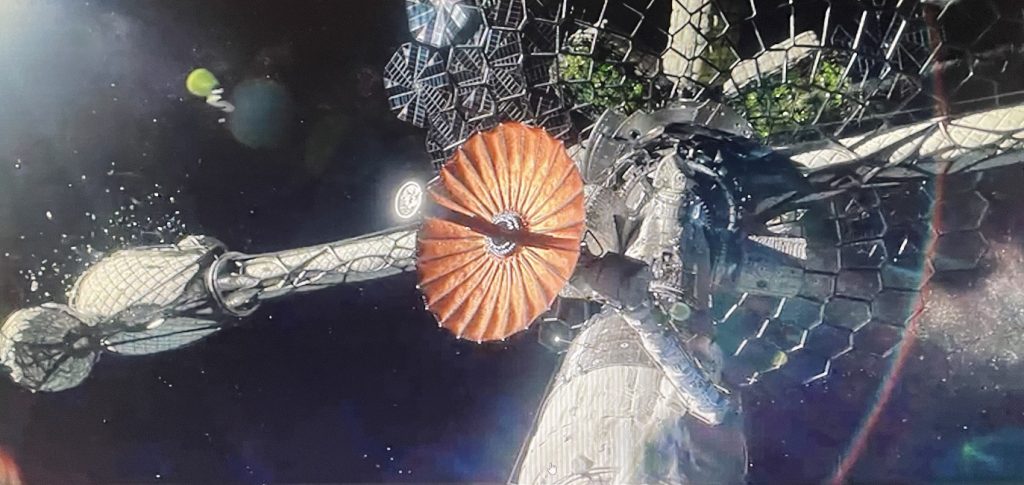
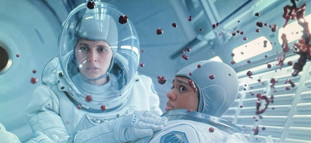
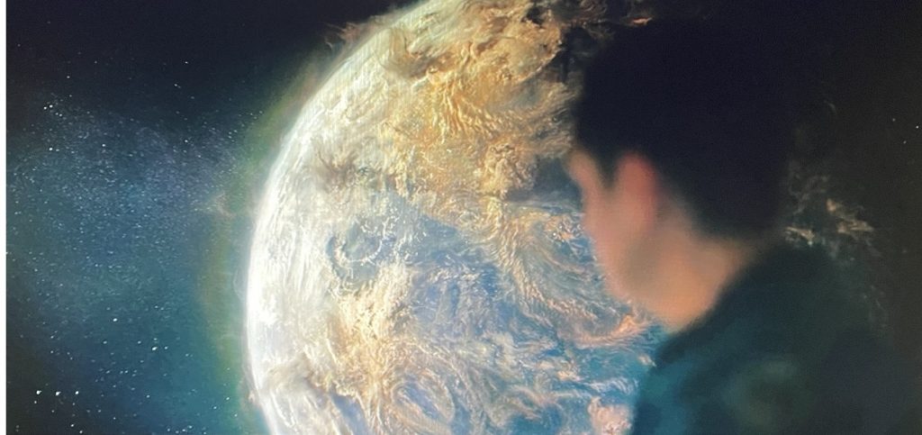
There was no visual effect technique in the film that I hadn’t seen in other films.  Yes, they did them all flawlessly, but where was the innovation?  And they seemed to be no better than what I’ve seen in those other films.  There was the space ship, the meteor shower, the weightless actors, the weightless blood, the CGI space suit helmets, the blinding snowstorm, the CGI wolves, and the devastated globe of the Earth.  And as good as these effects were, I can think of several movies where the exact same effects were featured.  Just watch the movie Gravity, and you’ll see most of these effects, and done better.

And I have to point out that half of the effects like the space ship and the image of the destroyed planet fall under the domain of the production design team.  Yes, the visual effects team brought the visuals to life, but that’s just the end result.  The production design staff did the ground work of planning it all out before it ever got to the digital artists, though I have to say, those things looked great on the screen.

One of the more impressive effects was the digital space suit helmets.  You see, if the actors were wearing actual helmets, they would have been reflecting everything from the filming cameras to the crew running them.  So the actors performed the scenes with no helmets, and the CGI glass was added in post.  This included the appropriate reflections of what would have been behind the cameras.

I also liked the snowstorm effect.  Yes, the effect has been seen plenty of times before, but this one looked incredibly real and fiercely intense.  However, the article I read felt it necessary to say how difficult and impressive the CGI wolves were to create, but to be honest, you could barely see them passing in the background of a few brief shots.  I’m sorry, but they didn’t seem all that impressive to me.

And finally, I liked the design of the space ship.  At least both its interior and its exterior were pretty unique.  The giant spider-web design of the debris shield was pretty cool, and the laser-printed components of the ship’s interior gave the aesthetics a more organic look than most movie space ships.  I also liked how some of the walls were not made of simple metal, but a more fabric-like material.  When a meteor hit the ship, the walls rippled and bounced back into shape instead of getting crushed and damaged.  But again, that has more to do with a great and interesting design than the Visual effects artists.

2020-21 – The One and Only Ivan

The One and Only Ivan – 2020-21

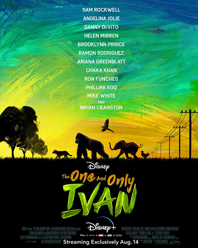
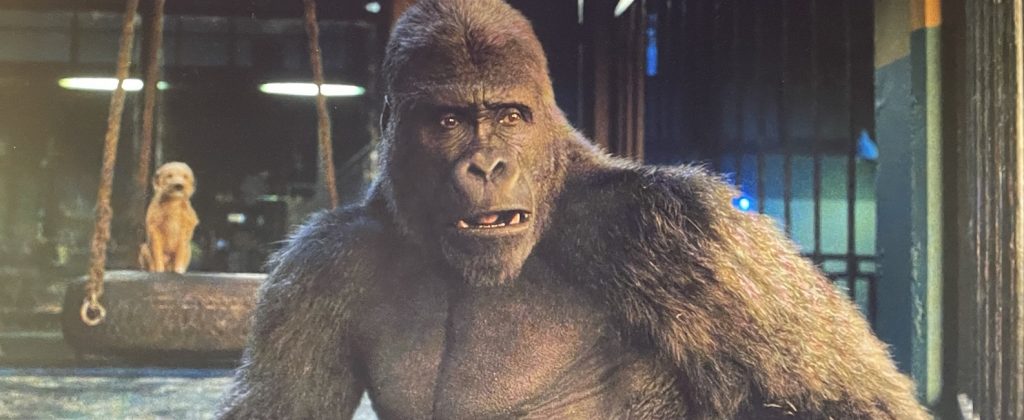
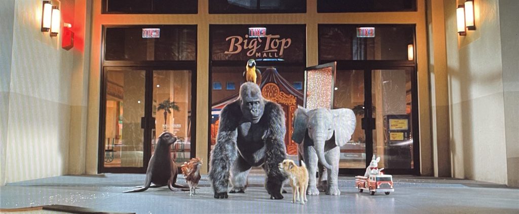
I’ll start this off by saying that Disney doesn’t put out bad material.  Their visual effects are always… well, almost always… top notch.  The main draw of these visuals is the talking animals, for which Disney is famous.  The photo-realistic CGI animals looked fantastic.  Like I said, Disney doesn’t put out bad material.  But then, why did I only give the visual effects three stars out of five?  Because, come on, Disney!  We’ve seen it all before, and executed just as beautifully.

I’m basing my opinion on films that have been nominated for Best Visual Effects in recent years that used the exact same tricks.  I saw no difference in the quality of the talking animals between this movie and The Jungle Book or The Lion King, or older films like The Golden Compass or The Lion, The Witch, and the Wardrobe.  Does that make me question the quality of the CGI effects here?  Of course not.  But I don’t get why the same visual effects keep getting Oscar nominations, when the actual quality has not improved, or gotten more innovative, or something!

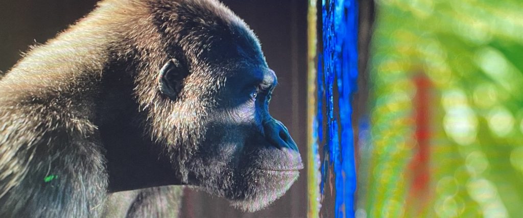
Keep in mind, this is just my uneducated opinion, but I’d say there were certain effects that I felt crossed the line into slightly cartoonish.  The main character of the silverback gorilla, Ivan, was great.  It was alright if, every once in a while, his emotive expressiveness looked a little too human.  After all, the movie is geared towards children of around five or six years old, and I understand that they might require a more recognizable display of emotion on the faces of the animals.  And Gorillas have nearly human faces that can realistically mimic our facial expressions.

But the baby elephant, Ruby, was the worst offender.  They went too far with the human expressions on the non-human face, and it was mostly in the eyes.  To be sure of my opinion, I went on YouTube, and watched a few videos of real baby elephants.  Ruby reminded me more of the animated Disney feature, Dumbo, than an actual live elephant.  Real elephants have smaller eyes that are much darker and unexpressive.  I understand why they had to make the eyes expressive on a near human level, but it took away from the realism they were trying to achieve. 

And one other thing.  The animals in this movie were too physically flawless.  Part of what makes a painted, or CGI, image is the imperfections that are crafted into it.  If there are none, it looks too much like an artificial image.  And I think all the CGI character in Ivan suffered from this.  They weren’t rough enough to be believable as real animals with human intelligence.  They were too squeaky clean and flawless to make me believe they were real.  This movie could have learned a lesson from the superior effects of the 2012 nominee, Life of Pi.  When I watched that film, I was shocked to learn that the character of the tiger was 100% CGI.  At times, I thought it was real, and I got all the emotion from its realistic face that I needed.

2020/21 – Tenet (WINNER)

Tenet – 2020-21

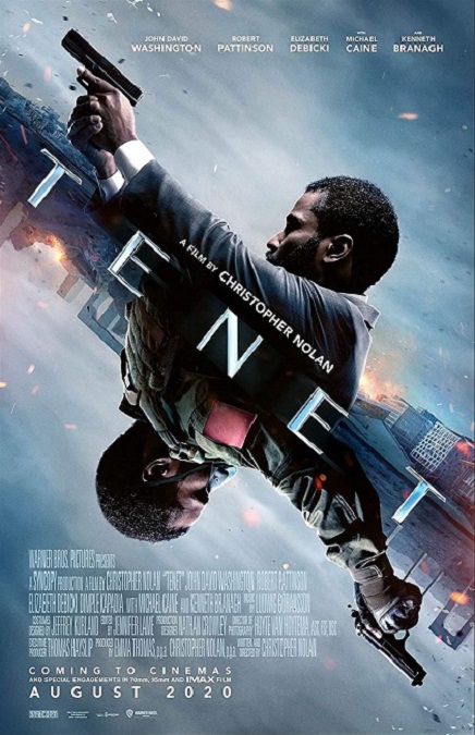
This movie’s visual effects really deserved the Oscar they took home, and for several very specific reasons.  The visual effects were obvious when they were shown on the screen, which usually is a bad thing.  Normally, some of the best visual effects are the ones you can’t see.  But here, the opposite is true.  As part of the movie’s fantastic plot, you are supposed to be able to see everything, and they made all the strange and unnatural images look perfectly natural and realistic.  And due to the nature of these effects, it was an amazing feat of filmmaking.

What I mean is that some images in the film were moving forward in time, while others that were on the screen at the same time, were moving in reverse, which the film called inverted.  The hole in the glass becomes whole before the gun is fired, and the inverted bullet shoots back into the barrel of the weapon, while at the same time, a non-inverted man ducks to avoid the reversed shot, knowing where the bullets are coming from, because of the holes in the wall.  It was honestly, a little confusing from a plot perspective, but also from a visual perspective.

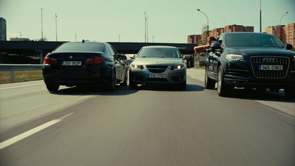
And speaking of perspective, we’ve all seen movies that show you a scene from one perspective, then later in the movie, we see the exact same scene from a different perspective.  But here, this is done with one going forward in time, and one going backward.  The perfect example is shown in one of the film’s most exciting action scenes: a car chase on a motorway.  The drivers come upon a crashed car which picks itself up and flips back onto its wheels, then starts speeding in reverse in the same direction as the drivers.  Later, we see the same scene from within the un-crashed vehicle, as it is driving forward, and the other cars are moving in reverse!

But it all looked pretty… natural.  So how was it done?  How did they film a fight scene with a regular man and an inverted man?  One trick they used was to decide, in a given shot, which actor had to fall.  Since that can’t be actually done in reverse, they had the other actor do the scene in reverse.  Many actors and stunt teams had to learn their movements backwards and forwards.

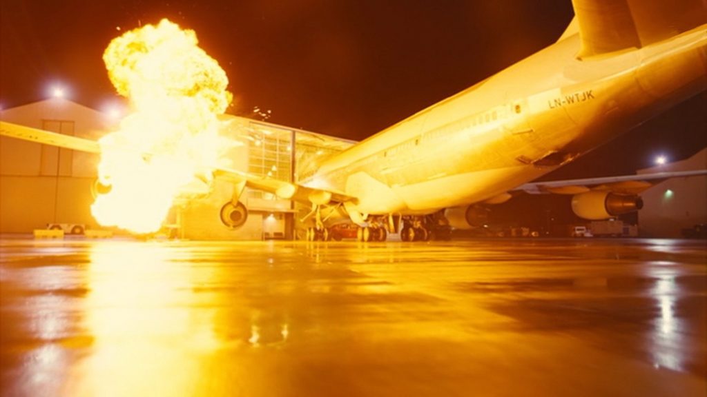
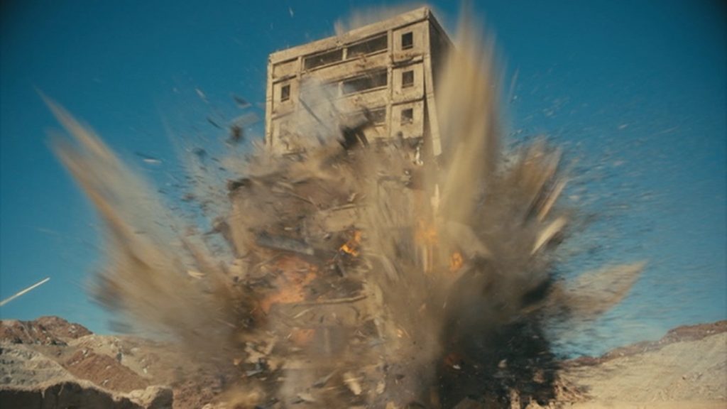
There was another great scene near the film’s climax in which a building is both exploded and imploded at the same time.  To accomplish this, two buildings were constructed, one of them an exact replica of the other.  They were both detonated and filmed from matching camera angles.  Then they played one of the films in reverse, and composited it together with the other footage.  Mesmerizing!

But for all this movie’s amazing visuals, very little CGI was used, compared to its contemporaries.  Most films of this genre use about 2,000 effects shots.  This one, thanks to director Christopher Nolan, only had around 300, which makes the Oscar win that much more impressive.  The rest were just amazing practical effects. 

2020/21 – Mulan

Mulan – 2020/21

So, I must confess myself a little… disappointed in the visual effects for Mulan.  I knew going into it that they had changed the story and added the character of a supernatural witch, so I was expecting some eye-catching imagery, and there was a little of that, but not very much.  There just wasn’t enough that caught my attention as either innovative or interesting.  Then I did some reading in an attempt to see what I was missing.  But the articles I read didn’t give me much to go on.

I even watched a three or four minute breakdown of the visual effects for the movie, and most of what they showed was fancy compositing and set extensions.  There were also a few CGI animals, some of which actually looked a little fake, like the rabbits running along with Mulan’s horse near the beginning of the film.  Even the magical phoenix had moments where it looked too cartoonish.  I mean, it looked alright, and I can’t put my finger on exactly what was throwing my eyes off, but there was something that made it look less than real.  That being said, the CGI chicken the young Mulan is chasing was not bad at all.

The effect that the video breakdown and the articles really pushed was the compositing to build the vast backgrounds and the enormity of the Imperial City, and I have to give them credit for those things.  The best visual effects are the ones you don’t see.  I would never have guessed that many of the shots were done against green-screens.  For example, the shots where the Huns are riding their horses towards the City walls, had a composited background.  Apparently, the landscape where they actually filmed the riders was too flat, so they added a far distant mountain range in the distance, and some dust to be kicked up by the horses.  That was well-done, and I would never have known.

But the effect that really impressed me was the avalanche.  To my inexperienced eyes, it seemed like it wouldn’t be hard for experienced digital artists to create, but it looked great on the screen.  The way the snow and ice slid off the mountain, turned into powder, and flowed like a cloud onto the unsuspecting Hun army was pretty cool.  And then there was the new character of Xianniang, a shapeshifting witch.  She changed forms, turned into a flock of birds, made the long sleeves of her clothing come to life and attack her enemies, and that sort of thing.  And both she and Mulan did a lot of physics-defying acrobatics by means of extensive wire-work.  It looks cool enough, but it is certainly nothing new.

And overall, I guess that’s my main complaint about the visual effects of this movie.  They were all effects that we have already seen far too often, and in better films.  This movie had the potential to be so much more.  I suppose I was just expecting more, and for me, the visual effects seemed to be struggling to deliver.

2019 – Star Wars: The Rise of Skywalker

2019 – Star Wars: The Rise of Skywalker

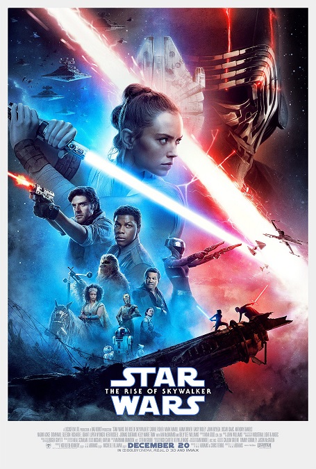
Here we are with chapter nine of the main Star Wars franchise.  And when it comes down to it, I believe that, as pertains to the visual effects, being the culmination of the Skywalker Saga has both its advantages and its disadvantages.  So I must do my best to leave the shortcomings of the script aside, though I actually liked the script more than most people seem to.  On the plus side, they certainly gave us that big epic visual climax that we wanted.  But on the minus side, it is Star Wars.  How visually stunning is yet another lightsaber battle going to be?

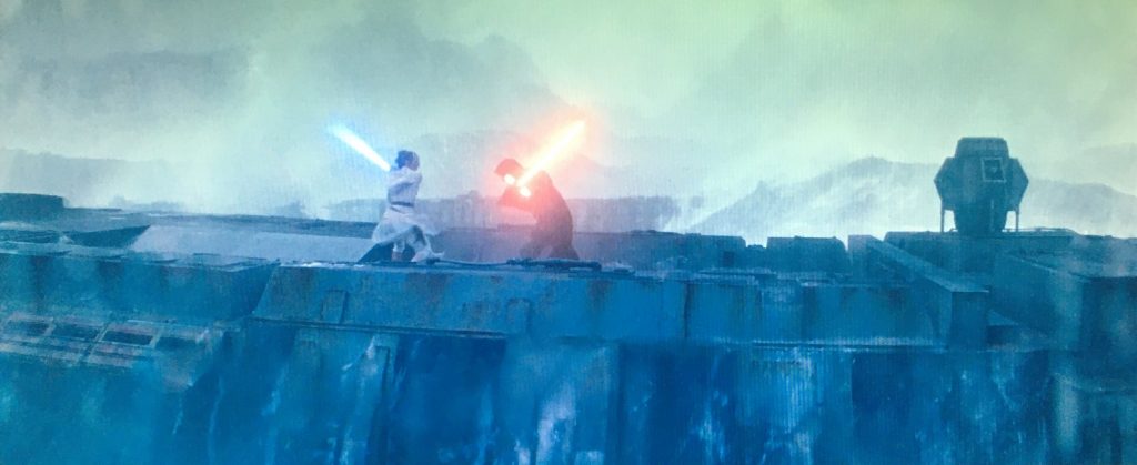
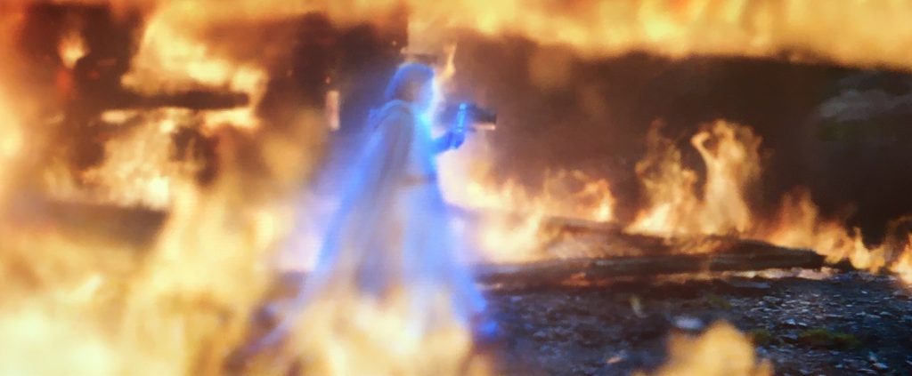
As you’d expect, the laser-sword effects were up to the franchise’s normal high standard.  They looked great, but why wouldn’t they?  They’ve had eight other films to practice the same effect to get it looking fantastic.  I think they actually had it perfected by the time The Return of the Jedi came out in 1983.  In other words, nothing new there.  There was a really cool scene where Rey and Kylo Ren had a lightsaber duel while they were both in different places.  I loved how it kept cutting back and forth between the two locations, mixing and blending them together in a visually awesome way.  However, as I think about it, that probably had more to do with some pretty innovative directing and great editing, than mere visual effects.

And the same could almost be said of the space ship battles, though I think those were looking pretty darn good in The Empire Strikes Back in 1980.  They were just as expected – fast paced and thrilling.  The Millennium Falcon looked as cool and iconic as it always does… in five other Star Wars movies, six if you count Solo: A Star Wars Story.

But I think what this film had to offer was the new and unique digital environments that served as fabulous backdrops for the lightsaber battles and the spaceship battles.  For example, she saber duel on the narrow platform in the middle of the raging ocean was really cool.  The way the splashing water interacted with the actors and the sabers was awesome.  And the final ship battle where thousands of small ships arrive to fight against the fleet of planet-killing Star Destroyers was something that we had never seen before, and I appreciated that.

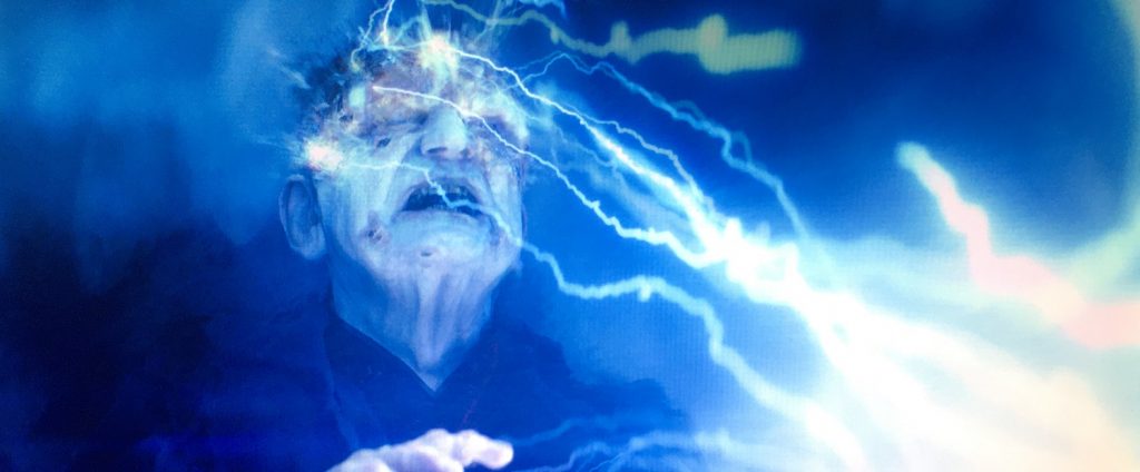
And I have to make mention of the really unique way they used the evil Emperor’s force-lightning effect.  You see, here, he has become so powerful that he is able to shoot his blue bolts of electricity from the surface of a planet up into space, destroying rebel space ships.  If that’s not grand and epic, I don’t know what is.  And when it was turned back on him, it looked fantastic – so much better than when the same thing happened in Episode III.  It was so much more realistic.  Here, you can actually see his flesh burning away, not just a shriveled head.  In all, the effects were perfectly executed, even if we’ve seen a lot of them before.

2019 – The Lion King

The Lion King – 2019

First, I’m just going to say that this movie was kind-of a one-trick pony, the trick being photo-realistic CGI animals.  Second, it’s the same trick that was used in Disney’s 2016 film, The Jungle Book, and while the technological superiority may have been better, I couldn’t really see much difference between the quality or realism of the talking animals between this movie and that one.  And third, the very nature of the film, hyper-realistic talking animals, as opposed to cartoon animated talking animals, triggers a disconnect in my brain that often destroys the very realism the filmmakers are trying to achieve.

When it comes down to it, I’ll admit, I didn’t really care for this movie, and that disconnect was a big part of my reasoning, though it wasn’t the only thing I didn’t like.  But this isn’t a review of the movie, just its visual effects.  Did the animals look real?  Of course they did.  They looked incredibly real.  But again, this is nothing new. So what else did the visuals of the movie get right?  Well, all the environments were digitally created, as well.  In fact, I think I may have been more impressed with the realistic scenery than I was with the talking animals.  Unfortunately, I don’t think that was the filmmakers’ intention.

One of the new technologies that was used to make this movie was actually pretty interesting.  When making a modern movie, it is now pretty common practice to have roughly animated pre-visualizations made.  It is almost like an animated story-board.  But here, they went a step further, using virtual reality equipment.  The incredibly detailed 3D environments were all created ahead of time.  Then the director, John Favreau and his production crew would put on VR headsets and explore the virtual sets, setting up shots and camera angles.  I’m guessing this eliminated the need for location scouting.  And if they wanted anything in the environments changed in any way, it could be done fairly easily – remove that rock there, make the angle of that slope steeper, that kind of thing.

And there are other advantages to having a 100% CGI movie.  For example, you never have to deal with actual nature.  There are no delays due to bad weather, bad lighting, or uncooperative animals.  In fact, the animals all behaved exactly as they were made to.  Unfortunately, I think that was also a point against the realism of the film.  The characters may have looked real, but they didn’t behave real.  Talking aside, they didn’t always move like real animals.  The perfect example is when they sang The Lion Sleeps Tonight.  The fact that they were dancing made them look so fake.  I tried to use my suspension of disbelief, to accept that animals in this world could dance and sing, but because the animals looked so real, I just had such a hard time believing the scene.  So I suppose this might just be an inherent problem with CGI animals that look real but don’t behave real.

2019 – The Irishman

The Irishman – 2019

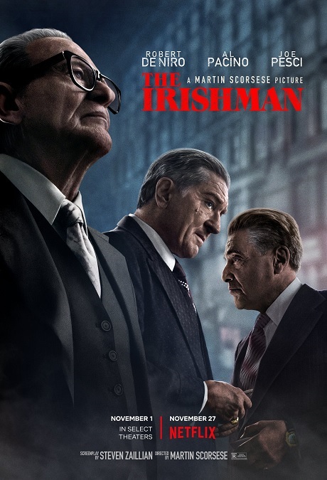
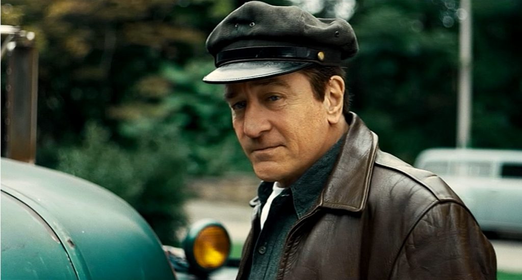
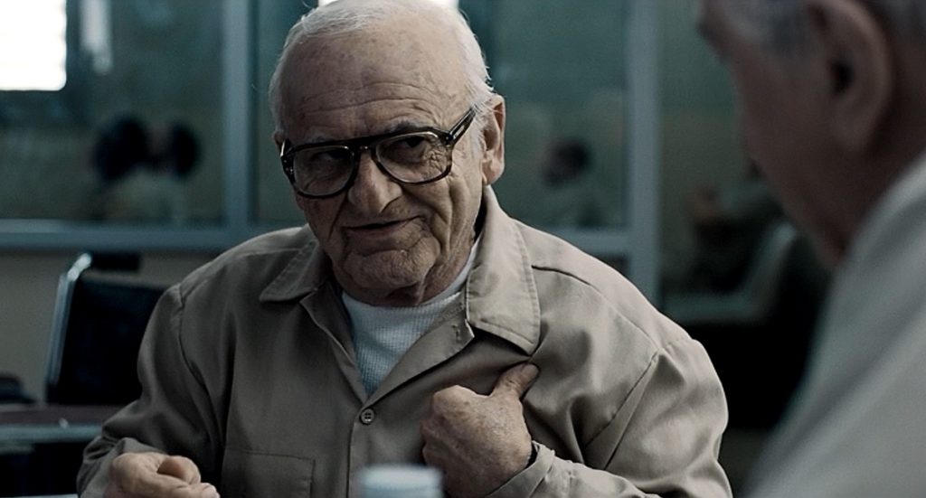
Ok, I’ll say it right off the bat.  The visual effects in this movie were nothing more than a one-trick pony, though the trick was, I’ll admit, a masterful one.  The only real effect in this film that was noteworthy was the de-aging of the main actors.  The film was in the style of an epic that took place over a long period of time.  The three main actors, Robert DeNiro, Al Pacino, and Joe Pesci were shown at various ages over the course of 50 years.  In the past, this was generally done with either makeup and prosthetics, or finding other actors that resembled the stars that we all know and love, but here it is done with CGI.  And, unfortunately, that was it.  That was its one claim to greatness in its visual effects. 

So lets explore that one effect a little.  The film’s director, Martin Scorsese didn’t want the actors to have to wear dots, or golf balls, as he put it in interviews, on their faces.  He needed his actors to be able to interact with each other without the normally required facial prosthetics getting in their way.  A visual effects designer named Pablo Helman, along with the people at ILM, developed a new technology. 

A new kind of camera was created that was equipped with a row of three lenses.  This gave digital artists and renderers the same image from three slightly different angles.  In addition to that, the outer two lenses captured infra-red images.  Then they went through the archives of the three actors’ films so they could intensely study what they looked like when they were younger.  They also had the actors sit in front of a camera and go through an extensive range of facial expressions, giving the digital artists even more data on how their individual faces moved.

Finally, they analyzed the newly-filmed performances, and allowed their computers to recreate the actors, using all the images collected from the three-lensed camera, the archival images, and the data from the moving facial expression sessions.  Special software was then used to analyze the lighting from the filmed footage, and recreate it on the digitally created images.  In the end, they didn’t try to create younger versions of the actors, but rather, younger versions of the characters they were playing.  The result was pretty remarkable, though I will say that there were one or two shots that looked just a tiny bit wonky.  I couldn’t put my finger on what was off, but my brain perceived something that was not quite right.

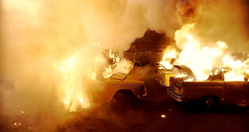
The only other prominent visual effects in the films were in the form of exploding cars, people getting shot, with the appropriate splashes of blood, of course, and a car that got riddled with bullets.  Also, the really old-age makeup was pretty incredible, though that would fall under the category of Best Makeup.  I can see why The Irishman was nominated for Best Visual Effects, but I agree with the academy’s decision not to award it an Oscar win.