1950 – Destination Moon (WINNER)

Destination Moon – 1950 (WINNER)

I really liked this movie because there were so many things they got right.  Not everything was perfect, but they were trying, with their 1950 knowledge of space travel.  This movie was unique in that it was trying to be as factual as possible, going a little bit into the science of their fiction, whereas other sci-fi movies were just basing their plots on uneducated guesses, or more often than not, pure fantasy.

The was only one thing that didn’t really work for me, so I’ll get that out of the way, right off the bat.  As the four men blast off from the surface of the earth, they are immediately hit with g-forces so strong, the skin on their faces pulled back in an almost comical way.  This was accomplished using invisible pieces of tape that actually stretched the skin of their faces.  The astronauts were screaming in pain and could barely even move their arms.

You see, to me, that seemed like the silliest effect in the film.  So I did my research.  But I discovered that it was I who was wrong, and not the film.  Modern Astronaut John Grunsfeld described the act of taking off as an actually painful process that lasts about eight and a half minutes.  He said it makes you feel as though you weigh seven hundred pounds.  So, score one more for the movie, though the actors with their stretched faces did look a little silly.

Another thing about the movie that I learned which surprised me concerned the few wide shots of the rocket ship as it was being built.  I just assumed that it was either a matte painting or a scale model.  But again, I was wrong.  While those techniques were used at various times, they actually built a life-sized structure for several shots.  Once again, I am impressed.

To create the illusion of the astronauts floating weightless in space, invisible wires were used, and several times, a simple effect of turning a camera on its side made it appear as if an actor was walking down a wall.  But the illusions were complete.  I couldn’t see the wires, though at times there were up to thirty-six strands holding up each of them.  There were shots during a sequence when the four men are walking on the outside of the spaceship, in which they are not only floating, but turning at strange angles.

And finally, the moon itself was a pretty cool bit of artistry.  Apparently, the matte-painter, Chelsey Bonestell, was a professional sci-fi artist, and the crew who constructed the sets were given actual photos of the moon to work with.  The result was a fantastic moonscape that looked as realistic as they could make it.  The movie was really an impressive bit of filmmaking, considering all the attention to detail concerning something that had never actually been done.  Very cool!
1949 – Tulsa

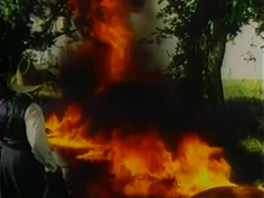
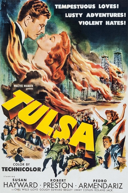
Tulsa – 1949The Special Effects for this nominee come down to one thing: the big climactic scene in which there is a massive oil drilling fire.  That was basically it for the entire film.  The movie was like the previous 1940 Best Special Effects nominee, Boom Town.  The only difference, really, was that the earlier film was in black and white, and this movie was in glorious Technicolor.
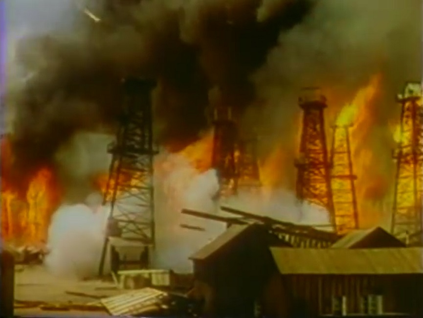
Now, that’s not to say that it wasn’t an impressive fire.  In fact, it was on a scale that was staggering in its size and intensity.  It was absolutely huge!  There were oil towers exploding everywhere, flames consuming them as they toppled.  There were roaring blazes billowing thick black smoke everywhere.  It all started with a single match, but ended with dynamite explosions to cut off the conflagration.

Now, as far as the effects went, I expect that most of the burning towers were scale models, though I suspect that there were also some life-sized towers thrown into the mix.  There were some pretty impressive shots of exploding oil drums, and one that even spilled its burning contents across the ground like liquid flame.  Then, of course, the actors were composited into the blazing wreckage and choking smoke.  There was even a herd of cattle being guided through the catastrophe.

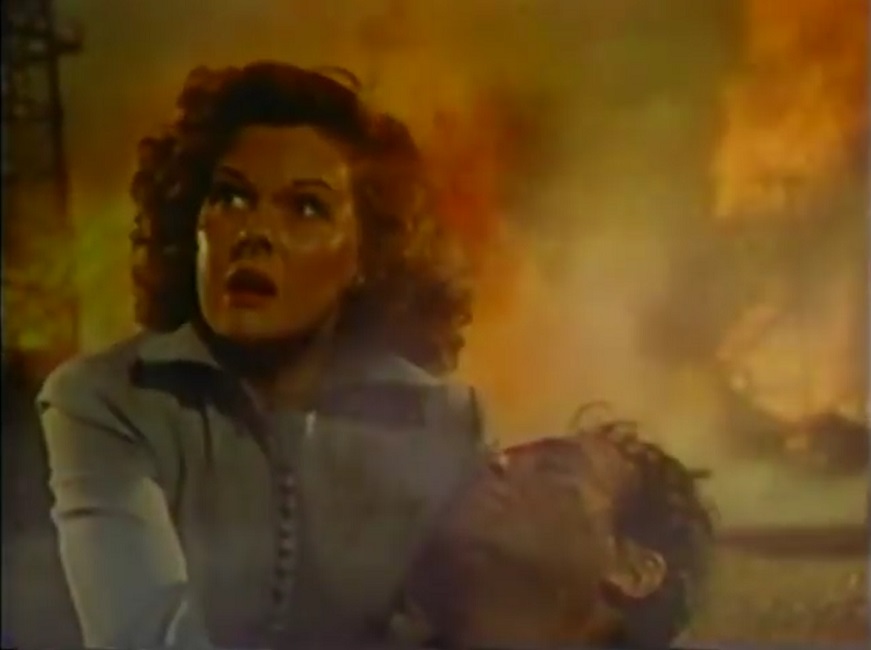
But the best shot of all was when the heroine, played by Rita Hayworth, gets trapped behind a fallen tower.  The burning structure is so large, it hides her from view.  So the hero, played by Robert Preston, jumps onto a bulldozer , covers himself with a blanket, tells the firemen to keep their water hoses fixed on him, and drives the construction vehicle into the flames.  The camera follows him into the fire.  We see the burning tower being pushed out of the way.  We see the tongues of fire surround him on every side.  Eventually the flames get between the bulldozer and the camera, and Preston disappears from view.  Quite impressive!

And I mustn’t forget to mention that the sound mixing during this scene, which was still being considered part of the special effects by the Academy, really went a long way to create drama and intensity.  The constant roar of the oil fire was nearly deafening, forcing the actors to shout their lines to be heard.

I can understand why the film was nominated for the Oscar, but I can also understand why it didn’t win.  I think there were two main reasons.  First, it was an effect that had been done many times before.  In general, fire and explosions were nothing new to the big screen.  And second, it was really the only scene in the whole movie that used any kind of notable special effects.  Sure, there were a few oil or water geysers, but really, how hard could those have been?  Just get some dyed water and a powerful water pump, and you have your effect.  I expect more from a Best Special Effects Nominee.

1949 – Mighty Joe Young (WINNER)

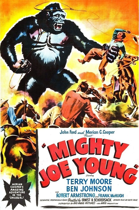
Mighty Joe Young – 1949

This was a great example of a special effects winner!  There was a ton of effects, all of which were impressively executed.  The film’s most creative and innovative effects were those of the stop-motion animation variety, though there was also a smattering of actual hand-drawn animation as well.  And these were all composited together with live actors in a clever and surprisingly seamless way!

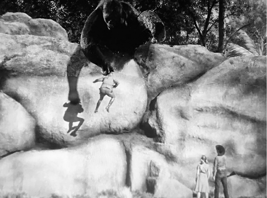
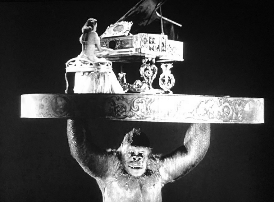
The giant gorilla, Joseph Young was one hundred percent stop-motion animated, as were a handful of lions and any human who Joe picked up.  The way they switched back and forth between live actors and fake dolls in Joe’s grasp was smart and impressively executed, though it was always a little obvious when the switch was made, because let’s be honest.  Stop-motion animation is an imperfect technique, now-a-days only reserved for the likes of Tim Burton or Wallace and Gromit.

But that being said, the actual motion and body language of the beast were amazing.  As jerky as the finished effect looked, the gorilla’s movements all appeared to be placed perfectly as to be otherwise natural.  And that’s saying a lot because there were several action sequences which showed the giant gorilla running, fighting, and demolishing the sets.  My only complaint would have been in his eyes, which were far too large and human-looking, not at all ape-like.  But even that had a reason.  They wanted the eyes to be large enough to display Joe’s emotions to the audience, so I’m thinking it was a necessary evil because they got everything else right.

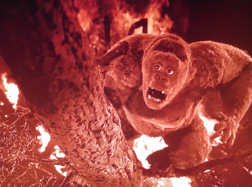
And then there was the movie’s climax.  They all come across an orphanage that is burning.  The entire image on the screen is tinted red as a massive fire is destroying the tall building.  Even without the giant Joe climbing up and down a tree to rescue his friends and a little girl trapped on the roof of the orphanage, the burning and collapsing building was a pretty awesome effect in its own right!  And then when the tree on which Mighty Joe Young is climbing topples, he falls, all the while holding and protecting the little orphan girl.  It was a very exciting climax.

There is just one negative thing I feel I should mention.  Watch the scene where Joe is tearing down the nightclub.  There are a bunch of lions behind large windows that are released when the gorilla smashes the glass.  The lions exiting the enclosure were rear-projected into the scene.  But I noticed how the exact same projected image kept being repeated over and over again, making it appear as though there was an endless stream of identical lions escaping from the cage.  Did they think I wouldn’t notice the pane of broken window glass that kept reappearing and falling over every time the exact same lion stepped down onto the floor?  That was actually pretty poorly done.  But the rest of it was good!

1948 – Portrait of Jennie (WINNER)

Portrait of Jennie – 1948 (WINNER)

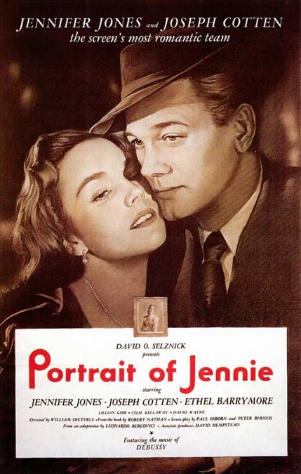
I watched this movie knowing nothing about it before hitting the play button, except for the fact that it won the Oscar for Best Special Effects.  Today, most people have never heard of the film.  But I’m glad to say that the movie deserved its award.  The special effects were visually interesting, technically innovative, and artistically creative.  They did things that I haven’t even seen done in modern films.

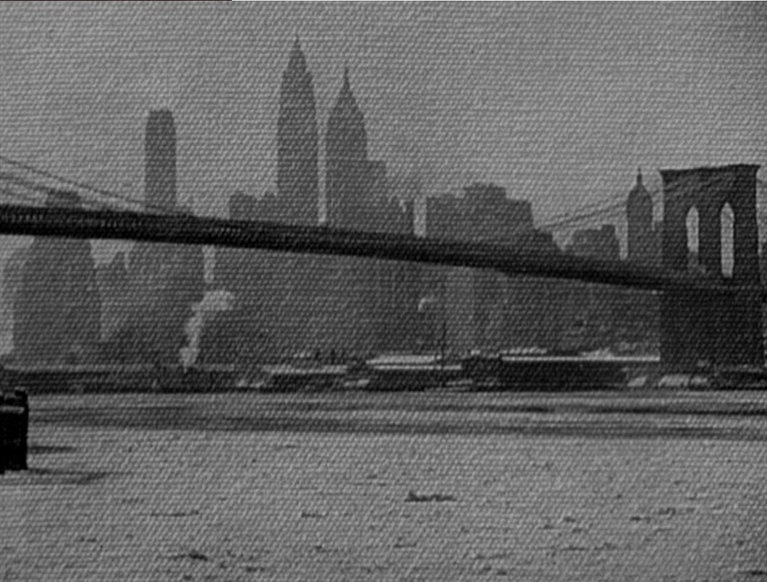
Directed by David O. Selznick, it was part romantic fantasy, part ghost story.  Many of the outdoor scenes were filmed through a canvas, emphasizing the point that the main character was an artist who painted landscapes.  The moving images on the screen were like a painting, overlaid with the weave of the cloth at close range.  Even though this was done by the cinematographer, I still think of it as a special effect that was interesting and appropriate for the plot.

The team of four effects artist, Paul Eagler, Joseph McMillan Johnson, Russell Shearman, and Clarence Slifer, did a fantastic job with creating very ethereal and dream-like images.  They created impossibly swirling masses of thick and viscous clouds, which had nothing to do with the story except to create a visual mood of other-worldliness.  Many of the scenes with the elusive Jennie, played by Jennifer Jones, had a soft focus to the imagery that also helped to create a sense of hallucination or cathartic vision.

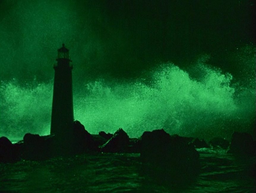
But it was the black and white film’s climax that really stood out.  As our love-sick artist takes a sail boat out to the lighthouse on the island where his ghost lover died, the storm that killed her returns.  With a sharp bolt of green lightning, the entire image on the screen takes on a green tint which remains until the artist loses his love to a massive tidal wave that briefly submerges the lighthouse.  Even the water on the black rocks sparkled a ghostly green.  The storm sequence itself would have been impressive even if it hadn’t been shown with the sickly green hue.  But when the violent storm and crashing waters are all done, the once again calm sea is shown tinted red for a few seconds.  It was a spectacular sequence.

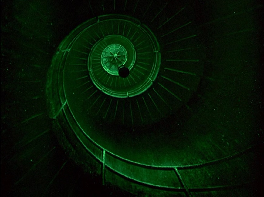
I really liked the shots of the inside of the lighthouse, which the artist climbs.  It was visually beautiful, and yet haunting at the same time, the circular staircase bathed in that lurid green.  And those roiling clouds from earlier in the film returned, looking all the more menacing for their green glow.  It was some very striking imagery that was beautifully done!

And then, in the last scene, the epilogue, the finished portrait of Jennie is finally shown in three-strip Technicolor.  And it really was a beautiful reveal.  Earlier, we had been shown the unfinished image in black and white, but this final shot displayed the portrait as a true work of art.  Very cleverly done, Mr. Selznick!

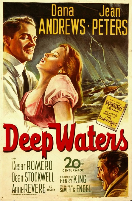
1948 – Deep Waters

Deep Waters – 1948

OK, am I being punked?  What is going on here?  This movie was one of only two that were nominated for Best Special Effects in 1948.  Am I to believe that there was only one other movie that year with visual or sound effects as good as this one?  The visual effects came down to a single scene!  A single five minute scene!  Other than a small handful of standard rear-projection shots, there was nothing!
This movie was a reality-based drama with no need for special effects.  Outside of that one sequence, there was no action, no stunts, no fires, no floods, nothing that required any kinds of special effects at all.  So why was it nominated for the Oscar?  I don’t know.  My online research turned up nothing, and so I simply don’t know.

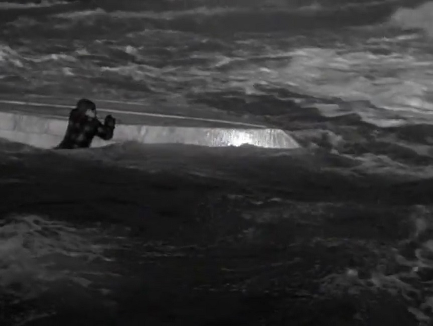
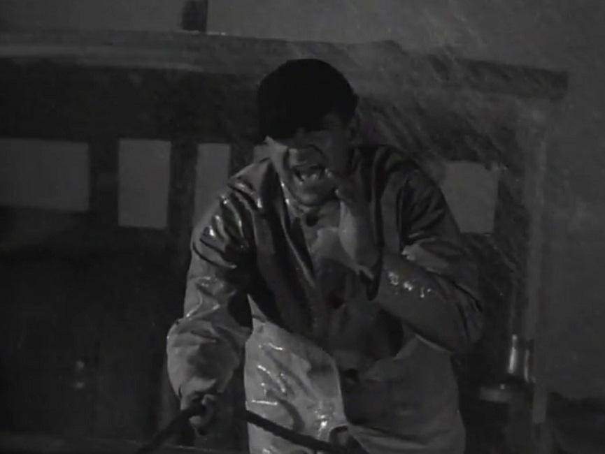
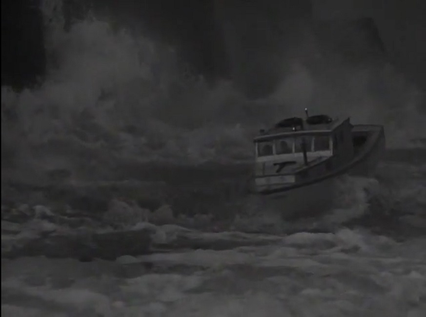
So lets talk about that one scene.  The young orphan boy, played by Dean Stockwell, steals a rowboat and heads out to sea.  Dana Andrews and Cesar Romero see him going and rush to catch up with him as they see a storm brewing on the close horizon.  The storm hits, the wind starts to howl, the rain commences, the waves begin to churn, bolts of lightning strike, and thunder rumbles.  As special effects go, they were done well enough.

The violence of the storm was real.  I’m actually not certain whether miniature models were used for the scene or not.  Scale model shots in scenes with water are usually pretty obvious because the water looks and behaves differently in the camera lens when shot at close range.  But I didn’t see any of this tell-tale effect.  But at the same time, when the large lobster boat is nearly thrown onto the rocks, it looked like a miniature.  The little black figures of the men on the craft looked stationary, though the shots showing them were brief, wide-angled, and clouded by rain and sea-spray.

However, the shots of the child clinging to the capsized row-boat were surely real.  Not only did he move, but you could see Stockwell’s face quite clearly.  And there was even one shot in which it felt like the camera was actually on a boat that was being tossed around on the waves.  It was chaotic and jerky, as if it was a hand-held camera.  It had to fight to keep the overturned row-boat in the frame.  It stood out because most of the shots showing Andrews and Romero were steady enough to see them easily.

I admit that the scene was done very well.  There’s no denying that.  But it was the only scene in the entire hour and twenty-four minute film that required anything more than simple rear-projection.  And not even very much of that was used, as the film made a point of letting us know in the opening title credits, that all the outdoor scenes were filmed on location in the state of Maine, the locale in which the story takes place.  I hate to say it, Academy, but where’s the beef???

1947 – Unconquered

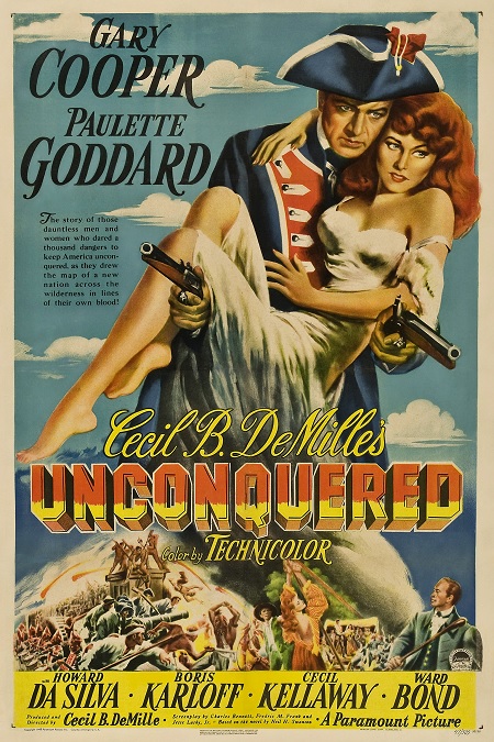
Unconquered – 1947

I found this to be, I’m sorry to say, a pretty dull movie.  It was slow and predictable, and when it came to the special effects, I honestly wasn’t very impressed.  By this time, Hollywood had been giving us better special effects for some time, and while a few of the effects were interesting, some even well-done, most of them were just average in quality.
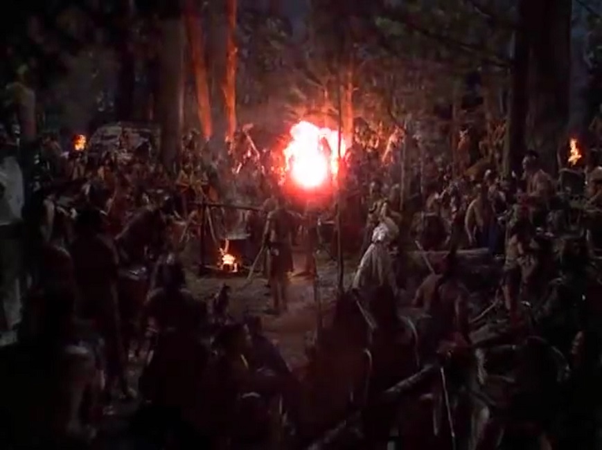
I’ll start with the things I didn’t like.  I thought many of the rear-projection shots were poorly done.  There, I said it.  There was a scene in which two men on horses are being chased by a band of Native American Indian warriors.  We start out with several wide shots filmed in the real outdoors.  But then when we needed to see a closeup of the actors’ faces, the process photography began, and it was painfully obvious, so much so that it took me out of the story.  It forced me to notice that the actors weren’t connected to their background.  The lighting, the focus, and the color saturation were all different.

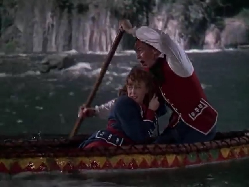
Then there was the big escape sequence in which there heroes were once again running from Indians.  This time they were in a canoe on a river.  They were supposed to be going through rapids, but the close-up shots of the actors were perfectly steady, ignoring the turbulence of the wide shots.  But on the other hand, there were some pretty good effects like the climax of that river escape, and the Indian attack on fort Pitt at the end of the movie.

As the little canoe goes over a waterfall, Gregory Peck, with Paulette Goddard tied to him with a sash, grabs onto a long hanging branch of a tree.  The bow bends and lowers the couple to safety and concealment.  As the boat sails over the edge, we are treated to a wide shot and a pair of dark, out of focus, animated figures.  We switch to a close-up of the pair hanging from the branch, and then back to the wide shot as we see tree bending under their weight.  I’ll admit, that was a good effect.

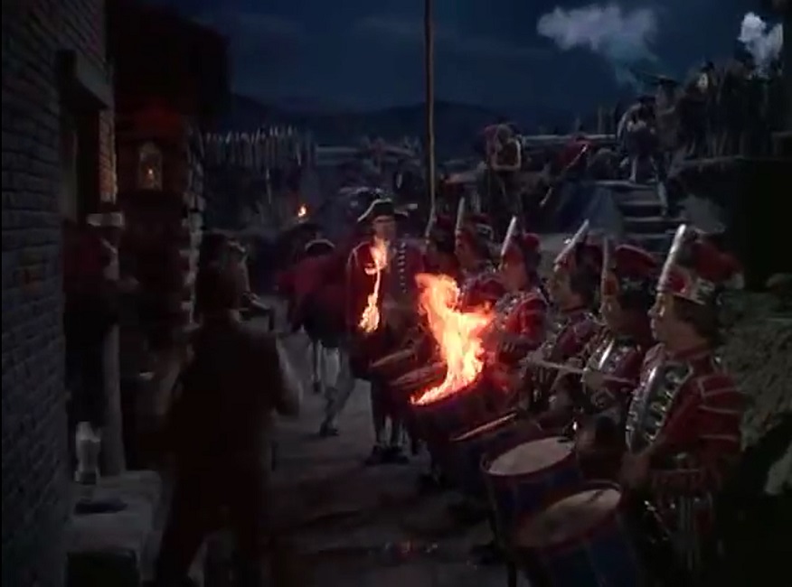
The fort Pitt sequence was alright, but just barely.  Some great miniatures were used, combined with some competent compositing.  The Indian warriors were hurling fireballs and shooting flaming arrows, and they were real enough to inflict burn injuries on eight people.  One extra’s hair was reportedly singed as well.  There was even one really cool transitional shot where a fireball was hurled at the camera, exploding in a rush of flames which faded into the next scene.  Very cool.

But as a whole, I’m afraid that the effects for this movie just seemed too few and far between.  And the ones that were done were either substandard or simplistic.  Sure, the attack on Fort Pitt was well-choreographed, but it wasn’t as dazzling as I have come to expect from big-budget Hollywood movies of the 1940s.  I’ve seen earlier movies do a better job.

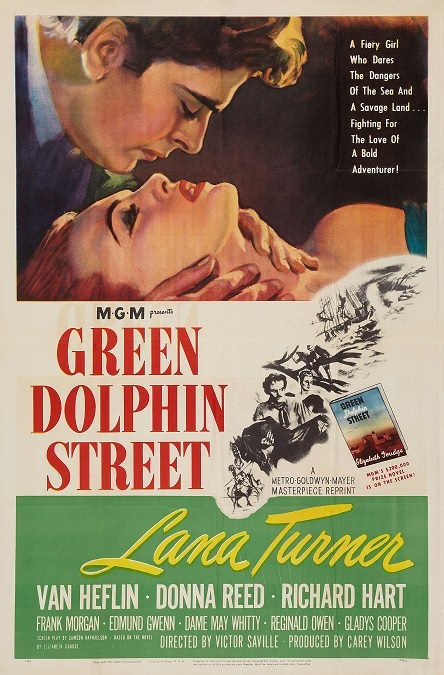
1947 – Green Dolphin Street (WINNER)

1947 – Green Dolphin Street (WINNER)

When this movie started, I‘ll be honest, I didn’t have high hopes, but boy was I ever wrong!  The visual effects team for this film came through with flying colors.  The movie was a spectacle of special effects!  After the first few minutes, I settled in for a drama with a few rear-projection shots, a few beautiful matte-paintings, and some clever compositing.  What I got was a period soap opera with a healthy dose of adventure thrown into the mix.

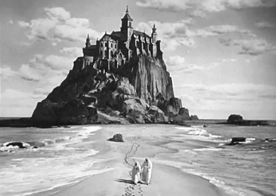
Where to start?  Well, the movie had all those standard tricks of the trade, and they were all beautifully done.  There were some gorgeous matte-paintings that looked incredibly real, though if I’m being critical, a few of them looked very much like paintings, like the nunnery up on the island mountain with the thin stretch of sand leading to the mainland.  There were also some nice projection shots of the giant galleon, the Green Dolphin.

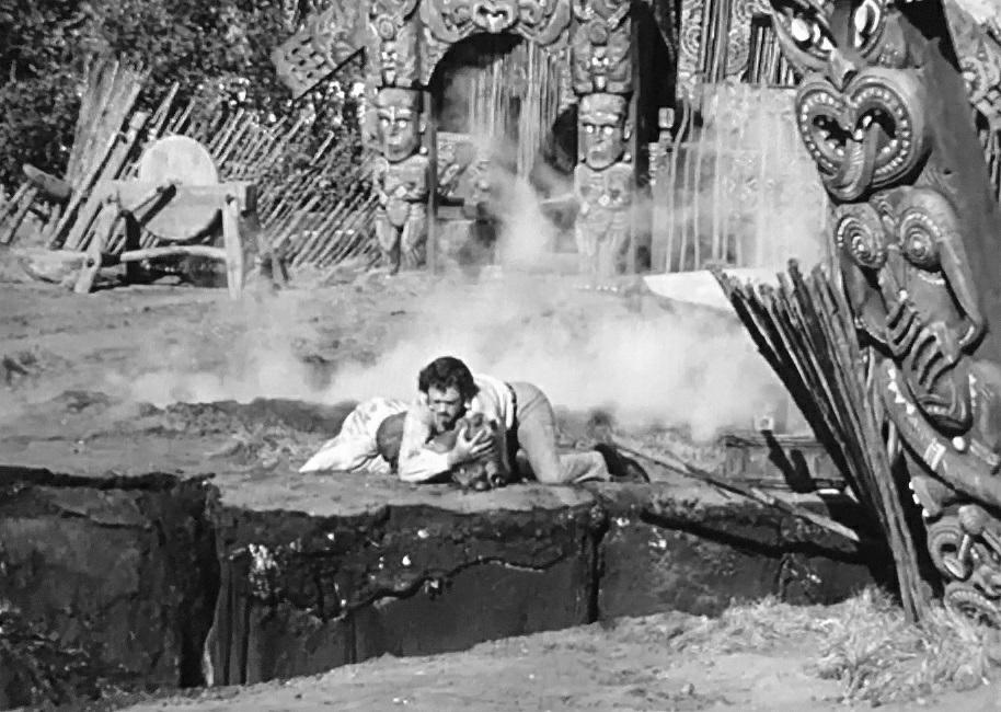
But the real highlight of the movie’s visual effects was the earthquake sequence that went on for nearly five minutes.  Not only did they do some masterful blending of rear-projection and live action, they also used scale models and a crew of stunt people.  The scene really woke me up and surprised me.  I might even go so far as to say that the sequence was nearly on par with some of the practical effects done today.  Just amazing!

The sets on which the actors were standing were clearly rigged to shake violently, putting them on unstable footing.  Cracks opened up in the ground and swallowed stuntmen whole.  Other fissures gaped open, leaving huge sections of the ground to fall away into the abyss.  Toppling trees fell on people.  These effects were particularly well-done.  Bubbling geysers shot up through the dirt.  Smoke and steam rose up into the air.  A mountainside crumbled to the earth, releasing a flood of water that destroyed a river valley.  The flood waters rushed upon floating lumber boats, destroying them and the people sailing on them.  It was an incredible sequence!

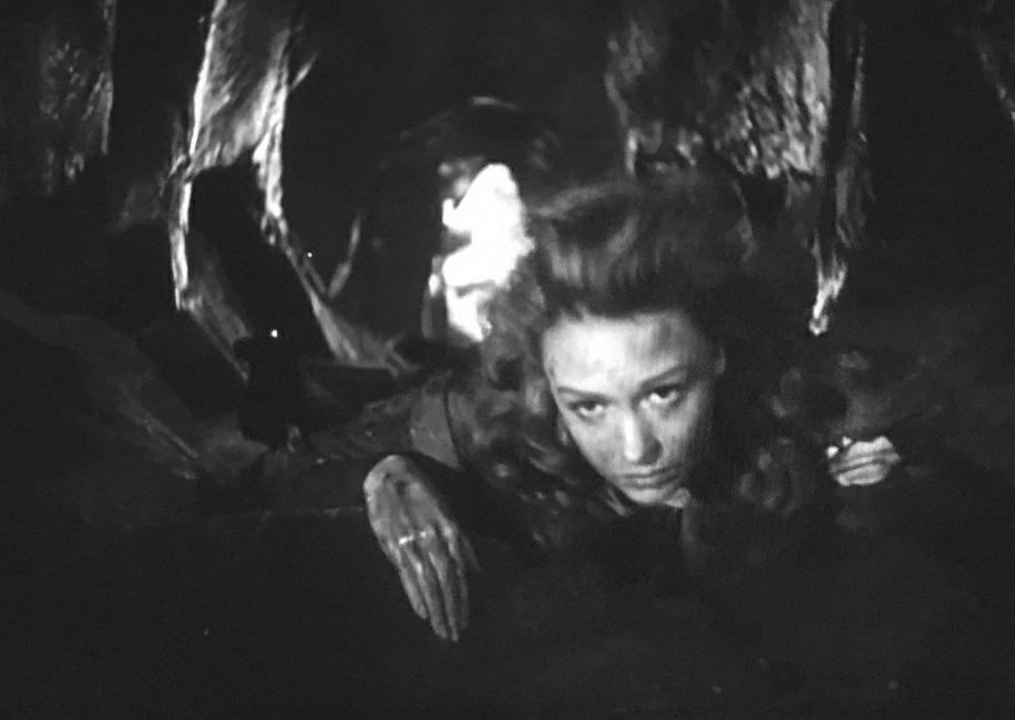
But there was so much more than that.  One effective little scene in which the dainty Margarite, played by a very young Donna Reed, had to climb  up a rocky shaft as tidal waters rushed into the pit beneath her.  That was a cool effect, though you could sometimes tell that she wasn’t climbing, so much as crawling horizontally through a tube.  It was still cool.

I can understand why this movie won the Oscar for Best Special Effects.  It really deserved it.  The sheer number of effect shots made it stand out as a winner.  I ended up really enjoying the movie, despite my original misgivings.  I’m glad I misjudged this film.  I’ll have to try to keep a more open mind in the future!

1946 – A Stolen Life

A Stolen Life – 1946

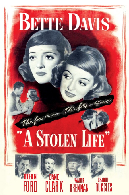
The visual effects for this movie were centered around the same thing as the previous year’s winner, that is the idea of having a single actor play two characters, and having them on the screen at the same time, interacting with each other.  But as the film Wonder Man was a silly comedy, this one was a serious drama.  And this movie took the effect a step further than its predecessor.

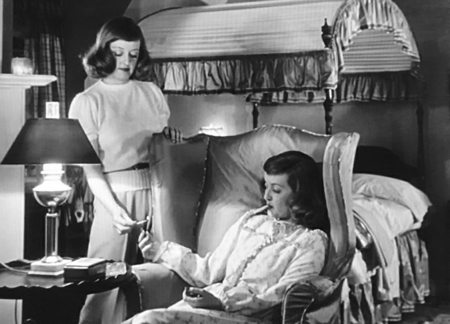
Here we have Bette Davis playing twin sisters, and the effect was achieved using more than just trick photography.  There were shots in which there was a body double of the same height and weight, though in those shots, one of their faces is either out of focus or impossible to see altogether.  But there were plenty of examples where both women could be clearly seen.

One of the most tricky shots in the film is when Davis lights a match and hands it to herself.  There was nothing obscuring either of the sisters, and the illusion was perfectly executed.  I’m not even sure how they did it.  I even rewound the film and watched it a second time, but I couldn’t see any flickering of the image to indicate a cut or split screen.

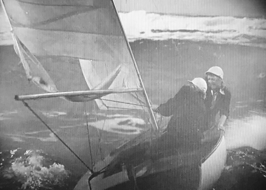
There was also a violent storm at sea in which one of the sisters drowns.  In that sequence, it was the storm that was the effect, not the two images of the same woman.  There was a rear-projected image of the violent waters going up and down, wind, and spraying water to hide the faces well enough.  Whenever the woman in the front was the focus, her twin sister would be out of focus behind her, and their hair was constantly being blown in their faces.

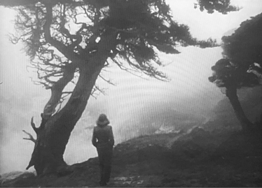
And there were also a fair amount of matte-paintings that were blended seamlessly with the lives action.  The ending scene, in particular, was beautifully done.  The surviving sister is walking alone along the rocky hills overlooking the coast.  Everything was covered by a thick blanket of swirling fog.  The bare tree and the jagged, mountainous rocks were gorgeous.  And of course, when her lover emerges from the fog and takes her in his arms, it really made for a lovely scene.

However, reading some little facts about the movie on the IMDB website reminded me of something that is listed as a goof.  While the two sisters are being tossed about on rough waters, a man in the lighthouse looks at them through a telescope.  We get that small circular image of the boat from a distance, with everything outside the circle being blacked out.  Watch the image closely.  There is absolutely no sign of the violent storm that ends up throwing the sailboat onto the reef.  The skies are clear and the waters are calm.  But then, we go back to the boat and it is listing on its side as the wind tears at the sails.  But really, is that the fault of the special effects team, or the director?

1946 – Blithe Spirit (WINNER)

Blithe Spirit – 1946 (WINNER)

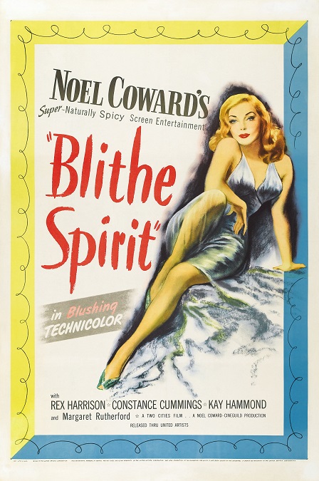
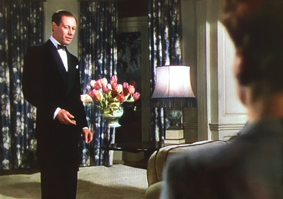
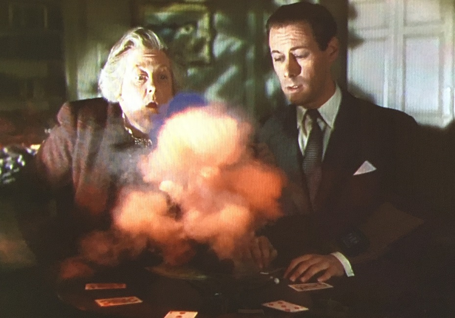
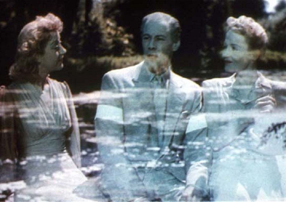
The special effects in this film weren’t bad.  They weren’t flawless, but they weren’t bad at all.  It was based on a play by Noel Coward.  As the title of the movie might imply, the story involved ghosts, so there were a few examples of floating objects, and people you could see right through.  The effects weren’t brand new but they were done exceptionally well.  It was the winner, but I have to ask why.

Well, to answer that question, I have to mention something that had a significant effect on the category as a whole.  This was the year in which the number of nominations went from five or more to only two.   In fact, from this point on, there would be only two, sometimes one, and sometimes zero nominations per year.  The trend continued until 1982 where the number would rise to three, the only exception being 1979 in which there were five.  Then in 2010 the number rose back to five, and has seemed to level off there until the present.

The point is that there wasn’t much competition for the Oscar.  I have searched the internet and cannot find a specific reason for this shift in 1946 nominations, because there were certainly a lot of movies that were innovative and ground-breaking in the field of cinematic special effects.  Whatever the reason, only Blithe Spirit and another film called A Stolen Life were nominated that year.

For me, one of the best special effects in the movie could partially be attributed to production design, cinematography, costume design, and makeup.  The ghosts were all an other-worldly green, from their clothing to their skin.  The only things that had any different color were their lips and their nails, both of which were a bright red.  Their hair also retained a semblance of its natural color, though it was also tinted green.  It set them apart and made them interesting to watch.

The expected floating objects were kept to a minimum as were the effect of people and objects passing through one another.  In a black and white film, these effects would have been fairly simple, but this movie was filmed in Technicolor, certainly making it more of a challenge.  Usually, a ghost on the screen would just be an actor being careful not to touch anything that would make her solid form obvious, though the spirits still had to open doors to go through them.

And speaking of doors, there were a couple of scenes in which doors would open by themselves, strong winds would blow leaves through them, and the dramatic music would swell, indicating than an angry ghost was making an entrance.  And there were also a few shots of the spirits being less than solid or even fading away into invisibility.  The effects were perfectly well-done and should be applauded.  But considering all the wonderful films that weren’t even nominated for the category in 1946, I’m not exactly sure why this one took home the Award.

1945 – Wonder Man (WINNER)

Wonder Man – 1945 (WINNER)

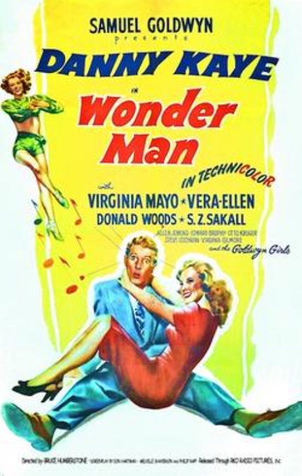
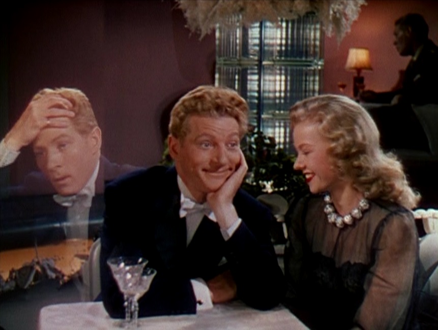
This movie was good, and I understand why it won the Oscar for Best Special Effects, but I’m not convinced it should have.  The effects were good, and from what I have read, some of them were even groundbreaking for their time, but I’m just not exactly clear on why.  The effects seemed simple as versions of them had been done in earlier movies.  The only distinguishing thing about Wonder Man was that it played a single actor opposite himself, something I haven’t seen in older films that used split-screen or double-exposure effects, though I’m sure this wasn’t the first time it had been done.

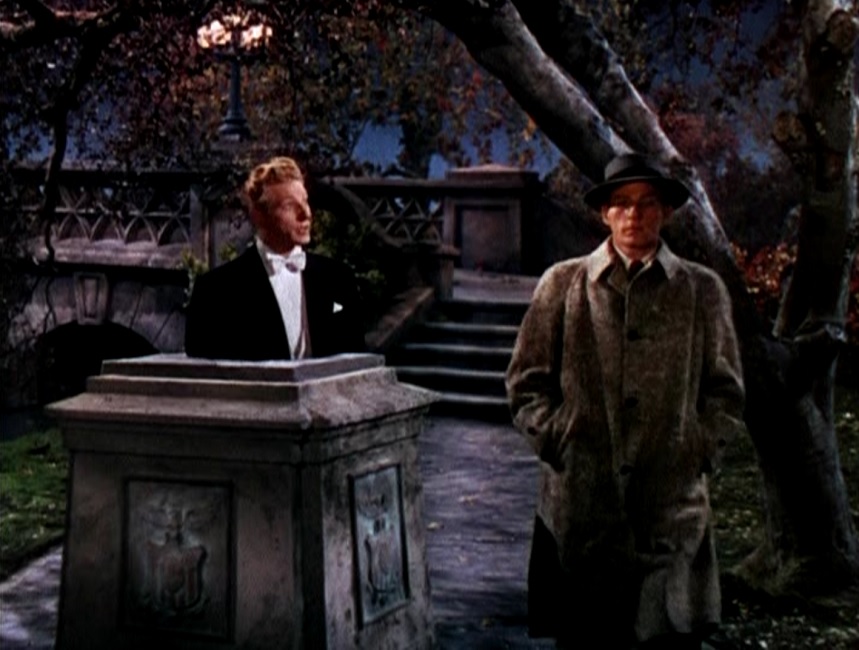
The main thrust of the movie’s special effects were plot-driven.  Danny Kaye played twin brothers, Buzzy Bellew and Edwin Dingle, and there were a lot of split screen effects where he played opposite himself.  According to an article on the TMC website by Lisa Mateas, “Kaye’s twin brother interactions were made possible by seamless and state-of-the-art (for its time) techniques which earned John P. Fulton (photographic) and Arthur Johns (sound) the Academy Award for Best Effects, Special Effects at the 1945 Awards.”

But there was more than just that.  One of the brothers dies and comes back as a ghost, and so we also had a few instances of Kaye moving through objects like doors or stone blocks.  There was one very amusing scene in which the ghost of Buzzy is drunk, (how can a ghost get drunk if he can’t touch the alcohol?) and can’t understand why he isn’t able to pick a glass of Bromo Seltzer.  He humorously drives himself crazy because his hands keep passing through the glass.

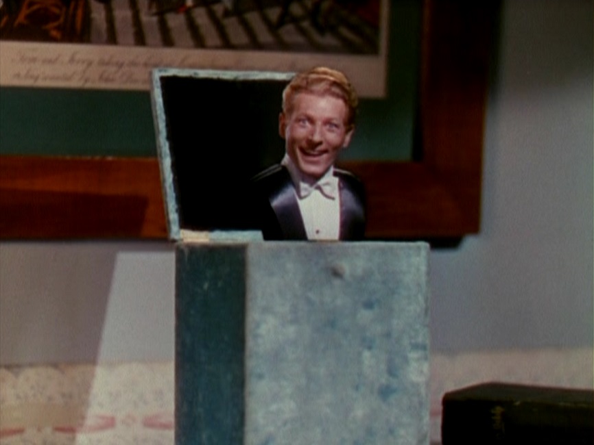
In Wonder Man, there were also some effects that showed the ghost as a transparent entity.  It was amusing as it floated through the nightclub.  And there were also a couple of times when the ghost had to enter his brother’s living body and take control.  Again, these effects were all plot-driven and were used mostly for comedic effect.  In fact, the very last shot of the movie was one in which Kaye rises up out of a little container like a jack-in-the-box, except that for some reason, his arms seem to be missing.

And there was a funny little effect that in the movie, in which the living brother tries to walk away from the ghost, but his feet are glued to the spot.  He ends up leaning impossibly far forward, though never falling.  That one made me smile.

But all those split-screen visual effects were done perfectly.  He passed in front of and behind himself, and it looked perfectly real.  So why do I question whether this movie should have taken home this particular Oscar?  Because it was up against movies like Hitchcock’s Spellbound and They Were Expendable, both of which were films that had some pretty impressive Visual Effects.