1940 – Foreign Correspondent

Foreign Correspondent – 1940

The Special effects for this movie were pretty much perfect.  The only thing I give it a mark off for is the image of the man falling from the tower.  That’s the only effect about which I have anything bad to say, so I’ll just get it out of the way.  It was pretty laughable.  So a man falls out of a high tower and we are treated to a wide shot of the tower as a tiny black shape plummets to the ground.  The shape was a statue with no movement at all.  The least they could have done was drop a dummy and composite it with the obviously still-shot background of the tower.  There was more movement in the composited tree at the lower left corner of the screen than in the falling figure.

But aside from that, the film’s effects were brilliant and perfectly executed.  I saw a documentary that explained some of them.  For example, the windmills in the Dutch countryside.  You see the shot, and it appears that they filmed the shot in a field outside of Amsterdam.  But in fact, it was all filmed in a studio.  The sky, the road, the field, and two of the windmills were part of an artificial background.  But they looked real, because the brilliant director, Alfred Hitchcock, had them attach moving sails through the matte painting.  So simple, and yet so effective!

Another simple effect that this movie seemed to get right was the rear-projected shots of people driving in cars.  The backgrounds seemed to be moving at the right speeds, which is more than I can say for other movies that used the same technique.  And there was some pretty spot-on compositing in the scene in which Joel McCrea, playing the film’s lead, Johnny Jones, has to creep along a ledge on the outside of a tall building.  The image was pretty seamless.

And the movie’s grand finale was the plane crash into the Atlantic Ocean.  The actors playing the passengers had to deal with a severely tilted set as the aircraft was speeding toward the water.  Remember, stunts are part of special effects.  Then there were explosions as the German guns fired at the plane.

But the coolest effect was when they hit the water.  There was a shot of the pilots trying to flee the cockpit at the moment of the impact. This was done using a rear-projected image of the Ocean, shot by a stunt pilot diving at the water.  Then, before the stunt pilot began to pull out of his dive, a ton of water was forced through the screen and into a mock-up of the cockpit.  It was a fantastic effect that looked amazing.  However, as I am thinking about it, I notice that in an earlier shot, an anti-aircraft bombshell had taken out the side of the cockpit, right next to the pilot.  But in that awesome shot when the plane hit the water, there was no evidence of that damage.  Well, I guess Hitchcock didn’t think of absolutely everything.  But he was still an outstanding and brilliant director.

1940 – Dr. Cyclops

Dr. Cyclops – 1940

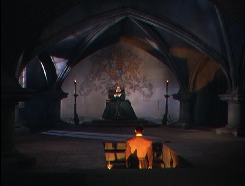
This movie was a cheesy sci-fi horror film, and yet was an utter delight to watch.  It had no big names, bad acting, questionable directing, and a poorly written script.  But despite these shortcomings, it had remarkably good production design and well-executed special effects.  Some of them were even better than The Thief of Bagdad, the movie that won the Academy Award for 1940.

Dr. Cyclops had the distinction of being the first horror movie to be filmed in Technicolor.  And as to that, the color was excellent.  Even the eerie lighting in the opening scene was greatly enhanced by the color.  The plot revolved around a mad scientist, who shrinks a group of five people to a height of around twelve inches.  As such, most of the special effects had to do with scale, and the special effects team of Gordon Jennings and Farciot Edouart really pulled out all the stops.

First, they made great use of incredibly detailed large-scale props.  Everything the actors interacted with was produced in giant size.  These were combined quite cleverly with the regular-sized props to enhance the effect.  For example, at one point the actors had to hide inside a cactus plant.  At first, we see the plant in the background as the miniaturized group runs toward it.  Then we see them in closeup.  They could have composited close-up shots of the real cactus and composited them with the actors, but instead, cactus panels as tall as walls were built.  The fabricated succulent was virtually indistinguishable from the real thing, and there was no telling blue halo around the actors.

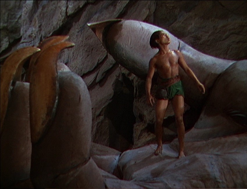
At one point, a giant animatronic hand was used to grab an actor.  While the evil Dr. Thorkel, was still on the screen as a background, his hand came in from the side of the shot and grasped the doomed Dr. Bulfinch.  Once seen, it was a perfectly obvious effect, though it actually took me a moment to realize that the giant hand was mechanical.  It was perfectly placed in the shot to match the image of its owner.  Sure, it moved slowly, but the fingers actually moved, the skin had texture, and most importantly, it was a practical effect as opposed to a blue-screen effect, a process that had not yet been perfected in 1940.
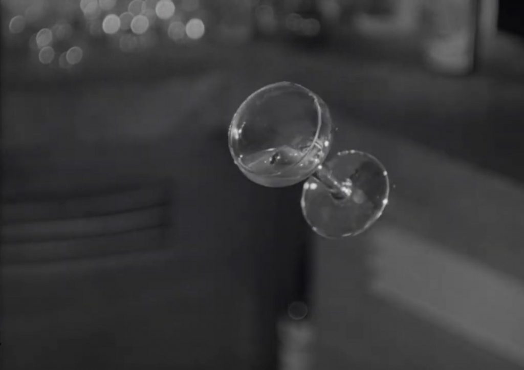
That’s not to say there weren’t any composited shots or blue-screen effects.  But the distinction was in whether or not the actors actually interacted with the effects or not.  In that scene, the hand grabbed the actor, but in the scene in which an alligator is attacking the tiny people, the actors never actually touched the reptile.  Though, that being said, there was a shot of the small party running behind the creature, in which a giant version of its tail was fabricated.  The beast’s head was shown to be moving furiously, though its tail was completely motionless.  Oh well.  The effects were still inventive and wonderfully executed. 

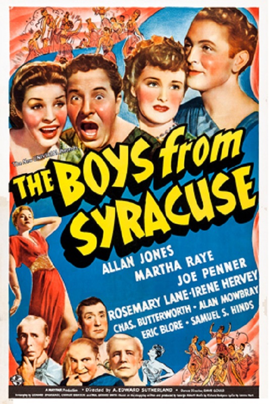
1940 – The Boys from Syracuse

1940 – The Boys From Syracuse

I don’t know what I was expecting when I sat down to watch this movie, but it wasn’t this.  I mean it was a fun movie that accomplished its narrative goal, but I was expecting some visual effects that were a little above the norm.  But I’ll be honest, while the movie itself was silly and fun, there were very few effects to speak of.  So I’ll try to give an account of what there was. 

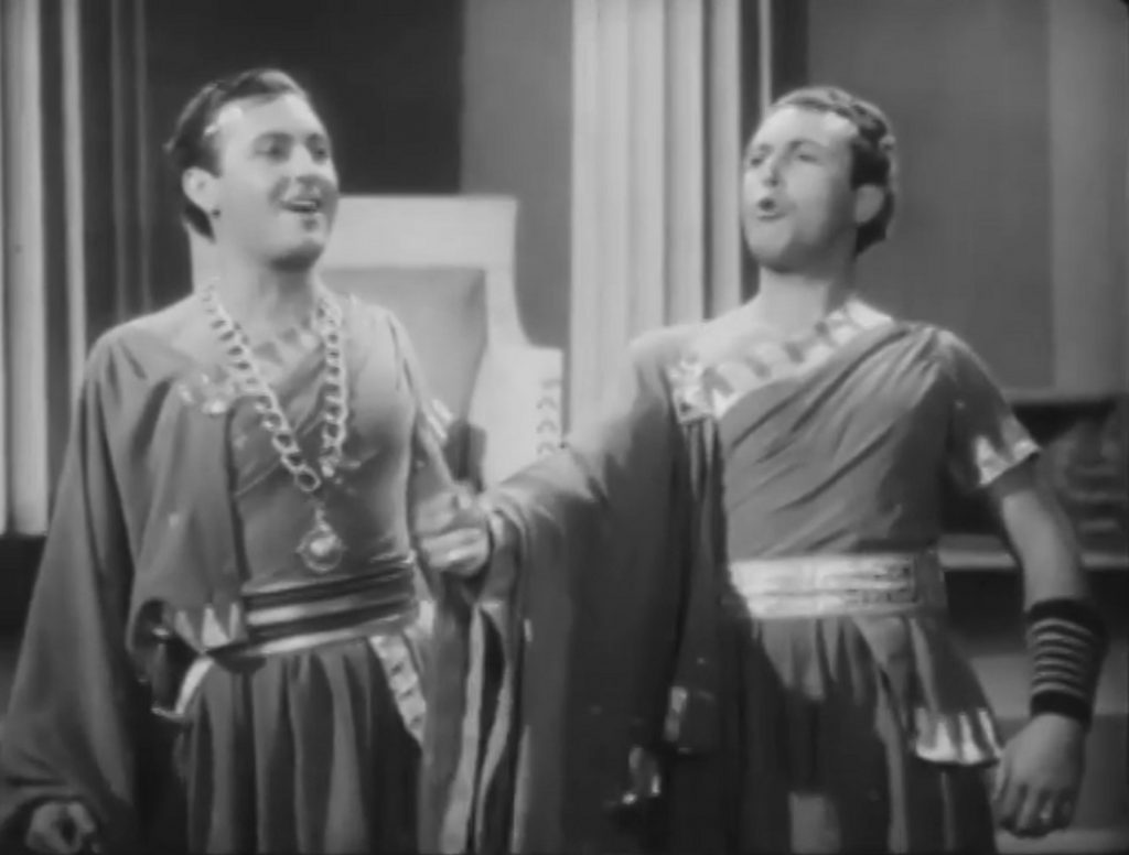
I think the movie’s big effect was that of having the same actor on different sides of the screen, but this was actually done pretty seamlessly.  They didn’t always stay on their own side.  There were shots where an actor’s arm passed in front of his split-screened counterpart perfectly.  And I think those were the shots that earned the movie its nomination.  They didn’t use the effect much, but when they did, it was pretty good.  So I’ll give them credit for that much.

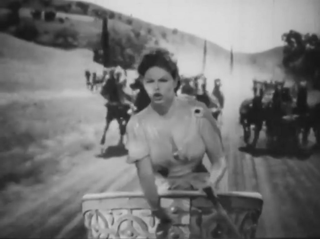
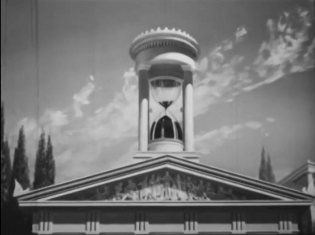
But there were other effects in the movie that were pretty poorly done.  For example, there was a chariot chase scene where they used either rear projection or compositing.  But the actor being filmed in the foreground looked like they were in front of a rear projection screen.  They didn’t do a very good job of blending the two images.  It looked really fake.  There was another gag shot where they were looking at an hourglass above a Greek temple that was supposed to be like a big public clock on top of a bank.  But again, it didn’t blend with the rest of the image at all.  I mean, sure, it was just a one or two-shot gag, but it looked pretty bad.  And I don’t know if the sand in it was real, or if it was animated, but it looked wonky.  I’m guessing some people might think that the less-than-perfect effects might be part of the movie’s silly charm, but I wanted more for an Oscar nod.

Then there was another sequence where the camera was fixed on the bottom of a slope, and actor after actor kept falling and sliding into the frame at the bottom of the slope.  So they would send a few actors down, but then you could actually see the cuts where they had stopped the film, and then started it again, as more actors slid into the frame.  It was a fixed image, and it should have been more seamless, like an endless stream of actors were falling to the ground.  For that matter, why didn’t they just do a continuous shot, and have all the people they wanted sliding onto the screen?  It felt like it was just rushed and shoddy work.

But I’m being nit-picky because I also have to consider the caliber of work being presented in other movies in the same year.  Just look at the effects in movies like Dr. Cyclops, Foreign Correspondent, or The Invisible Man Returns.  They all far outshone the visual effects in this silly slapstick comedy.  If it weren’t for those few split-screened shots of a single actor appearing as two characters in the same image, I doubt this movie would have been nominated at all.

1940 – Boom Town

Boom Town – 1940

Well, to be honest, I don’t know why this movie was nominated for Best Special Effects.  I mean, I know which effects earned it the honor, but I’m just not sure they were special enough.  The movie was a romance on a rather small scale.  The movie tried to be grand and epic, but it just wasn’t, and the scale of the narrative was directly related to the Effects category.

What I mean is that, except for one major scene, there were very few effects in the film.  The plot revolved around a love loves and lives of two oil men in the late 1920s.  It started off in Texas and moved around to other parts of the world.  Though there were some, there were very few wide shots that required matte paintings or miniatures which might have given a sense of the vast scale of the state’s wide vistas.  Most of the shots were close-ups, concentrating the characters and the story-driven plot.

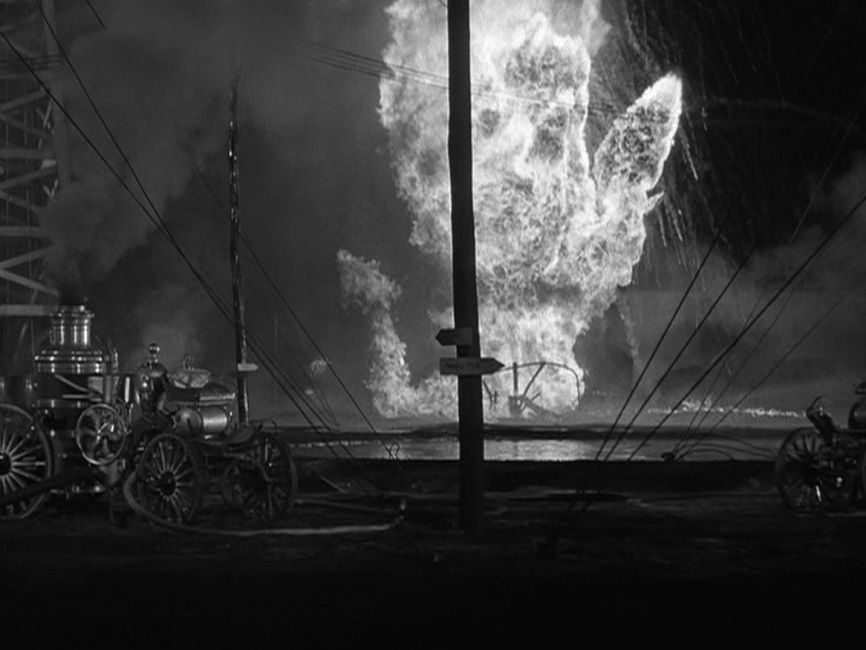
The oil gushers themselves were interesting enough to see, though hardly what I would call an impressive effect.  Some high-pressured water pumps and some colored water would have done the trick.  So what was the that one major scene which earned the movie its nomination?  The oil fire.

When one of the oil gushers catches fire, the blaze was epic and amazing.  To put out the flames, Clark Gable and Spencer Tracy risk their lives in a daring feat of daring bravery.  The flames were out of control with extreme explosions and shooting gushers of fire everywhere.  While being showered with water, our heroes approach the conflagration behind a heat shield.  When it is close enough, they race back to collect the nitroglycerin charges to put out the fire.  When the charges are detonated, the flames vanish and a gusher of black oil takes their place.

The scene was certainly something to see. The stunt men really earned their pay, because while most of the flames were provided via rear-projection and composited shots, not all of them were.  One impressive shot in particular made it seem as though the two men were completely engulfed in fire, though they were protected by the heat shield.  To give proper credit, I have to admit that the filming of the fire and explosions to project behind the actors was pretty spectacular and must have been a real challenge.  Unfortunately, some of those rear-projected shots were obvious, making the actors look completely separate from the background.

But then, after that one exciting scene, the movie went back to its romance story filmed on simple sets which didn’t need any kind of special effects.  Would I have nominated it for Best Special Effects?  Probably not.  I’m not saying that it was a bad film or that its effects were poorly done, but when I compare it to some of the other movies in the category, it just didn’t have much to offer.

1940 – The Blue Bird

The Blue Bird – 1940

This movie sure had plenty of visual effects, and some of them were even impressive, though not all of them.  And to be sure, it is a good thing I am only judging the film on its effects.  If I were critiquing the movie as a whole, this would be a very different review.  Half the film seemed to be aimed at four-year-olds, while the other half was aimed at more mature audiences. The movie’s forced wholesomeness was a little tough to swallow.  Also, there were too many themes within the film’s narrative that seemed to be Wizard of Oz knock-offs.

But I’m here to talk about the visual effects.  First, the movie starts off in color for the opening credits, then changes to black and white for the opening sequence that establishes the lead character.  But when the spoiled Shirley Temple goes into her dream sequence, the movie becomes technicolor again.  A few color enhanced puffs of smoke from the crotchety, old fairy, Berylune, and the children are dressed, and the cat and dog are changed into humans.

There were a few cheesy effects that showed the dog, played by Eddie Collins, making comical, wire enhanced jumps when he is frightened.  And I can’t forget the really silly stunt of him sliding down a long banister, landing on a cushion which slides across the floor, being launched underneath a table where he catches the tablecloth, destroying the contents of the table, knocking over a servant, and finally crashing into a desk, causing a vase to fall on his head.  It was clearly accomplished by simply speeding up the film to make it look fast and exciting.  But really, it was just cheesy.

Most of the rest of the film’s fantasy elements are brought out in the costumes and production design, until the incredible forest fire.  Now this scene was what really earned the film its Best Special Effects nomination.  There were falling trees trying to crush the children and their pets, and a magical fire that was actually very impressive!  It was huge, violent, and over-the-top, with flames shooting in all directions!  The blaze was in front of, behind, and all around the actors.  Well done!

The film’s big climactic scene was when the kids are visiting the unborn children of the future.  But again, most of this was costume and production design.  The final shot of the swan ship sailing away into the glorious sunrise on a sea of mist and cloud looked alright, though I think the moment would have been better served with a brighter and more color saturated sunrise.  Still, though the movie’s plot and forced wholesomeness might have had me rolling my eyes, the special effects weren’t bad.  Oh, and I also think they should have changed back to black and white after Shirley Temple woke from her dream, no longer a spoiled child, but maybe that might have made the movie too much like the Wizard of Oz, after all.

1940 – The Thief of Bagdad (WINNER)

The Thief of Bagdad – 1940 (WINNER)

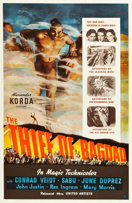
This film had a lot of special effects that tied in very well with the bright and colorful production design.  It was a true fantasy, and after watching it, I now know where Disney got the story for their big animated feature, Aladdin, though some of the characters were changed around a little. This movie had a flying mechanical horse, a magical storm at sea, a giant genie, a flying carpet, a mystical viewing stone, and a giant spider.

Probably the most famous effect was the giant genie coming out of the bottle. Black smoke billows out, and the image of a sixty foot tall man fades in. That was the first proper use of the blue-screen process to create a traveling matte.  But in other shots, I must confess a slight disappointment. For example, during two separate close-up shots, when the young man crawled from under a stomping foot or stepped off of the giant hand, the genie’s appendages became slow and clunky animatronics. And the shots where the young man was on the genie’s shoulder, when he is holding onto his hair, just looked incredibly fake.  I applaud them for constructing the scale sets, but it was so obvious that I was taken out of the story.

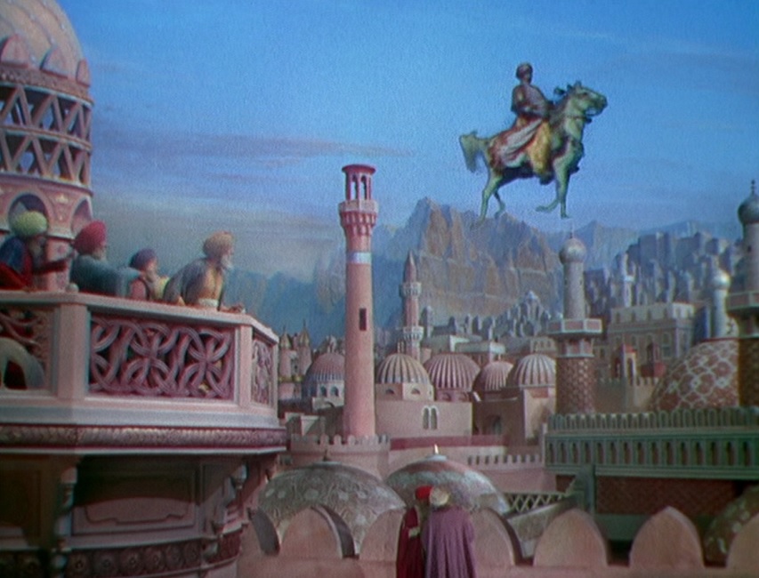
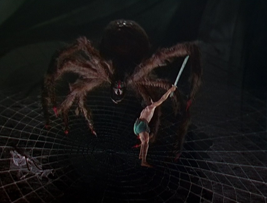
But I liked the flying horse. They showed it being put together in pieces, then a shot of a whole fake horse as it is mounted, and finally, a still shot of a real horse’s head. After that, all they had to do was start the film rolling, and the horse began to move. They were able to blend the blue-screened image with the matte-painted background pretty seamlessly.  I’m sure it helped that the sky was blue.  The giant spider wasn’t too bad either.  Clearly, it was a life-sized puppet, but it had a bit of movement to it, and when Abu cut off one of its legs, there was actually a little blood to make it more real.  However, its oversized web looked and behaved too much like common rope covered with fake, cottony Halloween webbing.

And if I’m being honest, I also wanted more in other effects, as well, like when Abu got transformed into a dog. I don’t think they pushed the effect far enough. It was nothing more than a simple image of the man fading away, overlapped with the image of the dog fading in. There weren’t even any transitional images of a half man, half canine to make it more like morphing.  And while I’m ranting, too many of the blue-screened shots had the obvious blue halo around the actors.  But hey, it was 1940, and such things had never been done before, so I shouldn’t complain!

I don’t want to give the impression that I didn’t enjoy the film or that it didn’t deserve its Best Special Effects award. I really think it did, and it was a fun movie to watch. It made great use of the new blue-screen technology effects.  It helped that the movie was just so full of fanciful visuals, giving audiences things they’d never seen before.  The director made the smart choice of filming in Technicolor, making them look even more dazzling to audiences who were still being treated to mostly black and white films. All in all, the Academy had plenty of reason to award this movie its Oscar.


1939 – The Wizard of Oz

The Wizard of Oz – 1939

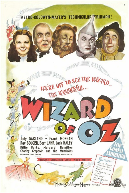
The Wizard of Oz was a special effects extravaganza!  The effects were inventive, ground-breaking, and dazzling.  This movie was filmed in Technicolor, and the filmmakers used both the black and white and color pallets to marvelous effect.  I don’t want to take anything away from the wonderful effects of the 1939 Best Special Effects winner, The Rains Came, but I think Oz got robbed!

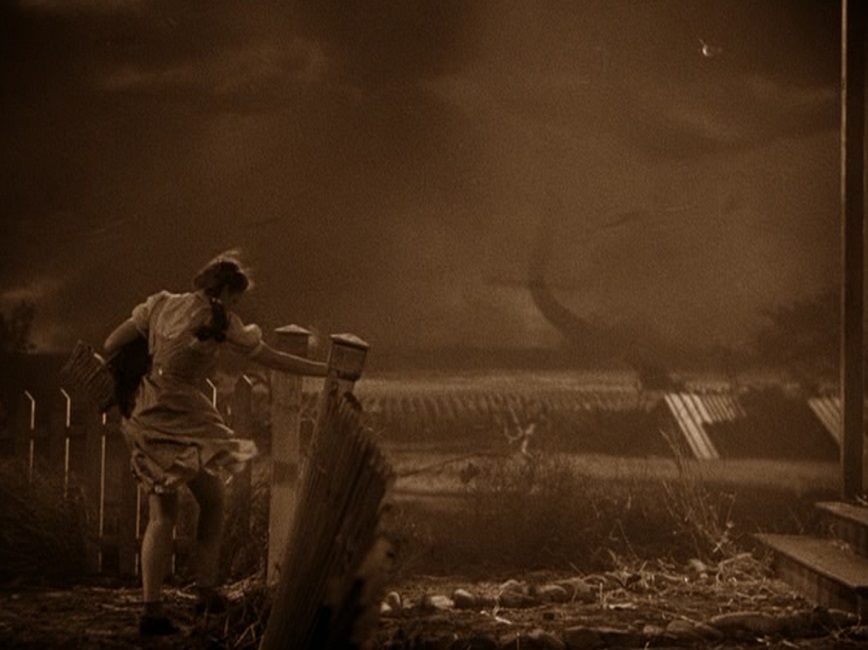
There were so many effects in the film, it is hard to know where to start.  But easily, one of the most memorable of them was the tornado!  The cyclone that carried Dorothy away to the magical land was amazing, and totally holds up, even by today’s standards.  Apparently, it was made from a thirty-five foot muslin stocking wrapped around chicken wire, which was rotated by a motor.  The base was attached to a car that was moved back and forth on a track.  The farmhouse, fence, barn, and prairie were all miniatures, and the clouds were painted on glass.  Composite in wind, dust, debris, and actors, and you have a fantastic twister!
Another of the film’s more iconic effects were the hideous flying monkeys. Of course, they flew with the help of thin piano wire, but the actors also wore battery packs that kept their wings flapping.  The witch’s sky-writing effect was done with a miniature witch riding a hypodermic needle filled with dye, which was injected into an opaque mixture of water and oil, and filmed from below.  The little detail of special water flowing into the tank, creating the effect of drifting air, was amazing.

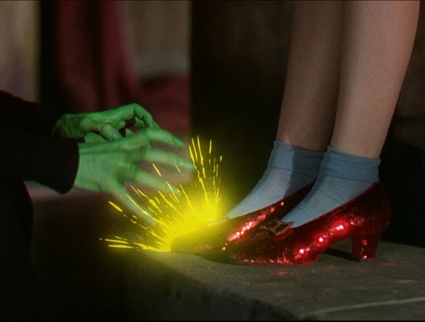
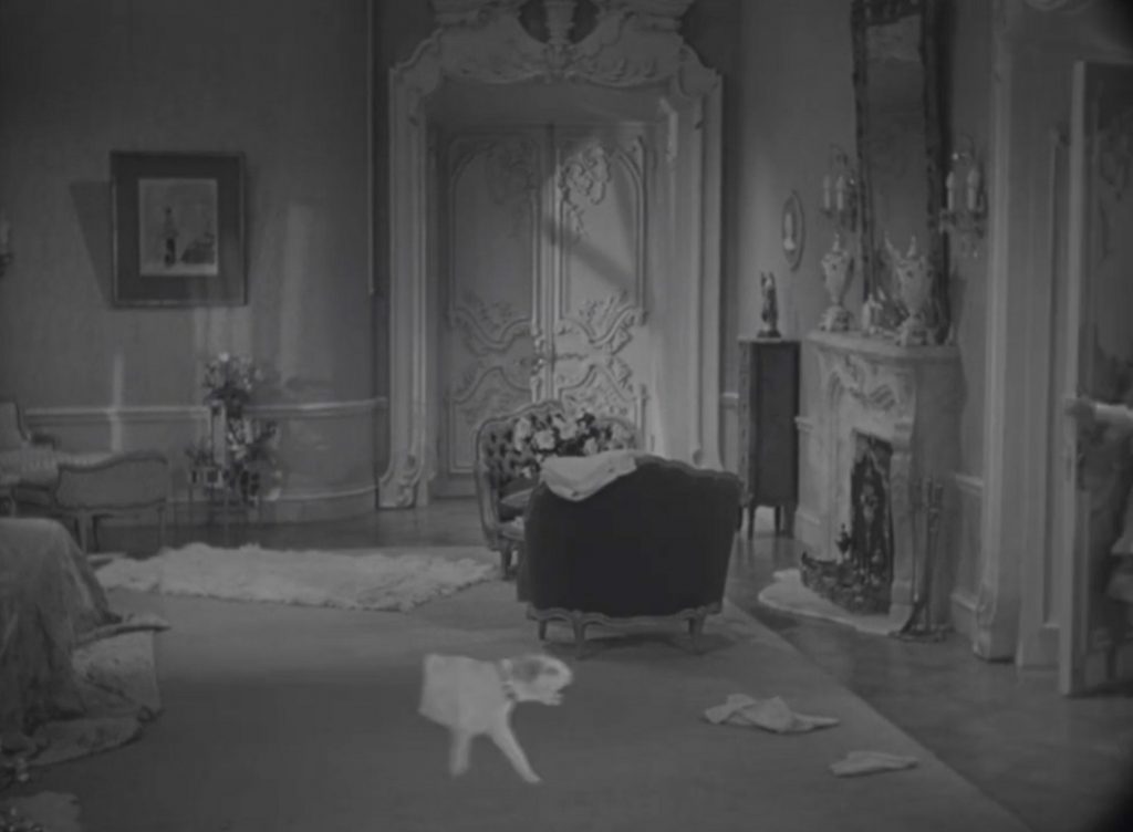
Glinda’s floating bubble was made using a stationary silver ornament, and a precisely moved camera that created the illusion of a growing bubble.  After that, specially processed film, lab dissolves, and perfect camera placement completed the illusion.  The witch’s crystal ball effect was done by side-projecting images into a large glass bowl.  A mirror at a forty-five degree angle reflected the projection onto a translucent screen inside the bowl.  Masterfully done!

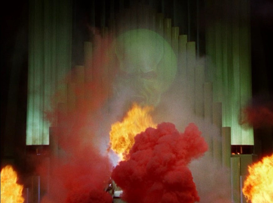
Other effects were achieved using pyrotechnics, smoke, little dashes of animation, mechanized miniatures, and matte paintings.  The Wizard of Oz pulled out all the stops.  The sheer quantity of effects in this movie far surpassed its competitors, and the inventiveness of many effects artists under the direction of Arnold Gillespie made for a phenomenal fantasy of a film.  It was truly a different time in filmmaking history, and the things that they were able to do with practical effects were simply mind-blowing. Today, it would all be computer generated, but there is a tactile charm to practical effects that seems to be making a bit of a comeback in modern movies.  I still think CGI is ultimately better, but practical effects can be just as impressive in the hands of creative and skilled effects artists.

1939 – Union Pacific

Union Pacific – 1939

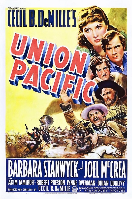
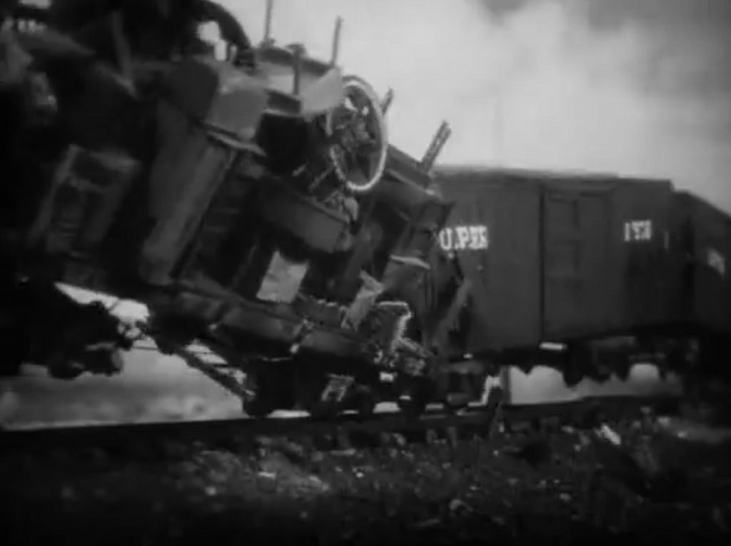
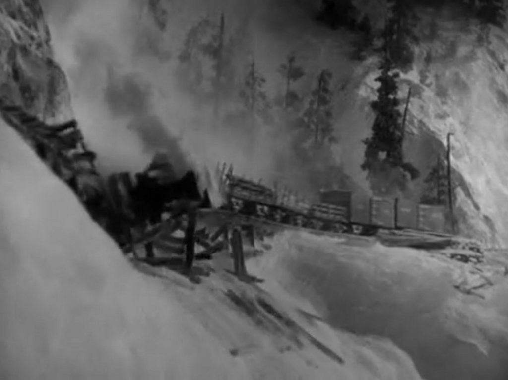
The visual effects in this movie were good, but I think they could have been better.  There were a couple of fantastic train crashes, but in both cases, I was quite aware that I was looking at a miniature train.  I can’t put my finger on exactly what the problem was, but they just looked fake.  The crashing railway cars looked like they had no weight to them.  They looked like empty plastic models, and I wanted them to look more real, somehow.

But I’m speaking of the outside shots.  In particular, the second crash, where a train is attempting to traverse rails that have been laid on snow.  The snow drift, crumbles, the support beams fall away, and the train rolls down a mountain slope, spraying snow in all directions, felling trees, and skidding to a rough halt.  As I said, it was good, but I think I just wanted it to look heavier, somehow.  I wanted to see some more substantial damage. 

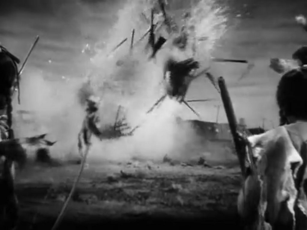
But all that being said, most of the effects in the movie were just fine.  When they changed to interior shots of the crashes, the collapsing walls and flying debris was good.  People got buried and that was pretty cool.  And the cause of the first crash was a pretty great explosion of water.  Savage Indians cut the legs out from under a water tower and timed it to fall onto the approaching train.  That was a pretty cool effect and it was done well.  There was a great shot of an Indian on a horse pulling on the rope that bound the hatcheted wooden supports.  The horse pulls hard, but the wood isn’t quite ready to break, and the horse tips over backward, the rider falling to the ground.

But train crashes weren’t the only effects in the film.  There were plenty of rear-projected background shots, some done pretty cleverly.  In one, Joel McCrea was filmed in the foreground.  Then he left the frame and appeared in the background projection and walked into the distance.  That was cleverly done.  The problem was that the backgrounds were always slightly out of focus, making it obvious that they were images that were separate from the actors being filmed.

There were also some great gunfights and the Indian attack was exciting to watch.  There were men on horseback, and men in the train cars, each shooting at each other.  There were some great stunts as injured riders fell from their mounts while the horses were running at full speed.  Even our heroine takes a bullet, without showing any blood, I noticed.  So I think that overall, the effects were done well, but I’ll be honest, I’ve seen better from other films made in the same year.  Movies like Gone With the Wind and The Wizard of Oz, and of course, the Oscar winner, The Rains Came, all had visual effects that looked more real, despite the fact that all of them used miniature models as well.  Those other movies just did it better.

1939 – Topper Takes a Trip

Topper Takes a Trip – 1939

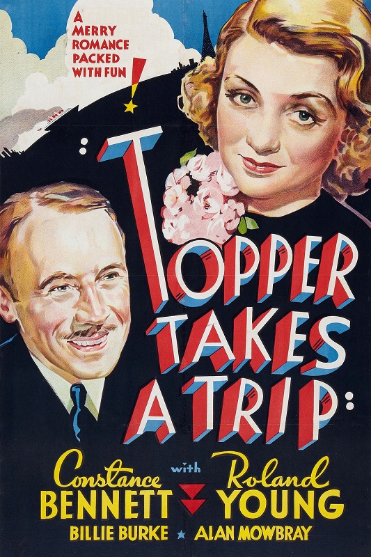
I was thoroughly unimpressed with the visual effects for this movie, and here’s why.  They were by far inferior to the visual effects of the first film in the franchise, just called Topper.  In fact, they even went so far as to take scenes from the first film and just put them into this movie as a kind of flashback, showing us effects that were lifted from the previous movie.  But as for the new effects for this film, they felt sloppy, throw away.  The whole shtick of the Topper films is that there are ghosts harassing Mr. Topper, doing crazy things that get him into funny trouble.

But when you really look at what was done for this sequel, it came down to just two effects, done over and over again.  One is having a woman and a dog fading in and out, turning from invisible to visible, and back again.  The other is having objects float or move with nobody touching them, and I’ll address that second one first.  I’m sorry, but a door opening and closing on its own is not terribly impressive, whether it is a car door or a room door.  A little more complex, though still pretty simple, is a depression appearing on a bed as a spirit sits on it wouldn’t have taken a lot of visual effects skill.  Having a ball roll across a beach on its own is something I could engineer myself, in a pinch. 
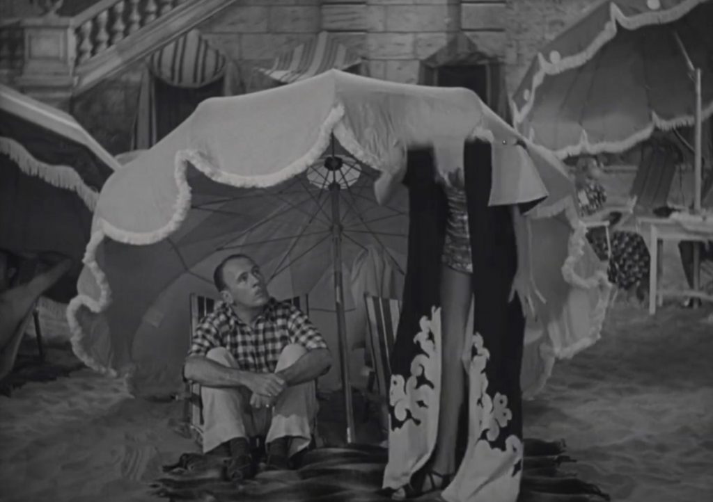
And then there was the actors fading into and out of the screen.  That must have been a little trickier, but it doesn’t even seem to approach the complexity of the effects in other movies that were nominated for the category in 1939.  Movies like The Wizard of Oz, Gone With the Wind, or the Oscar winner for that year, The Rains Came, were just better and more impressive.  These effects didn’t even come close.  The entire movie just felt like a cash-grab, an attempt to capitalize on the success of the first film.  The effects seemed rushed and hastily thrown together.

For example, there was a scene where an invisible woman drinks a martini.  The camera is focused on the floating glass.  It tips and the drink begins to flow out.  I could literally see the cuts in the film as they emptied the glass a little bit at a time.  It was choppy and obvious, and again, I’ll say, sloppy.  For another example, there was a scene when the ghost dog becomes visible, but only his front half.  So half the dog is barking and trotting across the floor.  It kept shifting in and out of focus, and the hard line where the black sheet was wrapped around the animal was, again, obvious.  I felt that a little more care could have been taken with the effects.
Still, there was one thing they did pretty well.  When there was a floating object hanging in the air, like a champagne bottle for example, and then the spirit materialized in the exact right position to be holding the bottle, must have taken a bit of precision, and I applaud them for that.  That kind of thing happened several times in the film, and it was done pretty well.  But for the most part, I don’t get it.

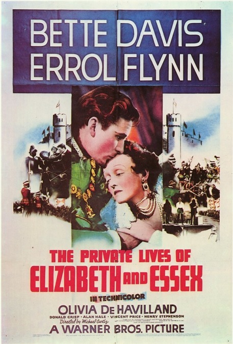
1939 – The Private Lives of Elizabeth and Essex

The Private Lives of Elizabeth and Essex – 1939

This movie is a little hard to critique for Special Effects.  There didn’t seem to be anything special about them.  There were a few matte paintings and a short battle sequence, but aside from that, there wasn’t much to catch my attention.  Now, I’ll be the first to admit that I’m not educated in film history.  I’m not very knowledgeable about movie magic of the 1930s and 1940s.  I know that there had to be a reason why this movie was nominated for the category, but for the life of me, I don’t really know what it was.

In fact, I even did a fairly competent search on the internet, trying to find anything that might explain what special effects I was supposed to be looking for, but still, I came up empty.  Then, I did a little reading about the category itself, and found that up until 1963, the concept of Sound Effects was part of the Special Effects category, at which time, Best Sound Editing became its own category. Perhaps this was nominated more for sound effects than visual effects.  But again, I did my research and could find no evidence to support this either.

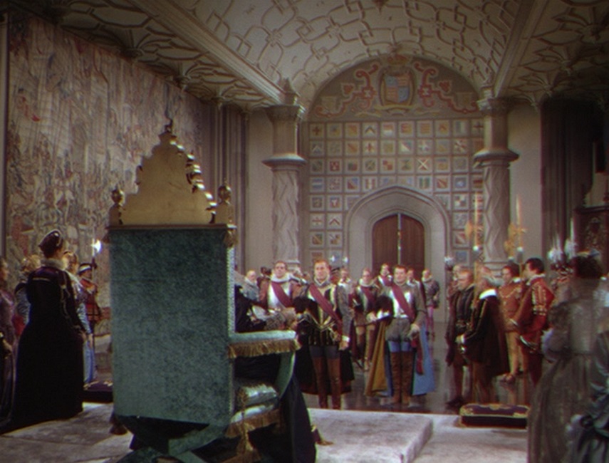
Either way, with my limited knowledge about the subject, all I have to go on is what I can see on the screen.  What looked impressive?  What looked innovative?  What looked good… and what looked bad?  There was a sense of grandeur about the film, that stemmed from the sets which looked gigantic, though, I’m sure they were filmed on smaller studios.  The matte paintings looked perfect.

What I was not impressed with were the inside walls of the castle.  In nearly every scene that took place indoors, the walls looked like painted stage flats.  They tried to make them look like stone by painting bricks in the corners of the rooms, but they looked completely fake.  But I can’t push this off on Byron Haskin, the Special Effects Technician.  This would have fallen under the Production Design category.

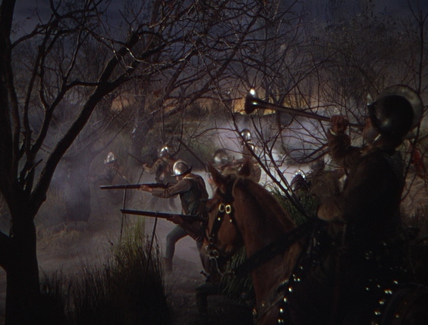
As I mentioned, there was a brief battle sequence that had some gunfire, men getting shot with arrows, and a shot of Essex’s camp being torched in the distance.  But while these things were passable, they were nothing to write home about.  When a man would get pierced by an arrow, it was always in his back, and you could almost see the wooden board under his tunic.

And finally, there was one curious little expositional scene that took place outdoors at the Red Lion Inn.  One of the documentaries on the DVD explained that this was a composite shot, with the setting sun being a separate image from the foreground.  But watch the shadow of the man riding the horse.  Based on where the sun was in the sky, the shadow seems to be falling in the wrong direction.  Don’t get me wrong, I liked the movie.  I’m just not sure why it was nominated for Best Special Effects.  If someone knows, please fill me in!