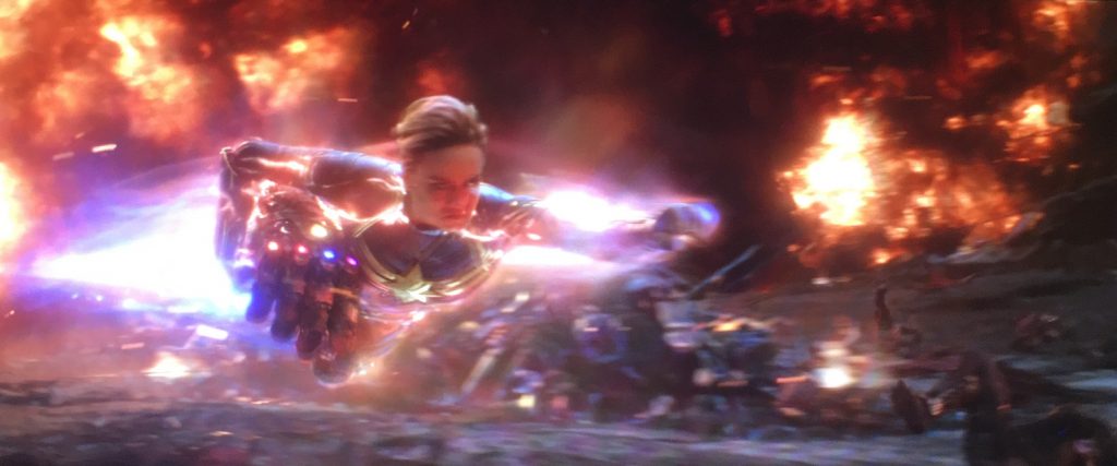
2019 – Avengers: Endgame

Avengers: Endgame – 2019

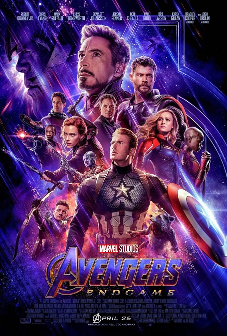
Ok, so as you’d expect, the visual effects for Endgame were top-notch, phenomenal, incredibly photo-realistic, perfectly executed, elaborately designed, highly detailed, and visually stunning.  The fact that the film was the culmination of at least 10 major Marvel properties, and sporting a character list comprised of nearly 35 super-powered heroes, not to mention all the great villains, was not lost on me.  That meant that all the great visual effects that we have come to associate with these beloved characters had to be either duplicated or improved upon.

So what was there to improve, you might ask?  I can think of several examples just off the top of my head.  There was the awesome blending of Bruce Banner and the Hulk, which gave him a completely new look.  There were the never-before-seen powers built into Iron Man’s suit.  There were new trick arrows for Hawkeye.  And they made use of the relatively new technique of de-aging actors like Michael Douglas and John Slattery, not to mention the extreme aging of Chris Evans.  Even Stan Lee was de-aged 45 years for his obligatory cameo.

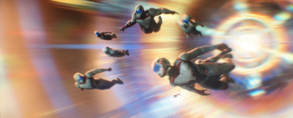
And it all looks fantastic.  Even the costumes that the Avengers wear during the Time Heist sequence were visual effects.  Yes, apparently, when the day of filming arrived, the special white and red suits that they wore had not yet been designed.  The visual effects team were given the task of digitally adding the costumes in post.  I would never have known just by watching the movie.  And the same was also done for Captain Marvel, every time you see her on the screen.

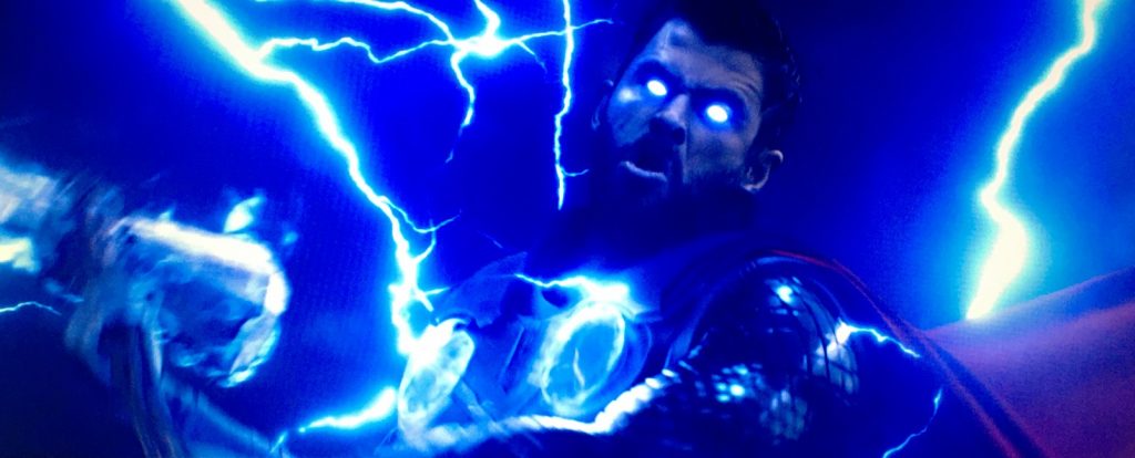
Also, I would be remiss if I didn’t mention one of my favorite characters in the MCU, whose look was also upgraded for this movie – Thor.  The character has had to endure unbelievable losses, and so he lets himself go, physically.  Interestingly enough, this wasn’t accomplished with CGI.  It was an incredibly convincing prosthetic suit worn by Chris Hemsworth.  The only concession was a seam in the suit’s back that had to be digitally removed when he was shirtless.

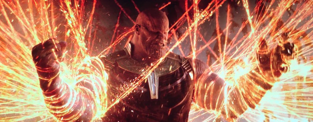
And, even though I already mentioned it in my review for Avengers: Infinity War, I’m going to mention it again.  The fully CGI character of Thanos was perfection.  Played by Josh Brolin wearing a motion capture suit, facial capture dots, and a camera mounted on his head, his incredible performance was brought to life by the digital animators in such a way as to make me believe it was a guy wearing purple makeup and prosthetics.  The emotions the digital artists were able to bring out of Brolin’s performance were done perfectly.  Just amazing!

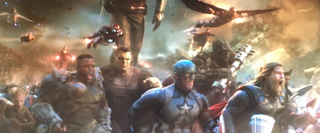
But I think the biggest standout of the film’s visual effects was simply the scale.  The gargantuan scale of the epic film, especially in that final action sequence, was what I seem to remember most, when I think about this movie.  Yes, we’ve seen battle sequences this big before, but none, I think, with one side of the conflict being made up of such unique and individual characters, each with their own looks, way of fighting, and super powers.  It was just a phenomenally well-made epic film.
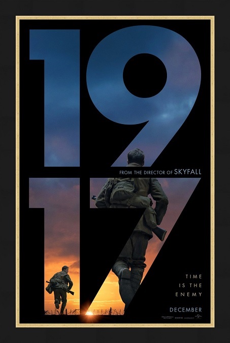
2019 – 1917 (WINNER)

1917 – 2019 (WINNER)

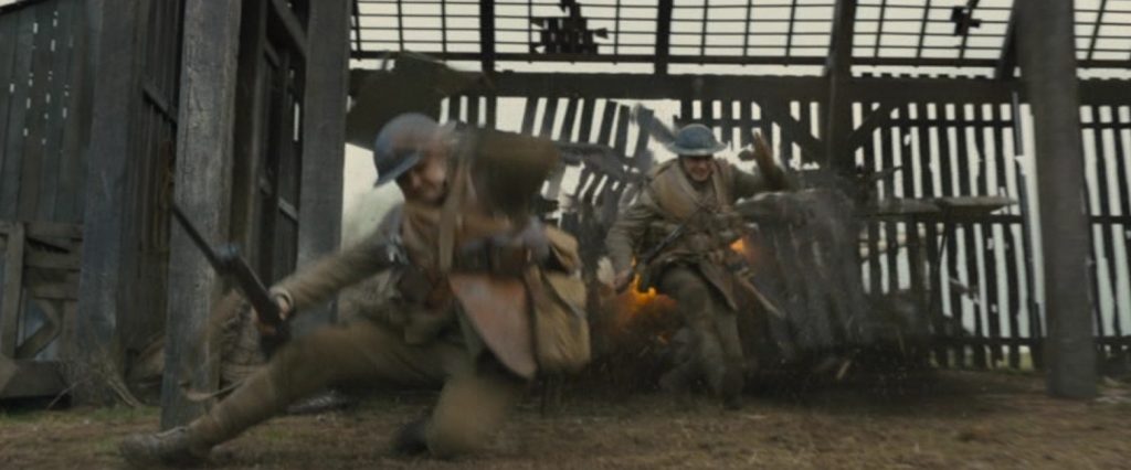
The visual effects for this movie, hands down, deserved the Oscar they took home.  They showed audiences something that had never been seen before.  This was innovative and gripping story telling at its best.  Director Sam Mendes had a vision of a film experience unlike anything that had ever been attempted, and he achieved that vision in a remarkable way. 

So this is a war film, and as such, it had its fair share of battle sequences, bloody death, and explosions, offering up a respectful amount of the horrors of war.  But what this movie did that was so remarkable was the fact that there was only one place in the film where there was a cut, a transition.  The entire film is made up of two continuous takes, each lasting around an hour.  The characters had to undertake a journey that crossed great spans of distance and time, and wherever they walked, the camera simply followed them, shooting them from different and unique angles, swinging around them, rotating from back to front, but never cutting.  It made for a fascinating and immersive visual experience.

Now clearly, this could only be done through the magic of visual effects.  It would be impossible to do this entire film in only two takes.  The visual effects teams had to find innovative and believable ways to seamlessly blend the separate cuts in such a way as to make them completely invisible.  To achieve this feat, this was the first film in which a specialized camera was used, called an Arri Alexa Mini LF Digital cinema camera.  This was critical, as it allowed the filmmakers to keep the camera in constant motion, sometimes being passed from cranes and wires, to being hand-held by a camera operator, and back again.  I’m guessing there were few or no stationary or fixed camera shots in the entire film.
The camera angles and movements had to be meticulously planned out and executed with a certain amount of precision.  This allowed the effects artists to stitch together the different cuts.  One of the film’s visual effects supervisors, Guillaume Rocheron, was quoted as saying in an interview with Computer Graphics World, or CGW, “Some of the stitches are simple, where a natural piece of landscape or architecture was used to disguise and blend the transition. Others were extremely complicated, where we switched to a digital set with digital actors because it was the only solution that would give us the exact throw of the camera, and as a viewer, you would not question it.”

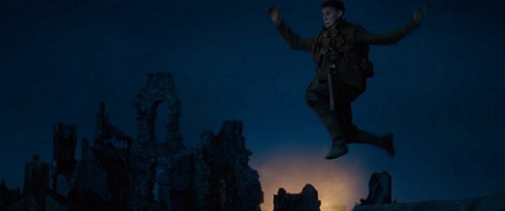
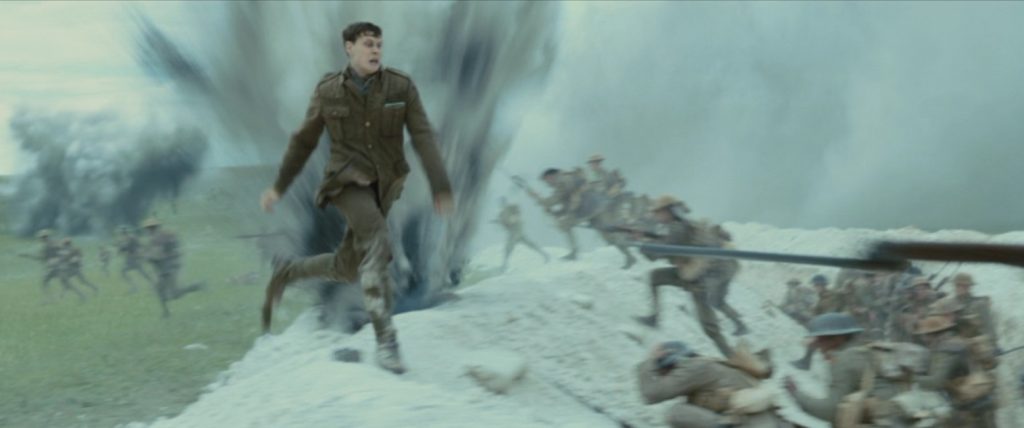
There are several scenes that stand out to me as really amazing.  There was the scene where two soldiers are nearly killed by a bomb in a bunker, another where an airplane crashes to the ground.  After one of them dies, the remaining soldier escapes a bombed out city by jumping off a bridge into a river.  And finally there is the scene where he sprints across a battlefield amid exploding shells and charging men.  This amazing film somehow blurred the line between a simple entertainment and a work of art.  I’ll say it again.  This film really deserved its Oscar win.

2018 – Solo: A Star Wars Story

Solo: A Star Wars Story = 2018

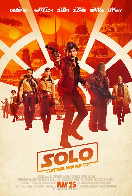
Contrary to popular opinion, I liked this movie.  The film may have been an unnecessary addition to the franchise, providing answers to questions nobody was asking, but it was a fun adventure, and a big part of that was the way it looked.  It brought back several characters we all know and love from the original trilogy, and introduced several new ones.  And it explained how Han Solo was indirectly responsible for the start of the Rebel Alliance…?  OK, I know, that’s all about the occasionally clunky script, not the visual effects, but I had to get it off my chest.

The movie had all the benefits of a big-budget blockbuster, and it showed in the special effects.  All the CGI heavy action sequences, all the strange aliens, all the sentient droid robots, all the high-speed space battles, and even a giant space creature, combined to form an aesthetic that perfectly fits into the style of every other Star Wars movie. There was an expected realism to everything that appeared on the screen, no matter how bizarre.  I especially liked the alien character of Rio, a snarky six-limbed monkey-like alien, and the super-giant space squid.

There seems to be a bit of a trend going on with visual effects, and that is to film as many effects “in camera” as possible.  All that means is that directors are using as many practical effects as they can, and enhancing them with CGI.  I can think of two significant ways in which Solo did this.  First, there was the character of L3-37, played by Phoebe Waller-Bridge.  This droid character could have so easily been a fully computer generated character.  She was a bipedal robot with many of her inner mechanisms and wires exposed.  Waller-Bridge wore a green body-suit on set along with robotic coverings over her arms, legs, and bit of her torso, with a small piece covering part of her head.  The animators were often able to use the visible parts of the costume in the final shot, eliminating the need for a fully CGI image.  That being said, I couldn’t tell when she was full CGI, and when she was not.

Second, the visual effects team borrowed a technique that helped its competitor, First Man, take home the Best Visual Effects Oscar.  They sometimes filmed the actors in front of a giant curved LED screen that provided the background like a modern version of a rear-projection screen.  I really like the idea that the actors actually get to see all the high-speed environments they are supposed to be in.

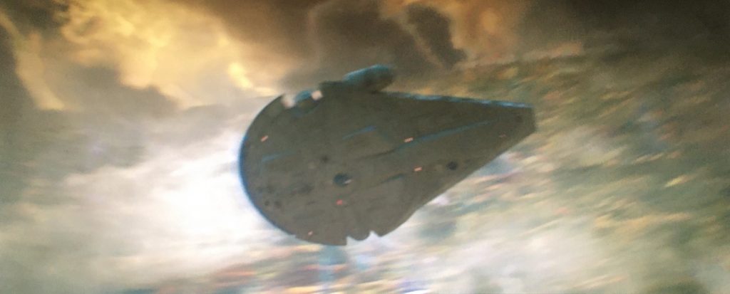
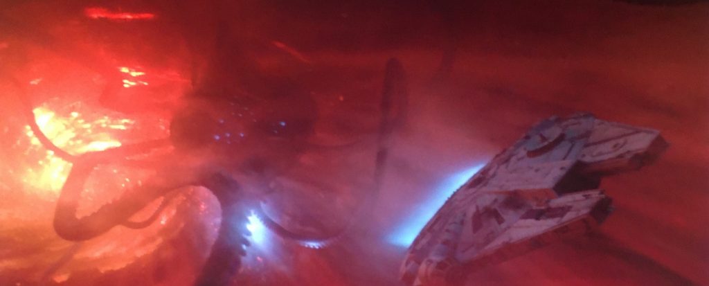
And all the fast flying action was fantastic!  The train heist sequence was awesome and the Millennium Falcon making the Kessel run in 12 parsecs, escaping both a glowing red gravity well and the space squid was very exciting to watch!  See, here’s the thing.  I have no problems with CGI imagery if you can’t tell it’s there.  But too often, there is an indefinable unrealistic quality to CGI.  And I know I’m skipping movies within the franchise, but I can usually tell the difference between CGI Yoda and puppet Yoda.  Was the CGI badly done?  No.  But the puppet always looked more tangible, more real.  Less mobile?  Of course, but more real.  All in all, this was a fast-paced fun space adventure that looked great on the big screen.

2018 – Ready Player One

Ready Player One – 2018

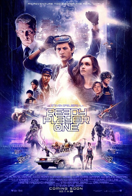
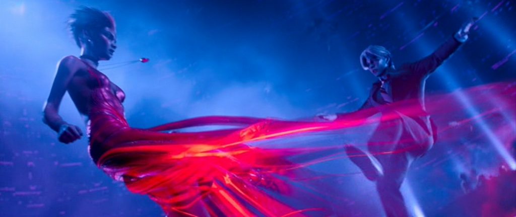
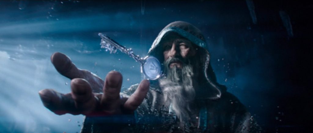
First off, I’m going to try not to give a biased opinion of the visual effects in this film, just because I really liked the movie.  There were two worlds in the film that have to be treated differently, from a special effects point of view.  There was the real world, and the virtual world.  The virtual world took up the bulk of the screen time, and every bit of it was CGI, from the characters to the environments.  All the action and all the drama, every single pixel, was made in a computer.

But that was as it was supposed to be.  One of the biggest plot points of the movie was that people spent too much time fantasizing in the virtual world, and not enough time living in the real world.  The virtual world was basically a big video game, and thus, it was appropriate when the CGI world looked like a cut-scene in a video game.  It wouldn’t have fit the story if it looked too realistic.

All the primary cast in the movie had to have their virtual avatars, for which the standard motion and facial capture techniques were used.  But because it was a fantasy world, there were certain things they could do that looked really cool.  For example, the avatar of Art3mis had oversized eyes.  Both she and Parzival had colorful facial markings.  Aech had a non-existent stomach, held together by metal support cables, resembling something out of the film Ex-Machina.  But it was the expressiveness in their faces that really sold the emotional content of the movie.  And the avatars of the bad guys had the same level of detail and emotiveness

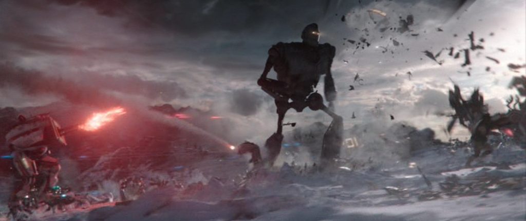
The two action scenes that stood out were the first car race scene, where the competitors had to avoid things like giant swinging wrecking balls, a T-rex, and King Kong.  But even that sequence was nothing compared to the final battle, in which hundreds of characters and items from every aspect of pop culture, or one might proudly say, nerd culture, at least the ones director Stephen Spielberg could get the rights to, like Batman, Halo, The Iron Giant, Mechagodzilla, He-Man, Krull, Monty Python and the Holy Grail, Back to the Future, Street Fighter, Nightmare on Elm Street, Child’s Play, and Gremlins, just to name a few.  Apparently, there were so many unique and individual characters on the screen at the same time, fighting in one massive battle, that a new software had to be developed to make it all work.  And it all looked… just unreal enough to be recognizable as the film’s virtual world.

And in the real world, the three most notable effects were also pretty impressive.  First, there was the Stacks, a giant slum neighborhood made of mobile homes stacked up on top of each other like metal-framed towers.  Next was the destruction of one of those towers, though our hero had to use the Prometheus school of running away from things when it fell towards him.  The third was the hologram of Parzival’s avatar being projected into Sorrento’s real-world office, made of sparkling pixels of projected light.  But I can’t forget the digital recreation of the Overlook Hotel from Stanly Kubrick’s The Shining.  The sheer number of pop-culture characters and reverences in this movie was just impressive!

2018 – First Man (WINNER)

First Man – 2018 (WINNER)

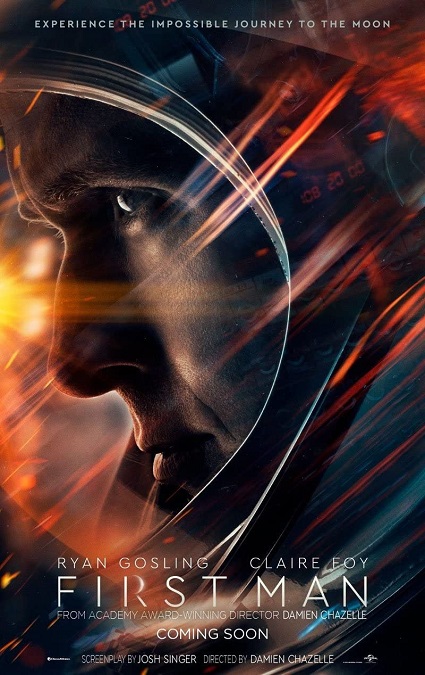
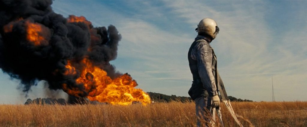
The visual effects for First Man did not, for the most part, impress me… that is, until I did a little research to learn how they were done.  Then my respect for them grew a little.  However, the first and biggest problem I had with these effects was that we’ve seen most of them before in other excellent films like The Right Stuff and Apollo 13, between which, there were noticeable improvements in the effects.  And while they looked good in this movie, I don’t see how the visuals here were significantly better than those other films which came out in 1983 and 1995.

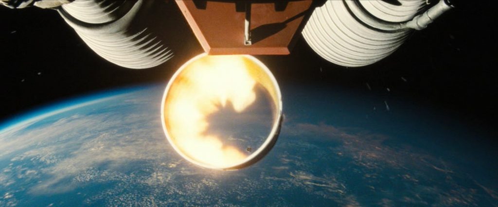
But what made these movie’s effects impressive was that they were all practical effects… well, kind of.  What I mean is that director, Damien Chazelle, used all practical effects, up to a point.  There were no green or blue screens, there were miniature models in various scales for wide or close shots, there was actual NASA archival footage that was used and enhanced, and there was minimal CGI.  So how did they get the shots of the Apollo 11 launch, the earth from outer space, and the moon landing?  The tried and true method of rear projection.

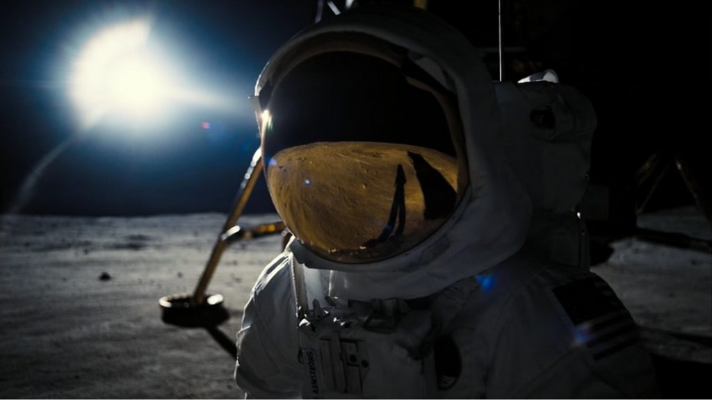
But it wasn’t your typical rear projection technique.  They constructed massive 35 foot tall, 60 foot wide LED screen that they put the actors in front of.  Now, the images being played on the screen were a combination archival footage and CG images.  So when the camera was recording, it picked up all those images without having to composite them together.  This had the added advantage of allowing the actors to see the backgrounds and environments their characters were supposed to be in.  Also, when you see images reflected in the helmets of the astronauts, many times, they were actual reflections that didn’t need to be added in post. 

So the real challenge that the effects teams had to deal with was preparing all the CGI images that were to appear on the LED screen.  Obviously, it all had to be ready before the actual filming began, as opposed to after filming was complete.  Also, depending on the kind of shots needed, different LED images need to be at different resolutions in order to make the shots believable.  And it wasn’t just a small amount.  They had to create around 90 minutes of background content, which is the size of a feature in its own right.  And I have to say that the best effects scene in the movie was the climax, the actual moon landing.  It was an event that has not often been depicted in films, and certainly not in such a realistic way.

So all the in-camera filming that was done added a certain level of realism to the movie, which I appreciate.  But that isn’t to say that there was no post-production work.  In the end, the practical effects were enhanced by minor CGI effects.  Also, the LED backgrounds were sometimes adjusted to better suit the needs of the scenes.  All in all, it was a very interesting and innovative approach to modern filmmaking.  But did this movie deserve its Oscar?  I suppose so, if only because of their innovation, blending an old technique with modern technology.  It was a new and effective way to show us things we’ve seen before.

2018 – Christopher Robin

Christopher Robin – 2018

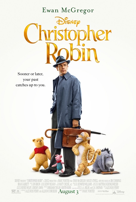
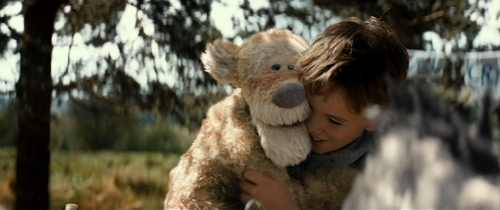
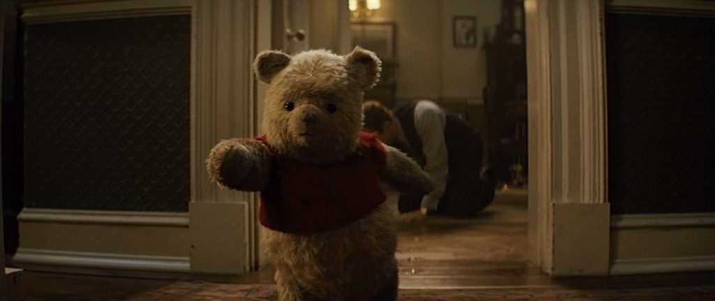
I’m going to say, right off the bat that this was a very sweet movie, but the visual effects were not as impressive as I wanted them to be.  There is no doubt that they were done very well, but they were kind of a one-trick pony.  The big effect of the film, which was at its core, just a kid-friendly family drama, was the animated stuffed animals.  They looked great, but there really wasn’t much else to look at.  To be honest, I’m not exactly sure why this was nominated for an Academy Award.

So I figured I must be missing something.  To find out what, I looked up a StudioDaily interview with the film’s visual effects supervisor, Christopher Lawrence, to see what he had to say.  I found it interesting that the first question they asked was, ”Why do you think your peers voted to give Oscar nominations for best visual effects to Christopher Robin?”  Exactly what I was wondering, myself.  His answer was that it was all about the complicated concept of toys coming to life and making them seem real.  Also, it was about making their performances subtle; animated without being cartoony.  And that was about it.  I read the entire interview, and that’s all that was mentioned.  So… I didn’t miss anything.

That being said, there is no question, it looked really good.  Even though the animated toys were completely CGI, they looked like real toys that were alive.  One of the challenges the animators faced was the fact that the stuffed animals didn’t have flesh and skin.  They had cloth and fur.  That alone made it different than most contemporary efforts of CGI realism, especially when it comes to lighting.  It really looked fantastic.  The stuffed animal character that got the most praise was Tigger, though I didn’t see how he was any different than Pooh or any of the others.  They all looked equally good, and the subtlety of the all emotional performances of the toys was perfectly executed, especially Pooh.

The problem is that once you get used to the effect, you look for something more, and there just wasn’t anything else.  The only real variations in the effect was when the stuffed animals were in different environments.  For example, when Pooh is walking in the rain, you could see the falling water interact with his fur, or when he is eating honey, getting it all over himself and everything else.  Though, even as I was watching the movie, I had to roll my eyes in disbelief.  Real honey cannot be cleaned up anywhere near as easily as it was portrayed in the film.  But I get it – that’s not the point.  The point is how the CGI honey looked matted in Pooh’s CGI stuffed animal fur, and it looked perfectly real.
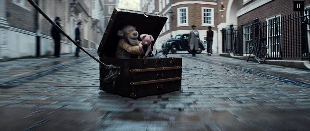
Of course, there was your standard cadre of green-screened environments that were nice, but nothing to write home about.  And there was one very brief scene in which several of the characters are in a trunk being dragged behind a moving truck.  The trunk is fishtailing and causing minor chaos in its wake, but again, nothing too difficult or exciting.  There just isn’t a lot to comment on.  Their one trick looked fantastic, but in the end, it was just one trick. 

2018 – Avengers: Infinity War

Avengers: Infinity War – 2018

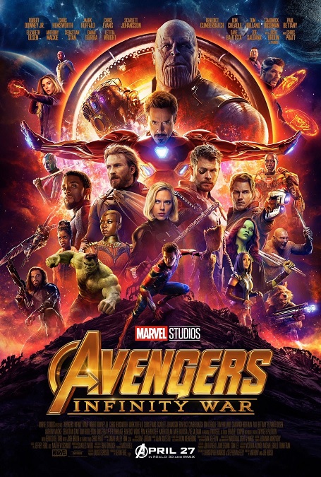
The visual effects in this movie were incredibly good!  So good!  They really knew what they were doing when they put this movie together, and there is no doubt that the effects were a huge part of that.  This is one of those films that completely embodies the modern action blockbuster.  In a behind the scenes featurette, Executive Producer, Victoria Alonso said that there were 3,000 shots in the film, and that 2,900 of them were CGI.  “The entire movie is one big CG scene.  The environment is CG, the weapons are CG, every shot is dense in layers.”

And many of those things are fantasy elements, so of course they are computer generated, but they make them look perfectly real!  Nowhere is this more clearly displayed than in the film’s main villain, Thanos, played by Josh Brolin.  So he acted the part in a motion capture suit, with face capture dots all over his face and a camera mounted on his head, but the animators actually made the character look vaguely like Brolin, and all the emotiveness of his performance came through clearly.  Brolin created such a great bad guy!  Yeah, he was giant and purple, but if such beings were real, that is what they’d look like!

Then there were a plethora of awesome effects that we have seen in earlier Marvel films.  There was the magic portals and shields from Doctor Strange, the genetically enhanced raccoon and talking tree from Guardians of the Galaxy, the nano-technology powered super suit from Iron Man, the bad-assed lightning god effects from Thor, and the crazy-tough fighting of Captain America and Black Widow.  We didn’t get much of the big green guy, but we did get plenty of other great heroes like Black Panther, the Winter Soldier, and Spider Man.  There was also a great bunch of new villains called the Black Order that looked fantastic.

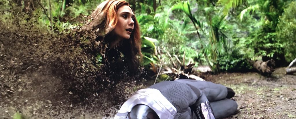
But it was the cool effect in the film’s powerful emotional climax that sticks in my memory.  You see, spoiler alert, the good guys lose, and Thanos wipes half the life in the universe out of existence.  When the heroes start to dissolve into flakes of dust that are blown away in the wind, it was heartbreaking, but so cool to watch.  It was so well done, and even though it was a CGI laden action movie, I am nearly brought to tears every time I watch it.

I also have to make special mention of the phenomenal CGI environments created for the movie, from the streets of New York, to various space ship interiors, to alien worlds, and finally to the fantastic battleground of Wakanda.  Every scene looked like it was shot on fully fledged, real sets.  That being said, a lot of the environments were made as live set extensions, but there is no way to tell where the reality ends and the CG images begin.  Perfect.

And finally, I’d like to say how much I enjoyed the varied array of spells used by Doctor Strange.  For example, though the name of the spell was not mentioned in the film, I easily recognized the crimson bands of cyttorak from the comic books.  They were true to the source material, so extra bonus points there.  Great visuals!

2017 – War for the Planet of the Apes

War for the Planet of the Apes – 2017

Here we are with the third installment of the revived Planet of the apes franchise.  The main effect we have here is, of course, the hyper-realistic humanistic apes, accomplished by sophisticated motion capture and facial-capture technology.  If anyone thinks that actors that perform rolls in this way should not be eligible for acting awards is fooling themselves, but that’s a different discussion.

The first film in this franchise, 2011’s Rise of the Planet of the Apes, had visual effects that were incredibly good.  The second one, Dawn of the Planet of the Apes from 2014, somehow improved on those effects, making them even better and more realistic.  And before watching War for the Planet of the Apes, I thought they had already reached the pinnacle, and that there was just no room for significant improvement.  But I was completely wrong.  They topped themselves yet again, and it was incredible!  Somehow, they made these fully CGI characters even more realistic and life-like.  The way they animated the chimpanzee, Bad Ape, played by Steve Zahn, was especially good, but made even more interesting because he wore human clothing like boots, a snow-vest, and a woolen snow-cap.

One of the things I loved about the animation of the apes was that from one film to the next, the characters were allowed to age.  You could see that by this third movie, the main character of Cesar was getting appropriately older, with gray hairs and more wrinkles.  They also had the apes featured in different conditions like rain and snow.  You could see how their fur became matted when it was wet, or how they became crusted with snow with prolonged exposure to the elements.  And I didn’t fail to notice the little detail of being able to see their breaths in the cold environment.  Little details like that just added to the realism.

But it was the flawless level of detail in the emotions portrayed on their faces that impressed me the most.  The animators clearly understood what facial muscles are involved in displaying those emotions in the non-human faces of the apes.  And all these things were based on the real-life acting of the incredible cast.  All you have to do is watch any of the side-by side comparisons of the actors in their motion capture suits, with the dots all over their faces, and with cameras mounted on their heads, shown next to the images of the apes they portray, to see that the CGI animators weren’t making the facial performances up.

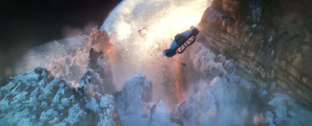
But that was just the film’s main effect.  The movie’s climactic battle was pretty cool.  The helicopter battle sequence with its missiles and explosions was perfectly executed, though it was standard fair for this kind of a movie.  But I have to mention the avalanche scene.  Cesar causes a major explosion that starts a massive avalanche that buries the military installation and the entire human army.  It was incredible!  The power of the avalanche as it toppled tall pine trees and destroyed everything in its path was pretty awesome!  If there is another movie in this franchise, I wonder how they’re going to improve the technology yet again?

2017 – Star Wars: The Last Jedi

Star Wars: The Last Jedi – 2017

Here we are with another Star Wars movie, and here I am loving just about everything about it.  Why, then, would I give its visual effects only four stars instead of five?  Well, it’s all about the CGI characters.  As good as VFX artists are getting in creating completely computer-generated faces of CGI motion, they have not become flawless or undetectable.

Now, I’m not talking about the digital body-doubles during action sequences or mechanical or robotic characters.  I’m talking about the fully realized organic characters.  In some cases, this is due to their slightly goofy designs, as in a few of the aliens in the casino scene, or the tall racing animals call Fathiers.  There was an underlying unreality to them that never quite fooled my eyes, especially when they were on the screen with a live actor.

Instead, I’m talking about one of the major villains in the movie, Supreme Leader Snoke.  Andy Serkis played the part in a motion-capture suit with facial capture dots all over his face.  But as good as the animation was, there was an undeniable unreality about him that didn’t fool my eyes, at least not 100% of the time.  There are three things about Snoke that stand out to me every time I watch the movie:  His mouth, his hands, and his clothing.  When it comes to his mouth, and really, his whole face, there are shots where the flesh looks perfectly real, though in other shots, not so much.  The skin seems a tiny bit too waxy or translucent. The motion of the lips looks too deliberate, too fabricated in order to form the words of the dialogue.  Similarly, with the hands, the motion is too slow and precise, too contrived.  But his gold robe is the most obvious offender.  It never looks quite real to me.  It doesn’t seem to move realistically.  It hangs too perfectly, moves too slowly, and for whatever reason, never seems to blend into its surroundings in a realistic way.  It is a good effect, but it isn’t perfect.  It catches my eye every time.

Of course, the space battles and the light-sabre fights are always cool.  I especially liked the awesome sabre battle in Snoke’s throne room.  The Elite Praetorian Guards were pretty awesome.  They held various cool-looking weapons that could compete with the laser swords wielded by Rey and Kylo Ren.  Such an awesome sequence.  There was also a pretty cool battle sequence on the flight deck of Snoke’s destroyed command ship.  Captain Phasma and a bunch of Storm Troopers are defeated by Fin, Rose, and BB-8 in a bright and explosive gunfight.

The battle on the white salt plains of the red crystal planet of Crait was thrilling to watch.  Other notable effects were the scene where a pretty good CGI Princess Leia is sucked out into space, but is able to rescue herself using the force, and the scene where Vice-Admiral Holdo hyper-drives her small ship through Snoke’s flagship, destroying it, a large portion of the Imperial fleet, and herself.  I also love the film’s over-all color pallet of black, white, and red.  This movie is packed full of exciting action sequences and some really great visuals! 

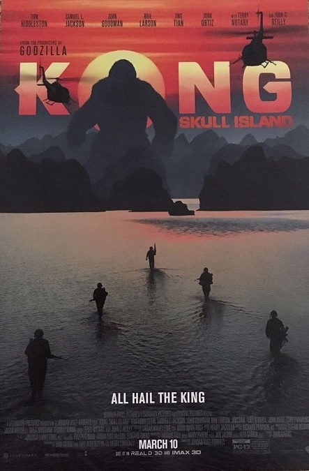
2017 – Kong: Skull Island

Kong: Skull Island – 2017

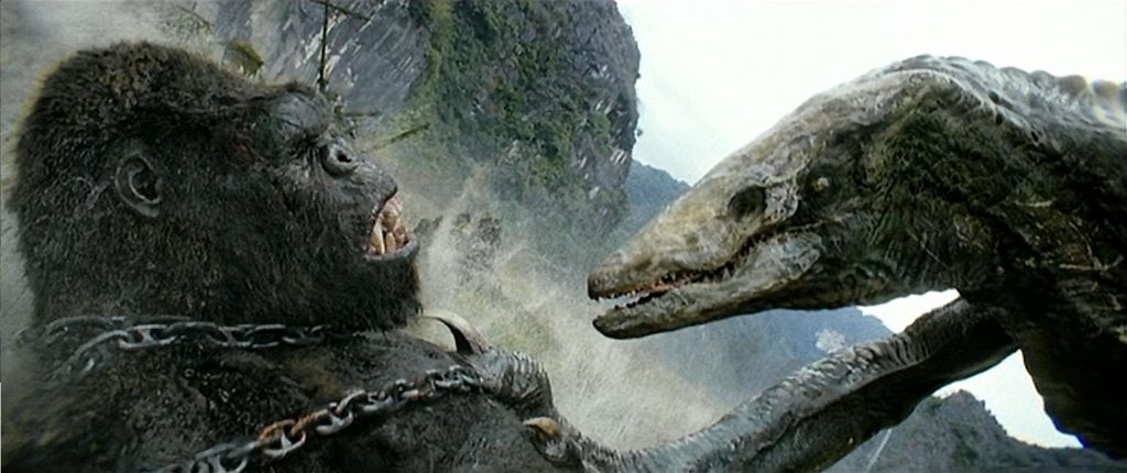
This movie was ten kinds of stupid.  The visual effects themselves were passable… most of the time, though there were some effects that were downright awful.  But the unfortunate truth of the matter is that the real problems were with the script.  When the visual effects artists are given the task of creating visuals that are so unrealistic that they take me out of the movie with their ridiculousness, the effects fail.  And who else can I blame, but the director, Jordan Vogt-Roberts.

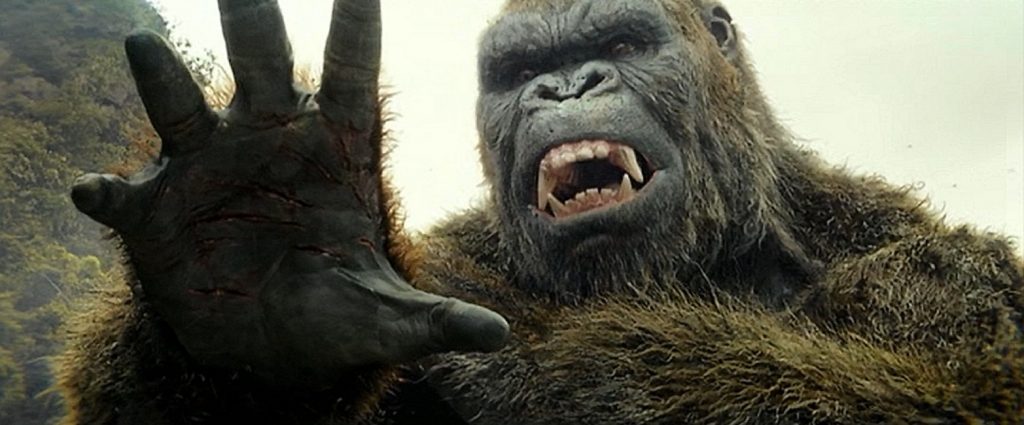
What I mean is that you can make a giant ape as photo-realistic as you want, but if he doesn’t move like an ape, I don’t buy into the illusion.  But I get what they were trying to do.  First, they were harkening back to the original 1933 version of King Kong, where he was not fully ape, and not fully man.  He was both.  Second, as I watched the film, it became clear that this was not a King Kong movie.  It was a Godzilla movie.  This was a film whose real purpose was to introduce King Kong into the Godzilla universe.  So ok, I have to take that for what it is.  I guess I was just spoiled by Peter Jackson’s phenomenal 2005 Kong, where he made a giant gorilla, while this version of Kong is its own unique creature.

Now, I have to mention his height.  In the original 1933 film, directed by Merian C. Cooper, he was 18 feet tall, but 24 feet tall in New York.  In 1976, director Dino De Laurentiis made him 42 feet tall.  In 2005, Jackson scaled him back down to 25 feet tall.  But in order to make him a worthy opponent for Godzilla in a future movie, Jordan Vogt-Roberts pumped him up to 104 feet tall.  That’s a pretty big difference.

At its core, this was a monster movie, and according to the director, many of the fantasy monsters that were created, were inspired by Japanese Anime and Pokemon.  Nowhere was this more evident than in the design of Kong’s main adversaries, the Skullcrawlers.  They had a torso that was like a hunchbacked snake or lizard, but with only two limbs, powerful legs/arms.  But there was also a giant cross between a spider and a crab, there was a giant six-horned water buffalo, and a giant six-legged, uh… turtle/stick insect?  The obvious Pokemon design influence made everything look slightly campy and silly.

But the worst effect in the movie was when our heroes were being attacked by a flock of monster birds.  A man using a samurai sword was slicing them in half.  There is a terrible shot where, in slow motion, a bird is opened up like a zipper.  Thick globs of blue blood squirt dramatically, and the man’s gas-masked face is revealed behind the CGI gore.  The images looked completely separate, and the blue blood looked almost laughable.  But I don’t know.  The silly effect of a man being torn limb from limb by the birds against the backdrop of a giant sun was pretty bad too.  The bird is holding the man’s briefcase, and yet, his arm comes off at the shoulder.  What would go first, the man’s shoulder joint or his grip on the brief case?  And someone needs to tell the director that the Aurora Borealis does not happen in tropical zones because… science.  It’s all in the details, Roberts.