2017 – Guardians of the Galaxy Vol. 2

Guardians of the Galaxy Vol. 2

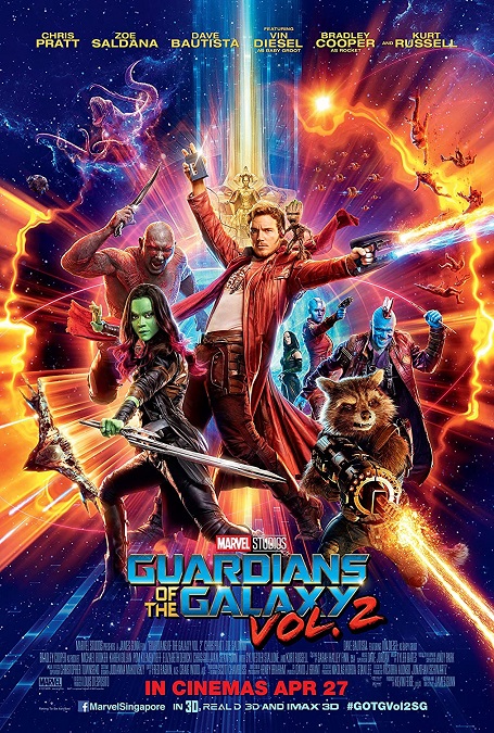
I’ve mentioned movies that had flashy visual effects before, and while flashy does not necessarily mean good, these effects were both.  The color pallet chosen for this film could be described in three words: psychedelic, rainbow, and glowing.  All three are apt adjectives, making the visual landscape of the film brilliant and dazzling.  It is truly like a comic book come to life.

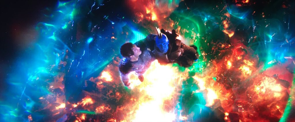
The genre is fantasy/sci-fi/adventure, and takes place in outer space.  Many of the spectacular effects were like a brightly colored laser-light show.  The explosions were not mere explosions of yellow and orange fire.  They were full of greens, blues, and purples as well.  The flames that burned the dead body of a fallen comrade were a complete spectrum of eldritch light.  For me, this marvelous color palate was one of the things that made this movie’s visual effects so memorable.

As one might expect in a modern space adventure, there were several scenes that displayed fast and highly maneuverable space ships moving like daredevil fighter jets.  There were space monsters, laser guns, a magical arrow that could penetrate any armor, and a living planet with an actual face.  This movie really gave us visuals that we’ve never seen before.  Of course, most of it was based on the images in the original source material, the pages of Marvel comic books, and they did a fantastic job of bringing it to life.

But the script was also light-hearted and didn’t seem to take itself too seriously.  Amid all the bright colors were the wonderful CGI characters of Rocket and Baby Groot.  I have to comment on how awesome the talking racoon was.  As they did in the first film in the Guardians of the Galaxy franchise, the animators really paid close attention to the distinctly racoonish fur on his face.  We saw when it got dirty and matted, or when a tear rolled from his eye.  Perfectly detailed.

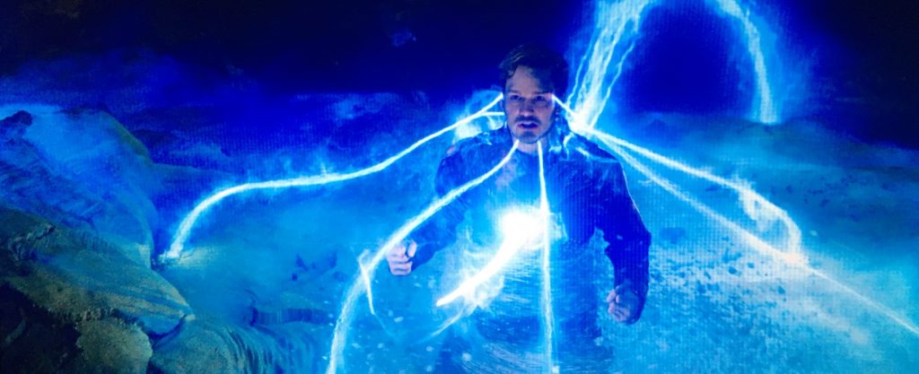
Then there was Ego.  As is becoming more common by this time, there were several scenes in which Kurt Russell had to be de-aged, and he looked pretty good.  There were times when he had to morph from a glowing blue skeleton into a fully fleshed man, or into David Hasselhoff, or when he is defeated and he crumbles into dust.  They did a pretty good job with the various physical incarnations of the Celestial.  And the fully CGI environments of his planet and his palace were beautiful, like a pristine paradise.  Even the inside of the planet was like a glowing cavern straight out of a dream.

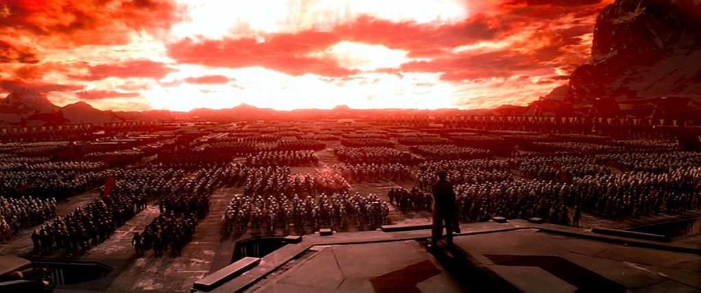
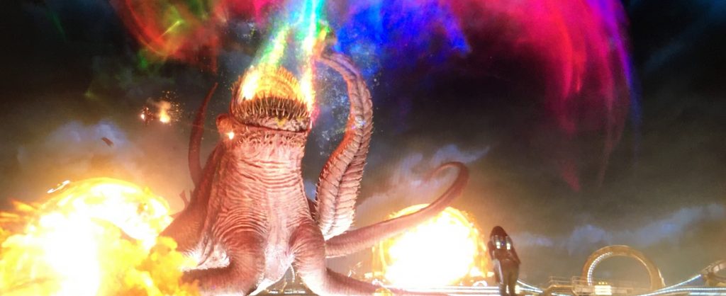
The movie’s opening credit scene and its climactic battle in Ego’s planet body were particularly memorable.  The tentacled monster with the psychedelic rainbow blasts that shot from its toothy maw was fun.  And the final showdown between Ego and Star Lord was fast-paced and exciting.  And staying true to that rainbow aesthetic, the Ravager funeral at the end where a massive fleet of ships spouts fountains of brightly colored fireworks all at the same time.  And yet they somehow managed to make that bright display the movie’s emotional climax, and it was beautiful.
2017 – Blade Runner 2049 (WINNER)

Blade Runner 2049 – 2017 (WINNER)

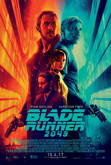
The visual effects for this movie were so good!  They were visually stunning, inventive, and technically superb.  They were incredible, and I’m not at all surprised they took home the Oscar for the category.  Not only did they go a long way to make the aesthetics of the film match with the first Blade Runner film, but they did so in a way that looked effortless.  They really knocked this one out of the park. 

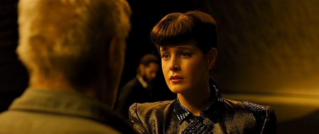
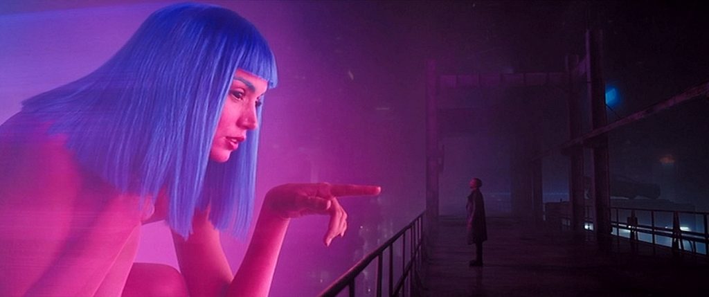
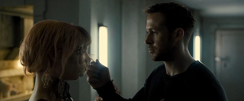
I was lucky enough to find on the internet, an interview given to John Nelson, the film’s Visual Effects Supervisor, in which he explains how a few of the film’s most memorable effects were accomplished.  Funny enough, when I watched the film, that is, before I read the interview, I had picked out the exact same scenes as my favorites.  The movie was full of visual effects, but two scenes stood out. There was the scene where the hologram of a woman is synched over a live woman’s body, and the scene in which the actress Sean Young is digitally recreated exactly as she appeared in the first film, which was made 35 years earlier.

The scene with the two women might at first appear to be created simply by double exposure, filming the two actresses separately.  That is part of it, but they really pushed the boundaries of the effect.  First of all, the fact that one of the women is a hologram was significant.  The way the image shifted between one woman and the other, sometimes not lining up, sometimes, being in perfect harmony, made for a fascinating and beautiful moment.  Add to that the fact that they were both interacting with the same live actor was just wonderful. 
The other scene, where Sean Young was recreated as a young woman, was beautifully done.  They had another actress play the scene as a stand-in, and then replaced everything from the neck up with CGI.  They scanned Sean Young’s face as it was in 2017, looked at her original Blade Runner performance when she was 19 years old, looked at a life-cast of her that was created about 10 years after that, and they looked at her performances from other films.  They studied her original character’s mannerisms, and used everything together to make the most accurate recreation as possible.  I think they achieved their goal… for the most part.  If I’m being honest, I have to mention a certain amount of falseness to her face.  There were a few shots in which she looked too plastic.  This might have been the extreme lighting in the scene, or, as was part of the plot, she was supposed to be a replicant, a realistic android.  But I think the recreation was 95% successful.
Another interesting fact about this film’s visual effects that I uncovered while reading the interview, was that many of the backgrounds in the film were not digital.  They were matte paintings.  They mentioned the orphanage exterior as an example.  How retro!  Either way, they looked great.  And I also really liked the dead Las Vegas city-scape with the giant statues of naked women.  They gave the whole scene a very surrealistic feel as K flies his car through the dusty ruins.  All in all, the film was visually beautiful, sometimes bordering on artistic.

2016 – Rogue One: A Star Wars Story

Rogue One – A Star Wars Story – 2016

Oh, they came so close!  So close to me giving them five stars, so close to wowing audiences, so close to bringing a deceased Peter Cushing and a young Carrie Fisher (she was still alive at that time) back to reprise their rolls which they made famous in 1977.  They did their best to match their CGI avatars to the Original Star Wars as part of the film’s plot.  *sigh*  They really did come very close.

Most of the film contained the wonderful visual effects that are the hallmarks of every Star Wars movie ever made.  There were exciting space battles that are like high-speed Air-Force fighter-jet battles, complete with bright, glowing laser blasts and fiery explosions.  There was an awesome ground battle with giant ATAT walkers.  Of course, there was the Death Star, using its green planet-killing compound laser to destroy entire cities and bases.  The destruction of the Holy City on Jedha was really awesome.  As the mega-blast from the Death Star hits the city, a concentric wave of devastation rolls across the surface of the desert planet like a mile-high ocean wave made of rock and dirt.  It looked amazing!

We even had a bit of light-saber action near the end of the movie that was fantastic.  In one of the coolest sequences of the movie, we finally got to see what an unleashed Darth Vader could do, as he single-handedly took out about fifteen Rebels armed with blasters.  And they got all the details right so the film could dove-tail right into the beginning of Star Wars Episode 4: A New Hope.  Seamless!

But one of the most memorable parts of the movie, memorable because it had never been successfully attempted before, was Grand Moff Tarkin and the young Princess Leia.  ILM used CGI and digitally altered archival footage, which they were able to superimpose over live actors, Guy Henry and Ingvild Deila.  Unfortunately, in my opinion, they fell just short of believable.  There was just something about them that made them resemble the very sophisticated animation style of the movie, The Polar Express.  Here, it helped that they were placed in live environments, but they stood out.  It was their movement.  Tarkin was the better of the two, but he still looked like an amazingly animated digital character.  And Leia, though her face only had a mere six or seven seconds of screen-time, just didn’t look at all real.  I think it was the bold shape of the face, the eyes that looked a tiny bit too big, the immobile upper lip when she said the word, “Hope”, and the flawless smoothness of the skin.  There were no slight imperfections that mark something as real.  She just looked a little too plastic. 

But I don’t want to give the impression that I didn’t like the movie or its special effects.  I did.  The way they were able to use archived footage that was nearly forty years old to bring back even other characters like the X-wing pilots Gold Leader and Red Leader was very cool.  And the familiar space-battle sequences, were all pretty awesome!  I especially liked when they crashed one Star Destroyer into another, or when they blew up several of the ATAT walkers.  Awesome effects!

2016 – Kubo and the Two Strings

Kubo and the Two Strings – 2016

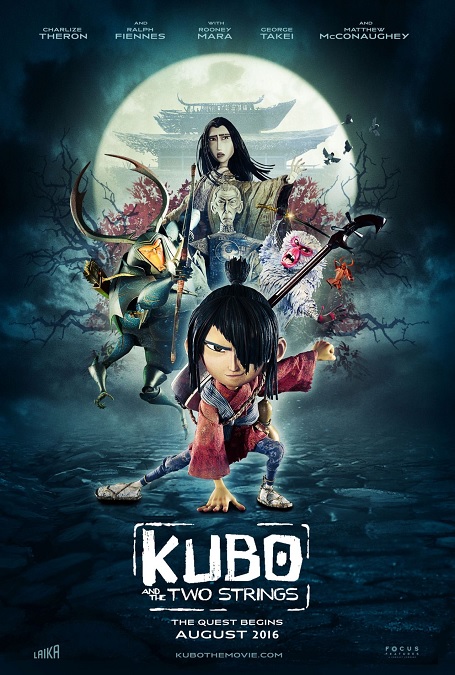
I almost gave this movie only four stars, but it was just such a good movie, I had to give it its due credit.  Why would I have given it a lower score?  Well, it was, after all, just a stop-motion animation film.  It’s not like we haven’t see this kind of animation before.  Was it done well?  Of course it was, and I can see where it was phenomenally better than, say, The Nightmare Before Christmas or Coraline.

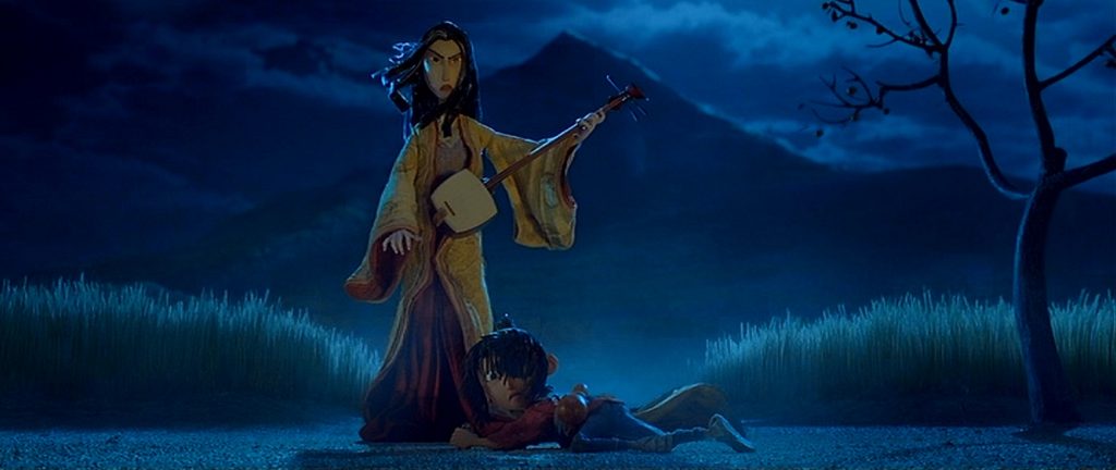
To be sure, the animation was incredible.  However, as with all stop-motion animation, it has it a few issues, which are inherent in the art form.  For example, when characters are speaking, try not to look too closely at their mouths.  Every once in a while, the smoothness of the motion falters, and you can see a certain amount of jerkiness.  Also, in order for the small puppets to be as expressive as they needed to be their eyes were vastly over-sized.  There were times when Kubo’s eyes seemed to cover nearly a third of his entire head.  The same can be said about his hands and his feet – too big.  But I wouldn’t even call those small attributes flaws.  They are just normal conditions of the art form.

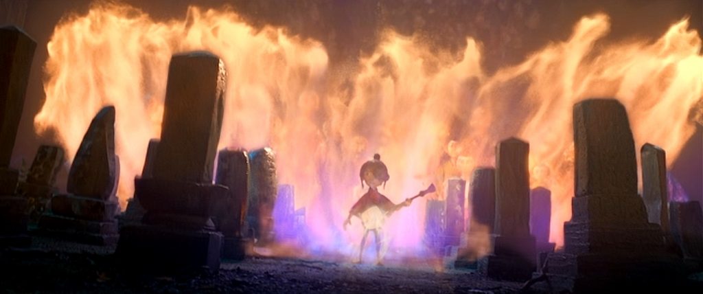
The but the high quality of the film’s effects far outweighed these minor issues.  The design of the digital environments was stunning.  We were taken from a frozen blizzard to a desert wasteland, from a raging sea to a dark and forbidding cave, from Kubo’s lonely mountain home, to the ruined home of his dead father.  As always, lighting was key in blending the CGI backgrounds to the live environments of the puppets.  There was even a great sequence that took place underwater in a garden of giant glowing eyeballs, and everything blended seamlessly.

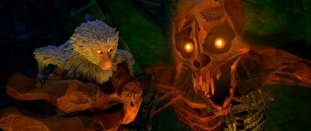
There was a sequence in the film in which the heroes battled a giant skeleton with glowing red eyes.  At first, this scene didn’t impress me, but then I did a little reading about the making of the film.  Apparently, the skeleton was the largest puppet ever used in a stop-motion animated feature.  It was eighteen feet tall, and I’d say that, in itself, was pretty impressive if you consider the medium of stop-motion.  Making something that large move the miniscule amounts necessary to achieve the same smooth motion as the rest of the movie was pretty amazing.

So when it comes down to it, I can see why the film was nominated for Best Visual Effects, but I can also understand why it didn’t win.  While the execution of the stop-motion was far superior to any other stop-motion I have ever seen before, stop-motion, itself, is not as technically impressive to me as the movies it was up against.  Sure, there is a certain amount of realism, of tangibility, to the images on the screen, because real puppets were filmed, one frame at a time.  And my research revealed that the film contains at least 145,000 separate still images strung together, which must have constituted an unimaginable amount of work to put the film together.  But the Best Visual Effects category is about more than the patience and ridiculously hard work of the filmmakers.  Stop motion animation is like a one-trick pony, even if the trick is amazingly executed.

2016 – Doctor Strange

Doctor Strange – 2016

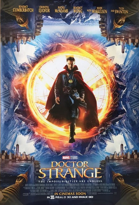
This was one of those movies in which the fantasy imagery was really on another level.  It clearly required a lot of imagination and innovation.  It would have been so easy for the magic effects to appear silly or cartoonish, but they didn’t.  Even though there is no real-life comparison to go by, they looked completely realistic.

Of course, one of the major action sequences in the film had already been done before.  In the scene, Doctor Strange and his enemies battle in the fantastic Mirror Dimension, where a city is bent, folded, warped, stretched, twisted, shuffled, and magically rearranged.  They took the effect that we saw in the 2010 Best Visual Effects winner, Inception, and enhanced it a hundred-fold.  Director, Scott Derrickson, confirmed that this was not a coincidence.  It was inspiration.  The whole sequence was like a fast-paced M.C. Escher design in motion.  But that was just one of the wonderful effects we were treated to.  The film dealt with a certain style of sorcery, and it was given its own unique look that was perfect for a superhero movie.  The tools, weapons, and shields that were conjured as sparking light and glowing kaleidoscopic patterns that resembled artistic mandalas.  They were flashy, beautiful, and just plain cool.

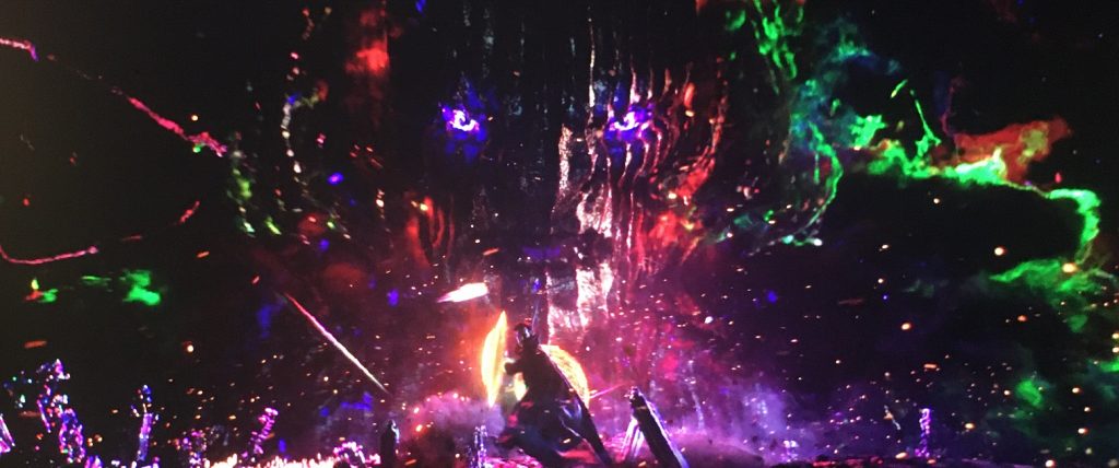
And then there was the climax of the movie that took place in the Dark Dimension.  It was all bright rainbow colors and shapes against the void of a black background.  It was designed to look grand and majestic, but dark and forbidding at the same time.  And the evil Dormamu was the best part with his glowing purple eyes and his flesh that looked like rippling tree bark.  He was so big that he looked like just a floating head, though every now and then, I could see what looked like shoulders and a torso.  The design work was just so cool!

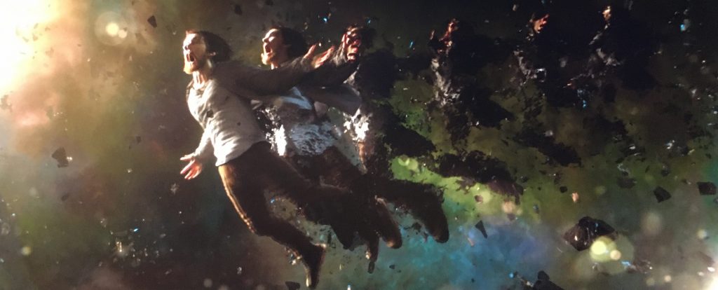
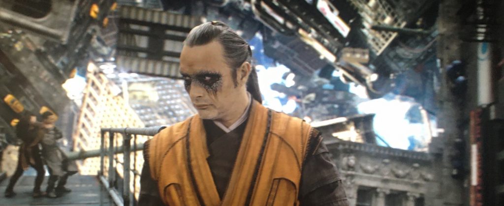
But there were plenty of other effects that were just as cool, and just as perfectly executed.  There was the horrific car crash at the beginning of the movie, the astral projection scenes with their ghostly floating people, and the Cloak of Levitation, which was like a character in its own right.  One of my favorite little effects was the magical device that ensnared and immobilized the evil sorcerer, Kaecilious.  It just looked awesome as it wrapped around him, forced him to his knees, and bound him into a prone position in which he could not use his magic.

This was a CGI-heavy movie, and I know that there are people who hate movies that rely too much on digital imagery.  But if the animated effects are done well, and they look as realistic as the live actors, sets, and props, then I say why not use the tools that we have available to us in the current age of technology?  This movie lost the Oscar to The Jungle Book, but I think the wrong movie won.  Then again, I’m a fan of superhero movies, so, like most people, my opinion is biased.

2016 – The Jungle Book (WINNER)

The Jungle Book – 2016 (WINNER)

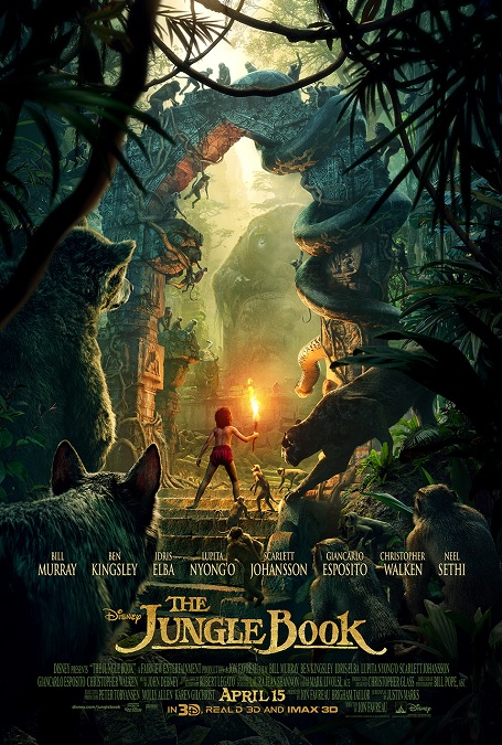
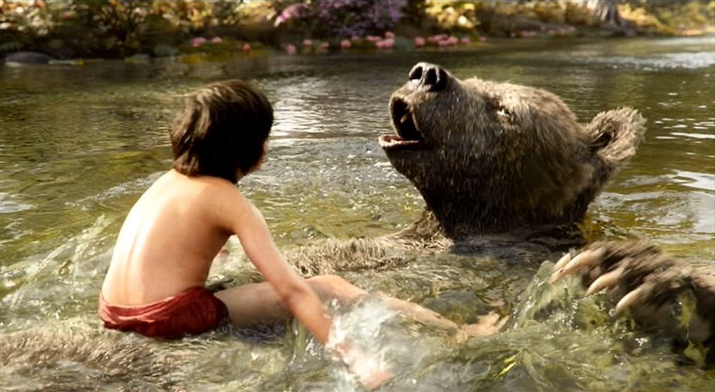
At first, I thought that this movie’s visual effects were good, but not as good as all the attention they were given.  But the more I think about it, the more my opinion has changed.  Not only were the visuals incredible, I believe they deserved their Oscar win.  When thinking of the visual effects for this movie, I’d wager that most people immediately go to the completely CGI animals, and to be sure, most of them were just about perfect.  But it was the CGI jungle environments that were, for me, just as impressive.

Every bit of jungle, every blade of grass, every leaf and vine, were all manufactured in a computer, and when you think about the fullness of the scenery, it really is pretty spectacular.  At times, I was not aware of the backgrounds, but I am confident I would have noticed if it didn’t look right.  In other words, the composited jungle environment became invisible, which is usually one of the most successful kinds of effects.  When effects become invisible, they allow viewers to focus on the story, and the animator has accomplished his or her objective.

But the more visible effects are what people remember, and here we have all the talking animals.  The first big movie that gave us a realistic live-action version of talking animals was Babe in 1995.  There, they captured video of live animals and computer animated the mouths.  Here, there were no live animals that made it to the screen.  They made sure to make the mouths move realistically.  For example, an animal’s jaw didn’t bend to make him look like he was forming words with a mouth that isn’t designed for speech, which was all for the better.

The animators had to choreograph every frame of movement for every animal, of which there were around 70 different species featured.  And they got it all right.  Different animals move in different ways.  For example, a bear doesn’t walk the same as a panther, and neither walk the same as a wolf.  An orangutan moves differently than a baboon or a gibbon.  And since every creature that appeared in the film had to have its every move fabricated by an animator, all these animals had to be studied in great detail.

But there was one animal that took me out of the story and made me notice him.  It was the baby elephant.  In a film in which the realism of the CGI animals was so important, this one was a disappointment.  The facial expression looked too human.  They made the eyes too wide, and the mouth curved into too much of a human smile.  It looked photo-realistic, but the child-like emotion expressed on its face made it stand out as a bit silly, especially when compared to the realism of the other animals in the movie.  They tried too hard to make him cute, and it showed.

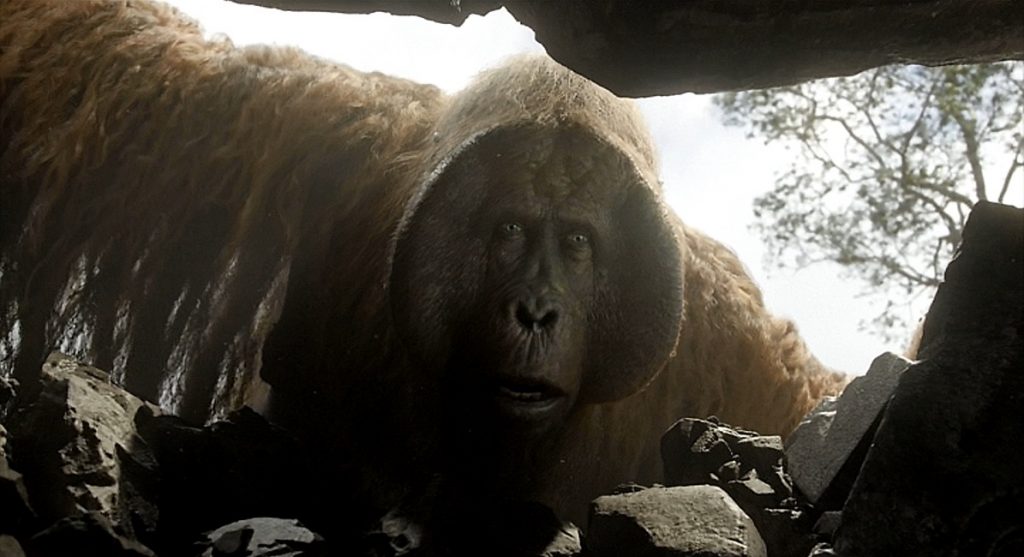
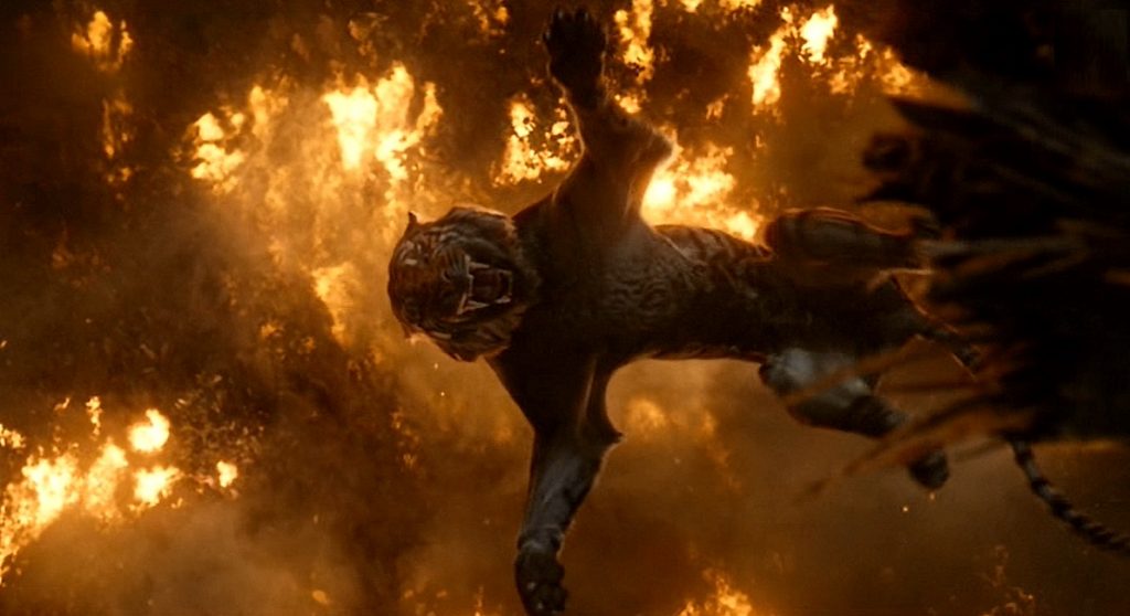
Finally, there was the jungle fire, and Mowgli’s conflict with Shere Khan.  The shot where the tiger falls into the fire was good.  I also liked the look of how the fires were doused by a re-routed waterfall, the steam hissing as the fires went out.  All in all, very well done.  Yes, even the ridiculous prehistorically giant orangutan.

2016 – Deepwater Horizon

Deepwater Horizon – 2016

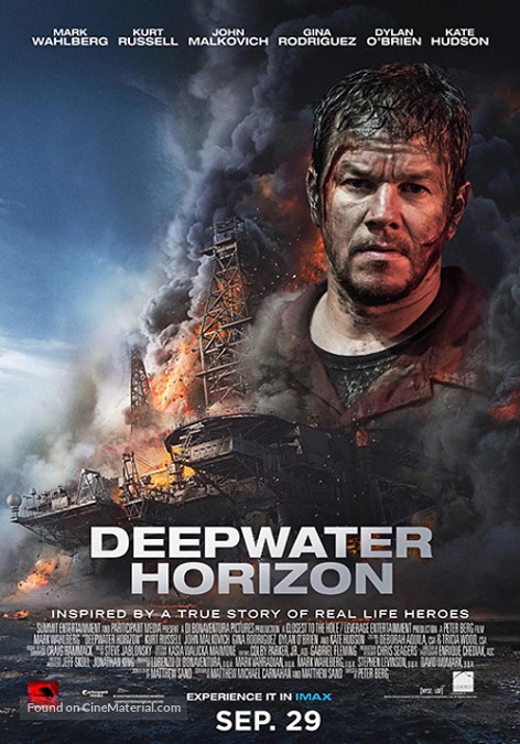
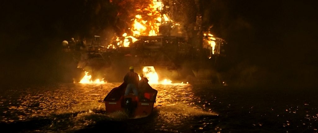
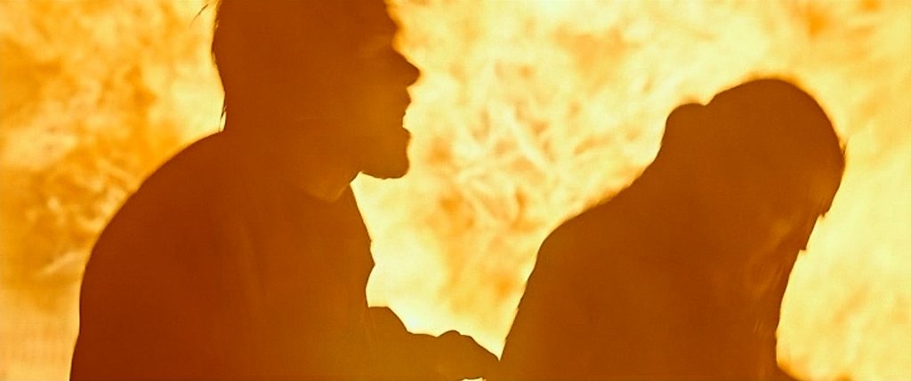
This movie, which is based on true events, was done pretty well.  Unfortunately, we’ve seen all these effects done before, and just as well.  There was nothing new here.  As the big effect of this movie was its incredible fire effects, the whole movie was like the movie Backdraft, except on an off-shore oil rig.  That’s fine, except that Backdraft came out 25 years before in 1991, and while the fire effects in Deepwater Horizon were good, they were no better than those of the earlier film.  The only difference was that these fires probably relied more on CGI.

But we’ve seen plenty of CGI fire effects before, too.  So I had to do some reading to find out what earned the effects of this movie an Oscar nomination.  Wikipedia didn’t have much to say about the visual effects.  I found a three minute and forty-four second video on YouTube interviewing Burt Dalton, who was part of the visual effects team.  In it, he says that the most difficult effects in the film were the fire effects, the mud explosions on the drill deck, and the destruction of the drill shack.

It is important to note that the set that was built was an 85% scale model of the Deepwater Horizon oil rig, built in an abandoned parking lot.  It was 70 feet tall, and had a functional helipad and elevators.  It stood in a tank filled with two million gallons of water.  When actors were shown in front of the inferno of flames, only a small amount of real fire was used in the foreground, the rest being added digitally.

But the spectacular wide shots were completely CGI, and there’s no doubt, they looked amazing.  The entire rig was like a tower of hellish smoke and fire.  There were multiple explosions, flying shrapnel, and burning metal towers and cranes that crashed down, causing massive destruction to the rig.  Apparently, when the real survivors of the disaster were interviewed, they said that it looked very accurate.

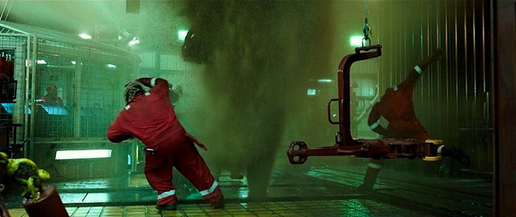
I personally liked the mud explosions.  Yes, similar effects have been seen before, but I really liked the shot where the rig’s main tower erupts all at once, where its solid structure suddenly shoots plumes of muddy water from every side, from its base to its pinnacle.  It was an awesome looking effect, like the exploding skyscraper in Independence Day.  Then as the drilling equipment is torn apart, pieces of debris start raining down onto the glass windows of the drill shack.  Eventually, large pieces of machinery crash through the walls, killing everyone in the shack.  Not long after that, there is a wide shot of the rig, where its entire surface is engulfed in a massive ball of fire.

But I have to ask again, why was this movie nominated for Best Visual Effects?  Yes, the flame effects looked good, but did they look better than those of other movies?  Were there new techniques used to create them?  As far as I could tell, no.  Was there anything special that set these effects above their peers?  My research brought up nothing.  Maybe it was the scale of the spectacle, the seventy-foot-tall set.  But if those wide shots were all CGI, then the size of the set wouldn’t make any difference.  Maybe I’m just missing something…

2015 – Star Wars: The Force Awakens

Star Wars – The Force Awakens – 2015

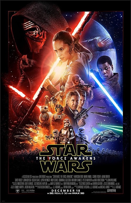
I would expect nothing less than perfection from the visual effects of a Star Wars film, even though at this point, George Lucas is no longer the owner of the franchise.  Disney has now purchased it from him, a transaction from whence both good and bad things came.  But one of the things that remained the same was the quality of the visual effects.  Only here, we have J.J. Abrams sitting in the director’s chair.  Even though there were way too many plot elements repeated from the original Star Wars, visually, Abrams has a very different aesthetic than Lucas.

I can start this off by mentioning some of the iconic, uniquely Star Wars things that got modern make-overs, such as Kylo Ren’s rough red lightsaber, with its two fiery cross-guards, or the new droid design of BB8.  The X-wing ships got a new black paint-job.  Even the storm troopers got an upgrade in the character of Captain Phasma with her silver armor.  So many things were updated thanks to Abrams.  But despite all that, it was still clearly Star Wars.

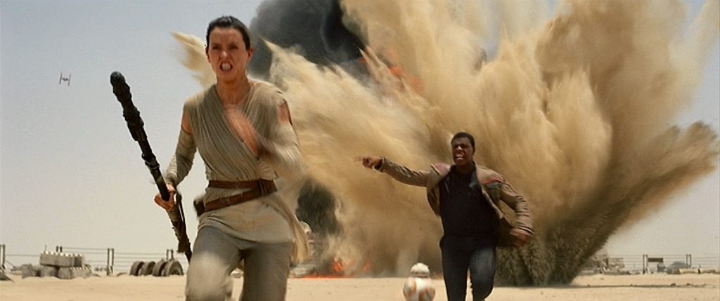
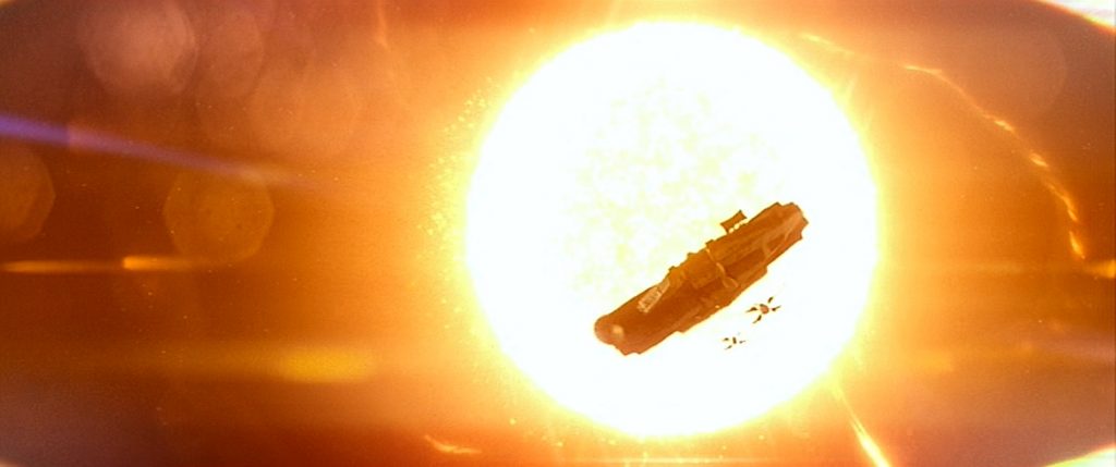
At the beginning of the film, one of the first effects that caught my attention was a clever use of the Dark Side of the Force, when Kylo Ren freezes a blaster bolt in mid-air.  Ok, J.J., that was cool.  After that, the action kicks into high gear when Po and Fin escape from the First Order in a TIE-fighter.  Lots of fast flying and things blowing up.  Then we went back to the desert planet of Jaku, where there was a chase, more fast flying with the Millennium Falcon, and things blowing up.

But the next big action sequence was on board Han Solo’s freighter ship where massive, semi-comical CGI monsters with big round bodies, flailing tentacles, gaping maws, and rows of sharp teeth.  After that was more action on the planet of Takodana: first a laser-gun ground battle, and then more fast-flying x-wings and things blowing up. I’m starting to see a pattern here.  Later, there is the attack on Starkiller Base (another Deathstar), with fast-flying x-wings and TIE-fighters… and things blowing up.  And finally, we get a lightsaber duel in a snowy forest at night.  The exciting climax where the base explodes and seems to become a star was cool.  And that was all the major action sequences in the film.

Throughout the movie, there were plenty of the expected CGI characters, some filmed using motion control technology, like having Lupita Nyong’o as the diminutive alien, Maz Kanata, or Simon Pegg as the oversized Unkar Plutt, the junk dealer on Jaku.  On Takodana, there was a cantina of sorts, so there was an even wider variety of digital creatures and robots on display.  And there were several well-crafted digital environments, like the surface of Starkiller Base, where the Stormtroopers were lined up like on vintage newsreel footage of Nazi soldiers.

Obviously, the CGI work was noticeably improved from the previous Star Wars films, the prequels.  Granted, Episode One came out sixteen years earlier, but it was more than dramatically improved, showing just how far computer generated imagery has come since that time.  Well done!

2015 – The Revenant

The Revenant – 2015

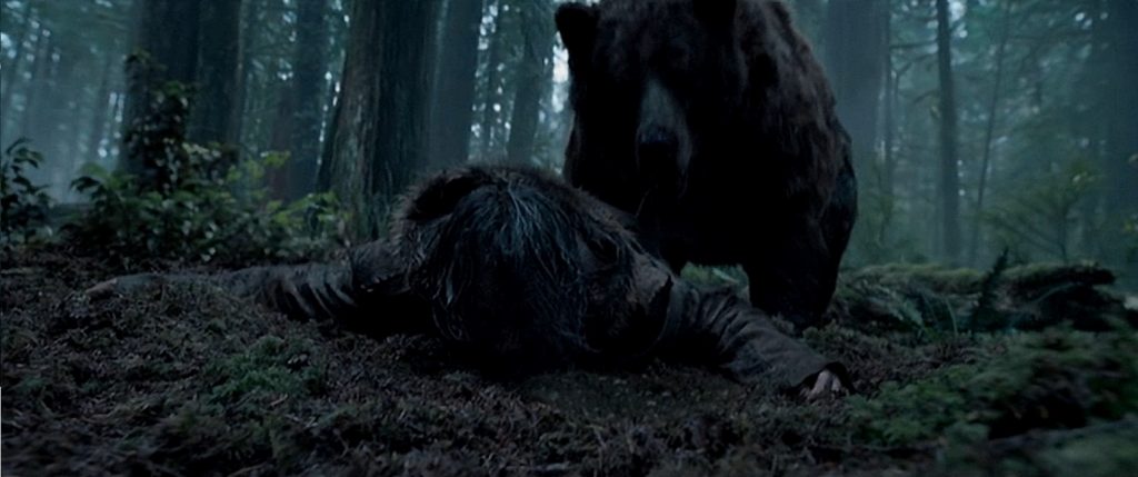
This movie was full of invisible visual effects, and to be honest, the expert digital compositing for things like landscapes and the like, were on par with, but no better than any other contemporary film.  So what was it that earned this movie its Best Visual Effects nomination?  What was it that earned it three visual effects awards from the Visual Effects Society?  Plain and simple.  It was the CGI bear.

You see, Leonardo DiCaprio’s character, Hugh Glass, is mauled by a bear that looked so photo-realistic that I’d swear it was real.  Of course, there were two things I can think of that might have made the difficult effect a little easier.  First, the lighting was dim, as the scene took place near dusk in a heavily wooded area.  Second, the bear moved so quickly at times, that it was difficult to see.  What I mean is that, for example, when we first see the bear and it charges through the underbrush, the camera is shaking slightly, and the bear is only half-seen through the bushes.  Then when it is upon him, the camera is in constant motion.  The bear often fills up large portions of the screen like a shapeless mass of fur, and is not always facing the camera.

Sometimes we got to see certain details very clearly like a clawed paw, a flash of bared teeth, or a blood-soaked patch of fur.  And don’t misunderstand.  All those qualities of the scene, the low lighting, the shaking camera, are not bad things.  No, they went a long way to increase the intensity of the scene.  It was really horrific exactly as it was!  In fact, no crucial detail was ignored!  Even the bear’s behavior was hyper-realistic.  The effects artists clearly studied animal behavior, allowing them to accurately create more than just its movements.  I’ve seen enough nature documentaries to know how bears behave, how they attack.  The way it clawed and bit, the way it crushed its victim into the ground by raising up and pounding its front paws down, the way it sniffed at the mangled body, was all 100% believable.

Another little detail that sold the scene for me was a strange one.  Something that usually annoys me in a movie is when a character is in water or snow, and the filming camera gets droplets of moisture on the lens, as if there is a suddenly visible plate of glass between me and the action on the screen.  Here, something similar was actually created by the VFX artists.  When the bear is sniffing DiCaprio’s head, he gets too close to the camera, and that plate of glass fogs up with the bear’s breath.  But the bear wasn’t real, so they had to have gone out of their way to create the effect.  Strangely enough, it adds to the realism of the scene.

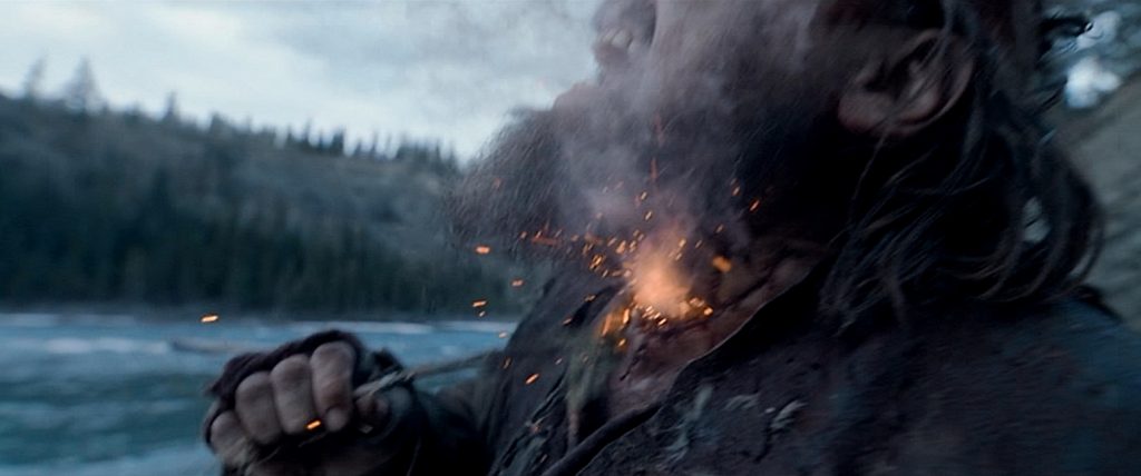
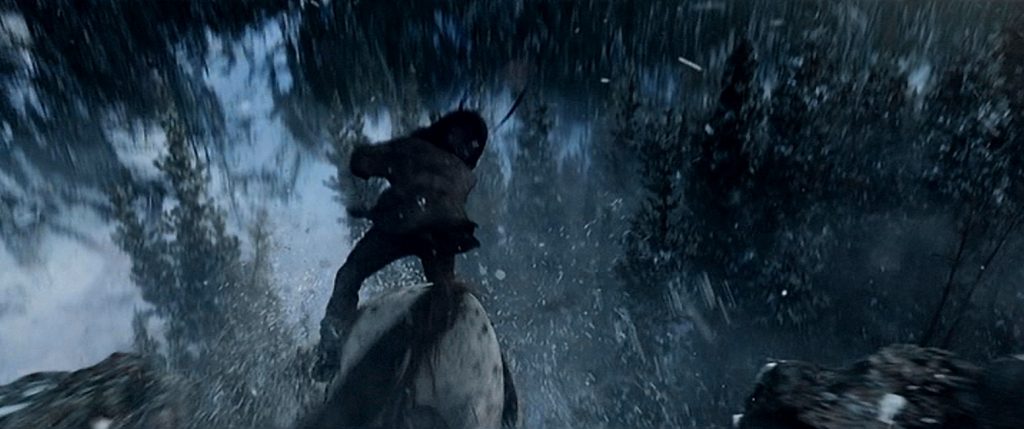
Another effect that was a bit less impressive was when Glass rode his horse off a cliff.  We see the horse fall and land out of sight behind a pine tree, and we see glass disappear into the branches of the tree.  But the shot only lasted for maybe two seconds.  I also liked where Glass cauterizes his slashed throat with gun powder.  Like much of the film, it was gruesome, but cool to watch.  These effects looked great, but were brief, and I think the rest of the movie was mostly drama.

2015 – The Martian

The Martian – 2015

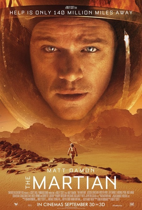
The only reason I’m giving this movie’s visual effects four stars instead of five was, I’ll admit, not the fault of the VFX artists.  Unfortunately, they were betrayed by a basic flaw in the script.  The Visual effects team did what they were told, but the resulting visuals took me out of the story because they had to throw reality out the air-lock.  Strange, for a movie that prided itself on scientific accuracy.  Not only did I notice, but I couldn’t get my mind off of the unreality of the effects.

It’s a shame they couldn’t find a more fitting plot point, like maybe an unexpected explosion, to strand the astronaut on the surface of the Red Planet.  But here, when a surprise dust storm on the surface of Mars is strong enough to break off a piece of equipment and hurl a shredded piece of metal into Mark Wantey’s gut like an arrow, his crewmates leave him for dead.  Of course, the reality is that it would never have happened because the atmosphere on Mars is about 1% as dense as Earth’s atmosphere.  That means that a 60mph wind would only be felt as a breeze. 

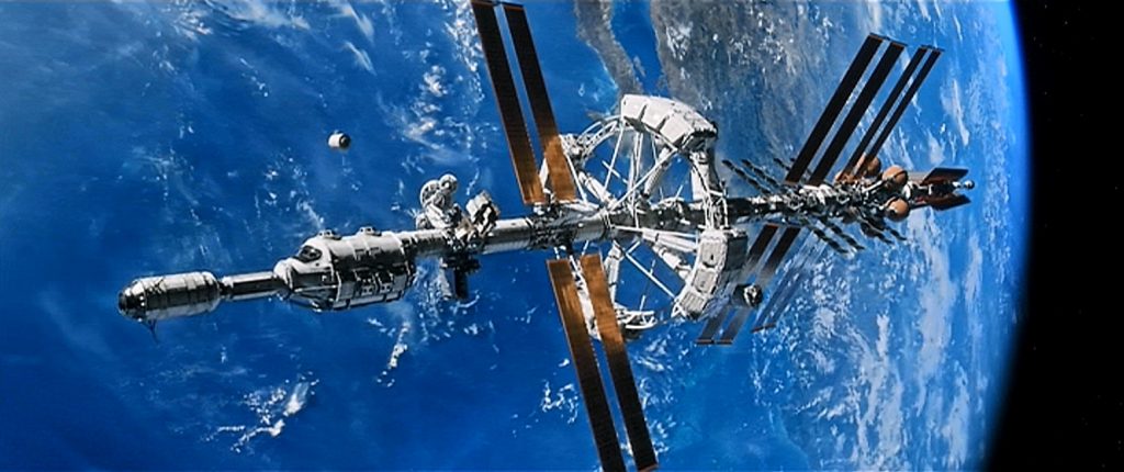
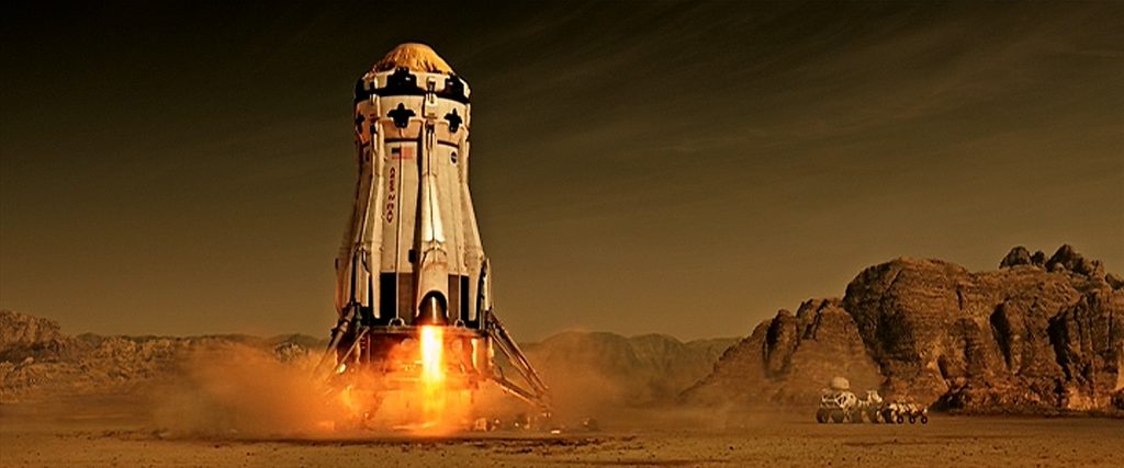
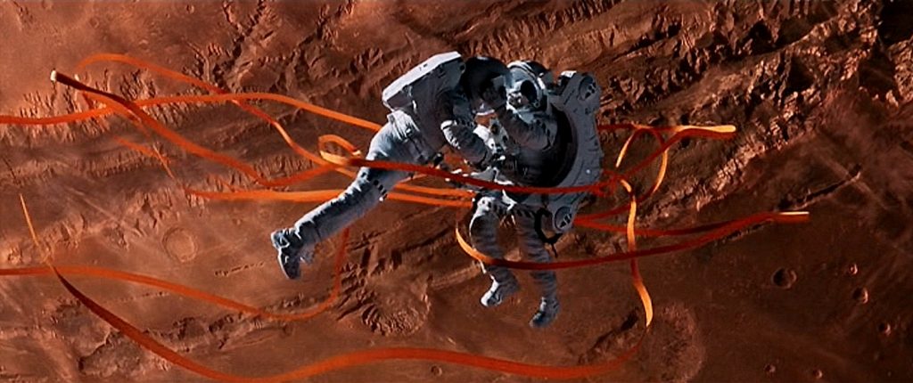
But putting that fact aside, the rest of the effects in the film were just fine.  The scenes of weightless astronauts and flying space craft dramatically displayed in front two different planets were pretty spectacular.  There were also a couple of pretty amazing launch sequences that were cool to watch.  I especially liked the scene where the nose of a space craft has been removed, and then covered with a plastic tarp to reduce the vehicle’s weight.  The exciting climax where the stranded astronaut is rescued was even more accurate than the 2013 Best Visual Effects winner, Gravity.  This movie understood that gravity and inertia work differently in weightlessness than they do in a planet’s gravitational pull.  I guess both movies have their fatal flaws, though they were both pretty enjoyable to watch.

In doing a little reading, I was surprised to learn what another one of the “invisible” visual effects were.  Sure, there were the Martian landscapes and sky colors, and those were perfectly executed and consistently believable.  But it was the space suit helmets that I would have never guessed.  In order to get the right reflections in the helmet visors, like planetary landscapes and not a film crew or lighting set-up, all the visors were completely created digitally in post-production.  I never really noticed those reflections, but I’m sure I would have noticed if they weren’t there, or if they showed the wrong thing.

In fact, I think that a lot of the effects in this movie were of that invisible variety, simply because of the nature of the story.  It was a movie that was, with the one aforementioned inaccuracy, based in reality and scientific accuracy.  We have detailed images of both the Earth and Mars from space.  We have enough experience in outer space to know how things move and behave in a weightless environment.  Ok, I’m not so certain about being able to propel yourself in outer space by cutting a hole in the hand of your space suit, (he controlled his trajectory awfully well…) but it looked really cool.  And this isn’t a documentary, it’s a movie.