2015 – Ex Machina (WINNER)

Ex Machina – 2015 (WINNER)

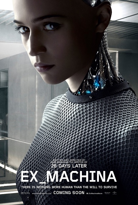
This is a movie that clearly deserved its Oscar.  If you look at the movie as a whole, there really weren’t a great variety of flashy visual effects, but the ones that they used were so incredibly well-done, I’m still amazed by what the visual effects artists were able to accomplish.  They were just that good!

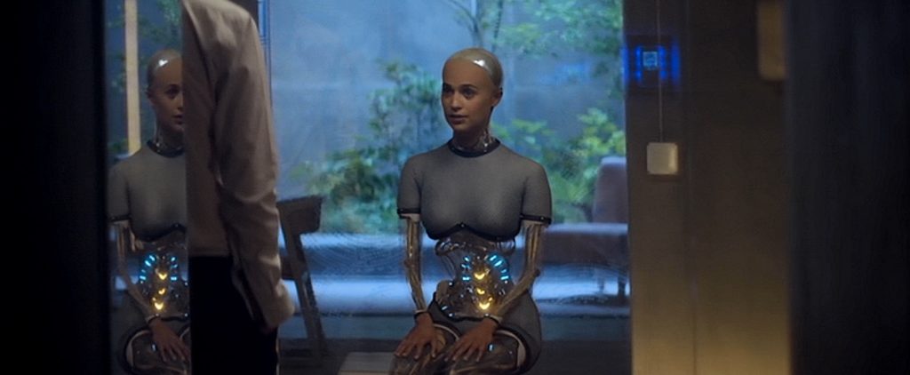
The effect I’m talking about is the character of Ava, an artificial intelligence in a robotic body.  What made it so good is the perfect combination of design and execution.  Ava had the face, hands, and feet of a human woman.  Her upper torso and pelvic area were covered by metallic mesh clothing.  But the rest of her, her arms, legs, lower torso, neck, and the back of her head, had no coverings.  You could see the mechanical parts.  The genius of the design allowed the audience to see into and through the metal skeletal structure.  You can see through her stomach area to the background in front of which she was standing.  She moved and behaved like a real person, though she was clearly a machine.  Amazing!

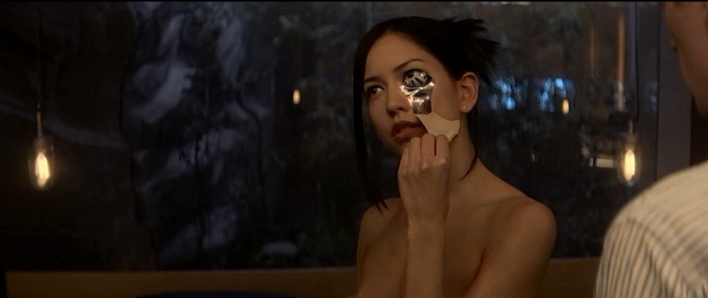
Apparently, the skin of the life-like robots was a synthetic covering that could be peeled away like the skin of an orange.  In a slightly disturbing scene, this was shown in great detail as another robot, Kyoko, revealed herself by slowly taking her skin off.  But I when it came to that effect, I had to use a little suspension of disbelief.  You see, the strips of skin came off, not in torn, shredded strips, but as if in pre-determined pieces.  But if that was the case, wouldn’t we be able to see the lines between the pieces. 

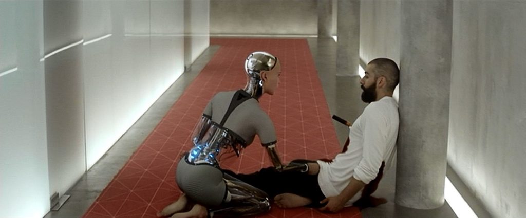
Then there was the climax of the film, in which the robots rebel and murder their creator, in order to escape their prison.  Nathan uses a metal bar as a weapon and smashes it through Ava’s arm.  Then after Kyoko stabs him, he turns on her and knock off her lower jaw.  The shattered pieces of metal, wires, and mesh tumble to the floor, scattering like so much debris.  Then there was the simple, yet perfectly executed effect of a stab victim, as he bleeds out of two wounds.  It was a pretty intense action scene in an otherwise dramatic film, whose main focus was on its intellectual story, colored with philosophical and moral dilemmas.

Wikipedia had very little info about the effects, but I found it interesting enough to paraphrase here.  “The film was shot as live action, with all effects done in post-production. During filming, there were no special effects, greenscreen or tracking markers used. To create Ava’s robotic features, scenes were filmed both with and without the actress’s presence, allowing the background behind her to be captured. Her hands and face were rotoscoped, while the rest was digitally painted and the background behind her restored. Camera and body tracking systems transferred her performance to the CGI robot’s movements. Other effects included Ava’s clothes when shown through the transparent areas of her body, Nathan’s blood after being stabbed, and the interiors of the artificial brains.”  As I said, the effects were not flashy or incredibly varied.  They were just so perfectly executed!
2014 – X-Men: Days of Future Past

X-Men Days of Future Past – 2014

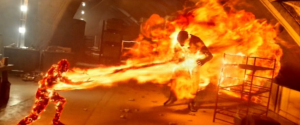
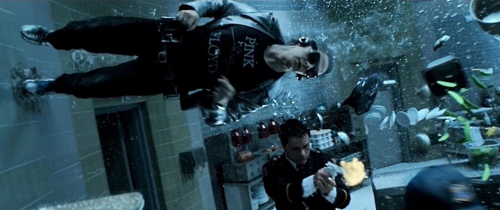
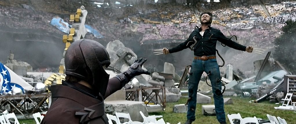
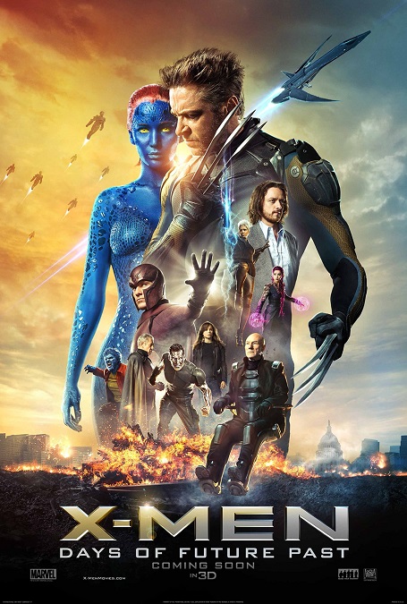
The visual effects for this movie were good, but not great.  There were moments that were absolutely fantastic, but there were others that were… just ok.  Unfortunately, at this level, especially when I compare this movie to its competitors in the category, I expected more. I read an article about the visual effects, and the major points that were brought up were Quicksilver’s Time in a Bottle scene, the Sentinels, both the past and future versions, Beast and Mystique’s transformations, Magneto moving the stadium, and the various mutant super-powers like Sunsopt’s fire, Iceman’s ice, and Storm’s Lightning.

I think the best of these effects was the Time in a Bottle scene.  They were in a circular room.  There were sprinklers showering the room with water droplets, metal utensils and cookery floating everywhere, flying bullets, splashing soup, nine guards, and three heroes, all frozen in a 3D environment that is seen from many different angles.  Then there was Quicksilver moving at normal speed. The attention to detail was amazing!  Not only was he able to move any object in the room he desired, but he left a wake of clear space behind him that was even free of water drops.  His feet left cracks in the tile of the curved walls on which he was running.  His hair was waving as if being blown back because of his super-speed.  It all blended together to make a perfectly executed scene that was stunning to watch.

But on the flip side, the worst effects were the future-Sentinels.  They had a look that greatly reminded me of CGI biped forms from back in the early 90s.  Sure, their textured rendering and movement was far superior to those early digital efforts, but I think it was their fundamental design that made them look somewhat antiquated.  I’m not even sure that’s the right word to use, but there you have it.  The past versions of the Sentinels were ok, simply because, as part of the plot, they were supposed to be less advanced and more robotic.

The CGI fire-man and the CGI ice-man came dangerously close to falling into the same category.  They looked a little too cartoonish, though I’m not really sure how else they could have been represented on the screen. In other words, they didn’t look quite right to my eyes, but I don’t know how they could have been improved.

Mystique and Beast had body transformation that were cool to watch.  I liked how Mystique had little scales that seemed to flip over in sequence to reveal her altered appearance, while Beast had a more organic change with his color and shape seeming to emerge from inside him.  There was a cool shot in which Mystique changed from a Vietnamese officer into her blue body suit.  The blue arms and legs changed first and she started fighting the men around her.  Then as she twisted and turned, the rest of her changed.  That was a cool shot.  And finally, Magneto moving the stadium was done well, but felt a little unremarkable.  Actually, that statement might just encapsulate my feelings about the effects for most of the movie.  I was a bit underwhelmed, and I don’t think I should have been.

2014 – Guardians of the Galaxy

Guardians of the Galaxy – 2014

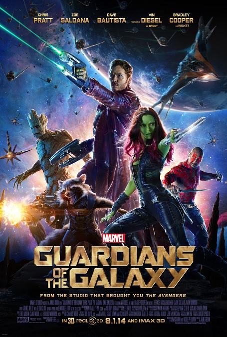
Every now and then, I describe a movie’s visual effects as not being flashy.  But that certainly wasn’t the case with this movie.  They were bright and colorful, a real spectacle for the eyes!  I loved the way they looked.  The designers of the film, and consequently, the VFX artists, really made the images on the screen pop!  And what’s more, because they were pretty much building their own worlds and environments, they were able to let their imaginations run free.

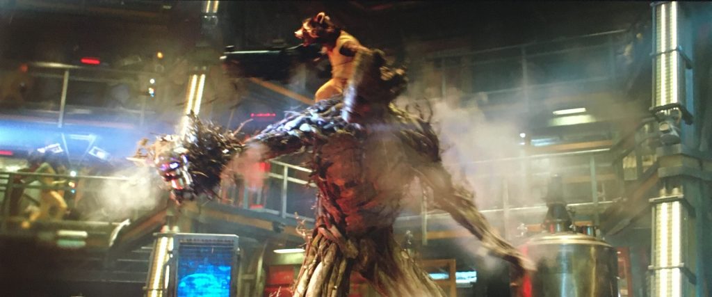
In this first installment of movies for this group of superheroes, there are five members, two of whom were completely CGI.  Of course, I have to talk about them a little.  The first was Rocket.  He is a genetically and cybernetically enhanced racoon.  He could have so easily been turned into a silly, goofy character, but though he had plenty of comedic moments, the animators really took him seriously.  He looked as photo-realistic as any of the live actors.  They had to alter some of his proportions to make him walk and move more like a human, but that’s perfectly plausible for a scientifically engineered creature.  The animators studied real racoons and paid attention to very specific details, like the fact that they have different kinds of fur that behave in different ways, which greatly added to the realism.  I loved the shot of Rocket waking up after he had been sleeping.  The racoon fur on the side of his face was crushed.  Great detail!

Then there was Groot, the walking tree.  The animators constructed his body, his skeletal and muscular structure out of wood.  His arms were like branches.  His skin was like bark.  And yet his movements were flexible, like branches that can bend.  He needed to be able to sprout twigs, leaves, and vines, all of which moved and behaved like you would expect of a sentient and mobile tree.  Amazingly enough, he was a fully realized and believable character, despite his entirely alien nature.

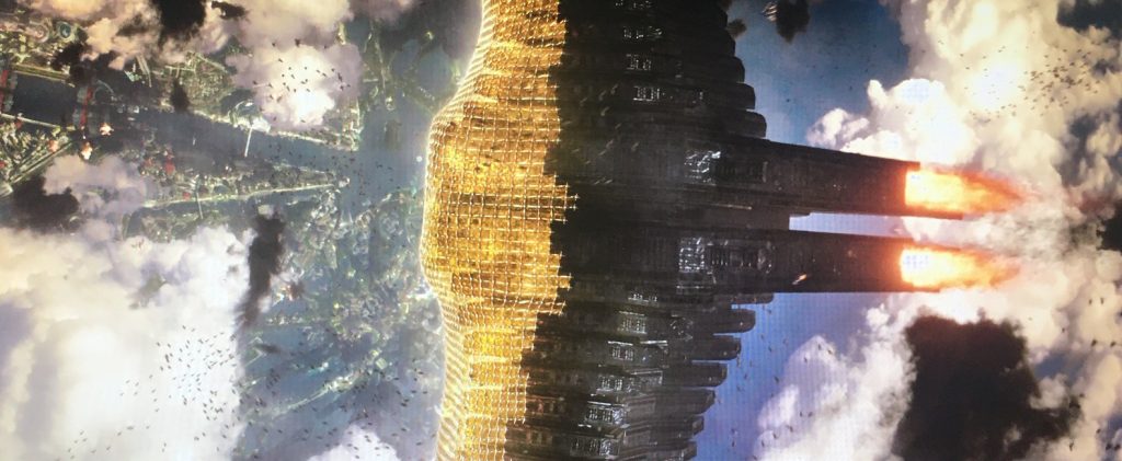
A lot of the film’s other visual effects, while perfectly executed, seemed to be standard fair for this kind of science fiction movie.  There were great space ships, epic arial battles, explosions, fighting, stunts, lots of gunfire, and even a few CGI alien creatures.  I loved the wide array of interestingly designed gadgets and weapons that must have taken a lot of imagination for the filmmakers to come up with.  I especially loved how the fleet of Nova Corps one-man fighters were able to link together to construct a massive net, as they attempted to prevent the giant behemoth space ship, the Dark Aster, from landing on the planet’s surface.

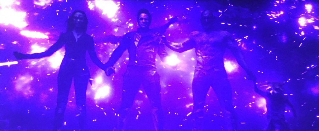
And then there were two scenes in which the purple infinity stone, the power stone, was really invoked.  This is sci-fi at its best.  There are massive explosions of purple fire and raging purple tempests!  Talk about eye-catching and flashy!  These scenes were pretty darn cool!  The articles I read said that the shots in this movie were about 90% CGI shots.  But they all looked so real, and the story was so engaging, that you tend to forget that so much of the film was made in a computer.  How else would we be able to accept a talking racoon and a walking tree?  I love it!

2014 – Dawn of the Planet of the Apes

Dawn of the Planet of the Apes – 2014

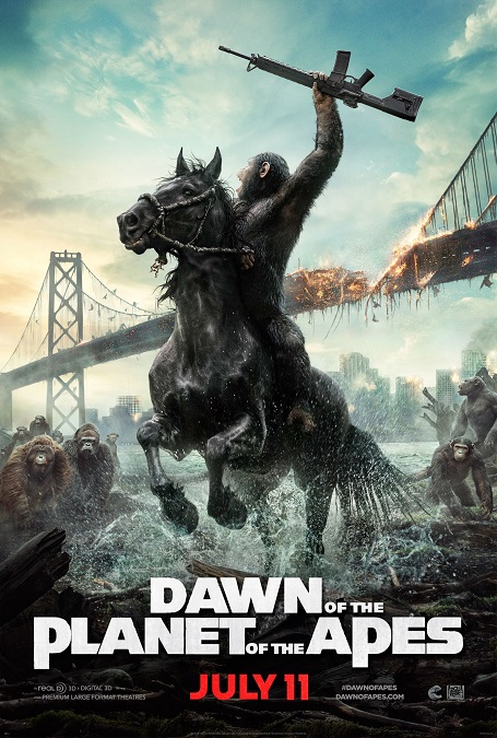
Perfection!  The visual effects for this movie were incredible!  They were amazing!  They were completely convincing!  Looking back at the previous film in this rebooted franchise, there is little comparison.  Normally, in a sequel, the idea is bigger, better, and more of it.  Well, this movie didn’t disappoint! There were more intelligent apes, clearly growing from the origin story of the first film, into the intelligent simian rulers of the world we know they are destined to become.

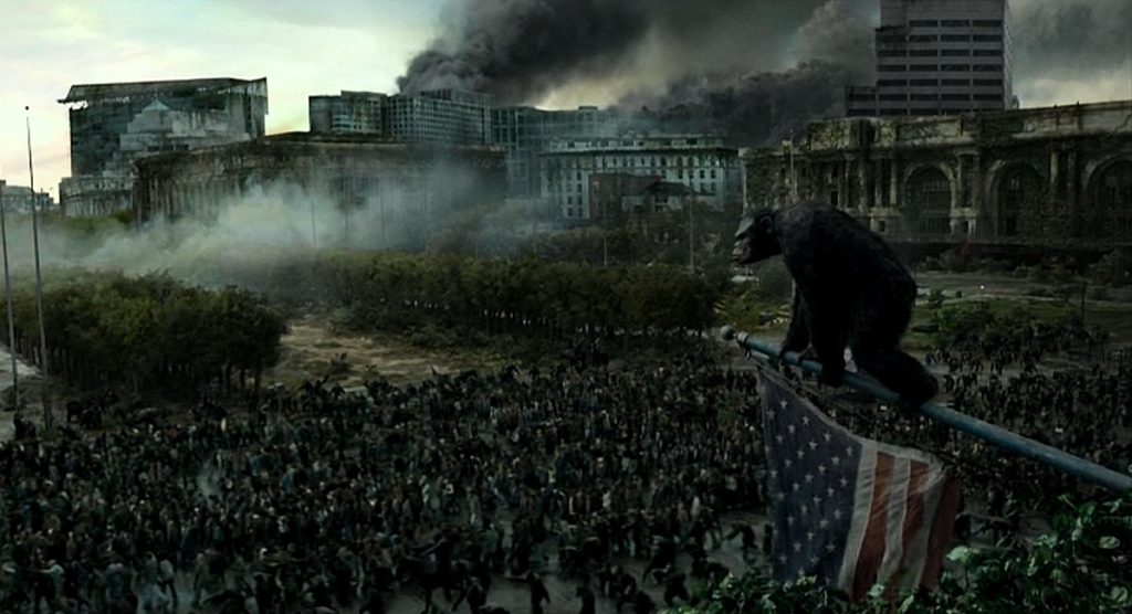
So first off, there were a lot more apes.  Their population had grown, so the CGI department had their work cut out for them.  The digital apes had a lot more screen time.  Much of the plot centered around their fledgling society in the Muir Woods.  I can’t say enough about how perfectly the photo-realistic apes looked and moved.  They mostly communicated with sign language, and we were given subtitles to understand them.  And here, there are hundreds of apes, as compared with the mere fifty or sixty in the first movie, Rise of the Planet of the Apes.

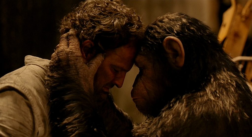
In addition to greater numbers, the level of realism and detail in the apes had risen significantly.  The apes were so much more expressive!  They had the ability to display real emotions just as convincingly as any live actor.  That being said, I find it ridiculous that Andy Serkis, the actor in the performance capture suit that played Cesar, the lead ape, was not given a Best Actor nomination because his character was CGI.  At this point, I think it is safe to say that a CGI character is nothing more than an actor in digital makeup, and they deserve to be recognized.

But the apes were not the only fantastic CGI images on the screen.  The caribou at the beginning of the movie, as well as the bear, were all digital.  Also, the horses that the apes rode throughout the film were CGI.  These were done so well, that it never even occurred to me to think that they weren’t real.

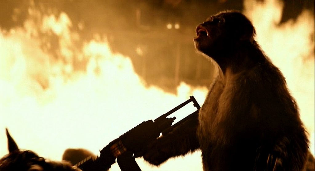
And there were some pretty exciting action sequences that looked fantastic, too.  The ape attack on San Francisco was remarkable!  The humans were able to defend themselves with machineguns, a rocket-launcher, and even a tank.  In the resulting fires, the CGI apes were perfectly blended into the burning backgrounds.  Also, the climactic battle between Cesar and Koba at the top of a tower under construction was phenomenal.  The realism has gotten to the point that my eyes can no longer tell that the CGI is not real.  If I didn’t know better, I’d think they were.

And then there was the baby chimp, Cesar’s newborn son.  There was a scene in which it was exploring, crawling onto Keri Russel’s shoulder.  Not only was it darn cute, but it moved and behaved just like it was supposed to.  It was an inquisitive child in the agile body of a chimpanzee.  So much wonderful attention to detail!

After watching this movie, I spoke to a friend, praising this movie’s visual effects.  He told me to just wait until the next entry in the franchise, the 2017 Best Visual Effects nominee, War for the Planet of the Apes.  I can’t wait!

2014 – Captain America: The Winter Soldier

Captain America: The Winter Soldier

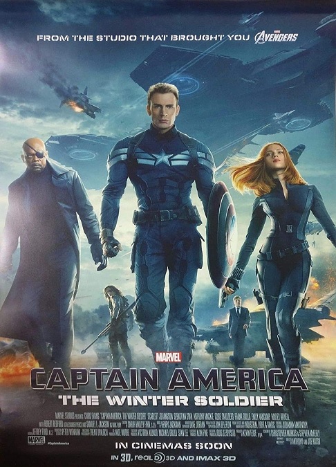
The visual effects for this movie were somewhat understated, especially when compared to some of the other nominees in the category.  While Captain America is in incredibly important and powerful character in the MCU, his powers aren’t as flashy as other superheroes like Iron Man or the Hulk.  As a result, the bulk of this movie’s visual effects were, likewise, not as flashy.  They were most definitely there, but they were of a less noticeable nature.

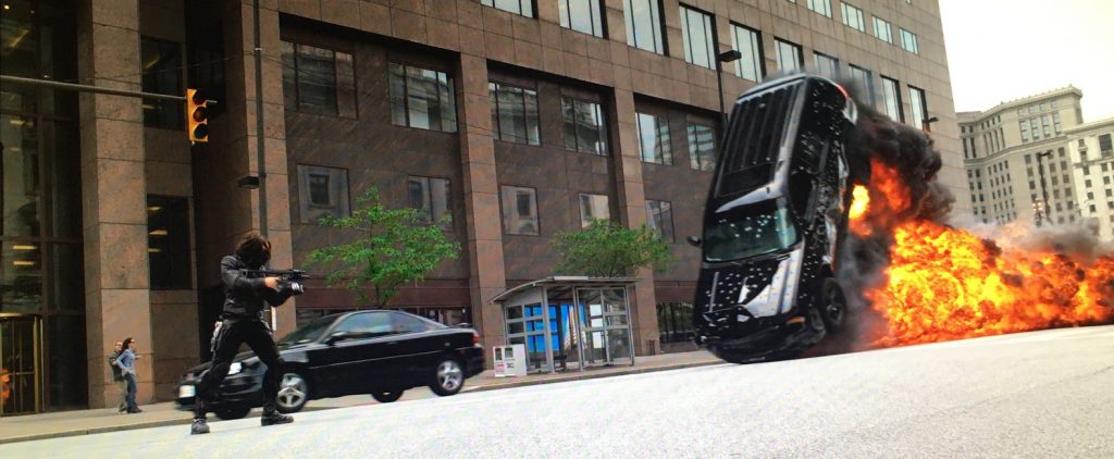
Cap’s powers are enhanced speed, strength, and endurance.  These things can often be shown without the need for CGI effects.  The same could be said for Black Widow.  You get a good action sequence choreographer, lots of wire work, and a skilled team of stunt men and women, and that covers most of it.  Sure, Captain America has his shield, which is equally effective as both offense and defense, and that was a mix of practical and digital effects work, but that was about it.  And then we had the Falcon, a man with mechanical wings and a super powerful jet pack.  His fast-flying acrobatics was a fantastic combination of wire-work, and CGI.  But as you might guess, there was more to it than that, and I’ll get to it in a moment.

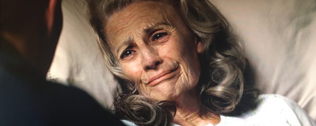
So what was it that got this movie nominated for the Best Visual Effects Award?  When I did a little research, I learned that the effect that visual effects supervisor for Lola VFX, Edson Williams, found the most challenging, and of which the film’s visual effects supervisor, Dan DeLeeuw was the proudest, was the aging of Peggy Carter.  Apparently, none of the old-age prosthetics or makeup designs were not giving them the results they wanted.  In order to make the 33-year-old actress. Hayley Atwell, look like a 60-year-old woman, a new and innovative technique was used.  They filmed Atwell performing the scene.  Then, using 8 cameras, they filmed an elderly woman performing the scene, matching Atwell’s movements.  Then they digitally projected the elderly woman’s wrinkled skin onto Atwell’s face. 

They also used digital facial mapping to put Anthony Mackie’s face onto the CGI shots as the Falcon sped through the frame.  According to an article by Rick Marshall, “In order to get the facial models just right, Mackie was required to stand in a ‘dome’ of cameras that could record every angle of his expressions in order to properly replicate them as his character spins, flips, and careens through the sky. These facial models were then blended with the digitally created portions of the sequence, and later merged with the practical effects and wire-work sequences.”

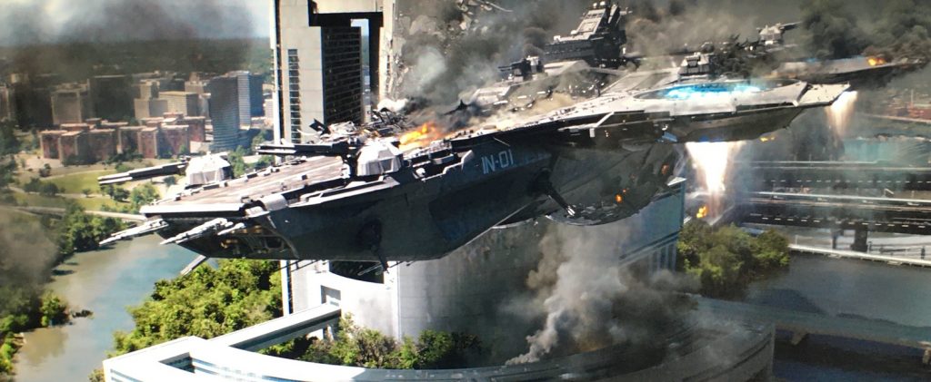
Of course, I would be remiss if I didn’t mention the three massive hellicarriers that ended up shooting each other down at the end of the film.  One of them crashed into a sky-scraper as it fell, burning, out of the sky.  These had to have been completely CGI, but they were incredibly photo-realistic.  The stunts, the fights, the explosions, the smoke, and the flying debris, all made for an intense climax to this action-packed superhero movie.  Like I said, it wasn’t as flashy as many of the other MCU films, but it certainly had just as many top-notch visual effects.

2014 – Interstellar (WINNER)

Interstellar – 2014 (WINNER)

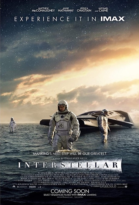
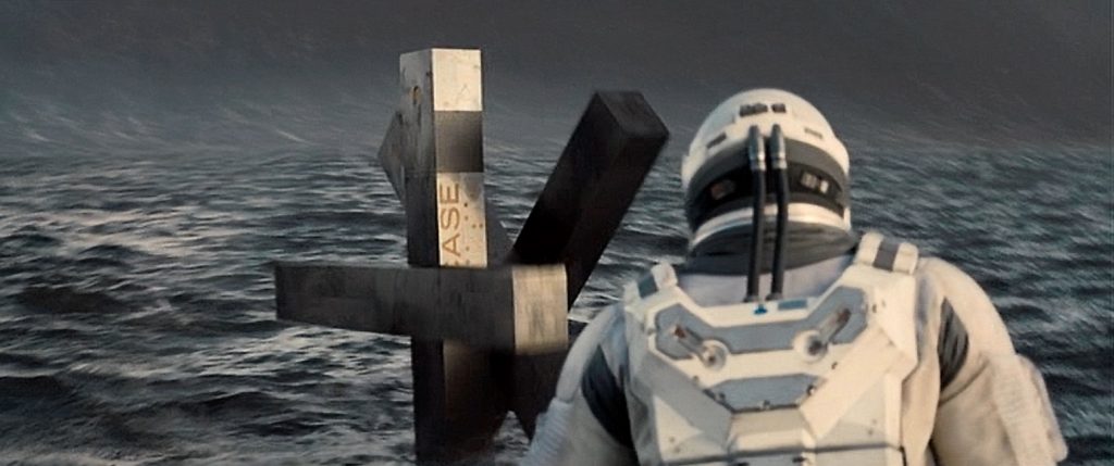
Wow!  I can only imagine what this film would look like on an IMAX screen!  The visuals in this movie approach the realm of art, not mere special effects.  But when I did my reading about the VFX for Interstellar, I learned a few very surprising facts.  There is no doubt in my mind that this movie’s award for Best Visual Effects was completely deserved.

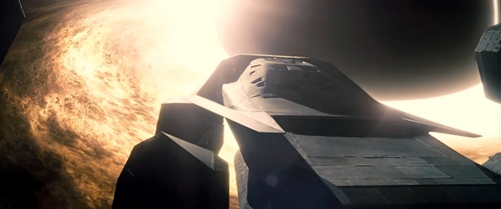
First, there was the realistic and scientifically accurate visual representations of cosmic phenomena, some of which we do not currently have the technology to be able to see properly, like black holes and theoretical worm holes.  However, director, Christopher Nolan brought on Kip Thorne, a prominent astrophysicist at Caltech, as an advisor to Paul Franklin, the film’s visual effects supervisor.  Together, along with a team of other scientists and advisors, they created images that were beautiful and captivating.

To quote an article by Rod Pyle on space.com, “‘Kip got us the three-dimensional mathematics behind these things, and we were able to turn this into software that could accurately calculate all the light-ray paths around these objects, to show how they distort space and create these vast gravitational lenses,’ Franklin said.”

The next thing I learned was that there were very few CGI space ship shots in the movie.  They mostly used miniature models, something that is very rarely done these days.  The model for the mother ship, the Endurance, was actually about 25 feet across, which is about three times wider than the model of the Enterprise, used in several Star Trek films.  The Ranger shuttles were also built as models.  Nolan felt these miniatures gave a more realistic representation on the screen, especially when it came to reflected light and shadows.

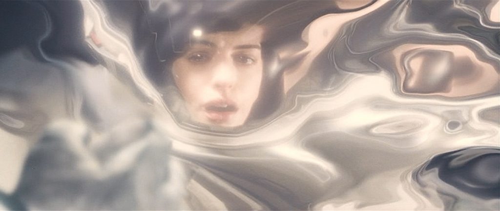
And then there was the film’s climax in which the main character enters what they called the 5th dimension, in which time itself has been turned into a physical three-dimensional space.  It is seen as a giant chamber behind the walls of his daughter’s bedroom.  But the M.C. Escher-like representation was done without green-screen effects, and was not an artificial digital environment.  It was created using the same camera effect that Stanly Kubrick used in 2001: A Space Odyssey.  To paraphrase Rod Pyle’s article, “Franklin used slit-scan photography, which allowed images to move past a slit-shaped shutter held open for longer-than-normal exposures. What you get is a photograph that captures one point in space across many moments in time, as opposed to a regular photograph, which is one point in time across many points in space. This immediately spoke to the idea of an object standing still, leaving its trace through time.”  It was pretty spectacular!

All that, and I haven’t even mentioned the amazingly designed robots that accompanied the astronauts.  They were like walking blocks made of connected sticks.  They were very mobile and versatile.  Yet even they weren’t CGI, but on-set puppets, controlled by puppeteers.  Amazing!  This was a well-deserved Oscar win!

2013 – Star Trek Into Darkness

Star Trek Into Darkness – 2013

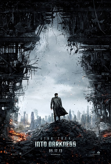
I’ll say right off the bat, that I am a pretty enthusiastic Star Trek fan.  I have always loved the franchise, no matter what iteration.  I love all the TV shows, the movies, the old ones, and the new ones, and this movie does not disappoint.  One of the things that I love about Star Trek is that great visual effects is always at the forefront of the story-telling.  As I’ve said before, I love seeing things on the big screen that I cannot see in real life, and Star Trek always delivers.

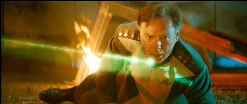
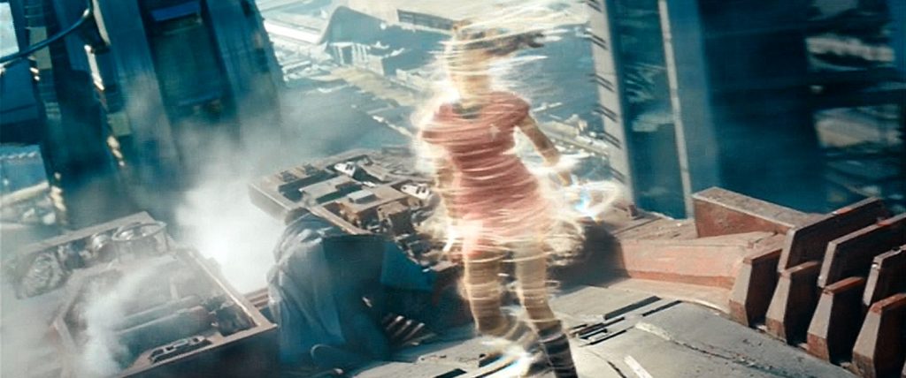
There is no doubt that Into Darkness had some pretty flawless visual effects.  My only problem, and I’ll get this out of the way quickly, is that there wasn’t much here that was really new or innovative.  The story was good, and it was an enjoyable movie, but visually, we’ve seen just about all of it before.  We’ve seen the phaser/gun battles, the spaceship battles, the ship crashing into the planets’ surface, the brawls, the new Abrams-style transporter effects, the explosions, and the precision skydiving action sequence.  Did it all look perfect?  Yes, it did, but we’ve seen it all before.  The story, while good, just didn’t require much more.

The only scene that I’ve never seen Star Trek do was a sequence in which the Enterprise is plummeting through the clouds towards Earth, and their artificial gravity has been disabled.  Kirk and Scotty are running along a corridor, and the gravity keeps shifting so they end up running on the walls, leaping over an open doorway!  It was like the incredible hallway sequence in 2010’s Inception, though in reality, if the ship was in free-fall at that altitude, everyone would be floating around, and they would not be able to run on any surface, but never-mind that.

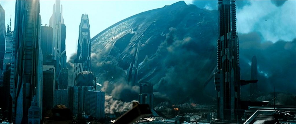
All that being said, it is difficult to call the visual effects for Into Darkness as anything but flawless.  The action sequences were fast-paced, exciting, and engaging.  The colors were bright and futuristic.  And Abrams actually went out of his way to correct one of the issues I had with his first Star Trek film.  He dramatically decreased the number of lens-flares, which I appreciated.  And the part where the gigantic Starfleet warship, the USS Vengeance, crashes into downtown San Francisco was very intense.  First, it hits the water, but then moves into the city, toppling massive skyscrapers like they were made of paper.  The large-scale destruction was very exciting to watch!  After that, the brawl between Spock and Khan was pretty awesome, too.

Oh, and upon reflection, there was one other cool effect that I’ve never seen in any other Star Trek.  There was an exciting sequence where the Enterprise and the Vengeance had a little space battle while flying at warp speed.  The Enterprise is out-gunned, and is physically knocked out of its warp stream.  It is forced back into normal space.  We actually got to see the famous ship crashing through the speeding wall of the warp stream.  And lest I forget, the movie’s opening sequence was great.  We go to see the Enterprise rise up out of an ocean, and rescue Spock, who is trapped inside a violently erupting volcano.  That looked awesome!

2013 – The Lone Ranger

The Lone Ranger – 2013

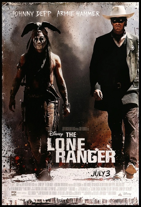
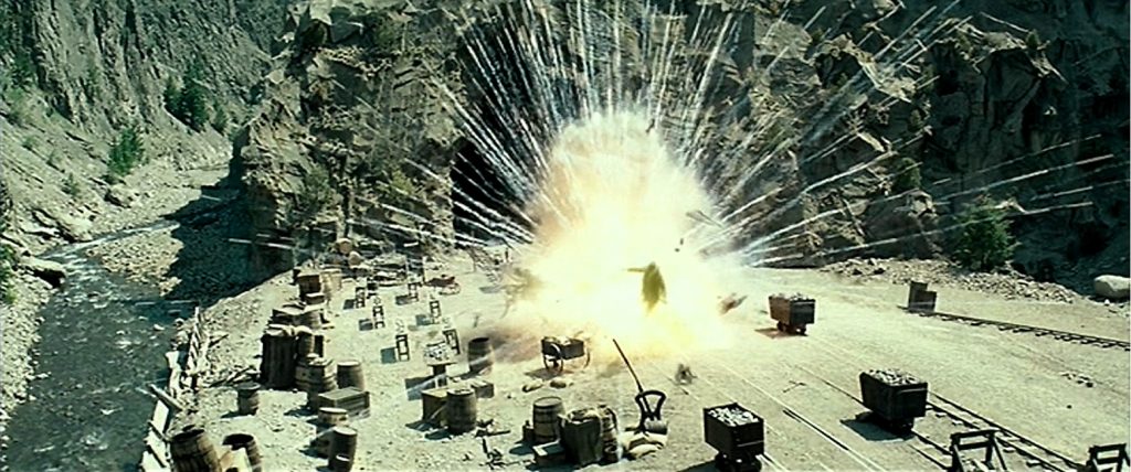
Ok, here we have yet another example of a movie with a poor script, but a lot of great visual effects.  It was a pure and unadulterated action/adventure movie that took place in the old west.  Unfortunately, it is yet another example of filmmaking that ignores reality for the sake of exciting visuals.  The characters survived crashes and explosions that would, in reality, kill any normal human being, and physics were often tossed out the window.  But the VFX artists did what they were told, and made it all look good.

Of the many visual effects in this movie, there were two main categories.  There were the stunts and the invisible digital environments.  Of course, there was a lot more than that, but those are the effects that stand out the most to me.  There were several fast-moving old west locomotives, so of course, we have to have a good train crash.  This movie has several.  There is a lot of impressive horse riding, and people transferring from horseback to speeding trains.

There were two stunts in particular that were really cool and both took place during the climactic battle.  There were two runaway trains, one moving forward, the other moving backward, so that their noses met in the middle.  As the trains are moving at nearly the same speed, there is a shot where a man attempts to step from the grill of one train to the other.  That was cool.  The other is where one train is on a track, and the other is on a separate track that goes above the other on a bridge.  Tonto jumps from the upper train to the lower!

So yeah, the stunts were cool and exciting to watch, but it was that other kind of visual effect that was really the more impressive one.  The invisible digital environments.  What I mean is that if I hadn’t done my research, I wouldn’t have known that most of the time, the actors were in front of blue-screens.  Going back to that climactic train battle, the actors were on mock-ups of train roofs.  Everything in the background was completely digital.  The sky, the desert, the mountains, the rocks, the trees, the smoke from the trains, and the bulk of the trains, themselves.  Each of these elements were created as separate layers in a computer simulation.  But I never knew.  And even as I go back and watch the scene a second time, I’d still swear they had just filmed these things in a desert.  You’d never know the environment was all fake!  It looks that real!

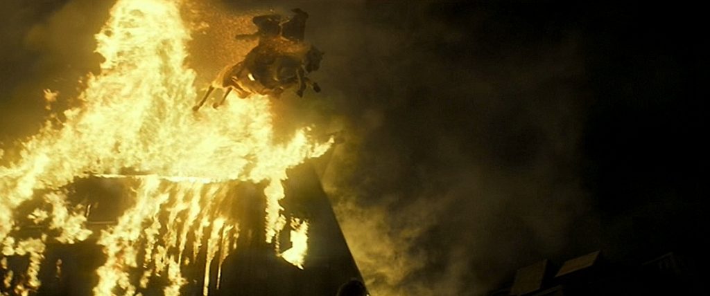
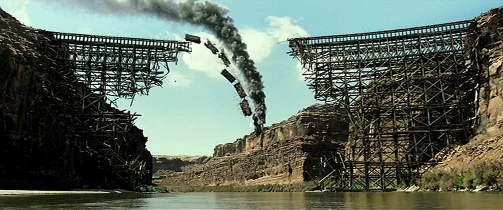
There were also some pretty fantastic explosions and fires.  But there was one effect that was pretty bad.  Just one.  When the Lone Ranger and Tonto are on the roof of a burning barn with Silver, the horse, they impossibly escape. Silver, with the two riders on his back, jumps through the flames and down about three stories to the ground.  The CGI landing looked a little wonky, and I was momentarily taken out of the story.  Thankfully, the shot was over quickly.  But the explosive destruction of the wooden bridge, and the shot where the train with the villain on it plunges off that bridge, was pretty darn spectacular, easily making up for it.

2013 – Iron Man 3

Iron Man 3 – 2013

Here we are again with Iron Man.  I sometimes wonder why Iron Man is getting so much attention for its special effects, when other MCU solo movies are receiving so little.  I mean, all three of the Iron Man movies were nominated for Best Visual Effects, but so far, the only other MCU movie to have the same nomination has been Marvel’s The Avengers, which prominently featured Iron Man.  What gives?  What did this third installment have that made the metal man stand out to the Academy yet again?

Well, like most action movies, it had to find ways to make the visuals bigger and more epic than the preceding films.  Also, the quality of the action sequences had to be flawless.  Yeah, I think they accomplished that.  There were more awesome stunts, more explosions, and more fast-paced, high-intensity action!   Just look at the climactic battle from the first and second Iron Man movies to this one, and there is no comparison.  This one is bigger and better!  Here, over thirty differently designed Iron Man suits arrive to battle the small army of Extremis soldiers, each of whom have enhanced strength and endurance, and a variety of heat-based abilities, generated from within their genetically altered bodies.  It was very exciting to watch!  Even Pepper Pots got to use her super dangerous heat powers.

One of the best action sequences was the attack on Tony Stark’s house.  The home is situated on the top of a cliff overlooking the Pacific.  Three helicopters over the water begin firing missiles at it.  The three characters inside the house only survive because Stark designed armor that could be remotely summoned in pieces that fly in and attach themselves to a wearer.  The design was even a one-up from the Avengers movie, and it looked fantastic!  The exploding house had to have been mostly, if not all, CGI, but the sheer scale of the destruction looked incredible, and very realistic.  At one point, half of the building fell off the cliff and plunged into the Ocean, burying Iron Man in rubble and debris under the water.  It looked very cool!

One of the best action sequences in the film was the one where Iron Man rescues thirteen people who are sucked out of Airforce One over the Atlantic, near Miami.  One of the things that made it so incredible was that it was not filmed against a green-screen!  They actually got the Red Bull skydiving team to dress in costumes that contained hidden parachutes.  Those actors were actually falling towards the water!  Per Wikipedia, “Computer graphics were only employed to add clouds, the destroyed plane, and the matte paintings of the Florida coastline in the background, replace a stand-in with the Iron Man armor, and some digital compositing to combine the different takes of the skydivers together.”

And lest I forget, there was one more small visual effects sequence that I enjoyed, in which Extremis soldiers try to kill an un-armored Stark.  One of them melts the structural support of a water tower, making it fall on our hero!  Yes, when it comes to action movies, in general, the action doesn’t get much more exciting than this!

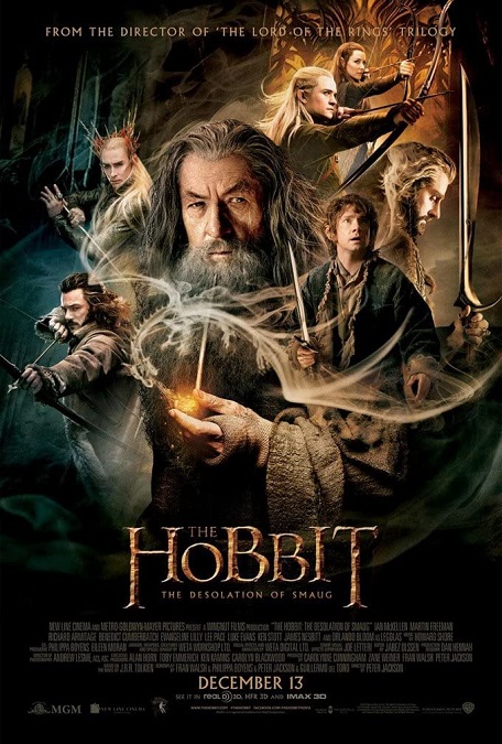
2013 – The Hobbit: The Desolation of Smaug

The Hobbit: The Desolation of Smaug – 2013

There is no doubt that this movie’s visual effects were top of the line.  But then, I would expect no less from Peter Jackson and the VFX wizards at Weta Digital.  Over the course of their Tolkien films, they have proven themselves to be capable of bringing any image imaginable to life in a most realistic and masterful way, and here, they certainly do not disappoint.

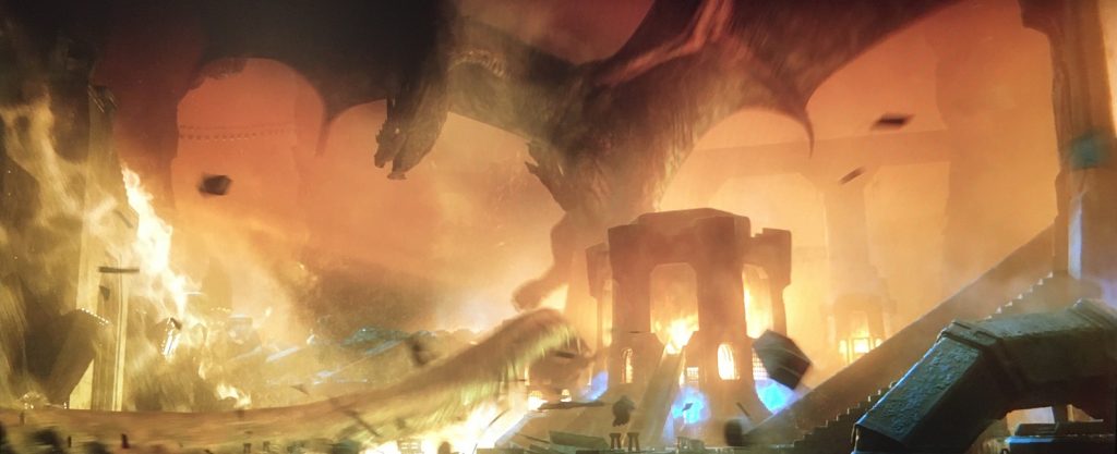
Of course, the one effect we all really came to see was Smaug, the dragon, and they seemed to have pulled out all the stops.  They created a creature with intelligence, personality, and gravitas to rival any live actor.  You see, even with all our modern technology and unbelievable digital effects, digital artists still have not completely mastered the creation of completely CG human images.  We are incredibly close, and make no mistake, perfection has been achieved on occasion, but it is still somewhat inconsistent.  But having no actual live frame of reference, it makes a certain amount of sense that a photo-realistic image of a dragon can more easily be perceived as real than a CGI human.  And as far as he went, he was magnificent.  His size, the texture of his skin, his movement, his design, not to mention all the perfect digital fire effects, was all flawless.

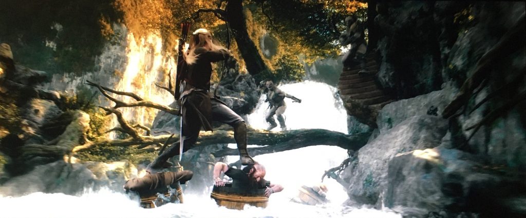
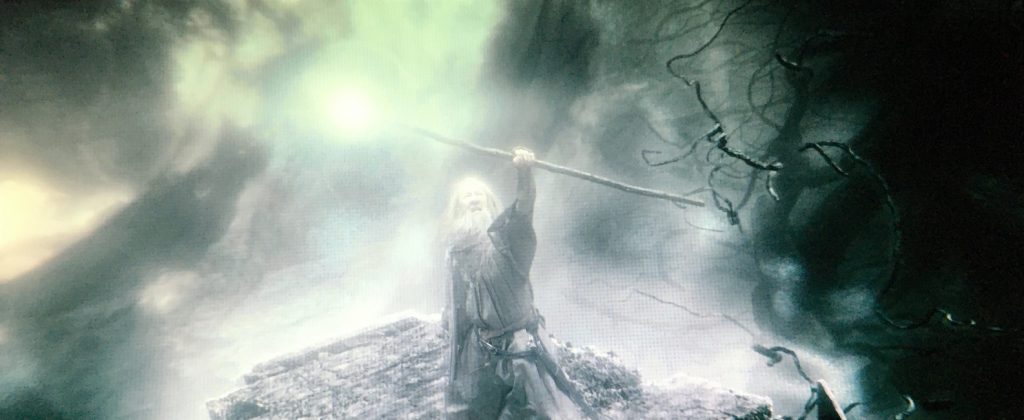
But the movie had so much more!  In The Return of the King, we were treated to a giant spider that looked fantastic.  Here we have a forest full of giant spiders.  They were not as big as Shelob, but they weren’t supposed to be, though they were still just as menacing.  We have a few thrilling Gandalf wizard battles, which are always awesome.  There is a really cool shot of him defending himself with his trusty staff, but he is defeated when his opponent disintegrates the wood in his hands.  There were also more orcs, more battles, and an exciting barrel ride down a rushing river.

As with other Tolkien films, the fantasy environments, many of which were created in computers, were awesome!  The interior of Thranduil’s stronghold in Mirkwood was gorgeous.  It was reminiscent of Lothlorien in The Fellowship of the Ring, but the design was different enough to make it distinct.  I also loved the wonderful design of the interior of Erebor. It had the proper scale to depict the epic nature of the story being told.  For that matter, the forest of Mirkwood was really cool, too!

But there was something I didn’t care for, and it spoke more of the script than it did of the competency of the effects, though it was the VFX artist that had to put it on the screen.  It was that barrel ride sequence.  It was the choice to make some of the action just plain silly, like when Legolas fought the orcs while standing on the heads of Dwarves in barrels, leaping from head to head like a silly video game.  Or like when Bombur’s barrel somehow got pole-vaulted out of the water, and his feet and arms popped out of the barrel, each hand holding a weapon.  Then, he started spinning like a top, making startled orcs fly back in every direction, defeated.   And these were just a few examples of such silliness in the action sequences in the film.  They didn’t need to be there, and I think they detracted from the film, as a whole.