2013 – Gravity (WINNER)

Gravity – 2013 (WINNER)

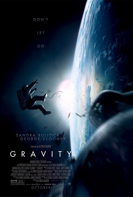
Probably the most important aspects of this movie’s visual effects was its realism.  And even though this is a work of fiction, the story took place in a modern time, employing technology, and an understanding of physics, that we know about today.  What I mean is that even though this exact scenario has not actually happened, it could, using today’s technology.  Well… the realism and scientific accuracy were not completely flawless, but they were a lot closer to reality than most modern movies.

The visual effects artist spent a lot of time consulting with real astronauts and scientists to get the look of the film right.  We know what weightless people and objects look like.  We know what jet packs in space look like.  We know what orbital sunrises look like.  The images of Earth were displayed beautifully from different angles and at different times.  And I loved the way these images were frequently reflected properly in the curved surfaces of the astronauts’ helmets.  The movie gave us a spectacular visual experience, with flawless attention to detail.

One of the challenges the filmmakers must have experienced is that normal movement for astronauts in space is very slow.  Unfortunately, that can make a film slow.  It runs the risk of being boring.  But I think the VFX artist overcame this problem.  They did a great job of keeping my interest with all the realism.  There was always something interesting on the screen, whether it was a beautiful night-time planet spinning behind the actors, a needed tool drifting away from the main character, or a tangle of parachute chords in free-float.  Even though these images were slow, they all looked fascinating.

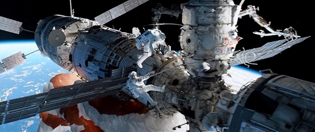
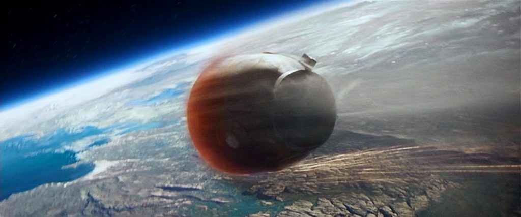
But there were also a good number of fast paced, exciting scenes, like a zero-gravity fire aboard a space station, a deadly barrage of speeding satellite debris, or a fiery escape pod re-entry sequence in the film’s climax.  The scene in which the International Space Station is completely destroyed was awesome!  There was so much chaos and flying debris, that it seemed remarkable that our main character could have survived, but the visual effects teams made it all look plausible.

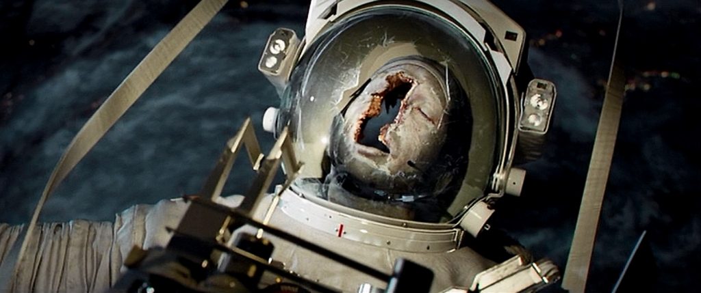
There was one effect that I’m unsure about.  The first astronaut was killed when a piece of debris crashed through his face shield.  Why did they make his head look like a completely hollowed out shell?  All you could see inside his head was a gray open space.  Why couldn’t I see the remains of his broken skull or teeth?  You know they would have been there because his head still retained its shape.  I’m not sure about the science of that, but it didn’t make sense to me.  Am I missing something?  Either way, they seemed to get just about everything else right.  Not bad for a movie that, according to VFX Supervisor Tim Webber, was about 80% CGI.  No kidding.  About 80 minutes of the 91-minute run-time was CGI.  Not bad at all.
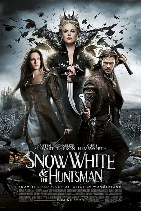
2012 – Snow White and the Huntsman

Snow White and the Huntsman – 2012

While the movie may have been a little average, the visual effects were pretty darn good.  It was a fantasy film whose failings were in the script and the acting, though it looked fantastic.  There were effects that, to use a gold-standard comparison, were just as good, if not better, than the visually stunning Lord of the Rings and The Hobbit trilogies by Peter Jackson.  However, there were also things that were a little less effective, though there were few of these, and I’ll get to them in a bit.

I’ll start off by going through the good things, of which there were many.  The movie’s first really interesting visual effect was the Evil Queen’s magic mirror.  When she evoked its power with her iconic rhyme, Mirror, Mirror on the wall, the large golden plate came alive and a liquid metallic cloth poured out of the mirror and onto the floor.  It flowed across the room and morphed into the shape of a specter draped in golden material.  You could even see the Queen’s distorted image reflected in the metallic cloth-like surface.  It looked fantastic!

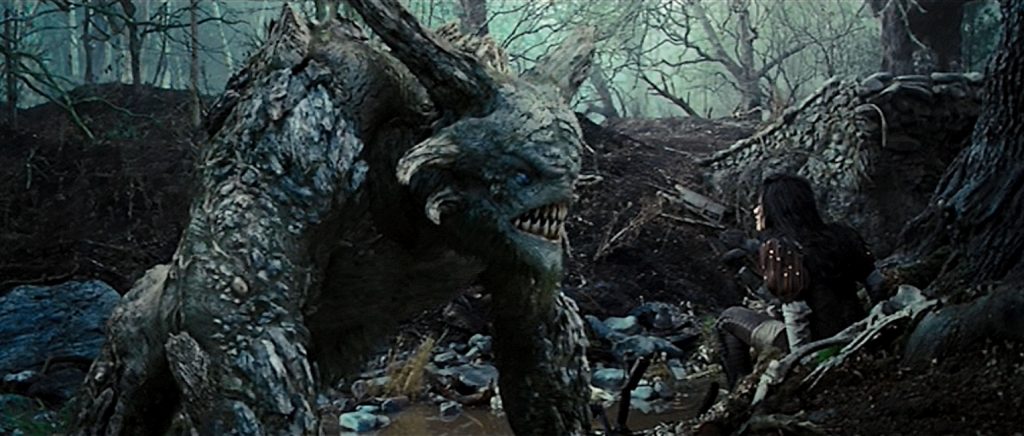
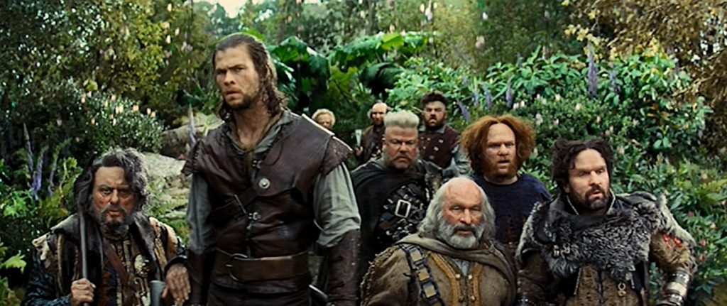
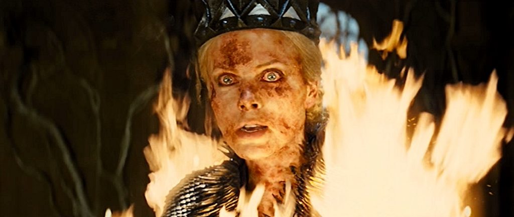
There was a brief fight with a massive troll that looked very photo-realistic, just as good as the trolls in LOTR, if not better.  But the one effect that really stood out to me as impressive was the seven Dwarves, which were also just as impressively executed as those in Jackson’s Hobbit films.  The size differences were handled with just as much skill and attention to detail.  Even the bizarre milk-bath scene where the Evil Queen rises out of a pool of the white liquid, looking like a perfect porcelain statue.  It added very little to the plot, but it looked cool.  There were also several interesting shots in the movie where a young face is morphed into an old and withered face, and these, while probably not terribly difficult, were very effective.

And then there was an effect that was used several different times in the film, in which a creature or a person would quickly transform into a burst of other animals like birds or butterflies.  There is a beautiful shot where a white CGI stag explodes into a flock of birds that fly away in every direction.  It looked great on the big screen, and is an interesting fantasy effect that I’ve only seen a few times before.

But I think a few of the more of the questionable effects had more to do with poor design than poor execution.  For example, when we first see the majestic white stag, it is a wide shot.  He is standing in front of a gigantic tree.  Except that his impossibly massive horns are tree branches instead of actual horns.  As such, they were difficult to see clearly against the actual backdrop of the tree.  Also, the depiction of fairies in these scenes looked to cartoonish.  They looked too much like CGI animated creatures, and I don’t think they were supposed to.

And one last effect that I didn’t care for was the magical evil soldiers made of black stone shards.  They also looked too animated.  And they moved so fast and so chaotically, that they just turned into confusing visual noise on the screen.  If your effects are so chaotic that I can’t tell what’s going on, then the effect has probably failed.  But if that is the worst of the film’s effects, then I think we’re still ok. 

2012 – Prometheus

Prometheus – 2012

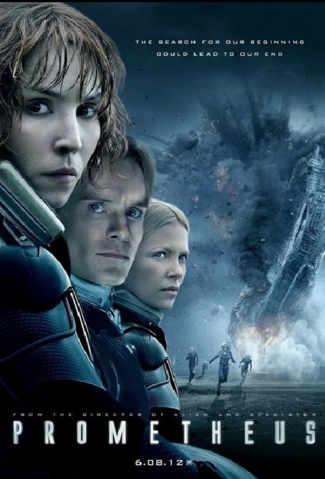
This was a movie that had the potential to be really good, but because, in part, of the visual effects, it fell a little flat.  But I’m certainly not going to blame the visual effects artists.  They did their jobs well.  It was the poor script that was the real problem.  The VFX teams were just doing what they were told, but were they really told to ignore a ton of important details?  And you can’t earn an Oscar nomination for Best Visual Effects based solely on the design of the CG on the screen.

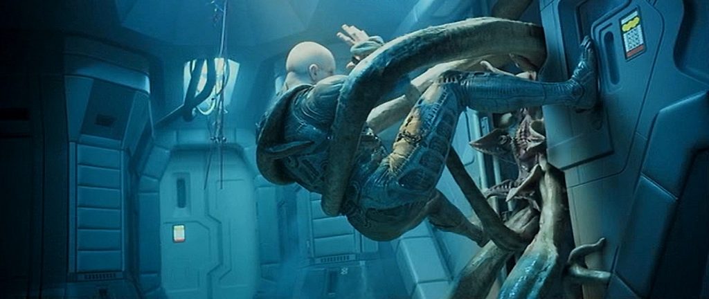
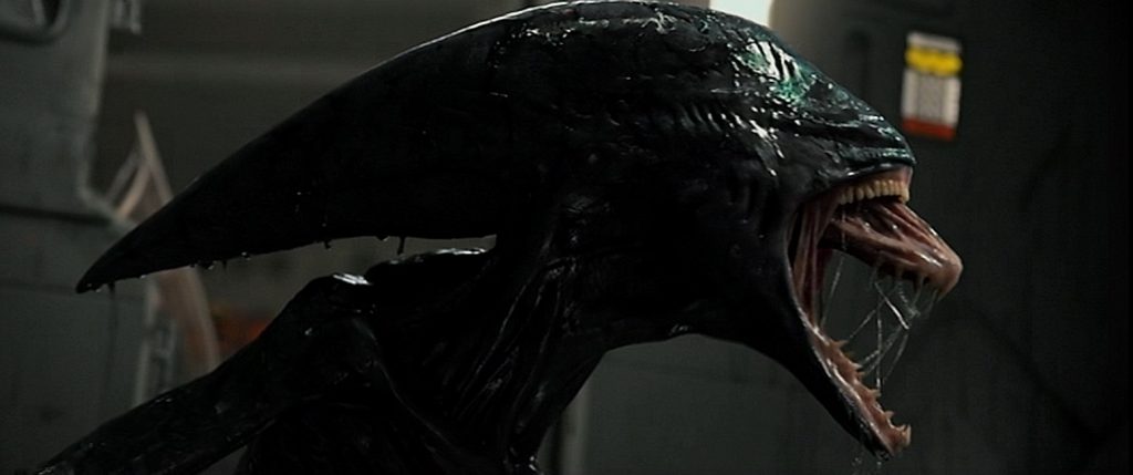
When you look at the effects on their own merits, they were just fine, I suppose, but I had to roll my eyes at some of the things taking place.  Granted, this is a sci-fi/horror movie, so, to a certain extent, they got to make their own rules about what was realistic and what was not.  But when, for example, at the climax of the film, a little squid creature had grown to the size of an adult elephant, in only a matter of hours mind you, with no food source or way to gain mass, my eyes rolled.  It had just magically grown in size and strength with no explanation.  It shifted the nature of the film from sci-fi to fantasy.  Sure, it may have looked cool, but it made no sense.  And at the end of the movie, the classic Xenomorph finally makes its appearance.  But instead of an appropriately sized little chest-burster, this one emerges almost fully grown, so it is nearly the same size as the host.  How had it fit inside the host’s torso?

But problems with the script aside, why was this movie nominated for the Best Visual Effects Oscar?  Well, for one thing, they made use of a new technology called sub-surface scattering, or SSS for short.  It is basically an algorithm that gives us vastly more realistic CGI skin.  This was a technique that was first used in the 2009 film, Avatar, but here the technology has been advanced to a much more effective point.  When creating a digital model, lighting is very important.  If light strikes someone’s skin and simply bounces off, there is a danger of the skin looking too much like plastic.  Real skin is partially translucent and doesn’t work that way.  SSS allows digital light to penetrate the digital skin and scatter, creating more realistic flesh.  The CGI alien Engineers looked perfect, so I’ll give them that.  I thought they were actors in makeup and prosthetics.

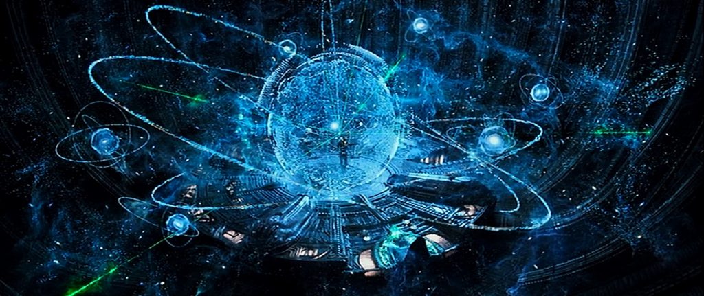
There was a scene where a holographic 3D star map filled a room and a live actor was able to interact with it.  There were a number of creature effects like the squid-like trilobite that is surgically removed from a woman’s uterus, or a cobra-like alien called a Hammerpede that attacks a man, breaks his arm, and then slithers into his mouth, or even a tiny worm that wriggles out of a man’s eyeball.  There were, of course, spaceship effects like the Prometheus, and the alien ship, the Juggernaut.  There was an intense scene in which a giant dust storm nearly kills several people, and that was exciting.  The problem is that these were all effects that we have seen before.  I didn’t find anything really special about them, nothing that stood out as innovative or above average.  The designs of the visual effects were cool, and that counts for something, but I didn’t think they looked any better than other movies.
2012 – Marvel’s The Avengers

Marvel’s The Avengers – 2012

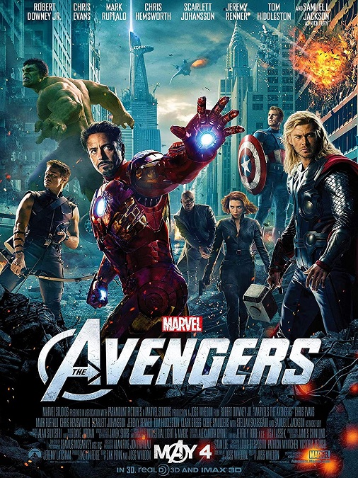
I have to admit that I might be a bit biased to the Marvel movies, since I am an unashamed fan of the franchise, in general.  But even when I try to look at the film’s visual effects as objectively as I can, I come to the same conclusion.  The visual effects are visually stunning!  Not only do they bring the iconic characters to the big screen, fulfilling a varied range of childhood fantasies, they do so in a modern way that easily satisfies comic book nerds everywhere.

So far, the only Marvel movies that have been nominated for the Best Visual Effects Award have been the Iron Man movies.  But here, not only do we get to see a lot more of that popular character, but we get to see six other heroes show us what they can do, not to mention an army of bad guys for them to fight, and a smarmy villain.  It is hard to decide what to start with.

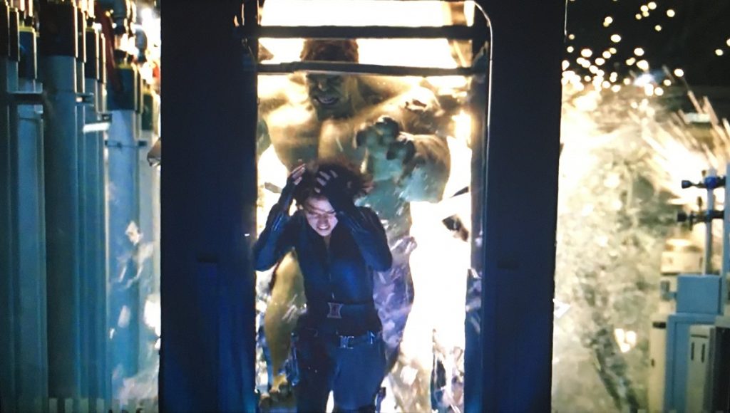
Visually, one of the coolest characters is the Hulk.  Yes, he is the embodiment of simple rage and destruction, but it seems like they finally got him right.  What I mean is that there have been several movies in which he is featured, and they never got the big green muscle monster quite looking photo-realistic.  He has always looked too cartoon-like.  In the most recent version, the 2008 film, The Incredible Hulk, they came close to making him real, but the CGI on him here was just better.  Finally, they got the right actor, and the right style of animation.

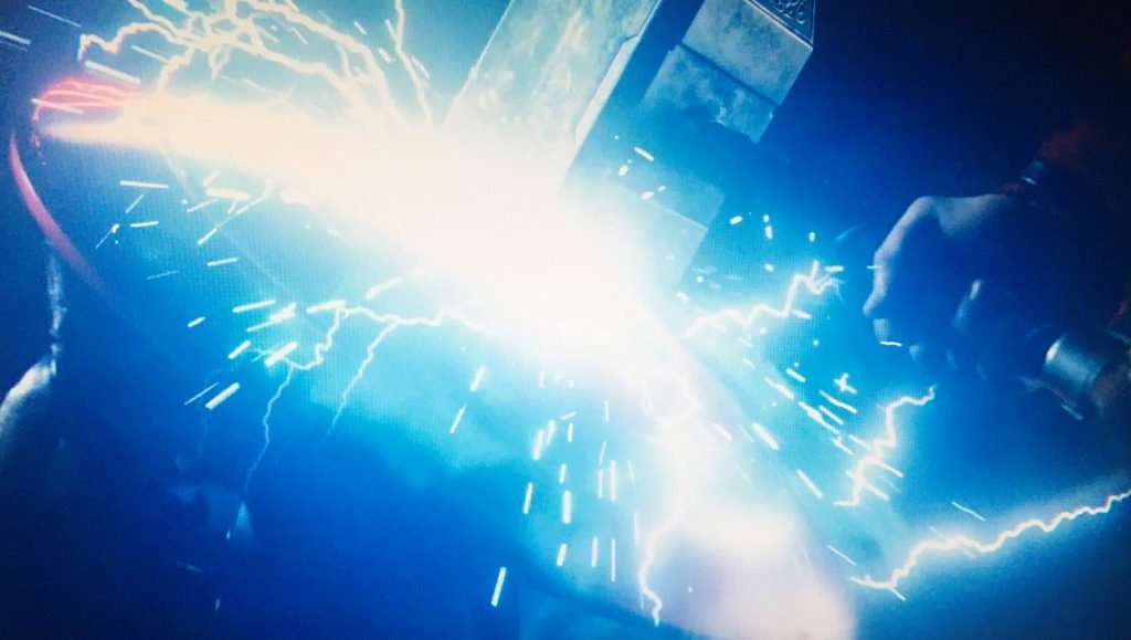
And then there was Thor, with his god-like strength, his flying, his magic hammer, and his lightning bolts.  He just looks great on the big screen!  The other heroes are all of a more human variety.  They are no less cool to watch, but they are all just master fighters with super-human skills.  Even Captain America, with his enhanced strength and speed, is just a brawler with a prop, same as Hawkeye, Black Widow, and Nick Fury.  Many of their visual effects were made up of great choreography and stunts, with maybe an awesome thrown shield or some perfect archery thrown into the mix.  Don’t get me wrong, it was all thrilling, but they aren’t as visually fantastical as a fast flying suit of armor that shoots force beams from its hands.

And as you might imagine, there were plenty of other really cool effects, not the least of which was the Helicarrier!  Not only did it look awesome, but its design made it look believable in our current world!  There is a shot where it is sailing on the ocean, but then four massive turbines start to spin, lifting the aircraft carrier out of the water, allowing it to fly amongst the clouds!  Very, very cool!

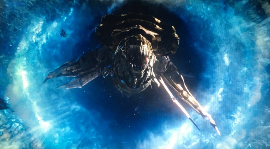
And then there was the final battle.  A hoard of evil aliens flew out of a magic portal in the sky and destroyed half of New York.  Their giant flying monsters the size of whales looked incredible, and the shot of the Hulk punching one down out of the sky was so cool!  And who doesn’t love watching the Hulk beating Loki against the floor like a rag-doll.  (Puny god!)  Every one of the four major action/battle sequences in the film was exciting to watch, from beginning to end!  Fans had been waiting for this movie for a long time, and they really knocked it out of the park!
2012 – Life of Pi (WINNER)

Life of Pi – 2012 (WINNER)

This is one of those Best Visual Effects winners for which it doesn’t matter what other movies it was up against.  I completely agree with the Academy’s decision.  It would have been wrong if it had not taken home the top prize.  The visuals for this film were beyond amazing.  The effects ranged from the realistic, like flawless composited backgrounds, to absolutely photo-realistic CGI, to magically colorful fantasy imagery, all of which combined to create an incredible visual experience.

Of course, the effect that really earned the movie its Oscar was the tiger.  It is important to point out that the character of the tiger was there throughout most of the movie.  It was one of the lead characters.  And according to a short documentary I found on YouTube, only 25 shots in the entire film contained a real tiger.  Every other shot of the tiger was completely CGI.  The thing is, even a live tiger trainer, Thierry Le Portier, who was used as a consultant on the movie, could not tell the difference between which shots were real, and which ones were not.  I certainly couldn’t.  That’s how good the animated animal was.

And for me, it wasn’t just how it looked that sold the imagery for me.  It was the movement.  As a cat, tigers have that innate, feline way of moving that is graceful and fluid.  The way this CGI tiger moved was just as life-like as any tiger I’ve seen on film or in a zoo.  The character’s realism was simply was amazing.  Le Portier coached the animators on how real tigers thought and behaved, and how their movements reflected their emotions and intentions, adding an important layer of realism to the character.  The result was phenomenal!

But it was more than just the tiger.  There was also a zebra, an orangutang, a hyena, and a ton of meerkats.  And like the tiger, their photo-realism was uncanny, though they didn’t have as much screen time.  The way they moved never once gave away their digital nature.  The documentary also mentioned that 7 shots containing the hyena were real, and none of the orangutan were real.  I call that pretty impressive, and worthy of the Oscar win.
Another amazing effect was the ocean itself.  Not a single shot of the movie was filmed on the ocean, though 80% of the story took place in the middle of the Pacific.  It was all filmed in a wave-pool, built on a sound stage.  The film’s director Ang Lee, stated that the ocean was a character in the film.  It appeared to have its own emotions and moods, and a life of its own.  There were constant normal ocean waves, violent storms, and calms so profound that it was impossible to tell the water from the sky.  It made for some stunningly beautiful imagery.

And that’s what made the visual effects for Life of Pi stand out.  The film was not just a great story.  It was a work of visual art, which was one of Lee’s goals when making the film, and I believe he succeeded. It was a beautifully filmed movie, one in which the fantasy elements were indistinguishable from the realistic elements.  Every time I watch the movie, I am more impressed by what I see on the screen.

2012 – The Hobbit: An Unexpected Journey

The Hobbit: An Unexpected Journey – 2012

Well, Peter Jackson does it again.  And he found new ways to solve old problems, so that just adds another layer of awesome to his visual effects for the first of the three Hobbit movies.  I call that pretty impressive.  A lot of people say that the one small book that this film is based on was barely enough to fill two movies, and that making three was just a cash grab, but I don’t care.  It gave me more awesome visual effects to see, and a broader, richer story. 

I’ll start off with one of the most important effects in the movie, that of the size difference between the various characters.  It was an issue that had to be address throughout the entire film, from beginning to end, and they never dropped the ball.  The dwarves of Thorin’s company were the main cast, but the were constantly sharing the screen with the tall Gandalf, elves, trolls, giants and goblins.

In the original Lord of the Rings trilogy, Jackson was able to get away with forced perspective to film actors on the same set, at the same time, to achieve the illusion of size difference between characters.  And that worked when there were only a few actors on the screen.  But here, the 13 dwarves are rarely seen apart from each other, along with taller characters.  The filmmakers’ solution was to develop a camera system that used two cameras.  The first filmed the dwarves.  The second camera was linked to the first so that they moved in exact synchronization.  The taller characters were filmed on a miniaturized green-screen set, with the camera being closer to the actors, making them appear large in the frame.  They had earpieces that allowed them to hear the other actors.  When the two images are composited together, they look like they are different sizes.  A genius solution!

But there were also plenty of CGI characters that were incredibly photo-realistic, both in how they looked, and how they moved.  It was all pretty-much flawless.  The best example of this was the main bad guy, Azog, the albino Orc.  He was incredibly done, and though there was an actor playing him, he was most certainly enhanced by digital means.  And even though the goblins in Goblintown had a core group of live actors, it was decided that most, if not all of them, were covered by CGI goblins.  It was too bad, because the actors were fitted with great animatronic face masks that looked fantastic.  Unfortunately they were too hot for the actors to wear for any extended period of time.

Also, the movie was filmed using a higher frame-rate, giving the images on the screen a vastly sharper image.  I remember seeing this movie in the theatre, and the difference in the image was easily noticeable.  It looked like the actors were actually real, maybe standing on a stage at the front of the theatre.  It was really amazing!  The problem was that it didn’t really enhance the movie-watching experience for me, at least not enough to make it worth their efforts.  I enjoy the movie, and am equally engrossed in the story when the frame rate is normal.  The enhanced picture quality seemed to be a novelty that was mostly unnecessary.

2011 – Transformers: Dark of the Moon

Transformers: Dark of the Moon – 2011

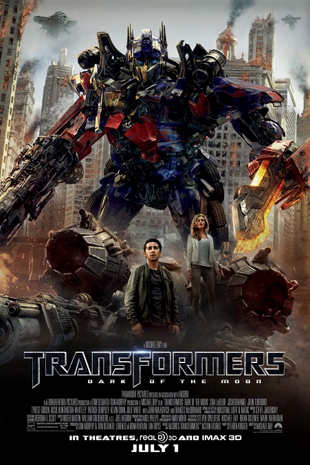
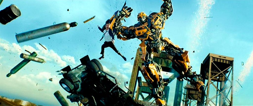
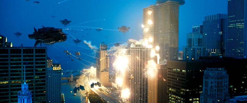
This was one of the dumbest and poorly written movies I have seen in a long time, but thank goodness the visual effects were passable.  I’m not saying they were perfect, but they did what they were supposed to do.  There were some really good things that made it to the big screen, but there were some little disappointments as well.  Unfortunately, I think I may have missed out on one of the main reasons this movie was nominated for Best Visual Effects.  It was supposed to be a 3D movie.  But if I am right, and that was the movie’s main reason for being nominated, then I’m glad it didn’t win the Oscar. 

This is the third film in the Transformers franchise, and as was the case with the first film, which was also nominated for the Best Visual Effects award, it was directed by Michael Bay.  As such, it had all the same signature techniques and aesthetics as the first one.  Lots of fast, jarring action, quick cuts, lots of explosions, and a massive amount of mayhem and destruction.  The problem is that we’ve seen it all before.  True, I have not seen the franchise’s second installment, but I can only imagine that it is more of the same. The transformations looked cool, for the most part, but no better than in the first film.

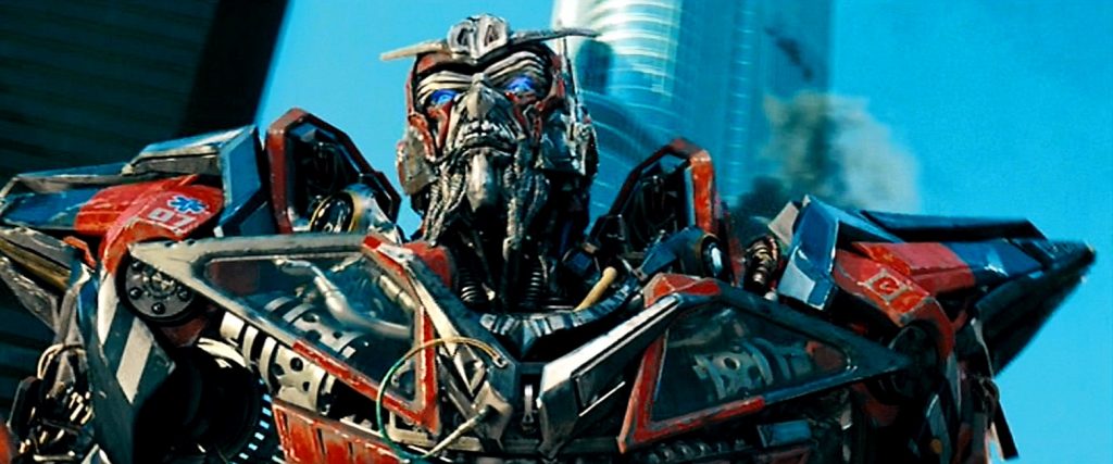
Not only did we see all the same effects in the first movie, but they seem to have amplified the aspects of the effects that I didn’t like.  When the robots changed from vehicles to robots, it all happened faster and more unbelievably.  When skyscrapers were destroyed, they defied the laws of physics for the sake of looking “cool”.  When the robots spoke, their metal mouths were flexible enough as to behave like human lips.  In fact, one of the new robots, Sentinel Prime, had metal facial hair.  He had a long beard and moustache that seemed to wave and flow like human hair.  Someone needs to tell Bay that metal doesn’t bend that easily.

Another effect that really bothered me was the skyscraper that broke in half.  The top half tipped over to about a 45 degree angle, causing our heroes to slide along the angled floor, and crash out the windows on the far side.  Both halves of the broken building just stood there, shaped like a bendy straw.  It was so ridiculously unrealistic, that I was taken out of the story.  I sat there rolling my eyes.  But that was only one example of how realistic physics was completely ignored.  I get that the real problem was with the script, but that poorly written script demanded that effects artists had to create that terribly unrealistic effect and make it look good.

 I also got really tired of the fast action that would periodically break into slow motion, in a bad attempt to look “awesome”.  No, actually, I think they did it because if they left the speed of all the effects alone, there would be times when the audience would never be able to comprehend what was happening.  If you need to slow the action down for us to be able to see what you are doing, then maybe you should find something different to do, or at least find a different way to do it.  Oh well.  At least Michael Bay knows how to blow things up in an exciting way.

2011 – Rise of the Planet of the Apes

Rise of the Plante of the Apes – 2011

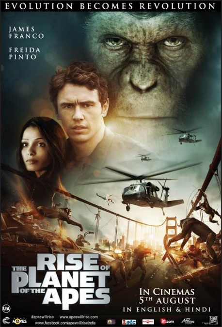
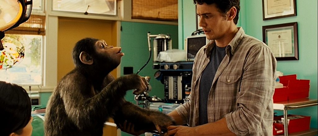
This movie’s visual effects were done so well that I have very few complaints.  We all know what we came to see, and we got it in spades!  We wanted the super-intelligent apes, but this movie went a step further, and believably showed us the progression from the countenance of a simple child, to that of a learning teenager, and finally, to a complex adult who sees the wrong being perpetrated against his species, places blame, and retaliates.  And through the masterful visual effects, we got to see it all in incredible detail.

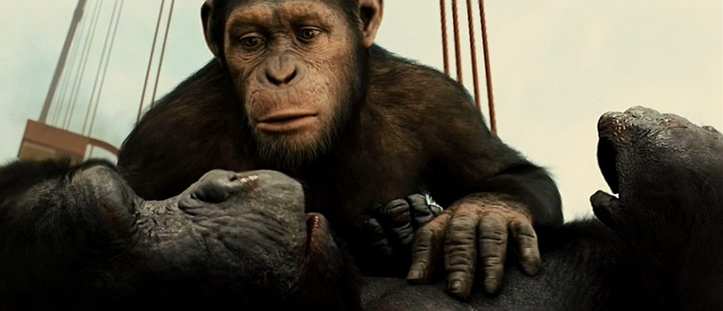
The poster child for creating believable characters by wearing a motion capture suit, Andy Serkis, played the main ape, Cesar.  It seems clear that the effects artists used Peter Jackson’s King Kong as a starting point, and then elevated the technique to an even higher level.  The bodies of the CGI apes looked and moved like the real things.  The VFX artists had the challenge of keeping Cesar’s face looking like that of a real ape, and yet giving him facial expressions that were distinctly human.  It is amazing how Serkis’ acting came through the CGI performance.  Using face-capture technology, the character of Cesar was just as expressive as any of the live actors. 

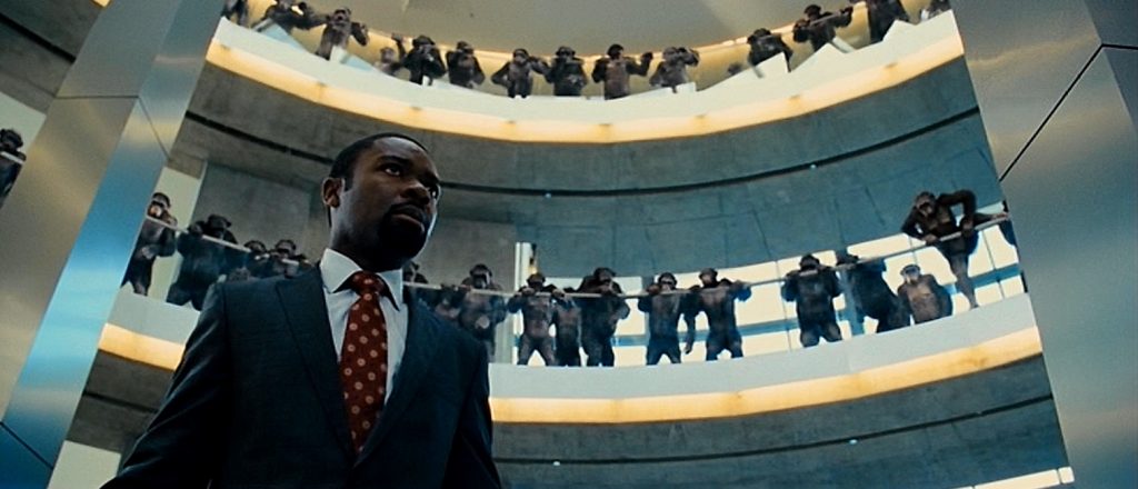
And there were a number of apes that had their own distinct physiologies, looks, and personalities.  There were chimpanzees, gorillas, and orangutans that made up the main simian cast.  They each had their own ways of moving and behaving, and the effects teams made them all unique and incredibly photo-realistic.  The orangutans, with their longer hair, heavier bodies, and slower movements were quite distinct from the gorillas that were far more aggressive, muscular, and stout.  At the same time, the chimps were more lithe, quicker, and nimbler than the rest, and it all came through perfectly in the nearly 100% CGI characters.  Fantastic!

According to Wikipedia, “The main break through was a camera that enabled viewing the motion capture dots in daylight, employed mostly for the Golden Gate Bridge battle. A maximum of six actors could have their movements captured, with larger ape crowds using fully digital animals animated using Weta’s move library.”

Though the apes behaving like humans was the film’s main draw, there were plenty of other effects that were memorable and awesome, so I’ll just mention a few of them that caught my attention.  The first one that comes to mind is when the gorilla attacks a helicopter by leaping into it, causing the pilot to lose control of the vehicle.  It crashes into the Golden Gate Bridge and explodes in a giant ball of fire!  The second is when the character of Jacobs is hanging on for his life in the destroyed helicopter’s cabin as Koba, a bonobo, pushes it off the bridge.  The shot where it falls into the water, killing Jacobs, was awesome! 

There were so many things this movie got right, and I find that I am really looking forward to seeing the two sequels, both of which were also nominated for the Best Visual Effects award in their respective years, 2014 and 2017.

2011 – Real Steel

Real Steel – 2011

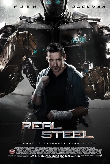
If I’m being honest about the visual effects for this movie, I have to say, I don’t think they were that great.  First of all, it was like a knock-off version of the earlier nominee in the category, Transformers, except without the transforming.  And there were a few inconsistencies in the visuals that stuck in my craw.  For the most part, the photo-realism was really good, so I’ll give them credit for that, but other than that, I wasn’t too impressed.

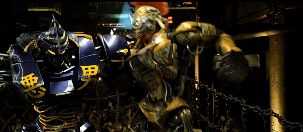
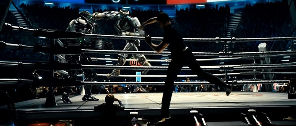
First of all, I’ll get the good stuff out of the way.  The design of the various robots in the film were interesting, in a gaudy WWF kind of way, which was appropriate for the plot.  Among others, there was the Japanese Samurai robot, the Roman Centurion robot, the Two-headed robot, and the big baddie robot named Zeus, that strangely didn’t even try to have visual references to the King of the Greek Gods.  And lest I forget, the non-flashy, low-tech-looking, scrappy underdog robot, Atom.  Yes, they all looked and moved realistically.  But it seems like that was the movie’s only real draw.  It’s what we all came to see.

Aside from that, there wasn’t much else except for some nice shots that created virtual environments that blended small sets with CGI.  But by this time, it is an effect that just about every movie uses.  It is usually cheaper than building massive live sets.  So, nothing new there, nothing new or impressive.

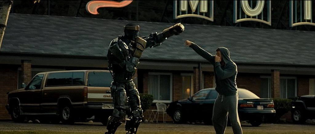
And then there was the effect that looked like it was done wrong, but only some of the time, or at the very least, the difference was never addressed or explained.  During the training montage, when Charlie is shadow boxing Atom, the robot should have been following his exact movements, right?  But the robot’s movements were opposite.  Charlie would punch with a right, and Atom would throw a left.  But then in the final fight of the film, it reversed so that they were in proper synch.  I don’t know why, but that really bothered me. I think the reason they did it is because during the training montage, it looked more synchronized if the movements mirrored each other like an actual mirror.  But it made no sense.

Another thing that bothered me was that the robot movements were not an exact match of the actors.  Of course, they used some pretty simple motion-capture techniques to make the bots mimic the actors, but then, I’m guessing the actors had to re-film their scenes and try to mimic what they had previously done for the motion capture.  But they didn’t always match exactly, and it was sometimes obvious.  An arm would be in the wrong position, or a leg would be out of place.  I’m sorry, but I noticed, and it temporarily ruined the illusion. 

There just wasn’t a whole lot about the visual effects that stood out to me as above average.  And aside from the CGI robots, which were done well, there just weren’t that many interesting effects.  And besides, we’ve seen giant robots before, and Transformers did it better.  And as a side note, as much as I was unimpressed with the special effects, I wasn’t impressed with the predictable script either.  Snooze!

2011 – Hugo (WINNER)

Hugo – 2011 (WINNER)

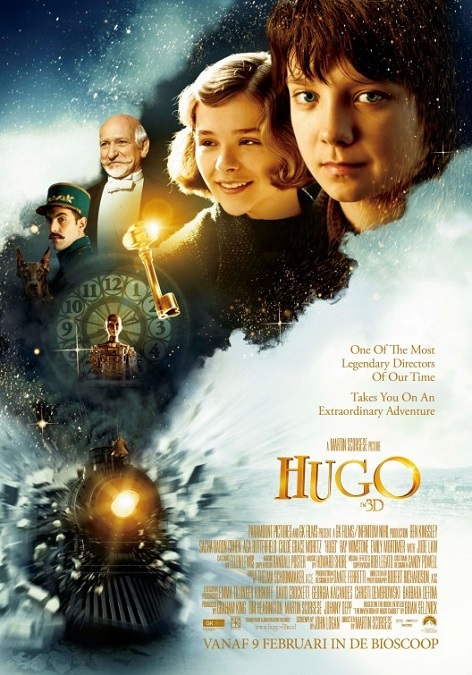
The visual effects for this Academy Award winning film were mostly of the subtle variety.  The majority of them are of the sort you are not meant to notice.  Of course, there were several sequences that were clearly CGI effects, but they seemed to be few and far between. 

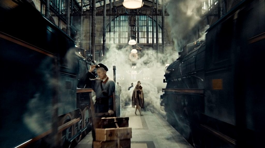
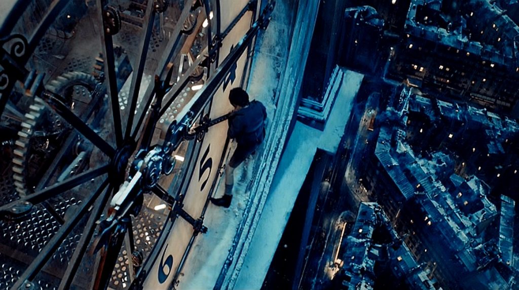
In this film, it wasn’t necessarily about the quantity of the effects, but their quality, and here, it was all about the compositing.  You can start at the second shot of the movie.  There is what seems to be an impossibly long crane shot that begins high in the sky above a train station, where you can also see the Eifel Tower.  The camera floats down into the train yard, glides between two trains, and passes a host of individuals who are engaged in various activities.  The unbroken shot continues into the main building, passing more pedestrians, shops, and kiosks.  Finally, it rises up into the air and focuses on a high clock where Hugo is peering through the number 4, spying on the people.

The continuous, sweeping crane shot lasts for about 50 seconds, with only one obvious break that was cleverly covered up by a heavy gust of steam from one of the trains, right at the point where the shot moves from the train yard into the station building.  The shot was pretty good, though one or two of the individually filmed people looked… separate from the CGI background.

But from what I gather, most of the interior of the train station, both in the main hall, and in Hugo’s world, inside the station’s walls, were made of small set pieces, extended with CGI environments.  This is where the film’s visual effects really shine.  You’d never suspect that they were not filming inside a real building.  The compositing was flawless.  The lighting was perfection.  They did a fantastic job making the place look immense, with a feeling of grandeur.  It went a long way, adding to the fairy-tale aesthetic of the story being told.

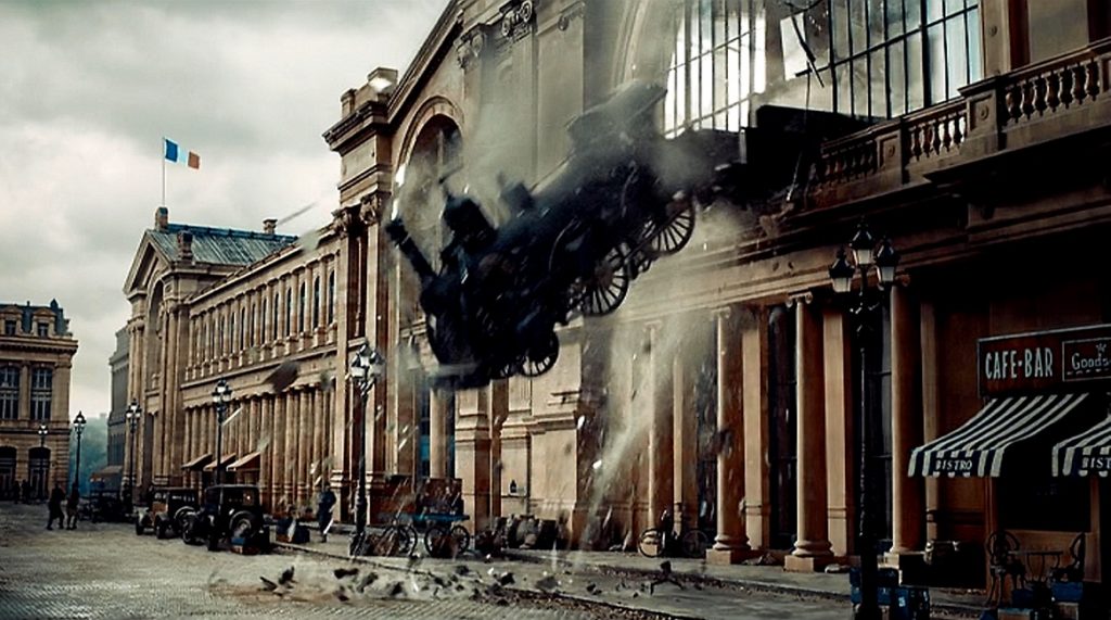
But unfortunately, that was about it.  There were a few sequences in the movie that were more than superbly skilled compositing, but not much.  There was the dream sequence in which a train runs off the rails, crashes through the station, and smashes through a second story window.  Incidentally, I thought this miniature model effect looked a little fake, until I learned that the sequence was based on something that actually happened in the very train station depicted in the film.  I found a photograph of the actual 1940 derailment, and it looked exactly like the image in the movie.  And there was also a second dream sequence in which a horrified Hugo turns into an automaton, and that was pretty cool.

But other than that, the effects in this film were ones we were not meant to notice, invisible effects.  And for those, I’d say they were pretty-well flawless.  Did these effects deserve to win?  I don’t know.  Did they deserve to be nominated?  Yes, they certainly did.  Plus, this 3D movie was made during a time when such films were in fashion, and I think that also might have had something to do with its win.