2008 – The Dark Knight

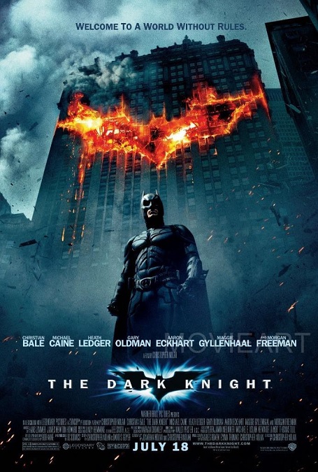
The Dark Knight – 2008

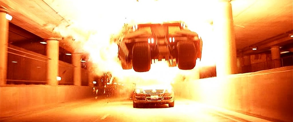
My initial reaction to the visual effects in this Batman movie, is that I was a little underwhelmed.  I’ll say that it was a good movie, without a doubt, but I just wasn’t terribly impressed with the effects.  But upon closer inspection, I have gained a certain amount of respect for them.  There was a good deal of practical effects and stunts, a fair amount of CGI work, and a lot of explosions to keep things interesting, but still, I wanted to be more impressed, somehow.

It’s that the movie was just so dark, and I don’t mean thematically.  I mean visually.  Many of the scenes took place at night or in dimly lit rooms.  For example, there was a dramatic scene in which live stunt man in a Batman costume leaps off the roof of a skyscraper and extends his cape into a functional hang-glider.  He becomes a CGI Batman, and flies around the city for several shots, and we are supposed to be impressed with the CGI.  But it was in the dark, and the only time I could even see him was when he passed in front of a building that was lit up brightly, and yet cast almost no illumination.  What’s the use of a visual effect if it is too dark to see?

And this is a good place to re-affirm that I definitely consider stunts to be visual effects.  If you think about it, there are many things that are peripheral aspects of visual effects, like, at times, cinematography, set decoration, and make-up effects, but those things all have their own categories at the Academy Awards.  Stunts do not, though many in the industry have been campaigning, unsuccessfully, to have the category created.  So I think it seems right to consider stunts to be visual effects for now.  If they ever get their own category, that would, of course, change.

A friend of mine pointed out that the scene in which a sixteen-wheel semi-truck was flipped over like a Scottish caber toss, because that was not a CGI effect.  They actually flipped a big-rig.  I can appreciate that effect and the ingenuity behind planning such a feat.  But again, it took place at night on a dimly-lit street, so a lot of the details in the effect were muted, but what I could see of it looked pretty cool.

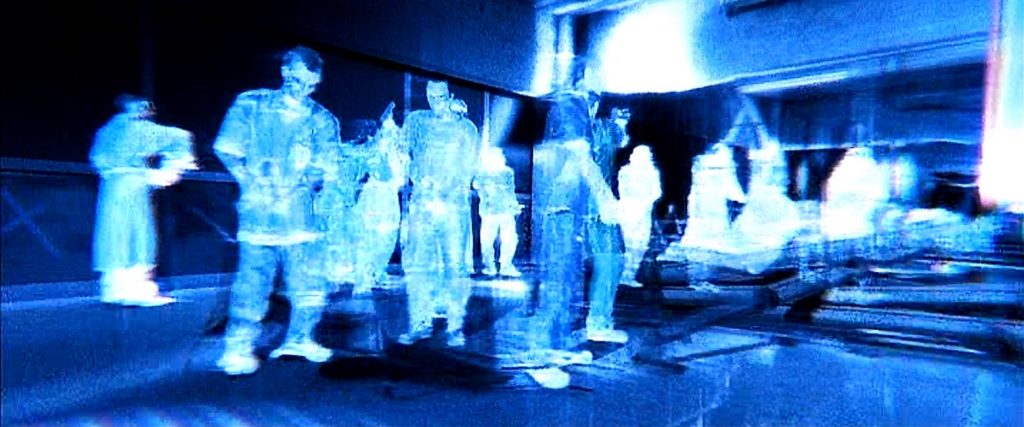
There were four other effects in the movie that really caught my attention.  The first was when the bad guys set up a trip-wire for a flying helicopter, causing it to fly out of control, crash into a building, and plummet to the street.  The second was when a hospital was blown up so badly that it collapsed like it was a planned demolition.  That one actually took place in a daytime setting, so that was refreshing.  The third was Batman’s ghostly blue sonar-sight, but that visual didn’t look like it would be too difficult to achieve.

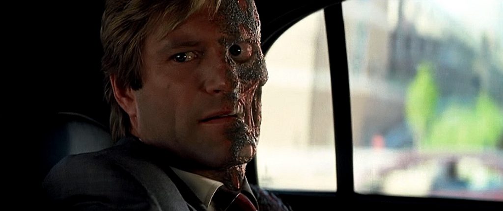
The fourth was the character of Two-Face.  The effect of the guy with half his face burned down almost to the bare skull was pretty awesome.  Scary, but pretty awesome!  The details of the inner-workings of his skinless face were incredible, especially around the eye when it moved.  And I liked how the line of the teeth perfectly extended from the actor’s mouth to the digital mouth.  Very cool effect!

2008 – The Curious Case of Benjamin Button (WINNER)

The Curious Case of Benjamin Button – 2008 (WINNER)

At first glance, you might wonder why this movie was nominated for the Best Visual Effects award, let alone why it won.  If you just watch the movie straight through, there appear to be very few special effects, other than a couple of brief war scenes that took up only seconds of screen time, and a lot of really well-done composite shots.  Sure, the main character was in heavy old-age makeup for most of the movie, but there was nothing terribly odd about that.  But then you’d be wrong, just like I had been before I did a little research.

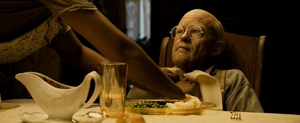
As I’ve said before, but best visual effects are the ones you don’t know are visual effects.  For a little more than the first third of the movie, the main character, or at least his head, was completely computer generated, and I really had no idea!  The movie is about a man who is born with the body of an old man, and ages backwards, until by the end of the film, he is an infant.  As I watched the movie, I kept wondering how they found actors that looked and behaved so much like Brad Pitt.  I eventually came to the conclusion that they just put Pitt in some pretty awesome makeup, and then digitally put his head on another actor’s body.  That was closer to the truth, but it was so much more than that.

Apparently, they developed and perfected a new type of motion capture technology that allowed a computer to track not just a person’s movements, but also their emotions.  They were able to fine-tune the technique to such an extent that they could accurately recreate every emotive muscle in Brad Pitt’s face in a computer.  Thus, they didn’t just stick the actors head on another body.  They created that head in a computer, aged it, lit it, and then attached it to the body so seamlessly, I still have trouble seeing through the illusion.

The technology was called Contour, a technique in which they applied a kind of phosphorescent powder to Brad Pitt’s face, then placing him in front of an array of rapidly flashing fluorescent lights.  Connected to those lights was a network of special cameras, by which they could create a 3D digital image of his face that was thousands of times more detailed than conventional motion capture methods were capable of.  They photographed these digital images in a range of different poses to create a database of facial expressions.  They then filmed Pitt performing his scenes so the digital animators could use his performance as a reference when creating the CGI face.  The result was an amazing performance that was entirely Brad Pitt, and entirely CGI at the same time.

All the articles I could find to research the effects for this film, focused on this new technology, but I have no doubt that there were also a number of detailed digital environments that were used as well, and of course, they were all perfectly done.  And then there was the eighty-year-old infant, which was a clever combination of animatronics and CGI.  Its presence on the screen was brief, though memorable.  But it was really Pitt’s digital face in the first third of the film that really earned the movie its Oscar win, and never once looking at all animated, I think it deserved it.

2007 – Pirates of the Caribbean: At World’s End

2007 – Pirates of the Caribbean: At World’s End

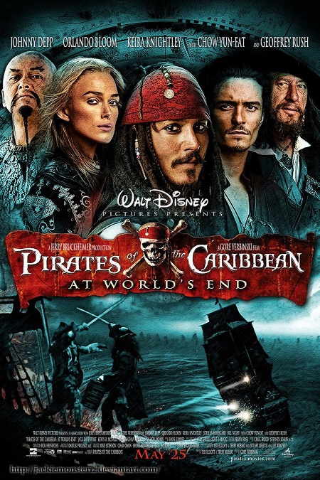
Here we are again with the Pirates and their crazy antics.  So what new innovations did they bring to the table this time?  Was it enough to earn them their nomination? At first, I thought, no, it wasn’t.  The film had many of the same effects we saw in the second film, Dead Man’s Chest.  But then the climax of the movie arrived, and I understood why this movie was nominated for the Best Visual Effects category.

But let me back up.  One of my favorite effects in both that earlier film and this one, was the fully CGI character of Davey Jones.  The man with the tentacled face was not only a pretty cool character, but the amazing effects that the animators applied to his constantly moving tentacles were amazing.  And whenever he had a close-up, the fantastic texture of his skin looked incredibly realistic.  I actually think it looked better here than in the last movie, proving that the effects artists weren’t just resting on their laurels.  And his completely CGI crew of fish people were done with just as much care and photo-realism that helped them win the Oscar in 2006. 

There was an interesting little effect where we saw a pirate ship sailing through the sands of a desert, though I had one tiny problem with it that was either the fault of the effect animators, the script, or the director.  The story established that the ship was actually moving across the sand on the backs of thousands of tiny scuttling crabs, but in the shot where it crests a dune, sails down the beach, and floats into the water, the crabs were all gone.  Did they just forget how it was supposed to have been moving?  Or maybe they were making the point that the crabs were all in Jack Sparrow’s mind.  The point is that it was never addressed.

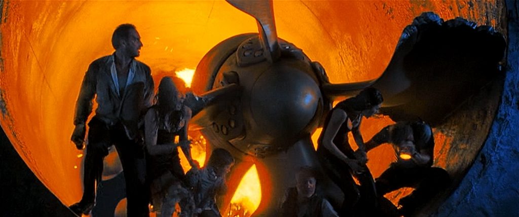
The incredible climax of the movie was full of magic and excitement.  Two ships, the Black Pearl and the Flying Dutchman, sail into a great swirling whirlpool in the middle of the ocean.  There is rain, lightning, wind, waves, and spray, and also cannonballs being fired from both ships.  Each ship took massive damage, and there was a great shot where the two vessels got so close to each other, but on opposite sides of the whirlpool, that their masts crash into each other!  And I have to mention how the awesome CGI water looked much more realistic than in other recent films like Superman Returns and Poseidon, despite its unnatural behavior.  The dark blue-green lighting was perfect!  And while all the mayhem was going on, Jack and Davey had to sword fight while balancing on one of the yard arms.

Then, another sequence that was amazingly lit and constructed was the destruction of the Endeavour.  As it takes cannon fire from both sides, the defeated Captain Beckett slowly walks away from the Poop Deck.  His ship is blasted to pieces all around him, but he isn’t touched until he is engulfed in fire.  A very cool effect!  So yes, I think there was plenty of reason to nominate this movie for the category.

2007 – The Golden Compass (WINNER)

The Golden Compass – 2007 (WINNER)

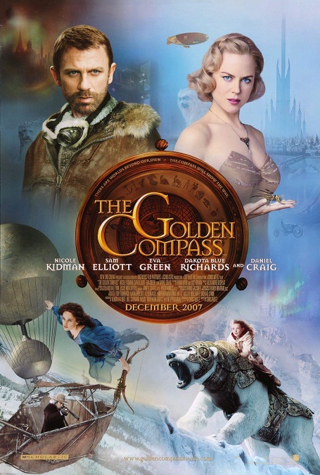
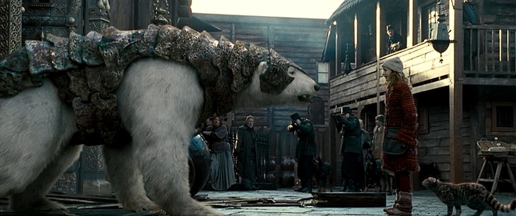
The effects for this movie were great for their time, far surpassing other attempts at creating realistic CGI.  The movie’s big effect was the daemons, which were animal representations of the characters’ souls.  They were in nearly every scene in the film.  Where there was a person, there was an animal.  There were close to 1,200 CGI shots in the movie, and for the most part they were incredibly well-done. 

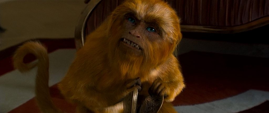
All sorts of animals were portrayed and in 2007, CGI creatures were still hard to create.  But here, they seemed to have gotten it right.  All the daemons in the movie were completely CGI, but they didn’t move stiffly or stilted like many previous attempts in other films, nor were they so perfect they looked fake.  The main character’s daemon was a shape-shifter, taking the form of many different kinds of animals throughout the film.  It was a ferret, a wood mouse, a cobra, a wildcat, a moth, and a bird.  The only one that really caught my attention in a bad way was Mrs. Coulter’s golden monkey, and even that was only in a few shots, and it was because his design looked a little strange, not like a real monkey.  But I learned that the effects artists made him from three different species of monkey.

Something else the film did a great job of was the way that the live actors interacted with the CGI animals.  If an actor has no physical object to work with when filming, the placement of their hands or their movements are difficult to match to the animation that is added in post-production.  So the filmmakers used all sorts of objects for the cast to act with that were later replaced with the CGI daemons.  The result was more realistic interaction between the two mediums.

Whenever a character was killed, their daemon would immediately evaporate in a cool burst of golden sparks and dust.  Dust was a mystical element that, among other things, was supposed to connect alternate dimensions with each other.  It was an effect that was also used whenever Lyra would get psychic visions from her alethiometer.  The animated swirling dust and shadowy images were captivating.

And finally, there was the race of talking polar bears.  They were integral to the story, so their design had to be handled with care, and the effects animators did some fine work.  In their big scene, two of the bears had an epic battle that was completely CGI and incredibly realistic.  It was a fight to the death that was exciting to watch, and it was a bit of a shock when Iroek Byrnison clawed his opponent’s lower jaw off, ending the battle.

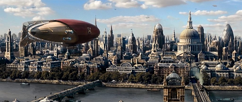
Aside from that, the half-real and half-fantasy London city-scape was awesome.  Also, the flying witches were interesting, though sometimes they looked too much like they were strung up on wires.  And the final shot of the movie in which an air-ship flies off into the shining Aurora Borealis was pretty spectacular.

2006 – Superman Returns

Superman Returns – 2006

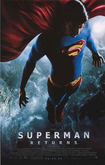
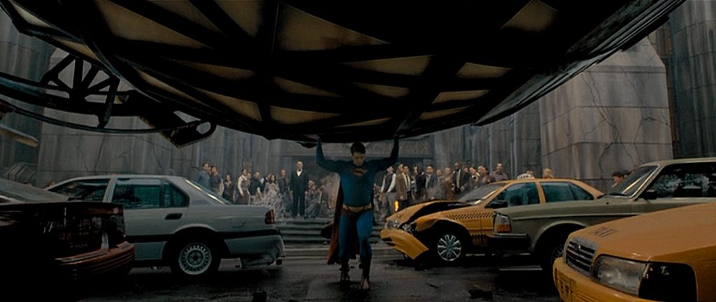
Honestly, I couldn’t really find very much wrong with this movie’s visual effects.  They were all pretty seamless and well-constructed.  So, what I’m going to do is point out some of my favorite effects and expound a little on how a few were done. I think it is important to point out that there were nine different visual effects companies that worked on this film, and they all seemed to blend their individual elements together so that you’d really never know.  It was all pretty impressive.

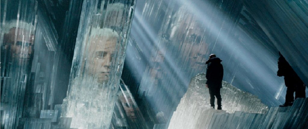
There was one effect in particular that really stood out for me.  They went out of their way to tie this movie to the 1978 Superman and the 1980 Superman II films.  To do this, they digitally resurrected Marlon Brando who played Superman’s father in those films.  Brando died in 2004, but they were able to use unused audio tracks from 1978 which either had no film, or had been filmed from the wrong angle.  They digitally modeled Brando’s mouth and then tracked it onto his face from separate takes, painstakingly lip-synching the movement of the mouth to the audio.

Another effect that I really liked was how Superman’s x-ray vision was portrayed.  Not only did they show what he was seeing, but they also gave us transparent images of what he was looking through.  In one memorable shot, Superman is watching Lois Lane going up in an elevator.  The art-deco style of the building made for a beautiful and artistically designed image that looked great on the screen.

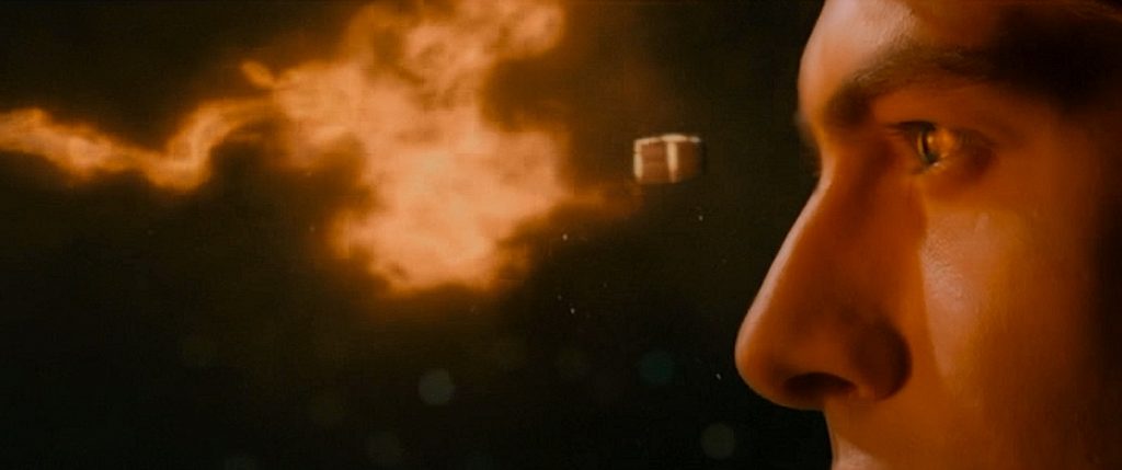
There was a cool shot of a bad guy shooting our hero in the eye from a distance of a few inches.  The gunshot was shown in slow-motion.  We see the blast of fire flash from the barrel of the weapon, the bullet as it hurtles toward Superman’s open eye.  Then we get to see the projectile make contact with the eyeball and flatten against its super surface.  The sequence ends by showing us the flat piece of metal falling to the ground.  It was pretty awesome!  And without going into any detail, the sequence where Superman stops a jumbo jet from crashing into a baseball field was exciting to watch, other than the fact that Lois should have come out of the crisis with massive bruising or broken bones, not just mussed hair.

Yes, there were great CGI effects in the film that you might have no idea were digitally created, like the entire cornfield through which young Clark Kent is shown running.  But one effect that stood out to me as a little questionable was the surface of the ocean water.   I think they got it mostly right, the coloring, the texture, the lighting, the spray, the foam, the mist.  But the motion in a few of the close-up shots just looked a little too artificially wavy.  This tiny thing caught my attention as I was watching the movie.  Still, I’d call this a very minor complaint.  Pretty much everything else was perfect, even the completely CGI Superman, whose digital cape flowed in outer space, as if there was an atmosphere.

2006 – Poseidon

Poseidon – 2006

This remake of the 1972 disaster film The Poseidon Adventure was, in many ways superior to the original.  However, was it different enough to make it necessary?  Were the visual effects so much better that the film deserved to be remade?  I’m not so sure.  To say that it has all been done before seems at least partially, if not, mostly true.  We’ve seen the ship being overturned, the extreme flooding, the fires, the daring underwater sequences, all in the film’s first iteration.

So what was it that set this remake apart from the 1972 version?  Well, for one thing, they modernized the effects.  The stunts were pretty much the same, but there were more realistic depictions of the death that such a monumental disaster would cause.  We saw more drowned people, more burn victims, more injuries, more blood, more on-screen deaths.  It had a grittier and more modern feel than the original.  But that was to be expected.

However, aside from that, I don’t really see where it offered a whole lot more than its predecessor in terms of visual effects.  Of course, I’ll admit that unlike the original version, this movie had the advantage of computer enhanced digital effects to offer the audience more exciting and dynamic shots of the destruction as it occurred.  The capsizing of the ship could be seen in a little more detail than just a tilted camera, a set on a gimble, and a miniature model getting hit with a ton of water. But really, it was essentially the same thing.

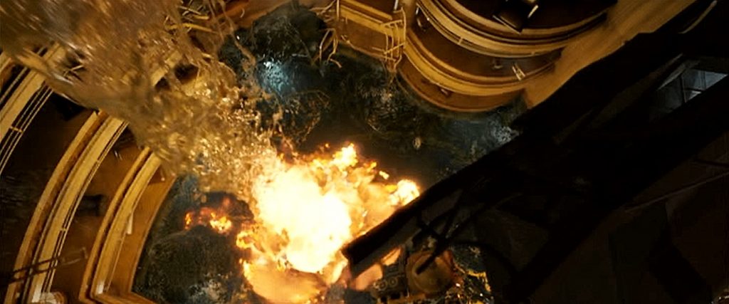
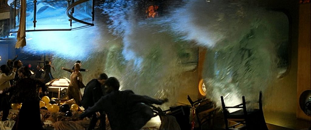
The scene that took place in the main lobby of the cruise ship, where our main cast had to cross from one side of the grand hall to the other was pretty cool, though.  When an unlikeable character is crossing the lobby on a fallen girder, one of the ship’s engines crash down from the lower deck of the overturned ship, killing him, and dumping fuel into the rising waters below.  Of course, there is a spark that turns the pouring fuel into a column of fire that also burns on the surface of the flooding lobby.  It was a pretty exciting scene to watch.  The later flooding of the ballroom scene was pretty cool, too.

Another effect in the film that I didn’t even know was an effect until I watched a “behind the scenes” featurette on the DVD, took place in the beginning of the movie.  There is a long, continuous shot that follows a man jogging around the ship.  Apparently, the actor was shot entirely in front of green screens.  The cruise ship, itself, was completely CGI.  It was really pretty impressive, allowing the camera to show the man from unique angles in a long, unbroken shot.  But was it a necessary shot?  Not really.  It, in itself, didn’t advance the plot in any way.  I don’t think I would have noticed if the shot had contained a cut or two.  But I guess the director had a vision of an unbroken shot, so the visual effects team gave it to him.

2006 – Pirates of the Caribbean: Dead Man’s Chest (WINNER)

Pirates of the Caribbean: Dead Man’s Chest – 2006 (WINNER)

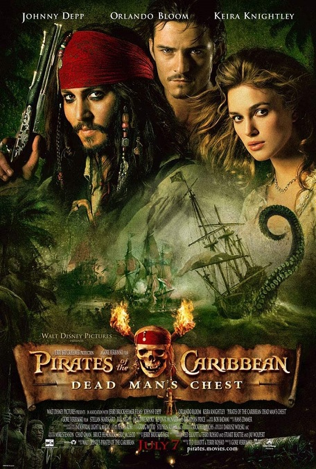
This movie’s visual effects definitely surpassed those of the franchise’s first installment.  But here, it wasn’t about the living skeletons.  Here, it was about two things: Captain Davey Jones with his squid face, and the Kraken.  There were many more special effects in this visual spectacle of a movie, but those two really stole the show.  This is what the 1954 Best Special Effects winner, 20,000 Leagues Under the Sea, another Disney film, would have done with today’s technology.

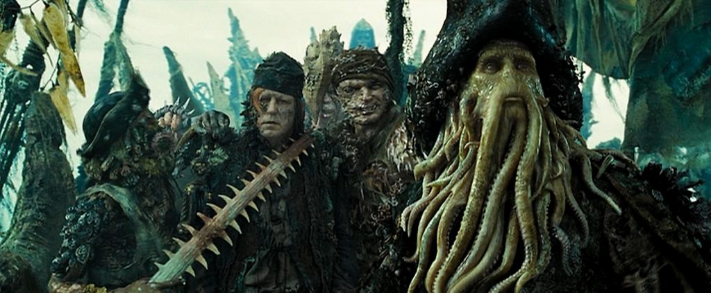
First, let’s look at Davey Jones’ squid face.  It was amazingly rendered!  It was in constant motion with dozens of tentacles squirming back and forth, curling about his head like a beard, playing a giant pipe organ.  The actor, Bill Nighy, apparently wore makeup around his eyes and mouth, which they originally planned to splice with the CGI.  However, as the design of the character progressed, neither his eyes nor his mouth were used, and the entire face was CGI, all except for the scene in which the key to the Dead Man’s Chest is stolen.  And what was just as impressive was the fact that his strange crew, were completely computer generated!  The only exception was Bootstrap Bill, who had no CGI applied to his image at all.

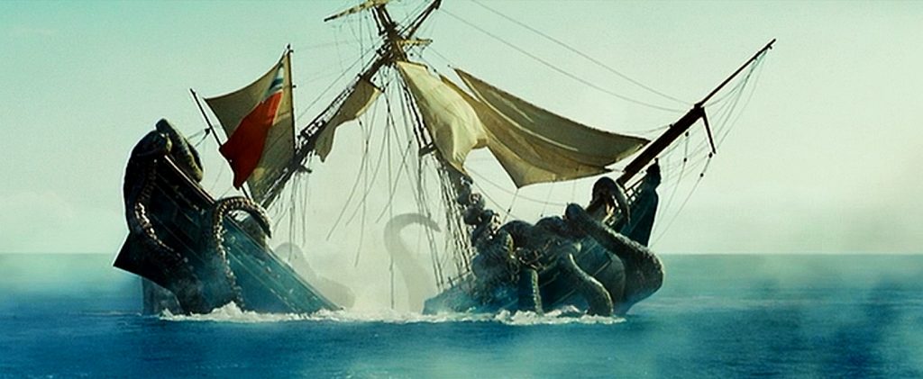
Then there was the Kraken.  The visual effects artists didn’t have a live reference from which to fork from, however, the film’s animation director, Hal Hickel, told his crew to watch the 1962 Japanese kaiju monster film, King Kong vs. Godzilla, which had a live octopus crawling over miniature models.  Until the film’s climax, all we really see of the Kraken is its giant tentacles as it smashes and destroys great ships, snapping them in half like so much old wood.  There is one image of the creature’s full body in a quick underwater shot, which is nice.

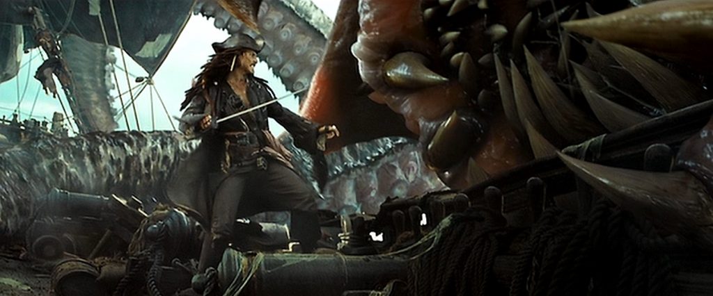
Then, in the film’s climax, as it is destroying the Black Pearl, we see its maw, a giant round hole lined with row after row of massive pointed teeth.  It was a pretty cool image, and Captain Jack Sparrow looked very courageous with his pirate sword, as the monster swallowed him whole.  It was a pretty exciting ending.

However, the movie was also full of ridiculous silliness, which made its way into some of its other visual effects.  These effects, while done well enough, I suppose, were just dumb and, for me, detracted from the movie’s effects, as a whole.  There was the giant water wheel scene, in which three swashbuckling sword-fighters fence with each other, both on top of and inside the rolling wheel.  It was so perfectly balanced that it rolled right through a rough jungle with uneven ground, and across a sandy beach without toppling until it reached the water.  There was the hamster ball scene where a group of pirates in a spherical cage rolled through more jungle and into a gorge without injuring any of them.  These kinds of things were only meant to be silly, but they had me rolling my eyes.  With relative realism in the rest of the film, these effects just kind-of dumbed the movie down.

2005 – War of the Worlds

War of the Worlds – 2005

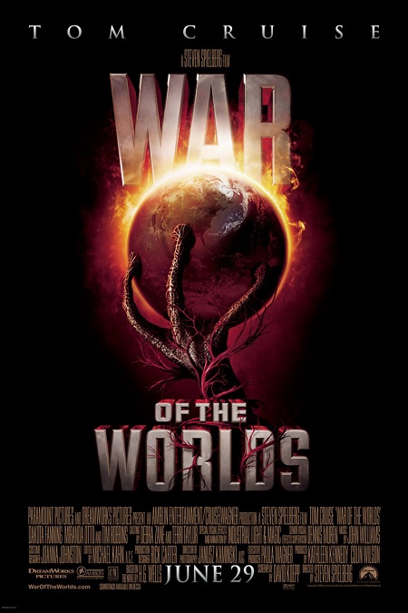
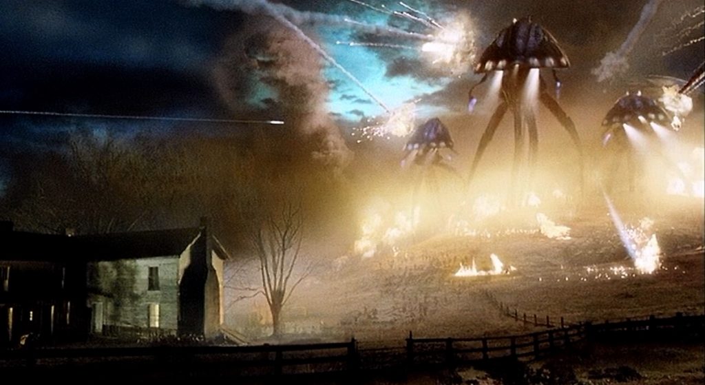
This film rightly receives a lot of praise from both critics and fans, and the special effects were incredible.  But by now, I expect nothing less from Stephen Spielberg.  It was visually stunning, and the movie itself seemed to have very few flaws.  The design of the aliens and their vehicles was really scary, firmly, I think, putting this movie into the sci-fi/horror category.

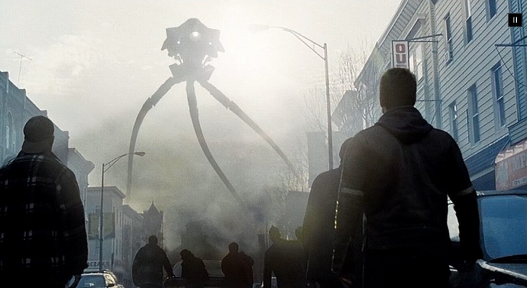
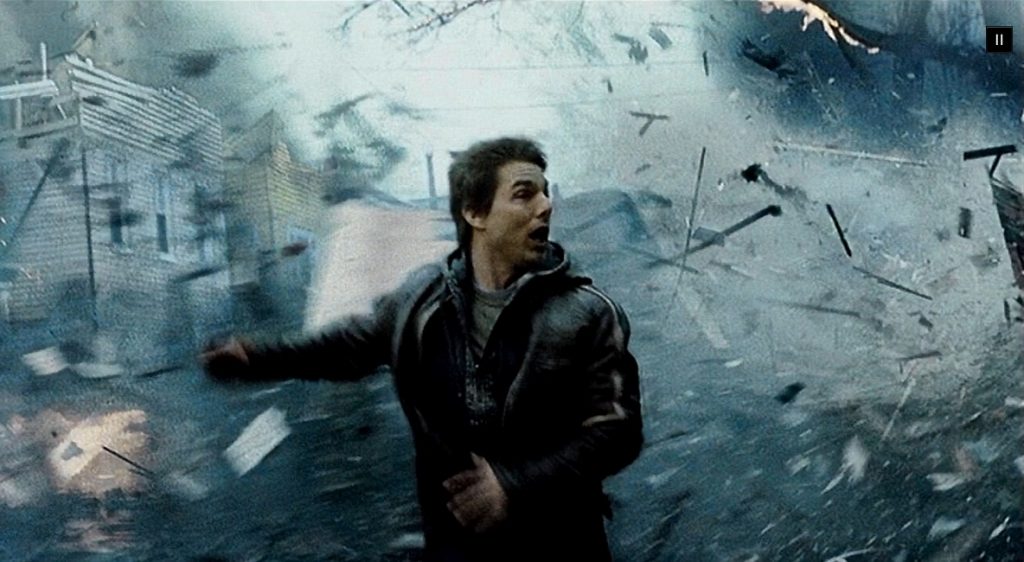
Much as you would expect, there were giant alien death machines that, in this version of the story, came up out of the ground and began vaporizing screaming people.  There was a lot of destruction as buildings and automobiles were blown up and tossed around.  The sheer violence of the mayhem was like a high-energy thrill ride.  The chaotic flying debris was amazing and really cool to watch.

The designers really did a great job of making the aliens seem really other-worldly, using the idea of tri-pedal creatures and ships, masterfully emphasizing the differences between them and us bipedal humans.  Their giant tripod ships looked almost graceful in the way they moved, almost like walking squid moving through water.  Their death rays were pretty awesome, too.  The victims didn’t just vanish.  Instead, they instantly turned to ash and shreds of clothing. Very cool effect!
The movie has several great scenes in which these tripod death machines slaughter great masses of screaming people.  There was the opening scene, in which one emerges from the ground in the middle of a crowded city, another in which one overturns a ferry boat, dumping the people into the Hudson River, and a third scene in which the military attempts to fight back, but fails miserably.  My research tells me that though there was plenty of CGI in the movie, Spielberg tried to keep it to a minimum, and use as many practical effects as he could.

The film also spends a pretty good amount of time in a basement, where the main character and his daughter are hiding with a crazed red-neck.  The basement is first invaded by a mechanical tentacle that looks like a giant snake with a deep-sea underwater camera for a head.  Then the three-legged aliens search the basement in person.  Their heads have large wide crowns, and giant black eyes that vaguely reminded me of aquatic creatures.  Near the end of the movie, we begin to see how the aliens are harvesting people for their blood, and spraying it everywhere, causing creepy blood vines to rapidly grow over everything.

Spielberg has once again created a visually spectacular film that has plenty of action, and yet a certain amount of well-placed emotion as well.  My only problem with the movie was that in the midst of all the chaos and destruction, there always seemed to be an open path for our hero to drive his car through.  How convenient.  But that was a very minor problem with the script, not the visual effects.

2005 – The Chronicles of Narnia: The Lion, The Witch, and the Wardrobe

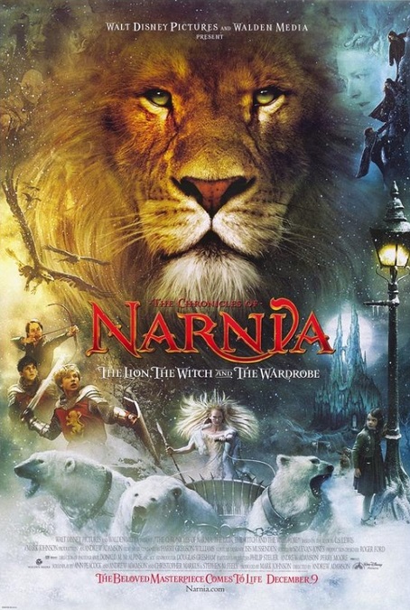
The Chronicles of Narnia: The Lion, The Witch, and the Wardrobe – 2005

As much as I love this movie, I have to admit that while the visual effects were very good, they were not perfect.  The production design was top-notch, which gave the visual effects artist a lot to work with.  The CGI was mostly great, but every so often, the movement of the digital creatures gave them away.

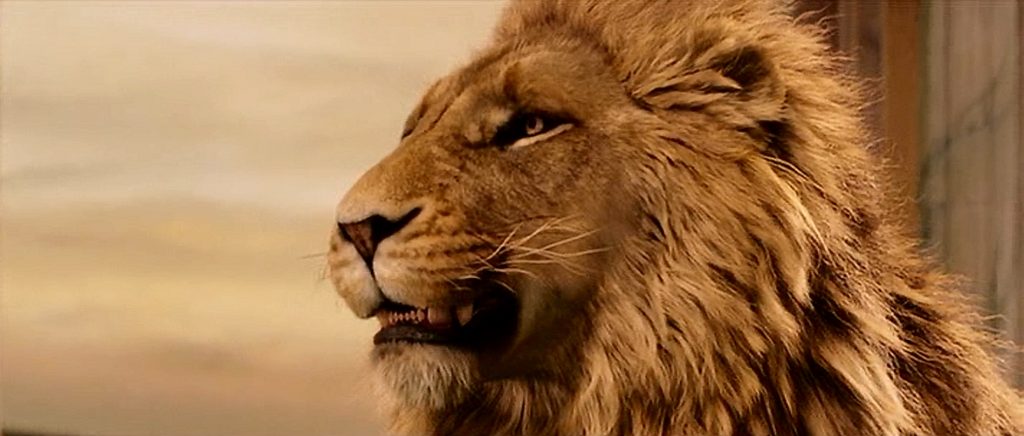
If you know the original Narnia books, then you know that all manner of classical fantasy creatures exist like centaurs, fauns, satyrs, minotaurs, griffins, dwarves, nymphs, unicorns, cyclopses, and many others are commonplace, not to mention all the sentient, talking animals.  Featured prominently are two beavers, a fox, and a large wolf.  And finally, there is the great lion, Aslan, who was mostly CGI, but who was also created with practical effects in many shots.

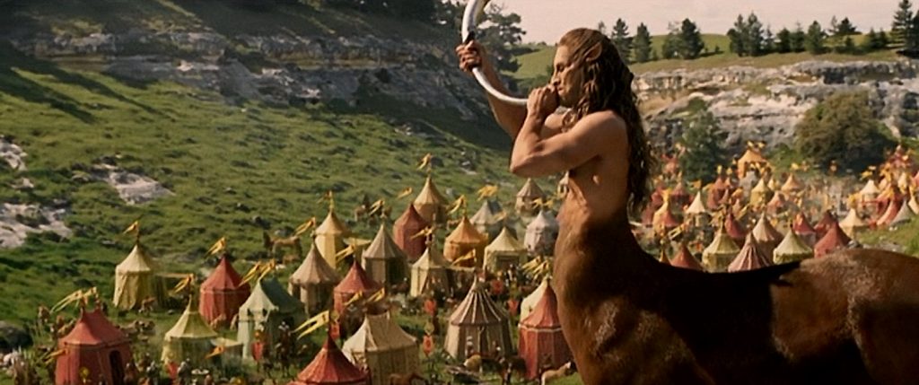
Personally, I have always been fascinated with centaurs, half horse, half man, and here, I think they got it right.  The only other example in recent memory of such a creature in a major film was the first Harry Potter movie in 2001.  There, the centaur was fully CGI, and honestly, looked pretty bad, especially the human half. Here, they created the creature using an actor in costume and makeup from the waist on up, and wearing green-screen pants below.  From there, they were able to blend the actor’s torso into that of a CGI horse and match the actor’s movements.  They did the same thing with the fauns.

The documentary included with the DVD also showed creatures like the minotaurs, the cyclopses, and the goblins in full body makeup and prosthetics from head to hoof. They were pretty cool, though the range of emotions that could be seen in their faces was very limited.  That’s OK, though.  We didn’t need much emoting from them.  I actually think that most of the completely CGI animals like the polar bears and the beavers were pretty good.

The most important one, of course, was Aslan.  He needed to be more expressive than any of them, and he really was.  The mouth moved in a naturalistic way when he spoke, and he really looked like a live lion when he roared.  The hairs of his mane were beautifully rendered, and his eyes looked both human and cat-like at the same time.  For the most part, it was hard to tell where the animatronic lion changed to CGI.  But the effects fell a little short in a few of the wide shots where he moved or jumped.  He looked a little stiff and jerky, giving his CGI nature away.

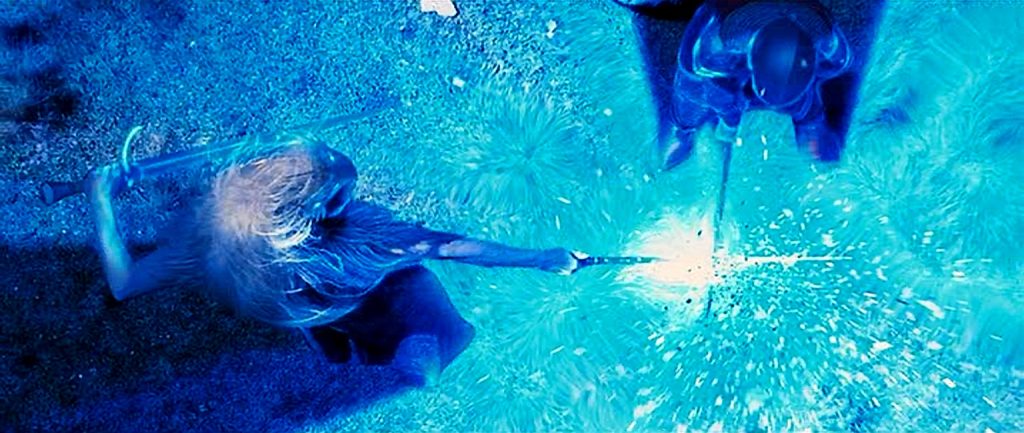
There were some other cool effects that I enjoyed, like when the Witch would change a creature into stone, or when Aslan would change one back.  The scene in front of the frozen waterfall, when the river broke through the ice, was brief, but it was done well.  I also liked the great and vast digital landscapes and locations like the inside of the Witch’s palace, and Aslan’s camp.  Perfect fantasy creations!

2005 – King Kong (WINNER)

King Kong – 2005 (WINNER)

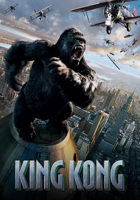
To say the visual effects were incredible in this film is a gross understatement.  We all know the story of King Kong, and even a little bit of the history of cinema, wherein this is the third major film for the big gorilla, the first being in 1933 with Fay Wray, the second being in 1976 with Jessica Lang, and now in 2005 with Naomi Watts.  And to be sure, they were all full of fantastic visuals for their times.

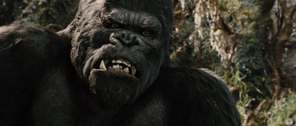
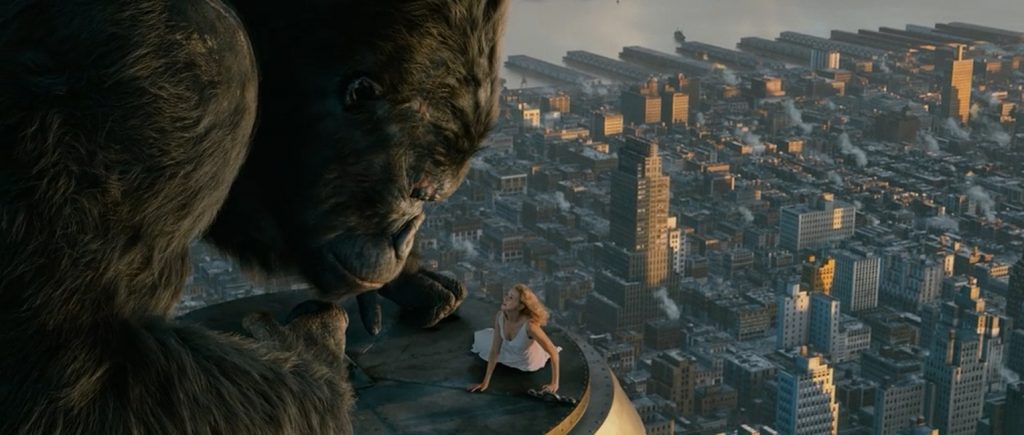
But the special effects in this newest version bordered on simple reality.  Kong, himself, was a fully CGI character.  Actor Andy Serkis played the giant ape.  He had to wear a motion-capture body suit and sit in a makeup chair for two hours every day of filming, to have a total of 135 small markers put on his face.  The result was an unbelievable amount of detail in the facial expressions of the gorilla.  I don’t know how they could have achieved a greater level of realism.  It was perfection.

But more than just the emotive qualities of the character, the realism on the rest of his body were amazing.  Director Peter Jackson wanted Kong to be more gorilla than man, so Serkis studied the creatures, both in captivity and in the wild, to be able to perfectly mimic their movements and mannerisms flawlessly.  And the animators were able to use their motion tracking technology to mimic Serkis.  The amazing level of detail in his shape, his fur, his teeth, and his eyes were all phenomenal.  And more than that, the imperfections that the animators included in the visuals added yet another layer or realism to Kong.  His scars, his wounds, and even areas of gray hair in his fur made him as real as an actual gorilla.

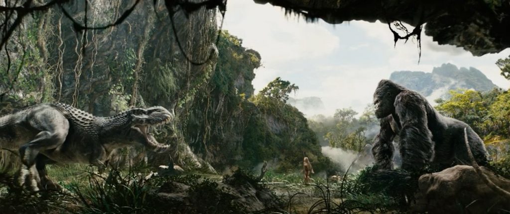
But there was so much more to the visual effects in this movie.  Skull Island, Kong’s home, was full of a wide variety of creatures.  Massive dinosaurs, terrifying giant insects, horrible giant bat-like monsters, giant iguanas, and other nightmare inducing creatures made this film a true visual spectacle, and they all looked as real as the giant gorilla.  I have a phobia of swarming insects, and the giant insect scene is so incredibly disturbing to watch!  I especially hated the things that ate Lumpy, a human character who also happened to be played by Andy Serkis.

The epic battle between Kong and three Vastatosaurus Rex was beyond amazing.  At the end of the battle, when he defeats the last of his enemies, he grabs the dinosaur’s upper and lower jaws and rips them apart!  But again, to add to the realism, they didn’t, for lack of a better term, Hollywoodize the creature’s death.  He didn’t rip the lower jaw off in a spray of blood.  It was simply enough to kill the monster and that was that.  And the visual effects artists were responsible for that realism.  There were also some great digital environments, not the least of which was the fully CGI recreation of New York City in the 1930s, and the iconic airplane battle at the top of the Empire State Building.  I’ll say it without reservation.  Peter Jackson is a filmmaking genius.