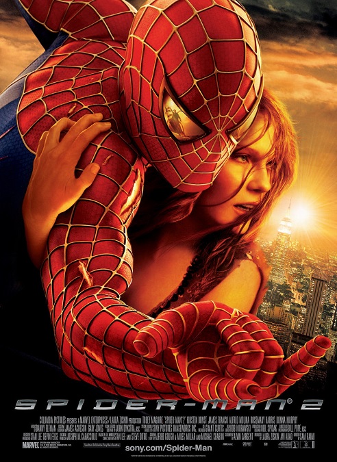
2004 – Spider-Man 2 (WINNER)

Spider-man 2 – 2004 (WINNER)

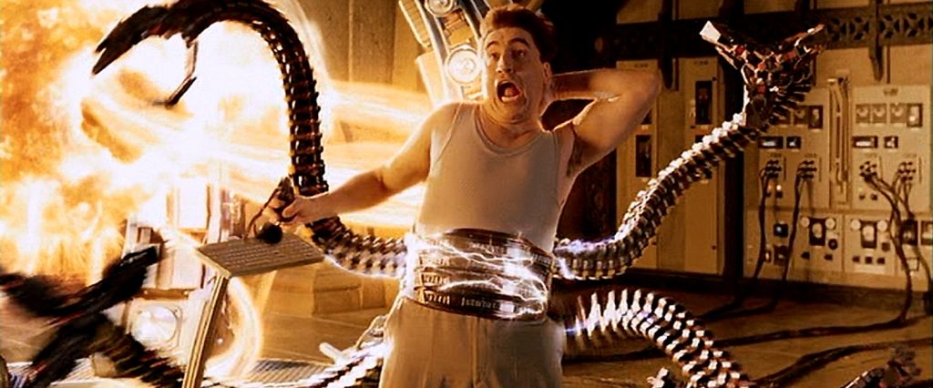
The visual effects for Spider-man 2 were good, but not as good as they think they were.  When it came to Spidey, himself, we saw all the great visuals before in the prior film.  Now, the big draw is Doctor Octopus.  I’ll say right here at the start, that his tentacles were amazing, and I’m pretty sure that they were the main reason for the film’s Oscar win.  But looking at the effects in the movie as a whole, I felt the special effects could have been better.

This was right around the time when filmmakers were beginning to get some pretty good results using motion-capture and other techniques that allowed them to create believable digital characters.  They also had actors play their rolls, and had them do stunts or impossible movements by transitioning them into CGI figures.  But this had not yet been perfected, and it was often too obvious when a live actor became a digital effect.  They tried to hide these shots behind fast-paced action and quick cuts, but they weren’t always successful.

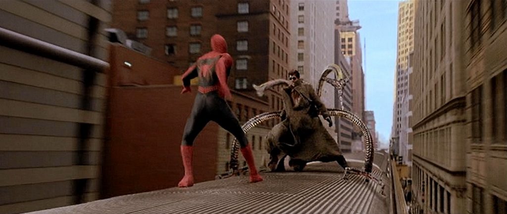
For example, we can look at the fight on top of the speeding train.  It was a great sequence, but it was sometimes pretty clear when the actors became computer generated images. They begin the sequence by fighting on the top of a clock tower.  The camera is able to get some pretty cool angles during the fight, but a few of the shots look slightly two-dimensional and fake.  Then they fall down onto a speeding train. It seemed that they were switching back and forth in every other shot.  It must have been easier in the wider shots where clear detail wasn’t as important, but these shots weren’t wide enough, and Doc Oc’s face, at best, looked like it belonged to someone else.  At worst, it looked flat and expressionless.

But the tentacles were pretty awesome.  The little “making of” featurettes included on the DVD explained that they were created using a combination of practical and digital effects.  For the real appendages, they had people in green-screen body-suits physically moving them independently, and they had a graceful fluidity in their motion.  And the digital shots worked well because they were inorganic mechanical structures, which I’m guessing were easier to create than human flesh.

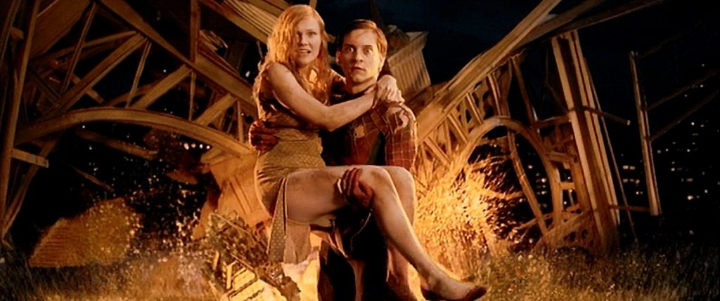
But I was a bit disappointed by a few effects that should have been pretty routine.  Every now and then, I was struck by how the actors didn’t seem to fit into their backgrounds.  These shots were few and far between, but they were there.  The trouble is, I find it difficult to pinpoint what gave these shots away, but as I watched the movie, my brain just had trouble accepting that they were part of the same image.  Maybe it was the lighting or the angle of the camera.  I don’t know.  Still, the Academy voters liked what they saw, and to be clear, so did I.  But  digital effects like these still had a little room for improvement.  The weren’t bad, but I suppose I just expected a bit more for a Best Visual Effects winner.
2004 – I, Robot

I, Robot – 2004

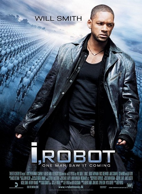
It’s a good thing I am reviewing this movie’s visual effects and not its script and its acting.  That being said, the visuals were actually pretty good.  It seems to me there are two things that people came to see this movie for: Will Smith, and the cool CGI robots, and there certainly were a lot of them, attacking cars, attacking people, and attacking each other.

In most cases, when a CGI character moves a little stiffly and mechanically, it would be a bad thing, but here, the filmmakers had an advantage since the robots were actually mechanical, so it was acceptable that their motion looked slightly unrealistic.  Their design was pretty well thought out, and allowed us to see just enough of their metal joints and moving parts to make them appear plausible.  Even today, while robots that can walk and perform complex operations like climbing stairs do exist, they are slow and clunky compared to the robots in the film.  Here, they can run, climb, and jump like spider monkeys.

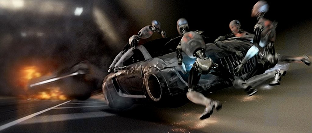
One of the greatest action sequences in the film is when our hero, in his self-driving car that is moving at over 160 miles per hour through a tunnel, is attacked by two giant automated trucks full of evil robots.  We even know they are evil because their red chest lights turn on to make sure we know they are murderous.  They leap onto the speeding car and punch through the windows, trying to kill Detective Spooner.  Yet he survives by shooting the robots, crushing them under his wheels or against the side of the tunnel, or making them fall beneath the wheels of the automated trucks.  The digital robots were created using a combination of motion capture software and keyframing animation techniques, perfectly blended together.  It was a wonderfully exciting sequence to watch!

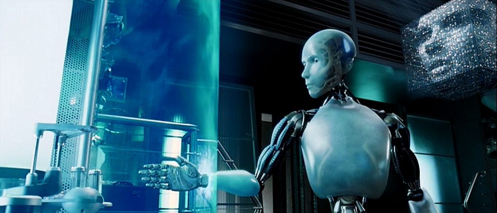
Then there was the climax of the film in which Detective Spooner and Doctor Calvin are trying to kill the evil murder computer, VIKI, with deadly nanites.  They are attacked by dozens of red-chested robots that crash through the glass ceiling.  The camera is furiously swirling around the action, above, below, and to the side, sometimes making it difficult to tell what is right-side-up.  I also liked the design of the visual representation of VIKI’s digital face. 

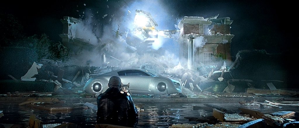
There were many other noteworthy effects in the film, like when the bad guys  attempt to kill Spooner by destroying a house that he is in, using a demolition machine with giant claws.  Anther cool effect was the street battle between an angry mob and the robot army.   But I think the most impressive visual was the way in which the digital artists were able to give the NS-5 robots complex and varied facial expressions, especially the only good one, Sonny, with very limited movement in the facial features.  It was pretty impressive.  Its just too bad the script and the acting weren’t as good as the visual effects.

2004 – Harry Potter and the Prisoner of Azkaban

Harry Potter and the Prisoner of Azkaban – 2004

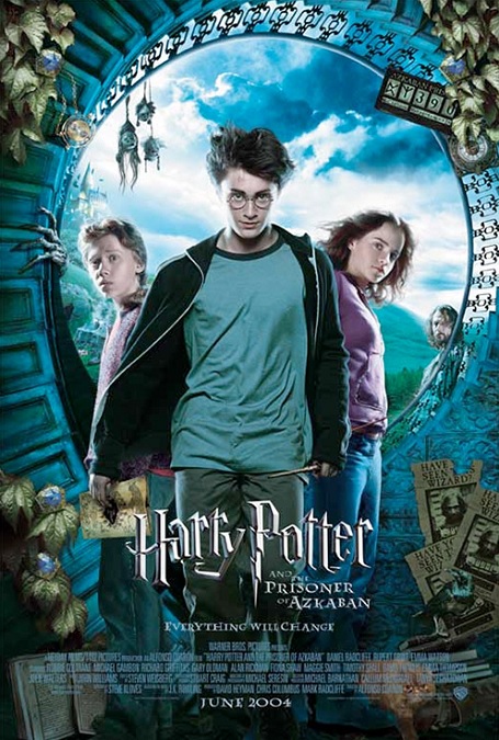
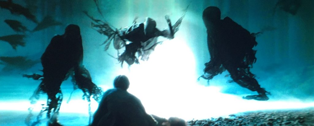
Here we are with the third installment of the Harry Potter franchise.  Like the others, it is geared toward a younger audience, filled with whimsey and humor, but at the same time, I’m betting it frightened a great many children with its very dark tone.  This aspect, of course, affected the really creepy visual effects, mostly in the form of the main bad guys, the Dementors of Azkaban.

These guys were truly scary.  The visual effects artists really paid attention to the way they looked, the way they moved, the way they floated.  I loved how their flowing black robes moved as if they were always under water.  It was a really awesome effect.  For the most part, they were CGI creatures, and that might have been fine except for a certain scene where it really looked like it.  This bad shot was the one where Harry first learns to conjure a Patronus.  When the Dementor shaped Boggart tries to penetrate Harry’s shield, it moves like a bad 1990s CGI image.

I also thought the completely made-up – meaning they weren’t in J.K. Rowling’s source material – characters of the talking shrunken heads, were ridiculous.  They looked like nothing more than childish puppets, and moved like pieces of stiff rubber.  They were poorly done and completely unnecessary as part of the movie, and yet, though it was only a little, the film spent too much time focusing on them.

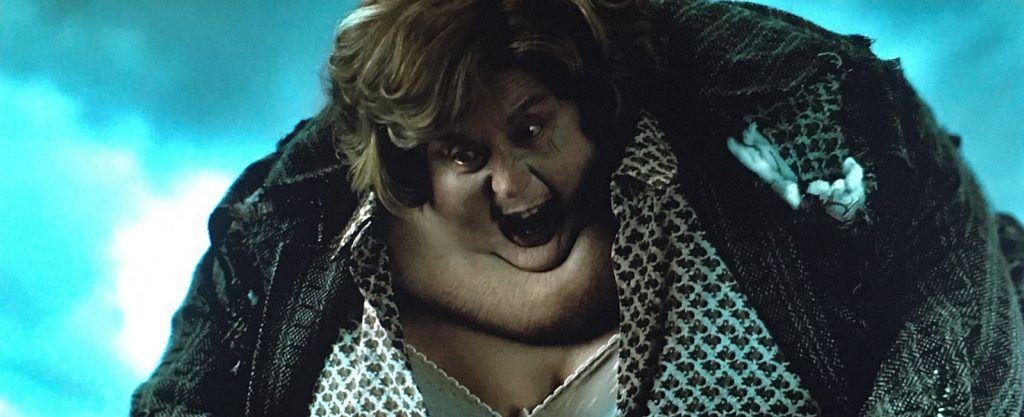
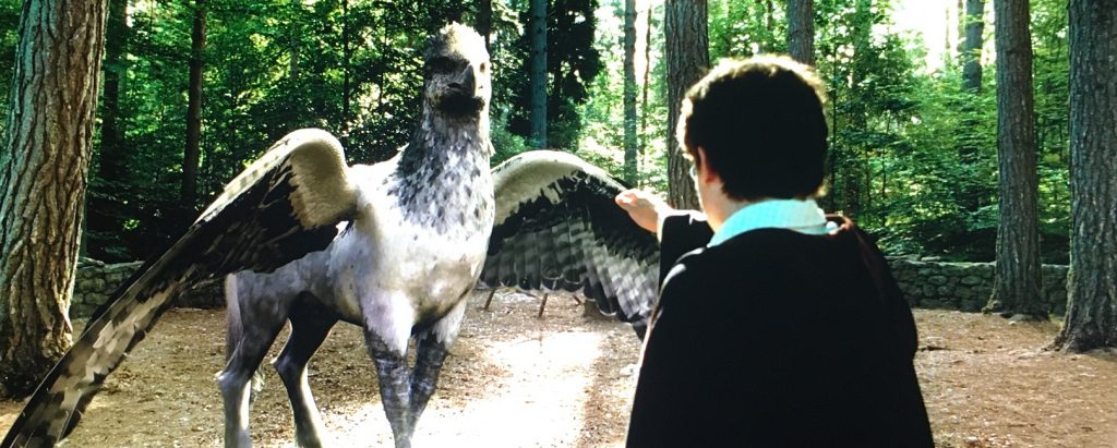
But what they got right was amazing.  The film starts off with Harry’s aunt blowing up like a balloon and floating away.  I always like the visuals in that scene.  Then there was the hippogriff, which was a perfect combination of CGI and practical effects.  They had sections of the creature built for the actors to interact with, and digital sections that were incredibly detailed, and it was all blended together seamlessly.  I thought it looked incredibly photo-realistic.  There were also Peter Pettigrew changing from rat to human, which was fantastic, and from human to rat, which wasn’t as good.  And there was Professor Lupin transforming into a werewolf.  Unfortunately, it looked too cartoonish, and didn’t have that photo-realism that the hippogriff and the Dementors had. The transformation was a combination of CGI and practical effects.  It wasn’t bad, but it wasn’t perfect.  And then when the change was complete, some of its movements were a little too computer-controlled. 

And lastly, I’ll mention the Whomping Willow fight scene.  Pay attention to physics, effects people!  When Hermione swings by Harry at break-neck speed and grabs his shirt, if she was even able to grab him at all, she would only have knocked him down or torn his shirt, and probably hurt him in the process.  Lifting him off the ground and tossing him with perfect aim into the tunnel at the base of the tree would have been impossible.  A thirteen-year-old girl can’t lift a boy off the ground by his shirt with one hand!  And they made it look as silly as a Wile E. Coyote cartoon. That one bothers me every time I watch it!

2003 – Pirates of the Caribbean: Curse of the Black Pearl

Pirates of the Caribbean: Curse of the Black Pearl – 2003

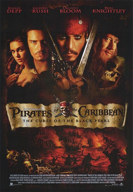
The visual effects for this film were actually incredibly well done, and here’s why.  This was a fast-paced action/adventure film, and I’m not just talking about the pacing of the film.  The pacing of the action was also fast, and the special effects did a fantastic job of keeping up.  In fact, that was probably why this movie earned its Best Visual Effects nomination.

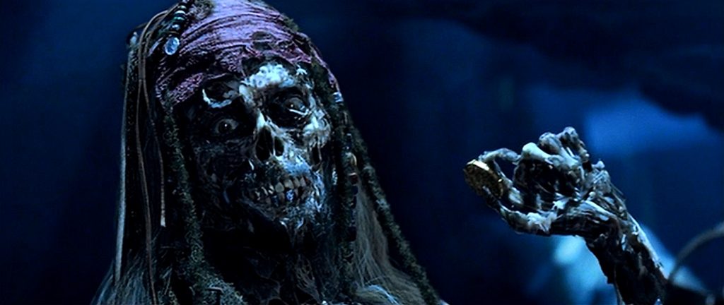
So, we’ve all seen living skeletons in other films, but here, they were the main event.  But there was so much more than just that to see.  With a story that takes place in the early 1700s, there were sea battles between massive galleons, cannon fire, sword fights, and general pirate-like town pillaging.  Clearly the movie and its visuals were pretty popular, because this movie is the first movie in a franchise that has had four sequels with a sixth installment on the way, and so far, all of them have been pretty heavy on the special effects.  Who knew a movie based on an amusement park ride would do so well?

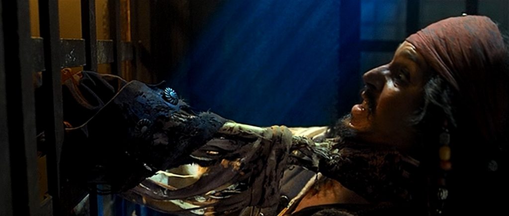
I’ll start with the big one.  The skeletons were not your garden variety collection of bones.  They were fully mobile and, according to the story, could only be seen in moonlight.  In other light, they appeared to be live human beings.  To take advantage of this, many of the scenes took place at night under a full moon.  And let me say, they were amazing.  They moved as quickly as live actors, with plenty of agility, as they engaged in swashbuckling fencing.  During the film’s climactic sword fight between Captain Jack Sparrow and Captain Barbosa, Johnny Depp and Geoffrey Rush were sparring all around a cavern with shafts of moonlight shining down.  They deftly moved in and out of the light, causing their appearances to constantly change back and forth between the actors and the CGI skeletons. 

According to Wikipedia, “Each scene featuring the skeletons was shot twice: a reference plate with the actors, and then without them to add in the skeletons, an aesthetic complicated by director Gore Verbinski’s decision to shoot the battles with handheld cameras.  The actors also had to perform their scenes again on the motion capture stage.”  Somehow, they got them to match up perfectly.

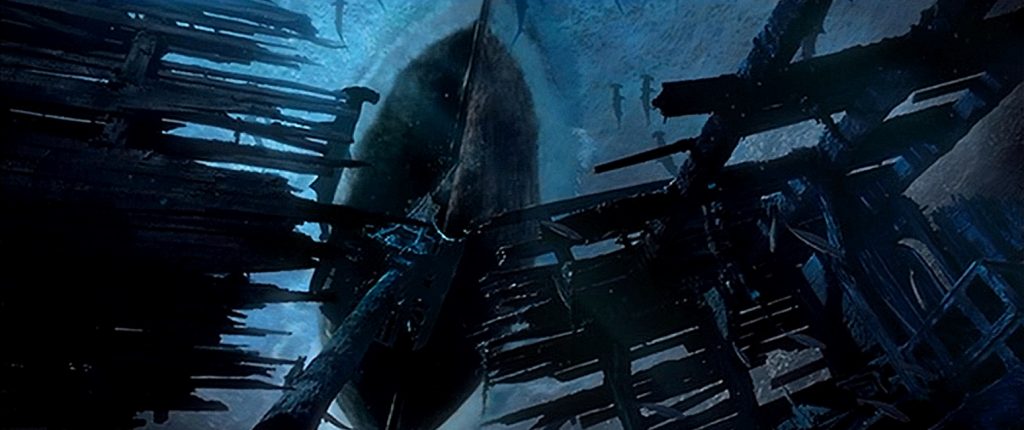
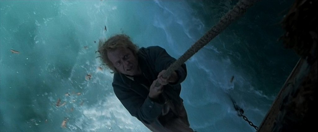
Another cool effect that I really liked was an effect that was so inconsequential, but for me, was pretty memorable.  These were the underwater shots that looked up at the underbellies of the giant ships.  So cool!  One saw a gigantic galleon from this unique perspective through the debris of previously sunken ships, and the other was when a ship was being attacked and boarded by the skeletons walking on the ocean floor, and climbing up the rope that held the anchor.  The visuals in the movie really did a great job representing the popular Disneyland ride, so much so that based on the success of the film franchise, the actual ride at the park was updated to incorporate elements of the films. 

2003 – Master and Commander: The Far Side of the World

2003 – Master and Commander: The Far Side of the World

The most effective visual effects are the ones you don’t see, and this movie is the perfect example of that idea.  At first glance, it doesn’t seem like there are many to really speak of.  Everything looked as if it was filmed practically, with very few digital CGI shots.  But in retrospect, that was actually one of the things that was impressive about the movie.  The film was a masterpiece of compositing.  Real footage was filmed and composited together in spectacular ways that made all the action and danger seem more real and more authentic.

There were really three major action sequences in the movie.  There was the opening ship battle, the violent storm at Cape Horn, and the final ship battle.  First of all, my research has revealed that most of the opening battle and all of the final battle were put together by different visual effects companies, the former being Asylum and the later by ILM.  Asylum also did the storm sequence.  They made the point of saying that most of the water effects in the film were practical effects, and not CGI.  They filmed actual storm footage, then composited and layered together different shots in a very seamless way with miniature models, scale models, and tank models.  The storm sequence really put the actors through their paces.

Something else they did that added to the realism was the main weapons of the sea battles: cannons. But there were no fiery exploding cannon impacts, a mistake I’ve seen other films employ to make the action feel more exciting and dangerous.  But here we see just the kind of damage a real cannonball would inflict on a wooden ship.  We see a bit of fire coming out of the cannon itself, then a ton of smoke, and flying splinters of wood, which can be just as intense and chaotic as an explosion.

The problem is, that as perfectly executed as these visuals were, they were like a one or two trick pony.  The effects were done incredibly well… over and over again.  There was very little variance in the actual visuals.  If you take out all the cannon fire, splintering wood, and rough water, there just isn’t much left except for the incredibly detailed miniatures. 

And one final effect that I noticed was a subtle one, and it might not even count as a visual effect.  The majority of the story takes place on a sailing vessel at sea.  Director Peter Weir made a very smart choice to have the camera rocking back and for ever so slightly whenever the story took place on the water.  It was a constant subtle reminder that the characters are not on solid ground.  Eventually, you get used to the constant motion, like you do on a real boat, and you don’t even notice it, but it is always there.  Yes, I can now see why this was nominated for Best Visual Effects, but seeing as how it was up against Return of the King, I also understand why it never had a chance of winning.

2003 – The Return of the King (WINNER)

The Lord of the Rings: The Return of the King – 2003 (WINNER)

Peter Jackson has done it again.  In this third installment of the amazing franchise, he knocked it out of the park and created a special effects extravaganza that, in most cases, looked absolutely photo-realistic.  Of course this one took home the award for Best Visual Effects.  The special effects were simply astonishing from beginning to end, and no other film really stood a chance.

A normal movie usually has about 200 effects shots, but this one had 1,488.  Due to the sheer number of effects shots, and the ridiculous time constraints that the effects company, Weta Digital, had to deal with, it was inevitable that there would be some shots that didn’t work quite as well, but they were, by far, the exception, and not the rule.  I can think of two examples.  There was a simple shot where Legolas and Aragorn are watching the night sky in Edoras, and they look strangely separate from the sky behind them.  The other is when Legolas slides down the trunk of a giant elephant he has just killed.  And according the one of the documentaries included with the DVD, that second one was a very last minute addition that was hastily put together in two days.  It was still pretty good, but it always catches my attention, and not in a good way.

But aside from tiny things like that, the effects were amazing.  One of the scenes that the documentary focused on was the massive Battle of Pelennor Fields.  They showed how the entire sequence was visually built from scratch, using both live elements and digital ones.  Now, giant elephants don’t exist in the real world, so we know they were digital, even though they looked very real.  But what about the hundreds of thousands of orcs and the six thousand horses and riders?  Only a few of them were live actors.  Most of them were digital, but don’t ask me which ones.  I couldn’t tell the difference.

Even the backgrounds and the battlefield itself were created by compositing photographs of completely different places and digitally combining them to make a new environment.  And this was just one example.  The black gates and the land of Mordor were all fantasy environments that only exist inside a computer.  The tower of Barad Dur was awesome, especially when it crumbled, fell, and finally exploded with the destruction of the Ring.

And like the first two movies in the franchise, there were amazing creature effects.  This time we had an amazing army of ghosts, a giant spider that came out of someone’s worst nightmare, flying Ring Wraiths, giant eagles, and, of course, the completely digital villain Gollum.  Perfection, every last one of them.  Obviously, there were too many effects in the film to mention them all.  There was a reason why this movie took home so many awards at the Oscars, the visual effects being one that was well-deserved.

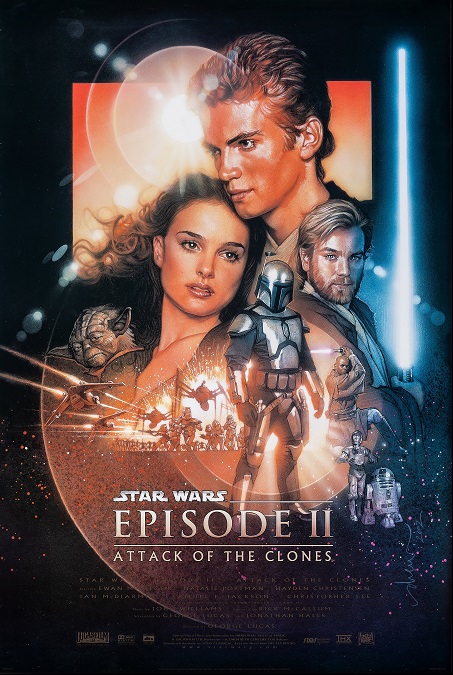
2002 – Star Wars: Attack of the Clones

Star Wars: Attack of the Clones – 2002

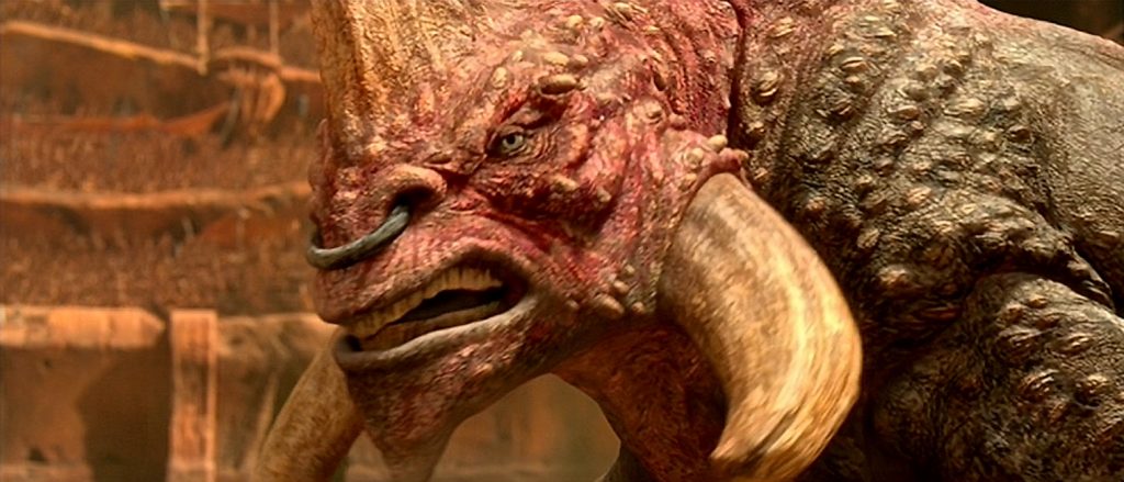
The visual effects in this movie were pretty good, but I feel they could have been a little bit better.  While they were not nearly as hokey as they were in The Phantom Menace, I don’t think they got everything right.  The creature effects, while pretty competent, still looked too cartoonish, and the movement of some of the CGI characters still looked unnatural.  But aside from those minor flaws, the effects were mostly photo-realistic.

One of the things they got totally right was the realistic skin textures on the CGI characters and creatures, of which there were many.  These computer-generated images held up fairly well under close scrutiny, at least visually.  Yes, there were a few of them that looked too much like drawings, but if that was the case, they looked like incredibly good drawings.  I think that their biggest failings were in the way they moved, and that tied in very closely with their designs.

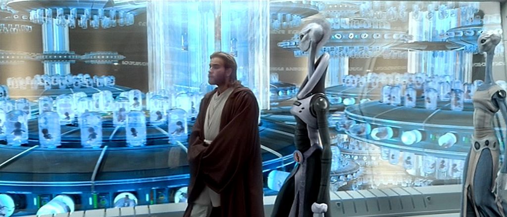
The worst offenders of this were the tall and slender aliens of the planet Kamino, where the clone army was grown.  The super thin and elongated design of their necks looked physically impossible.   But I get it.  This is science fiction, so I can let it pass, but then the hyper-graceful way they moved looked really fake and forced.  They moved in slow-motion, and when they walked, only their legs moved with their steps, and nothing else.  Everything from their hips to their heads were completely motionless.  My brain would have accepted the illusion if their entire bodies, strange as they were, would have moved like they were taking steps.  Even the fabric of their robes seemed to move in slow-motion, breaking the illusion even more for me.  Their motion just looked mechanical and fake.  But then we look at Yoda, who was also completely CGI, and he looked just fine.  So were the insect creatures of Geonosis.

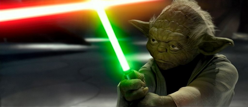
But I will say that the filmmakers always got one thing absolutely perfect: the unique alien environments. Whether it was the busy landscape of the planet-sized city, Coruscant, the turbulent waters and rain of the ocean planet, Kamino, the beautiful grasslands of Naboo, or the Romanesque colosseum of Geonosis, the varied environments all looked fantastic.  I also really liked the cloning labs on Kamino.  In fact, I think that’s one thing that all the Star Wars films have always done a pretty good job with. And lastly, I’ll mention one really cool CGI moment that I absolutely love every time I watch the movie.  It is when Yoda takes out his lightsaber and fights Dooku.  The way he leaps around, spinning like a Dervish, was actually pretty awesome, and the visual effects team made the duel seem both believable and exciting.  The first time I watched it in the theatre, I remember cheering like everyone else.

2002 – The Two Towers (WINNER)

The Lord of the Rings: The Two Towers – 2002 (WINNER)

Director, Peter Jackson returns with the sequel to the phenomenal visual blockbuster, The Fellowship of the Ring, and dose so in a way that tops its predecessor in so many ways.  Not only did it completely keep up the high standards of the effects in the first film, it improved on them, and came up with new effects that floored the world with their inventiveness and absolute realism.

When talking about the effects in The Two Towers, there are two main things that come to mind.  The first is the character of Gollum/Smeagol, and the second is the Battle of Helm’s Deep. Nobody had ever seen things like these two extraordinary effects, let alone the rest of the film which had more images of fantastical creatures like the Balrog, Ring Wraiths riding flying dragon-like creatures, Wargs, and Ents, trees that walked and talked, and more fantasy environments and landscapes like Edoras, Fangorn Forest, and Helm’s Deep, itself.

So first, I’ll go over Gollum.  Here is a character that was so integral to the plot, that I don’t think the film could have been made if they had not found a way to make him as real and life-like as the living actors, and yet they could not have made him using a live actor, at least not in the same way as the rest of the cast.  What we see of him on the screen is entirely computer generated, but there was a live actor in a motion-capture suit giving the CGI figure realistic movement that had never been done so perfectly in photo-realistic animation.  And it wasn’t just the body movements that were impressively realistic.  It was the unbelievable range of facial expressions, which so perfectly mimicked human emotions, that really brought the character to life.

The Battle of Helm’s Deep was really the centerpiece of the movie.  The night-time sequence lasted forty minutes.  There were so many things they got right.  There were the wide shots that employed miniature models, both physical and digital, that gave us a sense of scale during the battle.  There were ten thousand orcs in Saruman’s army, who, in the wide shots, who were all CGI.  A special computer software was developed for the film which allowed each orc to have independent computer-generated appearance and movement, just one more element that added to the realism.  They were so good that even the shots where Orcs were running right past the foreground of the screen, they were completely digitally created. One of the visual effects artists who worked on the film described the scene as being ninety-nine percent CGI.  Simply amazing!

There were so many things that this movie got right, but mostly, I’m impressed that they were able to build upon, and improve upon the fantastic effects in the first film of the franchise.  They just kept getting better and better, and the film’s Oscar win was well-deserved!

2002 – Spider-Man

Spider-Man – 2002

It has been a very long time since I have seen this movie, and I’m sorry to say, the effects don’t seem to hold up as well as I once thought they did.  I think I have gotten used to modern super-hero movies that have much better effects, but it isn’t just that.  I am comparing it to its peers, movies that came out around the same time or earlier, and the effects just weren’t as smooth.  Were they terrible?  No, of course they weren’t.  But I saw better effects in earlier movies even from as far back as the mid-90s.

 First, I’ll mention a few of the things I didn’t like, and then I’ll move on the good things.  First off, I hated the way the movie’s villain was portrayed.  Now, I know, this might have more to do with the costume design than the visual effects, but they are all kind of related.  He was way too cartoonish.  He looked like a stupid bad guy from the children’s TV show, the Mighty Morphin Power Rangers, a style which was inspired by the old, low budget Japanese action show, Super Sentai.  It looked ridiculous, in spite of Willem Dafoe’s very competent performance.

There were also several shots of Spiderman in action, where he looked too much like he was suspended on wires, just in the way that he moved.  It was true that we had never seen anything quite like it before, but it looked too much like animation. 

Still, I think those were the words offenders.  They got a lot of stuff right.  The shots of Spidey web-slinging his way between the buildings of New York were pretty cool.  First, we had the wide shots that showed him swinging up and down between the buildings.  These all had to be CGI shots, but they looked perfectly photo-realistic.  But there were also the shots that were from Spiderman’s visual perspective, as if the audience was seeing through his eyes.  Yes, I think the buildings speeding by were also CGI, but it was a very well-crafted effect!

The battle scenes were done pretty well, though nothing to rave about.  There were two real scenes that stood out.  There was the Green Goblin’s first attack, which had the ridiculously slow-falling balcony that waited until Spiderman could save Mary Jane, which reminds me.  The effect in that scene of the Goblin’s pumpkin bomb that turned people into skeletons looked somehow cheesy, though I don’t think it was supposed to be.  And there was the final battle at the end, in which The Goblin accidentally kills himself.  Standard-fare action battle.

But a real cool scene that wasn’t really a battle was the one where Spiderman manages to save both MJ and a zip-line car full of screaming children from plummeting to their deaths.  Of course, the scene wasn’t helped by the citizens of New York saving our hero by throwing debris and dumb one-liner zingers at the villain, but the action was pretty cool.

2001 – Pearl Harbor

Pearl Harbor – 2001

This was a pretty awful movie, but thank goodness the special effects were fantastic.  We all know Michael Bay is known for big-budget action movies with lots of stuff blowing up, but here was a project that was perfect for his direction.  The problem was that about two thirds of the film was full of stupid dialogue and bad acting.  But the scene of the bombing of Pearl Harbor was phenomenal, and really, isn’t that what we all we came to see, anyway?

Yes, there were a couple of other war scenes that were pretty exciting to watch, like a couple of RAF dogfights in European territory, and after the forty-five minute Pearl Harbor sequence, there was the U.S. response, the bombing of Tokyo.  These scenes were just as well crafted, as long as you throw out the Ben Affleck is the ultimate action hero angle, for which the actor isn’t wholly to blame.  There were plenty of explosions and gunfire, enough to put any 1940s war propaganda film to shame.  The action was exciting and realistic, and I really enjoyed watching it.

The bombing scene was mostly, though not completely, historically accurate in regards to what ships were destroyed, and in what manner.  The explosions and mayhem were fantastic! And to make it all the more accurate, the filming took place on location in Hawaii.  However, just to be clear, the iconic shot which followed the bomb from the Japanese fighter plane to the Arizona, while it was an awesome shot, might or might not be accurate.  In the film, the bomb penetrated four decks down, into the vessel’s forward section where their main armaments were kept.  When the bomb detonated, the massive explosion tore the ship in half.
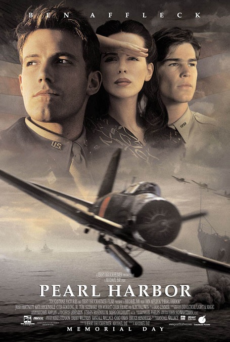
One of the most impressive effects was the capsizing of the Oklahoma.  Apparently, they only built a recreation of the front end of the battleship, the rest of the vessel being created digitally.  It was an incredible and memorable shot, with sailors sliding off the deck into the water.  After that, more Japanese planes flew over, flying in low and shooting the men in the water.  I have to be impressed with the massive scale of the film’s visuals and the and the amazing choreography involved.

But there was so much more to the scene.  We saw the Japanese forces flying all over the island, shooting down civilians and destroying airfields covered with grounded American planes.  There was the aerial battle between the Japanese and the two Americans that managed to get off the ground, though in reality there were five American airplanes that took to the air and gave battle.  A few of the silly antics in the air, like when Ben Affleck and Josh Hartnet tricked Japanese fighters into crashing into each other, made me roll my eyes a little.  But for the most part everything was done pretty well.  Now if we could just cut out the boo-yah dialogue and the poor acting from the lead actors… and the unnecessary love story, the movie could have been a whole lot better.